Hate the Liverpool home – plain and boring, the only saving grace is the return of the Liverbird, and in answer to the controversy re. the Hilsborough tribute, the twin flames and the ’96’ on the back of the collar arguably give more exposure than everything being squashed into one badge. But why, oh why, didn’t they give it a white V-neck? one tiny detail could have changed a glorified polo shirt into one of the all time great retro/modern combinations. As far as the rest go, the Nike kits are just missing something in my opinion – best home/away sets come from adidas – Chelsea kits are classy, Swansea’s are simply stunning – away is gorgeous, using the Welsh colours is inspired. And on a final note, what is going on with Macron? their kits are just weird – I know it’s Championship rather than Prem, but Leeds new away kit has the most bizarre shorts design I have ever seen!
…I think Villa are wearing something similar as well Martyn! Difficult to get them across in my illustration style. Something about Macron I kinda like though
After some of the horrible change kits Chelsea have had in recent years, the white shirt with the sky blue sash looks really classy, and the faded effect on the three stripes looks brilliant. The home is not too shabby either.
Aston Villa have a really nice home shirt, but the less said about the monstrosity that is the change, the better.
Im not too impressed with the Man City home (mostly due to the monotone badge, though this does work better than on the current England kit), but I am very impressed with the change shirt, which has a wonderful burgundy and gold colour combo.
I’m not usually a Nike fan but really like the Arsenal kits. I just hope they look as good in the flesh as recent Nike kits have looked a bit ‘cheap & nasty’
A lot of sites seem to be carrying pictures of a grey & white Liverpool third kit which looks fantastic but there seems to be some doubt as to their authenticity.
Isn’t the Liverpool third kit supposed to be purple? I’m I heard somebody mention that, as they criticising it for now really helping alleviate clashes, with the black away kit?
Excellent work, as usual, John!
Just some thoughts…
I love the Chelsea home kit. Simply stunning, and kind of appropriate now with the gold after the Champions League win. As most people do, I really like the away too.
The Liverpool home kit is great. Really smart from Warrior to just keep it simple. Especially after like seven years with the mandatory Adidas stripes. Not too sure about the way though. Just a bit too busy.
Man City home is nice, although I think it would have been better with plain black socks.
I don’t like the Arsenal kits, at all. The away is just an abomination, and is symbolic of Nike seemingly losing their minds. The home would have been fine, had it not been for the red stripe on the sleeves. Just odd.
The Everton away kit is good. I know that black kits tend to get a hard time on here, but I like them. Just simple and classy. The home is rubbish though, those cuffs, blimey… it looks even worse in action.
I like the Fulham kits. I have a soft spot for Kappa. There kits never seem to really change, and I mean that in a good way.
I’m not usually a fan of Macron, but I think their kits for Villa this season are okay. The home kit is very big though. I’m fine with the away, although I know most people hate it. I know fluorescent yellow is a bit out of fashion, but they have really run their course with white and black kits at Villa Park – so it’s nice to see something different.
Can’t wait to see the next lot…
Just out of interest, will you be doing article about the new kits, John? Also, will you be illustrating the new Championship kits?
I’m a bit surprised there hasn’t been more discussion about the Man Utd home shirt. The gingham effect is terrible.
I am not a fan of the Liverpool away shirt, didn’t like grey and black in 2002-03 either but I think Warrior have done a great job with the home. It’s exciting to see both Warrior and Under Armour in the Premier League.
I think that’s because the Man United home has only been uploaded in the past hour, or so, along with the Newcastle away, and Man City away.
Yeah, the Man United home is awful. Just more proof that Nike have lost their minds. On that subject, I’m sure I heard that their away was going to be the same, but blue, but there are pictures going around of a white (in a different design) kit as the new away today…
EricGeneric: The blue United “away kit” you’ve seen is actually one of the keeper’s shirts.
I agree the Gingham is dreadful though. So galling to see City get so many classic kits in recent years while Nike give us rubbish like this. Suppose they’ve got that to look forward to next season though.
Rumour on the ground is that Arsenal will return to adidas from next season 13/14. To be honest this years Nike set are absolutely dreadful. Cheap looking rubbish. If that is how they plan on Kitting out Arsenal in the future then good luck to them. I actually don’t mind the gingham on United’s kit strangely enough.
best kits are liverpool’s home and city’s away. dont know how arsenal will manage away from home against villa or west ham this season. im assuming a white or yellow third kit will follow.
Most disappointed with Everton kits from Nike, well the home, as the away is quite smart but the home ones looks like average team wear kit and im presuming it is due to lack of team name on socks (which is usually the tell tale sign between team wear and bespoke with Nike and Adidas) and also them using the park gk kit where arsenal have a different design. Much preferred the Le Coq effort last year
Personally, I don’t think Arsenal will have a problem wearing their new away kit against Villa or West Ham, but they probably should retain the yellow kit again (obviously, it would pointless retaining last season’s blue away kit) just incase. I don’t think they will be launching a new third kit. None of the big Nike teams (Man United, Barcelona, Arsenal) seem to anymore, for the past three or four years. It seems to be a new home kit, and a new away, with last season’s away being the new third kit.
Actually, Arsenal are in the Champions League and I think you need to register three kits if you are playing in the Champions League or Europa League.
@David1986
Yeah, it seems Everton have took over from Fulham (from a couple of years ago) as the average Nike Premier League who don’t get unique designs…
By the way, what do people think of the Newcastle away kit? Have they used maroon as a change colour in the past?
The new Man.Utd home kit is awful,worst effort so far from Nike,its being marketed as ‘Made of Manchester’ as a referance to the cotton industry in Manchester.The irony being that the cotton trade died a death because of cheaper materials from the far east where the shirts are now made.
Couldn’t agree more john. I am not a fan of Man Utd but it’s interesting to read that even their fans don’t seem to like it. I’m all for experimentation (up to a point) on kits, but I thought it looked bad in pictures and then I saw it ‘in the flesh’…oh dear. One of my favourites now added to the site is the Reading home – restrained and classy use of red for the shoulder flash, and wider hoops that make the sponsor stand out better. Puma really seem to THINK about kits, unlike Nike and to a lesser extent Umbro who just seem to throw ideas out and hope that they stick. Honourable mention also to Kappa and the Fulham away – orange is an unusual colour choice for them, but with white and black is really classy.
With you on Reading, Martyn. That new Puma template has been modeled in XXL by the likes of Sheffield Wednesday but Reading have worn it in the right size and it looks fantastic.
Notice that the (short) sleeves are still slim cut but are now longer. Sure it’s either following fashions (what do I know?) or just trying to step away from the pack. Looks great either way, as does the larger profile sponsor and use of red. One of my favourites for the new season.
What are people’s thoughts on the kit? I don’t like it at all, really. It’s just trying to be too clever. Maybe I am boring but I think they would have been better off with a basic Adidas design, in a red shirt, white shorts, and blue socks.
I do agree, Eric, but I would have liked to see the proper UJ colours used instead of that turquoise colour – I wondered what Stella McCartney was thinking when I saw it unveiled! But it’s true – if it had been designed by the adidas team instead of a fashion designer it would have been much nicer. Missed opportunity in my opinion. Nb. They should have stuck with the initial designs as modelled by Gareth Bale last year.
nike have done 2 nice kit’s for Celtic this year. not sure about both kit’s having dark sock’s though. the Arsenal away has the same design as Celtic’s away.
I think there is a rational explanation for Everton having teamwear kits. The deal with Nike was only signed back in March, and I’ve read that Nike get their bespoke kit designs off the drawing board and into production well in advance of the following season. As a result of the deal being signed after the cut-off point, Everton had to settle for teamwear designs in the colours of their choosing, which have a quicker lead-time for production. I know this happened with Galatasaray, who signed a late deal with Nike and had to wear teamwear designs in their colours last season.
They have a bespoke set of kits for this coming season, so my guess is that Everton will follow suit for season 2013/14.
I know Fulham wore a few Nike Teamwear kits a few years back, but their deal was with Just Sport, who I think also arrange deals with other clubs wearing Nike Teamwear style designs.
Eric, David, Martyn & Denis, the Away shirt is white with very light silver/grey Union Flag stuff. Personally I would have liked to have seen GB wear white shirt, blue shorts and red socks like the hockey team (who didn’t really get the Stella McCartney treatment it seems http://bit.ly/PqNUIf, save for the bizarre ladies’ skirt).
Plus, and I do go on about this but I maintain it’s a valid point http://bit.ly/HpZil8, the Team GB shirt has one navy sleeve and one predominantly white sleeve, so it’s about time we had baselayers that matched. In Blackburn games last season you had players with one white sleeved forearm and one blue (wearing long sleeves) and some with two white sleeved forearms (wearing short sleeves over baselayers).
Also, am I right in thinking that national association logos are banned from the Olympic football tournament? So what Brazil were wearing last night would go against regulations and they’ll have to put a flag over the crest?
How does it work in terms of national association manufacturer v olympic kit manufacturer? Will Spain wear adidas or something along these lines? http://bit.ly/OfXNsT
Jay,
My understanding is that the Great Britain situation is unique in world football – it’ll probably just be the badges that change, as you say. Sweden ladies played GB last night and just wore the same Umbro kit that the ‘full’ team wear, so Spain will probably do the same – obviously the star for the World Cup win will be removed, but I would expect it to be the EC ’12 template – of course, adidas brought out a special Spain kit for the last Confederations Cup, so I wouldn’t be surprised if they do the same for the Olympics.
Yeah, that’s what linked to, Denis. It won’t be that though, will it? That’s a leisure top or shooting or something isn’t it? Look forward to seeing it if it is that brand. I quite like the track tops http://bit.ly/LAZ5fO
It think it’s inevitable that Spurs will wear a goalkeeper kit outfield against West Brom.
That spain gear is awful,is it supplied by the same firm who make the fake barca/real madrid/man utd etc gear you see hanging outside beach chops in Spain!
Really? I don’t think it’s a problem, although I know you have more of a problem with “overall clashes” than I do, Denis.
I remember going to West Brom versus Sheffield United during the 1999/2000 season, as I was living near the Hawthornes at the time, and Sheffield United turned up in their away kit, which was white-black-black – against Albion’s navy/white-white-white – and I had no problem with it.
Maybe in practice Spurs in the away kit won’t be that much of a clash, I can recall Newcastle wearing home shirts with white shorts and socks away to Wimbledon in mid-90s.
Though I’ve just realised that WBA’s home has navy sleeves this year, so maybe not
The worst bit about the West Brom v Sheffield United game from 99/00 was the fact that the Blades had retained the previous season’s illuminous yellow away strip as a third choice kit. Why didn’t they wear that?
It’s annoying when a team has a change strip which resolves a kit clash issue but wears a home or away strip which results in a clash. Arsenal did that at Blackpool last season of course.
As for Spurs, someone in their management who decided on the kits should have realised that the silver/black kit is completely superfluous and does not in any way resolve colour clashes for the home and away shirts. Whilst they may get away with wearing navy at Newcastle (given their new home kit is 80% white), the West Brom fixture is a different proposition.
Ironically Newcastle had a pointless away kit in the 02/03 season in silver and some bluey-green colour, which they ended up wearing at….. yes you guessed it, West Brom, on the final day of the season (a shocking kit clash).
I guess I was the only who didn’t have a problem with the Albion/Sheffield United kits then? haha!
I just found a picture of the Arsenal/Charlton game from 2000, Denis. I really don’t see the problem. I guess I just don’t get this “overall clash” thing. I mean, I see your point, but I just don’t agree.
You have to go with “does the home shirt clash the away shirt”, “do the shorts clash with the shorts?” and “do the socks clash with the socks?”.
To be honest, I think that is the way most referees look at it too…
I’m not so sure that they do Eric – for example, take Watford v Southampton in the 2003 FA Cup semi-final – Watford changed from red to black shorts and socks, which were Southampton’s normal first-choice colours, and the Saints had to wear white shorts and socks.
Looking at something in a close-up picture is fine and it’s easy to tell teams apart, but in a match situation, where it often seems like a blur of players, it can be very difficult.
Like I say, I see your point, I guess we just have to agree to disagree buddy 🙂
I suppose it’s the whole teams wearing the same colour thing, which I have a bit of a problem with. What I mean is, I remember when Chelsea played Birmingham in the FA Cup last season. Chelsea obviously wear blue-blue-white, and Birmingham’s change kit is yellow-white-white. But Birmingham changed to blue socks, because of Chelsea wearing white.
I remember you saying that “Birmingham changing to blue socks, actually caused more of a overall clash” Meaning they maybe should of wore white sock, like Chelsea. That just seems all wrong to me. I’d rather there be more of a “overall clash”, than both teams wearing the same colour socks.
Did I say that it’d have been better with Brum in white socks? If so, then I’ve changed my mind now as I don’t think two teams should have the same socks either, they should have had yellow!
Oh and similar to Arsenal-Charlton, in 2008 at the Emirates Liverpool wore their home shorts and socks with their grey away, caused quite the confusion
I’m with Denis on this one. Something to consider is perspective with one player standing yards behind another. White, blue, white can be confused with blue, white, blue in the eyeline to seem like, at a glance, two players are teammates. This is particularly important for the linesman when deciding on offsides when there’s a crowded area.
I agree that no teams should wear the same colour socks – that’s even more important, for tackles etc – but if there’s a socks clash then the replacement socks chosen should not be in the colour of the opposition’s shorts.
…This is why I see method in the madness of the – supposed – one colour kits Uefa directive. Italy vs France is generally all blue v all white (or all white v all blue) and if it was blue, white, blue v white, blue, white or even white, blue, white v blue, white, red then it could cause difficulty for officials and compromise the ease of viewing for spectators.
the worst kit clash i saw was my team Ipswich wearing their abbot ale sponsored cream(ecru) and back striped kit 2 years in a row at West Brom. even worse that one of the games was an evening game. seasons involved were 96/97 and 97/98. 96/97 town had the green and maroon away as a third kit as well. the only difference was Ipswich’s kit had black short’s.
Anyone see the Team GB-New Zealand women’s game? Don’t worry if you didn’t, they’re rubbish, but I assume New Zealand’s women’s wear white as Home colours whereas they were wearing black and Team GB were in the white Away (shorts and socks are boring and plain).
The only thing I can think of is that because NZ were representing the Olympic team they were wearing the colours of that, which are probably predominantly black.
Also, France’s women were wearing adidas teamwear (reasonable style) rather than Nike so it does look as though Spain will be wearing something resembling the crap we’ve seen in pictures. Looking forward to that.
Wow, some GREAT comments here people, True Colours visitors are definitely the most intelligent football kit commentators out there!
Interesting to hear the clash arguments. Personally in theory I don’t have a problem with white shirts against striped shirts – however with designers these days obsessed with not keeping the stripes simple you do get occasions where there is a large proportion of white (eg on sleeves/yokes etc) where it does become an issue. Look at Man Utd’s 70s/80s penchant for wearing blue at Arsenal for example. The WBA/Sheff Wed was a good example of a situation that although wasn’t a drastic clash per se, visibilty all round for both teams, refs and fans could have been improved with sensible kit selection. Which is the point Denis made about Arsenal vs Blackpool a season or so ago.
In this day and age with awareness and experience of kits at a peak there is no reason why the teams cannot be attired in a way to make them clearly different. Surely it makes the refs job easier (although interestingly this is a topic that no pundits ever pick up on!) and makes the players jobs easier.
Anyone noticed Blackburn’s kits for next season? Blue/white halved home, navy away and white third….lights touch paper and stands back…
Questionable alright John (especially if they are drawn away to WBA in a cup), though the navy should just about work against royal and white sides, as it did for Everton a few years ago
I saw the new navy blue away kit being promoted, and just assumed they were retaining the yellow away kit from last season, as the third kit for the new season.
46. Jay, why should Albion change at home because of another club’s poor planning?
The Baggies kit does seem to be a problem for some clubs. I was at the Newcastle game and it was awful, as was the Stoke game last year. Our home kit had a lot of white last year, meaning dark kits were fine. This one has far more navy, so it should be interesting!
They shouldn’t, but as they have often worn navy shorts and navy socks (though curiously not recently together) as first choice home items I didn’t think it was too much of an affront to their identity.
I doubt I need to assert again that my preference is Spurs wearing a goalkeeper kit.
Yeah, but if Tottenham have nothing to change into that’ll help, which is the problem, then my idea is a solution.
I actually don’t think Spurs wearing ‘keeper kits would work. It’d have to be the green and it would actually look ridiculous. Not like if England wore their red gk kit…
It just seems to happen less and less, that’s all. It seems that nine times out of ten, the home teams just wears their away kit.
Like the season before the last, which I think was the last time it happened in the Premier League, in the match between Aston Villa and West Ham. A few years before, it would have been West Ham having to borrow that white Villa kit.
That’s the way it should be, as it is their fault, as the away team.
Although, teams wearing different branding is probably a much bigger issue than it was at one time.
I just noticed on the Arsenal Wikipedia page (I know! Before anyone says anything) that they have last season’s navy and light blue away kit, as the third kit.
Has this been confirmed anywhere?
Seems pointless. You would think they would have to retain the yellow kit again…
Yeah, that’s been a confusing thing about the new away. They do need a light change kit and the only way would be to keep the 2010-11 Away for a third season (reverting to its original crest). I actually expected a new release third kit, which would be poor form for Arsenal, but surely they won’t keep the navy and sky blue thing.
…Unless they want to unveil a new range of Nike baselayers with alternate sleeves! If Van Persie toddles off then the new captain might be into that.
The Everton kit is nice, but it would look so much better with white socks. Last year’s blue socks looked good because of the amber trim, but this year’s kit should have white, to make it look more like an Everton kit, as opposed to so many teams that wear blue-white-blue kits.
Currently reading Paul Lake’s autobiography and there’s a picture in it from a game which is a good example of why solving a shorts clash can add to overall clash IMO.
In 89-90, City wore their away shorts at Villa, but rather than go with a mismatching sky-maroon-navy, they changed socks too:
Just seen Chelsea’s new third kit – another stunning design from adidas. They will now be one of the best dressed teams in the Prem. Simple combination: Home – Blue & gold; Away – White & sky blue; Third – Black & yellow. Covers every eventuality, avoiding clashes as described above. Anyone agree?
Yeah, agree, Denis. Though I think the efforts now being put in to avoid “overall clashes” might spoil us a little and if we see games like that Villa-City example we may get lazy and tell ourselves we can’t make who’s who when really it’s not that bad.
Martyn, like the Chelsea Away, though the gradient on the stripes I think is overkill. Should’ve saved that for a plainer template. The sash was enough on that kit.
I think the Third is a great one to wear to football training but not ideal for wearing with jeans (I’m not being ironic here). adidas obviously decided they’d underused the “coloured abs” approach from the France 2010 World Cup shirt and it’s obviously done with techfit in mind. I think it works for its purpose but just on basic aesthetics (and on a standard replica) it’s a bit too modern.
Erm, if a lot of you guys weren’t happy with the West Brom v Sheffield United kit clash from 99/00 – what will Chelsea do at the Hawthornes this season? It seems to me they can’t wear the home or third kit, so that means the away, no? 😛
Jay – Think we have to agree to disagree on that one. I’m an FC Bayern fan and I love our new third kit with the orangey red flashes on the chest – provided it’s not too OTT (like the mid 90’s Umbro paint splash effect used on Forest and Aberdeen to name but two) then I think its fine…the Chelsea one I thought was snazzy without pushing things too far.
Eric – Anticipated this one! I would think that as the WBA is mostly navy, Chelsea will use the standard away shirt, which is light enough to avoid clashing, with new shorts. The last Bayern away kit was initially unveiled with navy shorts but with the majority of red teams in the Bundesliga also wearing dark shorts adidas soon came out with a white alternative pair – maybe they will issue a sky blue pair to go with the shirt? Alternatively I can think of loads of occasions where a team playing primarily in blue use a black away kit against a blue & white striped team – maybe the amount of yellow will be seen as enough differentation?
I reckon Chelsea’s away kit will have a pair of navy alternative shorts, to match the socks. They do have an alternative set of white socks for the kit too, having worn them in pre-season.
As for their choice of kit for the fixture at West Brom, I reckon they’ll use the home kit, it contrasts with West Brom’s new home shirts which are predominantly navy.
Last season Chelsea wore black, but that was down to West Brom’s shirts being predominantly white, plus the home shirt had the large white panels on the shoulders, which might have caused an issue.
I’ve never seen Chelsea wear their home kit at the Hawthornes. Must have just happened to miss Match of the Day on those weeks!
Interesting that Albion wore their home kit at Stamford Bridge in 05/06. They did at Birmingham also. You would have thought that at both Stamford Bridge and St. Andrews, they would have just worn the white third kit.
I think if they can get away with it a lot of teams will try to wear Home kits in local derbies. Newcastle-Sunderland being a prime example.
With you on that again, Denis. The best thing for Chelsea at West Brom will be to wear their Home, probably with the change Home socks http://bit.ly/Pcxims
Martyn, I don’t necessarily have a problem with all garish details on football shirts, what I mean is that techfit shirts (or shirts with techfit in mind) that accentuate contours of a muscular physique probably don’t work too well on an overweight chap in the Blackbird or wherever before the game. It’d be a little bit like the copy, er, bats in The Dark Knight.
Jay,
Fair comment – I remember those skin tight Kappa shirts from a few years back – thankfully they didn’t supply Bayern kits! It’s not uncommon for kit suppliers to ‘map’ the outline of muscles on shirts – Nike did it a few years ago. I don’t neccesarily think adidas designed it purely with Techfit in mind though – they seem to use Chelsea away/third shirts to wildly experiment – I’m thinking of last seasons black with the sky blue ‘net’ on it, and I seem to remember their first away shirt (or it might have been third) was flourescent yellow! Interestingly, John has now added the Swansea away – I think that one is stunning as well.
One final point: Which bright spark at Umbro had the idea of getting rid of Southamptons traditional stripes for their return to the Prem? Surely a striped home shirt, and a yellow and blue away (ie. a bit of tradition) would have been the best policy?
I know they’re not in the Prem no more, but just seen the Blackburn third kit that John said about in post no. 60…… a crazy decision to choose to wear a white third kit, and also looks like an off-the-peg Umbro effort worn by lots of lower league, Sunday league and pub teams.
Mind you the way Venky’s run that club, I’m not surprised.
Back to the Premier League and as for Southampton, I heard their new kit has divided the Saints faithful. It looks more like a recreation of the final Umbro kit worn by the great Liverpool side in the 80’s.
It isn’t the first time Southampton have strayed away from the traditional stripes, such as the “reversed Ajax” kit from the early 80’s as worn by Kevin Keegan and co, the red shirt from 1985, and the half and half Hummel kit which was almost identical to the Danish kit from 1986….. but all those kits had black shorts and white socks for contrast. This is just an all-red strip that smells of “re-brand”. The away strip reminds me of Sunderland’s kit made by Le Coq Sportif in the early 80’s.
Though I’ve heard the yellow and blue away strip from last season is going to be retained, but not confirmed yet.
I don’t like these ‘rebrands’ that seem to be going around at the moment – I think the Cardiff situation is just horrendous. Being a fan of your books, I know which kits you mean, but the ‘reverse Ajax’ Southampton was a partial compromise between stripes and plain. As you said though, they at least had the black shorts to keep a part of tradition going! I personally am dissapointed by the majority of Umbro kits for this coming season – I don’t know if it’s the uncertainty of Nike selling the company, but I get the distinct impression their heart has gone out of it – too many templates are being used ad infinitum, where Nike, Puma, and adidas at least vary the trim/collar/shadow combination. All the more dissapointing when back in the mid 90’s they were nigh on untouchable. Anyone agree? What about Man Utd fans? would they rather have the classic Umbro home kit from 94-96 (with the Old Trafford shadow pattern) or this seasons gingham monstrosity?
…Not a fan of Nike’s new kits, as you can probably tell! New Arsenal home isn’t bad though – the arm stripes which people seem divided on reminds me of a sort of RAF/mod/Ben Sherman motif…Away shirt is hideous though.
If anyone wants to see a truly ridiculous clash, have a look on ITV player for the 8th July edition of the Big Match Revisited. Skip to the last game (through numerous adverts) and you can see Coventry wearing their TV kit, which had a sky blue T covering most of the front with a white back and a black number. They were playing Manchester City who were wearing white shirts… with a black number. From behind they look identical. I assume City only had the 2 kits at the time.
Something even dafter I remember from a few years back was Port Vale wearing black and white striped shirts with a plain white back and black number. They were playing Lincoln, who rather than wear their home red and stripes all the way round wore their away plain white shirt with a black number. I can only assume they forgot the home shirts.
Back on topic, Man City’s home kit would be greater if it had navy instead of black. QPR’s kits aren’t up yet, but if you want truly pointless, what’s the best colour to use for a 3rd kit if you wear blue and white hoops? Sky blue of course. I suppose they could wear it against West Brom…
Nice kit but utterly daft as a playing kit, though doubtless it’ll sell as well as any other kit. Possibly not as bad as Blackburn’s kits, which are.blue and white halves, blue and white. I suspect they might need a 4th kit for Sheffield Wednesday.
For the last 2 years whenever we (Barnsley) have played Sheffield United/Doncaster (Red/White Stripes/hoops) We’ve worn Away (white) shirts – I dont think the Referees are too fussed about it.
Changing the subject…..I was watching ‘The Big Match Revisited’ recently from February 1983 and Arsenal were away to Middlesbrough in the cup. Being of a certain age and an Arsenal fan I remember the game well. What I can’t understand was ‘Boro (being the home team) wore that seasons red shirt / white shorts but with blue socks. Arsenal wore their tremendous green and blue of the time. Does anyone know why ‘Boro changed socks that day (the regular socks that year were white.)
Not sure, but on that Arsenal green kit, its been usurped as the worst change kit the gunners have had by this seasons effort IMHO. That template has been used by quite a few teams quite well (PSG, Monterrey, Kaizer Chiefs), but the Arsenal shirt is awful. It could have been decent if it was gold/yellow for the shirt and blue for the shorts.
Also, considering Reading are playing in the Premiership, its a bit of a let down them playing in cheap teamwear this season, the style used by the African teams or the top puma style would have been so much nicer than something picked from a catalogue.
Also, the new Norwich home kit is very nice, but as its very similar to the old one, was there really a need? Norwich have played in shirts with green sleeves, halved shirts and have had white shorts and black shorts in the past, so its a bit dissapointing not to see errea (Who have made some awesome kits in the past and made really good shirts for Boro in the past) sticking with yellow shirts/green shorts/yellow socks.
Thanks for that Denis, quick one for you: Cork and Galway will lock horns again shortly, are you (like myself) thinking that neither team will change? (for those who are unaware, the Cork colours are red-white-red, Galway maroon-white-maroon and it’s rare that we see a change strip when they play). Agree with ‘Spiderbait’ about the new Arsenal away – a total disaster and embarrassment to a fine club.
Ronan, IMO there is zero chance of a change. Galway wore white for a football league game in 03 and Cork did so in hurling, but other than Galway wearing maroon shorts in a few meetings in the 80s, these are the only changes apart from the 1973 All-Ireland football final.
Re Boro, they had been forced to change socks in previous round v Notts County and Malcolm Allison decided to keep the blue for remainder of cup run
A mate of mine said it all about the Arsenal away shirt….. “looks like one of them hoodie tops worn by 15 year old emo girls”…… priceless!
I’d be surprised if Arsenal did retain the navy/turquoise strip from last season as a third strip, but mind you the yellow kit was no longer for sale this time last year and did get used against Milan…… though why they didn’t wear it at Villa I don’t know. We’ll have to see when the Premier League Handbook gets released, it did say July 2012 but whether that is just to the clubs and not in the public domain I’m unsure, but will be interesting to see the third kits that haven’t been revealed yet.
I’ve seen teams wear plain red against claret (blue sleeves) in the past, but not for a good while. The last example I can think of was Man U wearing red at West Ham in 1996, possibly because they had lingering jitters about their grey kit before it went postal at The Dell.
I know Villa wore their home kit at Arsenal in 1999, but that was when they had the broad claret and blue striped kit. They wore alternate sky blue shorts that day too, though they had a turquoise third kit available which wasn’t called upon.
But as for plain claret, maroon, burgundy, cardinal red, whatever you want to call it, there’s usually been a change against a team in plain red.
From what I can gather, the yellow away kit Arsenal had that season wasn’t available until a few months later. In fact I remember they wore the previous away kit (navy with turquoise thunder flash) at Liverpool in the August, on TV.
You’re right about the 96-97 Arsenal away Jon, I remember McManaman scoring twice in a 2-0 win. I think yellow and navy was first worn at Old Trafford in October (Winterburn og)?
That is stupid, to me Liverpool always wear red unless there is a clash…… also FK Homel’ wear a Hibs-like green and white, so unless it was the white sleeves that did it, who knows?
I can’t imagine them wearing it at Anfield…..
They’re getting like those French teams with their bizarre changed coloured strips in Europe.
I really would not like it if that were the case, it would be a sad day, especially for a club like Liverpool with such a strong pedigree of winning in Europe wearing red
Talk about a marketing fail. It’s officially the Third Kit but it’s first choice in Europe? At least adidas/Nike call kits released with that in mind “European” or “International”.
Saw a father and son wearing it in Cardiff earlier – father short sleeves, son long – and it doesn’t really seem purple. Navy with the slightest purple hue perhaps. Certainly not the “nightshade” of colour charts.
Couldn’t agree more Denis, Spurs should always wear blue shorts. I’ve always thought that they’ve looked good in white shorts when they do play in Europe, can’t explain why though but I believe that’ve done it since the ’60’s (and this is from an Arsenal fan!), obviously a tradition of theirs and not a bad one. But other than that they should be wearing blue shorts and every Spurs fan I speak to seems to agree. Luckily for us traditionalists they will wear blue shorts in defeat at the Emirates this coming season………
Not a hope in hell of ever seeing Man Unted in red shorts ever again. Strange to think that they wore that combination years before their old buddies along the M62 ever did.
Or Chelsea with blue shirts and white shorts, I’d imagine.
Odd how they had no problem doing it as recently as 1990-91 (AFAIK), but then just stopped, even though Spurs would change for games at Stamford Bridge
Not kit related at all so I apologise for going of topic but In Leeds game against Preston yesterday I’ve noticed that the Leeds team featured White, Gray, Green and Brown. Has a team ever featured more ‘colours’?
Im not sure what all the fuss is about the Man U home kit. I get the design is not for everyone but on the pitch the gingham pattern has a subtle effect and the actual design of the shirt with the black v collar and lack of piping and trim is undestated and classic. I think people feel the need to hate on it because it is United mostly. The white away kit is in a different class though. Really nice.
I don’t think it’s that Noel, I don’t like Man U at all and I loved last season’s home, quite like this year’s away too, apart from the shorts, just think that pattern doesn’t belong on a kit
I wasnt a big fan of last seasons home kit. The collar seemed odd and the overall feel and quality of the shirt wasnt great. This seasons if you can get past the gingham ( and I realise that is a big ask for some people lol) has a much better overall design and quality. Gotta say though after watching the Real Madrid game this evening I am very impressed with the Madrid home jersey.
As a United fan i can’t stand the home kit,its awful,looks like a thermos flask!! The Away kit at least goes back to the traditional away colours(in my eyes) but its not perfect,the badge needs to be in colour and the shorts are checkered for some reason,the best bit is the socks!
I wonder what kit Liverpool will wear in Europe after being drawn against Hearts? Home shirt clashes with maroon, the Euro away/third clashes with maroon, the away kit is dubious due to the contrast in UEFA’s colourblind eyes…..
I saw Man U’s away kit in action the other day, the shorts make it look like a pyjama set in all honesty….. though not as bad as Celtic’s “international away kit” tartan shorts effort in 2009!
Loved those shorts, Jon. Won’t hear a word said against them. A pal constantly winds me up by reminding me that he has a pair and I don’t.
Liverpool will probably wear the black Away against Hearts. With Hearts wearing white shorts it shouldn’t be too bad.
On a somewhat related note, has anyone ever known a club to change kit manufacturer but keep the same bespoke lettering and numbering font? Incredibly cheap from Liverpool and in my own twisted head they’re now a laughing stock (due to this in particular, wags) whereas no one else has probably even noticed.
On a totally different sport but sportswear related,did anyone notice that whilst Great Britain(i refuse to use the marketing term ‘TeamGB’) all wore adidas in all sports,Germany..adidasland..wore different manufacturers in different sports.Thought all their gear would have been adidas? Even saw Germany athletics team in nike!!
AJ, I don’t actually believe that it was a pre-planned (or adequately planned) decision to keep the font, rather a marketing oversight. Is it not the third season of that style? I understand it’s likely to have been produced with Sporting ID in discussion with the club rather than adidas but a new kit should have a new font, as Chelsea have despite not even leaving adidas.
I agree with the white continuing despite the gold details but something could have been created to complement the style of the new kit. Retro white numbers with yellow/gold outline perhaps?
Surely the Man City kit manager would have known that the mauve kit would have caused a clash with Chelsea? To confuse matters even moreso, the yellow strip that Pantilimon wore was already prepared with logos and fonts applied, he even changed shorts and socks at half time…. why couldn’t he wear that from the start?
As for the thing about Liverpool carrying over fonts to a different supplier, I think Tottenham are doing likewise by wearing their custom typeface in cup competition. Also I know the FAW did it with the Welsh kits when changing over from Champion to Umbro in 2010.
Fabulous knowledge, Jon. Thanks for that. Still don’t agree with it but can partly understand Spurs doing it as their Euro name/numbering (especially the latter) are great.
Didn’t see Shield, was it difficult to tell teams apart? Is it the case that sky blue will be City’s best option at Stamford Bridge, as their away is dark too?
You know something, I kinda miss teams having their own typefaces on their shirts, it adds their own individuality to their kit, rather than having another money making arm of the corporate Premier League beast thrust upon them in the form of their own numbers and letters. UEFA even tried that trick and even though their font set is still used by a handful of teams, clubs have put whatever they want on shirts. Well except stripes on the back, but that’s another stupid regulation best kept to another forum for discussion.
I’ve noticed Premier League teams have started using their own fonts in domestic cups as well. Liverpool did in the 2010/11 season, but not last season, whereas Chelsea wore their 80’s style 3D block fonts in the FA Cup, and Man City wore a generic Umbro font today.
Talking of today’s match I could tell the two teams apart without any problems. The shade of sky blue on Man City’s new home shirts is darker than previous seasons, but it wouldn’t surprise me if they wore the away kit against teams who wear white. The third shirt has been leaked and will be dark grey (of a blue-ish hue) and black stripes, with the logos rendered in sky blue.
There’s a Uefa font set, Jon? Which teams have worn that? Sounds interesting. Wasn’t aware one existed.
I’m totally in favour of clubs having their own fonts like in European competition and in La Liga but it annoys me when they’re not made up to suit a specific kit (set), from a design and marketing point of view.
Birmingham (Xtep) used the same one as Arsenal (Nike) in the Europa League last season, so I thought it must have been the standard UEFA one. Although there isn’t a UEFA logo on it, which is a little odd.
Apparently its been confirmed that Arsenal have retained last season’s away strip as the third kit for the new season. Which puts it right up there with Liverpool’s “nightshade” kit as being one of the most superfluous!
You’re spot on Eric – as others have mentioned Nike have offered some poor kits and designs for a few years now (and not just for Arsenal). Hopefully the Arsenal return to Adidas rumour turns out to be correct…..
Bit O/T, watching England/Italy…
Italy in Blue/White/blue
England in White/Red/white (Although the red shorts dont look as dark as i remember..)
GK in the foul turquoise shirt/shorts with white socks
Would it not have been better for the GK to wear the red shirt with the black shorts from the 3rd GK kit????
In reference to Jon’s comment (162) regarding Arsenal retaining last season’s away shirt as this year’s third and Denis asking if the info came from HFK, interesting to see that HFK have changed the 3rd shirt to the yellow used over the last two years.
Matt, the England Home change shorts are a slightly lighter red than the goalkeeper shorts.
I’m not sure which black GK shorts you’re referring to. As I understand it, England currently have three goalkeeper kits: the all red, The purple and lime green and the turquoise (with white socks).
I thought the Italy shirt (and goalkeeper kit) was great, though I thought more of Schillaci and Zenga than Tardelli and Zoff.
Given that the differences are negligible, I don’t know why Italy didn’t just have that as their normal kit for 2012-14. Disappointed with the GK kit I must say, it should have been silver rather than grey, and needed black shorts and blue socks to finish it off.
I think the subtle changes made to the Italy shirt make it look more retro and way classier. Saying that I agree they should have used this kit in the Euros. This is obviously mainly a marketing ploy by Puma to sell more shirts.
Surprised that Arsenal have opted to retain a kit for a third season, rather than market a new third strip for extra coin, now that is a shock.
Also surprised Stoke and Swansea haven’t got third kits when they’ll need them. Perhaps the same apply to Sunderland and West Brom too. Spurs’ third strip is a waste of time, I forsee a clash incident at West Brom for sure.
To be fair the Premier League haven’t made the kit images themselves, they are provided by the clubs, who in turn had the images provided by their respective kit manufacturers.
Denis, I think it’s actually luck rather than judgement that made the one-off Italy kit superior to the actual design. Less is more and all that. 1982 of them were available so it’s there if you want it…
This has surely already been discussed at length but the reason why the GK socks weren’t blue was that they would clash with the outfield players. But what’s the difference between a goalkeeper and an outfield teammate from the waist down anyway? Do we need to differentiate? Surely the major factor is the top, in particular the sleeves. Do we know why the change was brought about?
And you’d think the rule could have been relaxed slightly for a friendly too.
Jon, I know that the makers provide the images but they’re not even consistent themselves, see Arsenal (I know that the yellow was from 2010). PL should have a template drawn and all clubs should fill it in, so to speak
Spurs’ lack of a viable third kit shown up on the first day, wearing navy-white-white against Newcastle. If Newcastle had a black back rather than white then all-white would have been fine for Spurs
Whilst I agree that Tottenham should have had something like yellow as a third colour, just looking at some pictures from the match, I don’t think there was really a problem.
We never seem to agree on anything, do we Denis? 😛
By the way, does anybody have a picture of the Tottenham third kit? I haven’t seen it and can’t seem to find a picture of it on Google…
Another spotter’s badge is for the socks that Wigan are wearing right now – white with blue turnovers.
However in the club shop, Premier League handbook and on last season’s final home match, Wigan had blue socks with navy turnovers, with no “WAFC” inscription on them. Not the first time they’ve had some sock inconsistency since getting supplied by Mi-Fit, that’s for sure.
As for Spurs’ third kit, I found another leak here
If the shirt was just grey, then fair enough, but the black stripes make it superfluous, and will cause an issue at West Brom for certain. I’m sure had Blackburn stayed up, this shirt would have possibly clashed with theirs too in the eyes of some officials.
Also agree with Denis on the differentiation thing with Čech’s kit, bit hard to see in dull light, perhaps he’d have been better off wearing the “slime yellow” strip that Chelsea have retained for a third season.
Still, better than his choice of kit the last time Chelsea played at Wigan on the opening day – charcoal grey, while his team mates wore black (one that the ref missed!).
Talking of refs, what about yesterday’s incident with Chris Foy (not to be confused with the Olympic cycling hero) being a right pedant about the colour of TAPE on James McClean’s socks. That is ridiculous!
Howard Webb has joined in by ordering David Silva to do likewise after he had white tape on his socks, which then got covered up with light blue tape. For the ultra pedants out there, the shade of blue wasn’t the same. Also, Joe Hart is wearing white tape by the looks of it over his green socks, but hasn’t been ordered off. Suppose its one rule for goalkeepers………
A truly ridiculous “directive” from FIFA, probably from the same guy who wanted to outlaw striped shirts just so the number could be “more visible”.
It reminds me of the time when FIFA tried to outlaw untucked shirts in the 1990 World Cup, telling referees to issue bookings for such misdemeanours. Thankfully common sense prevailed.
To be fair, a lot of players were using so much of the white tape, that it looked like they were wearing white socks. Which can cause a problem if the opposition are actually wearing white socks.
Instead of calling FIFA and the Officials pedants why not query the prima donna’s who insist on wearing white ankle socks tO show off, can’t think of any other reason why they’d wear them.
Just looked at the Premier Lge Handbook, Fulham’s third kit will be all Black with a White/Gold sash. Newcastle’s third kit is Lime green shirts and Navy shorts. Arsenal are supposedly keepeing the Yellow/Claret 2010/11 away kit for a further year as a third strip.
By the way, did anybody else find it odd that Portsmouth didn’t have the Jobsite branding on their shirts for the Capital One Cup match against Plymouth.
But it was back for the first league game of the season against Bournemouth a few days later.
Well I would say that it’s because they’ve decided to have separate deals for the cup competition and the league and have yet to sort the former, but it would imply financial nous.
RE Pompey. Glad to see us on a post relating to Prem 🙂
Firstly, All kits will be changing. Someone said above we would carry over, we arent.
Also we had no sponsor on our shirts for Plymouth as we had no sponsor at all at that point! Jobsite contract ran out at the end of last season. All preseason friendlies used kits from 10/11 seaon that had Jobsite already on them. Jobsite resigned as sponsor a day or 2 after the Plymouth game, days or so before the first league game.
New away shirt was used tonight v Colchester. Its an interesting orange affair.
After the first weekend of Premiership action, I can now form a more complete opinion…Arsenal home is best Nike kit by far – navy trim is really classy; Villa/West Ham are both like mid 90’s Pony kits – very old fashioned; Fulham home I like – but not sure the pinstripes really work; Chelsea black and yellow third I still think is gorgeous, as is Swansea away; Spurs I wasn’t sure about until you see it in the flesh – the silver grey trim does work, but it should have navy home shorts; West Brom/Sunderland/Stoke nice but a bit ‘templatey’; Newcastle home I think would have worked better with reversed colours – too much white on the shirt; Liverpool still HIDEOUS – nothing works for me on that home shirt at all; Norwich like West Ham/Villa looks a bit dated – last seasons was nicer; Man City home would be more balanced if it had black on the shorts, but why not use navy as a second colour?; Man Utd is an experiment too far – gingham is a pattern, like burbery, plaid etc, that should NEVER be used on football kits; Everton is nice but the ‘armbands’ just look naff; Southampton is not bad but not traditional enough for me; Reading home is really nice – love the red shoulder flash; QPR quite classy but can they start using the old ‘initials’ club crest again please? Think thats it, apologies if I’ve missed anyone!
The United ‘gingham’ shirt looked like a tabletop from a backstreet cafe on monday,the sweat gave it a sheen that looked plastic and shiny!! Whats the purpose of those ‘T’s on the shoulder too?
Anyone watching Malaga-Panathinaikos? Pana keeper is wearing a greenish-grey shirt and the outfielders are in the usual dark green, very hard to tell apart from a distance.
The Panathinikos GK choice is a shocker, very bad clash when at a glance, also would have thought Malaga would have been worthy of a bespoke kit from Nike
Martin Ping I have to vehemently disagree with you about the Liverpool home shirt, in my view it isn’t just the best kit in the Prem this season, but the best for years. They could only have bettered it with a white V neck (I suspect that tweak to appear next time they change the kit). As for the Navy bands on the Arsenal kit, I think they are naff and pointless. About the only thing I agree with you is that Tottenham should have Navy shorts (white for Europe)
Recently I bought the book Football Manager Stole My Life and, rather predictably, it resulted in my downloading the 2012 version, so my hours are going to be taken up with it.
The data editor had some kit options though, with the possibility of including change shorts and socks, as well as making changes for different competitions!
Andrew,
My biggest objection to the Liverpool shirt is with just a little more thought it could have been so much more – the material looks like a polo shirt, the ribbing likewise, and despite intending to evoke their 70’s/80’s heyday, the yellow logos just make the whole thing look unbalanced and cheap. But this is the whole point of a football strip forum – we aren’t all going to like the same thing! Just my opinion, no offence meant. Warrior I think have just come up with three strips without too much thought…should have been plain red shirt with white V-neck, white sponsors logo but other logo’s in yellow (a la early 80’s Umbro), plain red shorts and socks with single white stripe down the side of the shorts, with the away a simple white/black/white combo and the third all yellow..I’m sure LFC fans would have preferred that?
Well I was right about Liverpool’s kits causing a problem tonight. Hearts are wearing white at home, with Liverpool in black, which is apparently registered as their third strip in European competition.
Martyn I agree with almost all of your assessments, especially that of the new Liverpool home shirt – like City’s away shirt of last season, having the sponsor trim in yellow/gold really distorts the balance of the shirt – both kits I feel would be better with white sponsors to offset the colour of the manufacturer’s logo. And as you say, the Liverpool shirt would look much better with a white v-neck.
Massive fan of the new Arsenal home kit – was a huge fan of the previous two, but this is great too. Love the navy trim – reminds of the 90s, and looks so smart on the collar.
My only qualm is as with those kits mentioned – why not red socks? When are Arsenal going to return to red, for the most part of their history the most traditional colour? The 10-11 and 11-12 kits looked, so, so much better when worn with red. Oh well.
Still, Gunners fans can be happy that this strip will have a two-year lifespan – if only all clubs adopted this policy. We can but dream.
Arsenal home shirt has really grown on me. Hated it at first.
Aston villas home shirt has too much going on with the collar and the shors look naf.
Chelseas home and away are pretty good if nothing special. Third is horrendous.
Evertons home just doesnt look right with the armbands. Overall it is a cheap looking shirt.
Fulham kappa kits re meh.
Liverpools home kit s not bad but agree with the comments that there is too much yellow on it.
Man ctys kits are class. Best of the bunch in my opinion.
Man Utd . Big fan of the home kit, in the minority I know . Away kit looks great too but heads up I picked it up without tryin it on and the collar feels reallyuncomfortable
Spurs kits look pretty good but would have to say after seeing them i person they look really cheap.
Not much to say about all the generic adidas kits. Very uninspired and lazy.
And other crap looking Puma Newcastle shirt. They havte y et to make a decent looking shirt for them when compared to the Italyand African nations cup kits.
Re Barca v. Real Madrid. Barca always had really nice classy looking tradititional shirts until the last three or four. It now seems to be a case of what can we do next instead of traditional stripes to make them look as tacky as possible. The new Real Madrid shirt on the other hand is plain yet different to previous offerings. Having said that I always preferred Madrid kits with purple trim as was the case in the Hummel and Kelme kit days.
Mark,
I don’t know what has gone on with Barca/Nike either – nothing wrong with tweaking the width of the stripes slightly, or adding a third colour (navy or yellow are the most common), but last seasons was horrible, and just didn’t say ‘Barca’ to me, and this seasons is an experiment too far – like TV interference!
I like the Real kit – navy as trim with subtle hints of sky blue works well – but purple would make a nice change.
Have you seen the new Bundesliga kits? Some interesting kits there – as a fan of FC Bayern I love our new away shirt – wasn’t sure about the flourescent orange/red trim at first but it looks really fresh and they’ve used it loads in pre season.
Martyn, the Black/Grey third kit is the pick of the bunch for me in this years Bayern wardrobe. Having had a quick look at other Bundesliga offerings i’m really impressed by Hannover’s offerings especially the third kit.
Pretty sure Nike used to make referees kits but didn’t put the Swoosh on them because dour authority doesn’t really fit in with their all action marketing angle. So it could be one of theirs.
This season they are putting the Swoosh on (France, Holland…) but they’re doing the tonal thing where it’s the same colour as the shirt.
To sum up, I’m pretty sure Rennie’s wearing a Nike shirt in that pic.
Mark (228),
In Germany you usually get really interesting offerings from smaller companies, plus the larger ones use templates that you don’t see in England. For example, a couple of years ago adidas used a template for 1.FC Nurnberg and Carl Zeiss Jena that had asymetric sleeve colours – the former’s away kit was white with one red and one black sleeve, the latters home was white with yellow and blue. As you say, Hannover have had some interesting kits, and this season is no exception. Going back to FCB, the third shirt is different because of the orange and silver trim – Liverpool fans have pointed out the similarity to adidas’ last away shirt for them, but that was trimmed with grey – ours is a real silver shade. Interesting that the only English team that adidas experiment on with trim seems to be Chelsea. Biggest UK contract I suppose – but they do seem to try different things there.
229-232:
Don’t think I’ve seen that ref kit before – My theory is that it is from a pre season tournament – judging by the sleeve logos maybe the Emirates Cup? You do sometimes get different ref kits for those, but they’re still done under the auspices of the EPL, hence the logo…bit of a mystery is why the manufacturers logo is not visible/covered up? template looks like a Nike one (like the TC ones used on the top bar of this home page), but as you say, is probably a ‘kick racism out’ logo on the chest. Another mystery is where Uriah’s breast pocket is?
“MIDDLESBROUGH, UNITED KINGDOM – NOVEMBER 20: Referee Uriah Rennie in action during the Barclays Premiership match between Middlesbrough and Fulham on November 20, 2005 at The Riverside Stadium in Middlesbrough, England. (Photo by Laurence Griffiths/Getty Images)”
If you search for Uriah Rennie on Getty Images, you’ll see lots more picture of Rennie wearing different referee kits, with that logo.
Eric, the kit Uriah Rennie is wearing is an official sports kit, they had the contract for the premier league and football league after nike and before umbro. They have ceased trading in the UK but still provide most of the refs kits in the US (although not MLS as they have adidas). The nike ref kit had two narrow white lines going doen the sleeves on the black kit, the lines were black on the coloured kit.
Denis,
Granted, the trim colour on the new Bayern away isn’t traditional ‘Bayern’ red – adidas call it ‘infrared’, and the overall effect in the flesh is a bright orangey red – the problem here is that unlike the strips referred to in your article, Bayern are (unusually for one of Europes big clubs these days) alternating the issuing of new shirts, so they are using last season’s red and gold home this year. Plus, I can’t think of an instant of Bayern using change shorts with the home kit – they have the same level of integrity as Liverpool and Arsenal when it comes to that. I would imagine that if we are playing a red shirt/white short team adidas will either come up with a bespoke change pair for the away, or we’ll use the third…Where I am going with this is that I would think adidas are thinking of making the red in the home shirt a much brighter hue next season. Our nickname is ‘Die Roten’, but there is no hard or fast rule as to the shade of red – up until the mid 60’s it was almost claret, so we’ve come full circle! Still love it though, traditional or not!
Oh I know that Martyn, and as I say it’s a nice kit, I’d just prefer if the shade of red matched. Were change shorts/socks used on the 03-04 home kit, the Arsenal-style one (I realise they were not the away versions)?
Denis,
Don’t think so on that one, but the one that followed it (retro styled with no adidas trim whatsoever in its first year) had white shorts & socks so neccesitated a red change pair – in its second year adidas changed it to all red. I don’t think when they have red shorts they have ever used a change pair. Socks are a different matter – the hooped style home kit that followed the above had white socks with red trim and a reverse as backup, and the striped ‘110th anniversary’ shirt from a couple of years ago was worn with navy or red in its lifetime. Being a Bayern fan, and a fan of football kit design, we have a very complicated history when it comes to strips, with some one off combinations that would no doubt cause Jon some headaches if he did do a European TC!
Did anyone see the highlights of Wycombe v Bristol Rovers? Both team were in home kits. Wycombe Sky Blue and Navy halves and Rovers in Royal and white quarters. I know Bristol R have a black away kit which was more of a clash but I’m sure normally the do not play each other in home kits.
To be honest Alexander I think the green/black would be more of a clash contrast wise. I foresee another issue in the reverse fixture as Wycombe’s away strip is all white. Agian not a terrible clash but I suspect other clubs will change from white against Rovers.
Denis – I know – so strange when teams (the kitman?) do that.
Does anyone else find it ridiculous that Aston Villa’s socks are quite obviously a darker shade of sky blue than the sleeves on the shirt? Seem to recall similar last season when West Ham paired their away shorts and socks with the home shirt.
Very slack, Nick. Back in the late 90s, O’Neills, who manufacture most of the teams’ kits in Gaelic football and hurling, made the sleeves from a different material to the rest of the jersey, look at this for example: http://www.sportsfile.com/id/022389/
I remember those jerseys very well Denis, I used to wear a Cavan jersey around North London (the only blue shirt you’ll see me in) and the body material fading after many washes but the sleeves keeping it’s colour, didn’t look great.
My own thought at the time Denis was that on the body of the shirt, the badge, sponsor and the GAA logo were all on the (cotton) shirt in felt. These were the first jersey’s O’Neills were producing with county crests etc on the sleeve as part of the colour of the sleeve (is this making sense?) I’m no expert in things ‘textile’ but perhaps they didn’t have expertise to do this in cotton and had to use that awful material instead.
Something else I’ve noticed this evening. Fraser Forster in goal for Celtic is in all black and so are the officials – bear in mind you have the ones now placed to the side of the goal (who do nothing..) and that seems more than odd that it’s allowed.
You’ll find officials in the premier league do not allow it, actually I think kitmen in the prem sort it out in advance so the officials know what shirt to bring.
I believe that in current academy football, if the home team is wearing any black kit (Player or GK) they must supply a kit for the referee.. if not (and the away team are) they the away team should fetch a referee kit… strange isnt it!
The Umbro Diamond kit, available from A&H International, comes in 4 colours – Black, Green (Jade), Red & Yellow. So when Liverpool play Norwich at Anfield there may be a clash with the ref in Reina wears Green and Ruddy wears Black.
Some odd clashes in the Championship this weekend. The ref at Millwall wore black which in my view clashed with the home teams Navy (he could have worn yellow as neither keeper did) and Bolton’s Adam Bogdan wore Orange GK kit away at Hull. Surely that’s not on?
Yeah, Andrew, that’s another problem with Warrior in that we’re only aware of two goalkeeper kits as things stand. With other manufacturers you’re confident they’ve got another just in case. With Warrior, less so.
When I said “I remember them having a red goalkeeper kit in 2007 aswell” – I meant to type “I remember them having an orange goalkeeper kit in 2007 aswell”
That one in 06-07 was more old gold in my view, zero clash. David Seaman had orange in 96-97, 97-98 and 98-99 too and there didnt appear to be any confusion.
Even if it is gold, to be honest, and I know I’m probably the only one, but I have never liked teams wearing red against Wolves either – but that has always been accepted within the game.
Although, maybe I have a friend in Alex Ferguson, from that game at Molinuex a couple of years ago!
Arsenal wore navy at Wolves in 09, but I don’t see any clash there – I would against Blackpool but I think the two clubs (Blackpool and Wolves) have very different colours
Re. GK kits – here’s one for everyone: Bayern’s home GK shirt is lime green and black (contrasting with the red home), but the away GK is red…now surely if Bayern are wearing their away shirt, then they would be playing a team in red, meaning that the GK shirt would clash with the opposition? They couldn’t wear it with the home shirt, meaning that it’s only use would be for European games where they might be wearing the third shirt when they don’t clash with the opposition (ie. last year they wore the black third away at Napoli).
I know that David Seaman wore red against Blackburn in 1992-93 when Arsenal wore their away, but I can’t think of too many other examples of a goalkeeper wearing his club’s home colour, bar of course when French ones do it in the Champions League
Yes, it is a bit strange. adidas are marketing it as a ‘Limited Edition’, and it is a near replica of the club’s home kit from the 70’s – red with chunky white collar and cuffs…but a very strange choice nonetheless.
Oliver Kahn used to wear red (with blue) gk kits back when he was in his prime didn’t he? Sure the reverse of the one he wore in the CL Final shootout win over Valencia was red.
It’d be good to see a picture of the one you’re referring to, Martyn/Denis.
Yes, as previously stated, Bayern had a navy home kit when Olly Kahn wore the red GK strip – the away during that period was either white with red stripes and navy trim or a horizontal twist on the same theme, and the third was the grey and red design as worn when we were robbed of the European cup in ’99, so a red GK kit wouldn’t really clash with any of those.
There is a data editor Eric which allows complete editing of kits, loads of styles available and the option for alternative shorts/socks and different kits for different competitions.
Just wish I’d explored it more before starting my game with Cork City!
regarding goalkeeper kits i am sure i have seen Buffon of Juve wearing the home kit as a keeper shirt. i think Juve had a salmon pink away kit which they were wearing at the time(early 2000’s) and whoever Juve were playing he was wearing that.
Is the Portsmouth away kit, the same black with blue one that they had last season?
I can’t tell from the picture on Wikipedia, and they aren’t selling any of the new kits in the Portsmouth online store.
They released a new orange third kit for the new season, which they have used. Just seems odd that the black kit is still the away, if it is the same one as last season.
Bit strange seeing as their home kit is blue/white stripes and blue shorts/socks (albeit royal blue)… Surely they’d not be allowed to wear that if their home kit clashed (Or is Royal/Navy not a clash?)
Royal blue against navy blue is generally considered a clash. Last season, any team who played in royal blue and went to the Den to play Millwall (who wear navy blue) – wore a change kit.
Eric, actually I just remembered that in 1992-93, when PL refs began wearing green, goalkeepers were forced to change, with the exception of Peter Schmeichel for some reason
Bit Lazy of Warrior not to give Liverpool grey away change socks, isn’t it? I know that there is red on the shirts, but red socks still look out of place.
Agree with that Denis.The red socks dont suit them at all against a team like sunderland.Stranger still I find is that Sunderland are wearing Black shorts/socks which would be better on Liverpool.
Ciaran, Denis, I was thinking about that myself. Sunderland were wearing their first choice kit and I have no problem with Liverpool wearing black shorts but the socks are an odd one (gr?).
Firstly, as you say, it’s technically not necessarily mismatching as the red and gold/yellow are used throughout – though this season’s kits are obviously not designed to be interchangeable – and I probably would have ended up loving it if the game had been won convincingly and memorably by Liverpool. However, the fact is it’s more evidence that Warrior have treated Liverpool’s kits with a lack of care and forethought.
I think you’re best going with a solid shirt v a striped shirt, and the white shorts when there’s so much white on the Sunderland shirt isn’t great either. Not necessarily a clash but just not better than black shirt and shorts. It may seem contradictory but for me the solid colour of black against red/white-black is easier to distinguish.
Sorry, I’m talking out of my a*se aren’t I? The Liverpool Third has nightshade shorts, right? I imagined the white ones. But I stand by opinion regarding the shirt – the black works better.
Fellaini just had a goal disallowed even though a defender’s trailing leg was playing him on. The exact reason why teams have to have different-coloured socks, but not caught.
Manchester United always change socks when away to a team with blue socks, is black and black enough of a contrast in such a situation?
I don’t want to be pedantic, but isn’t the reason why teams have different colour socks because it is football, and often players are looking down at the ball on the floor at a players feet?
As for Man United, they aren’t changing socks because the opposition are wearing blue socks. They are doing it for the Ferguson fetish! As I’m sure you know, Denis.
It’s just that it’s only more obvious when playing teams in blue, as not many teams have red socks, but not a red shirt (which means Man United have to wear a change kit anyway) and obviously they can’t switch to white, if the opposition are wearing white socks, like many teams do. And not many teams wear black socks. And if they do, they usually have a red shirt.
Why haven’t Arsenal opted for red socks as their first choice in recent years? Each of the last five strips has looked so much better for having them, particularly the 10-11 home strip.
Hopefully they’ll return to this tradition in two years with the next home strip.
Last season the official home socks were red, but were only used away from home in the event of a clash.
Also, interesting to see Malaga wearing their away kit at to Zenit (who turned up in all light-blue) last night. You don’t see many kit mix ups in the Champions League normally.
In April Spurs play at Stamford Bridge, as normal they will switch to navy socks to avaoid a clash but my question is will they change shorts too? Usually they wear Navy but this years kit has white shorts. In my opinion I hate the white shirts, white shorts and dark socks look, it looks unbalanced. Anyone else care?
They’ve often wore white-white-navy at the Bridge though haven’t they? Even though I think Jon said Chelsea haven’t wore blue on white since about 1987
Interesting to see the match officials wearing different kits in the Champions League and in the Europa League this season. Adidas usually just give out one set, don’t they?
Like the one’s used in La Liga and the SPL are usually the same for Europe.
The Champions League kits are nice, but the Europa League kits are… wacky.
And on Spurs’ strips: for those who’ve seen them in the flesh, do you agree with me in saying that they look cheap? I’m not a big fan of all the unnecessary design flourishes on the away in particular, very dated.
Spurs trim: Silver – looks better in the flesh than on TV. Despite the third being superfluous, it’s really nice – yellow trim at least HINTS at classic Spurs kits of old. Really like Fulham’s away, unusual colour choice for them, but it works, and their third, which I saw for the first time here, is stunning (though I’m not sure where the green comes from). Best Man City kit is the third – when it was unveiled I thought ‘oh great, trying too hard again’, but I like it. Best Prem sets IMO still Chelsea and Swansea (if you count last season’s SCFC black effort being this seasons third). And I’m sorry, I still think that Liverpool’s three are the WORST combination of strips in the history of the Premiership…
I would just like to apologise to Andrew, and to a lesser extent Denis, for the the whole “match officials wearing the same colour as goalkeepers in the Premier League” thing.
I was wrong. I’ve kept a close eye on it the past few weeks, and I got it wrong.
I’m mainly apologising for calling Andrew’s comment “nonsense”. Sorry Andrew.
Sorry to go off subject (and return to my pet subject) but Bayern Munchen were away at Werder Bremen today and unveiled a dedicated pair of change shorts to go with the away shirt (yes I know that red doesn’t strictly speaking clash with green but they ARE both dark-ish strips neccessitating the change)…They are flourescent orange/red (matching the trim on the shirt) – looks classy when you see the whole outfit, and should please the contributors to this site who complain about teams wearing the same coloured shorts. ALSO – Haven’t seen the highlights yet but I would guess that Neuer had the all red GK strip on (much lighter shade than the outfield red meaning no clash).
Yeah, love those Bayern Away change shorts. On the same subject, Swansea wore black (with gold) change shorts and socks but, whilst being very nice, didn’t quite avoid an overall clash with Stoke, in my opinion.
No Worries Eric. Clash of the day for me was at Bramall Lane. Notts County in Pink against Sheffield Utd just does not offer any contrast. Surely their Gold/Orange and Navy hoops would have been better?
They could have offered a bit more variation. I mean, God knows what an Adidas team who play in blue are supposed to do when they face a team like Wolves.
The Liverpool 3rd kit seems to look a lot darker on the field. I was listening to the Norwich game on the radio and they described the Liverpool kit as black. Then on Match of the Day they had black as Liverpool’s colour when they were going through the starting line-ups. So, in effect,Liverpool have two black kits this season!
Had the same conversation last night whilst enjoying several pints with the Arsenal Tralee Supporters lads who were in town for yesterdays game. As far as I can see both shirts clash with West Ham, as you know we’ve worn red at Upton (and Villa) Park before and it looked wrong. Common sense says wear the yellow but common sense didn’t prevail at Blackpool the season before last….
In person the Liverpool Third does look like a dark navy. It would be good to see the Arsenal “Third” for a third season. But will they revert back to the crest from 2010-11 or keep the one from last season? I have the feeling it’ll be the latter as all the original stock will be gone.
Well good for Arsenal/Nike if that’s the case. I now, however, have a feeling that the 2011-12 handbook had the Third kit crest as it was in ’10-11 too. You able to check that?
I don’t think there will be a problem with Arsenal wearing the new away kit at Upton Park.
By the way, Iker Cassillas wore the green outfield third kit against Deportivo tonight. Iker has worn outfield kits in the past, in the event of a clash. But tonight there was no reason why he didn’t just wear the bright pink, or black goalkeeper kit.
Claret v black is not often allowed, for example in 2007-08 Manchester United wore the previous season’s white away when they went to Villa Park while Liverpool did the same in 2002-03.
Both Arsenal and Manchester City wore navy at Villa Park last season and both instances caused confusion
Only missing Tottenham’s third and a couple of last season’s away strips that this year are used as third strips! (Arsenal 3rd, Man Utd, Reading, Southampton)
Only just seeing highlights of Villa v West Brom for first time – both in white shorts and sky blue socks against white, which Arsenal considered enough of a clash to change from last week.
That was fun viewing! So many times I wanted to hurl my iPhone out of the window though, and also several moments that demonstrated surprising astuteness.
The manufacturer that Pat Nevin refers to, in case you haven’t worked it out, is Xara.
Full of errors, that clip, but entertaining all the same.
It was mentioned on this site that Manchester United would never wear all-red when shorts clashed due to the all-red connection with a certain team from Merseyside. Now, I’m not the youngest bloke to contribute to this site but I cannot remember the last time I saw them in all-white. Very similar to their old buddies from Yorkshire, nice of them……
Agreed with that 100% Jay. But after having a close-up look at the shirt in the club shop before the game tonight I can really see a Ref not allowing it to be worn at the weekend.
I wonder what Bordeaux will wear tonight at Newcastle?
Or rather, what will Newcastle wear? I have a feeling they’ll be wearing the glow-in-the-dark lime green kit at home again, just as they did at home to Atromitos in the last round.
Bordeaux are a bit like Liverpool and a few others in that their third kit is entirely superfluous. Navy home kit, white away kit, and what appears to be a more purpley shade of navy for a third kit, complete with white Vee, and a PINK sash! Looks more like a Miss World pageant outfit!
1. Characterized by nobility; majestic.
2.
a. Of high spiritual, moral, or intellectual worth.
b. Not to be excelled; supreme.
3. Inspiring awe; impressive.
4. French for wierd!
One final word on West Ham v Arsenal before I’m no doubt proven wrong: in 2009-10 Arsenal wore their white third rather than the navy away, which would have clashed less than the current one would
Yeah, reckon you’re bang on with the shorts. I think they may have had to manufacture new old shirts as I doubt the stock would’ve been kept until now (as I have a pretty good idea where it goes) but last season’s shorts – Home, Away or Third change – didn’t have the laurel and oak leaves so work ok. A hybrid kit, whatever next…
Didn’t watch the game but thinking…borderline overall clash? Arsenal didn’t wear those shorts all of last season but chose to wear them on a day they matched their opponents’ shirts? Should have worn the yellows I reckon.
I thought that the claret shorts were first choice when it was unveiled? didn’t Arsenal wear the clarets until they went to Anfield? In a related note, Arsenal/Nike have changed the crest/sponsor to keep a kits lifespan going before (the unveiling of the new crest overlapped, as did changing from Sega to 02). Don’t think any problems were caused by the shorts though – without wishing to open a can of worms AGAIN, but Spurs rarely changed their shorts (when navy was first choice) when they played Everton. Surely the issue of shorts clashing with opposing shirts is irrelevant? Especially when a vivid yellow shirt (like Arsenal’s) is used. I know there are some exceptions, but I really don’t think its an issue (sorry). Moving on, Hoffenheim (all blue) played Bayern (all red) yesterday, yet turned up in their black away strip…confused?
The redcurrant are first choice Martyn, though Anfield was the first game of the 2010-11 season.
I don’t think it’s a problem in all cases about shorts clashing with opposition shirts, but I think that there can be issues with peripheral vision. In the comments on my article, John linked to a college study on this, with interesting results.
There was a lot of objection when Blackpool got Wonga as sponsor, maybe we never heard much about it given their lower profile compared to Newcastle. Having said that I think a lot of the objection to Wonga is down to people not understanding the market place in which they are operating. The ridicoulously high interest rates quoted by them are based on borrowing a loan over a minimum of 12 months (APR). This is the figure they are required to quote by law however loans offered by companies like Wonga are intended to be very short term.
Eric and Denis, of course the referee should be in black.
The referee should always be in black! Unless its a game involving the Scottish national side.
Eric,
I believe that the official line is that they still have to name 23 players, given 1-23, but only 18 actually in the squad. But as you say, a lot of national teams persist with the numbers from the previous tournament. As a fan of German football, I know Germany do.
It’s an interesting one. Discussed the number 10 missing for Ireland against Germany with Denis yesterday. Both theories above could well apply, Denis would have to confirm (because I can’t be bothered). The thinking would be a Euro 2012 squad picked based around what the expected starting lineup would be, then for the next games the players from the Euros keep their numbers with those missing again being replaced based on expected starting lineup and, with Robbie Keane out, that resulted in the ten not appearing.
Denis is right Jay, I was making a joke about the performance as it was, well, a joke I suppose! Didn’t see HIGNFY myself but turned to Sky 1 to watch ‘Moone Boy’ and very good it was too! By the way noticed that we have another new kit. It’s ok but I’d love to see us go back to the circa 1978 O’Neills number.
Yeah, the joke wasn’t too subtle, Ronan, it was me being an idiot. Moone Boy was a good choice, as it’s set bang in between Euro ’88 and Italia ’90 isn’t it? A happier time for Irish football. Think he wears a Crown Paints Liverpool shirt (’87-88) in one episode, or certainly in publicity shots.
I’ve checked it and I’m sure it’s a reproduction. I don’t think adidas Originals ever did that one so it’s probably Score Draw or something. The sponsor’s too big – not to mention in too good condition – for it to be an adidas replica from the time.
Think you’re spot on with the Liverpool shirt Jay. Plenty of Liverpool fans around in Ireland back then (and of course a fair few today). Also correct to say that it was a better time for Irish football – they were wearing the Adidas shirt with the ‘mesh’ sleeve if I recall correctly. Met a bloke once wearing the away one that he said once belonged to Niall Quinn – it was about 8 sizes too big for him so he could have been telling the truth….
That would be a fair point, Denis, if I’d actually advocated using an original shirt rather than a reproduction. I don’t think it would have been a good idea, and I’ll tell you for why: if I saw a show had gone to the length of sourcing an original shirt I would have been in such awe that I might have missed some lines of dialogue.
Actually, I’ve seen a few of those shirts in mint condition – the kids’ ones aren’t that rare.
On that same theme, there’s a new Gerard Butler film – Playing For Keeps – where he plays an ex-Celtic and Liverpool player and there’s flashback footage of him wearing an ’89-91 Celtic Home shirt. It’s a sourced original but there’s a problem: it’s a replica so the sponsor’s far too small.
Yeah, Denis and I were discussing how bad that one was just the other day. I saw someone at training with that on once and wasn’t even immediately sure of what it was trying to be.
Oh there must be method to the madness. It’s not difficult to replicate a kit. There must be some sort of benefit in the two being easily distinguishable, though what that is I have no idea.
Have heard the excuse that differentiation is required so that those with originals (as opposed to Originals) don’t lose out if they’re selling, but you could easily just put that on the tag
I don’t see why adidas would care about that, unless managers (designers twenty years ago?) have a stash of the originals ready to sell for their retirement. And the problem with just adding the label is that people will swap them. Some people buy old kids’ Umbro shirts for the diamond strip so they can make up men’s shirts to sell as original 70s/80s stuff, so I don’t think an exchanging of labels would be beyond them.
With England playing tonight, I was thinking about the upcoming switch from Umbro to Nike.
It’s obviously been a long time since England changed kit manufacturer, so I was just wondering about what they are going to do.
Do you think they will release a new home and away kit at the same time, and just release new kits every two years at the same time? Or will they go back to staggering the release dates, which will lead to a kit only lasting one year?
What do the good folk of this website think they will do?
What are the shorts? They’re not the outfield Away change because they have a full colour crest, if memory serves me correctly. My initial thought was that they were the “Galaxy” training shorts.
Eric, the precedent that springs to mind regarding the England kits would be France. Nike took over the FFF contract in 2011, I think, immediately released two beautiful kits, then released two more beautiful kits for Euro 2012.
To sum up, England will have lots of beautiful kits.
What could the referee switch to anyway, to allow Hart to change?
They have four kits. Black, yellow, grey and light blue. Black would have clashed with England. Grey would have caused an issue with Poland. And the Poland keeper wore yellow.
Not that I have a problem with refs wearing the same colour as keepers.
Oh yeah, I know Denis. I was actually talking about Matt’s post.
I decided to leave the overall clash thing. I, unsurprisingly, had no issue with it, but the thought did occur to me during the game that you and Jay would bring it up! haha!
What was the order I said for precedence on changing? Home outfield, away outfield, away goalkeeper, officials, home goalkeeper? That would have worked today. Officials would have worn yellow and the home ‘keeper would have had to find another top. If only there was a website that could tell us what options he would have…
Didn’t Arsenal turn up with the same kit again the following season, and Man United decided to change to white socks. Which, I guess isn’t too much of a problem, as they like to do that.
Also, I noticed from one of @hullcitykits tweets, that the ill thought out Adidas goalkeeper kits are causing a problem. Something which I mentioned on here a few weeks ago…
@457 – The shorts are from the England 3rd Gk Kit (They have one that the Mens team have never used but the u21’s downwards and ladies have.. think we had a pic on here somewhere)
@466/468 Poland do have a Green GK shirt (That design is available in Green/Yellow/Red/Black/White/Purple) which of those colours they could have worn green (which they used at Euro 2012 I think..) and put the Referee in Yellow (and therefore Joe Hart in the Light blue/green effort..)
A little known fact regarding the Man U Arsenal cup game that season……now we all know that Arsenal will either wear all short sleeves or all long sleeves (never a mix) except for that game. What happened was all the Arsenal team wore long sleeves in the first half but changed at half-time to short sleeves (haven’t got a clue why). Thierry Henry came on as a second-half sub but hadn’t changed his shirt at half time, so it’s the only time you’ll ever see a mix on the same pitch where Arsenal are concerned. Unless anyone out there knows different…….
We missed a trick when talking about which kit Arsenal would wear at Upton Park, and whether if it is the yellow third kit, if it will have the anniversary badge, or not. When they turned at Upton Park with the new/old crest, somebody should have said…
Matt (476), what shorts are those? The Home change gk kit, which I think you’re referring to, is purple (though it looks like navy) with apparently luminous lime green details. There’s no way those are the shorts. I’m sticking with them being the “galaxy” training shorts http://amzn.to/OQIo6c
There’s a whole load of colours for that Nike goalkeeper template but this site doesn’t give Poland the green version, certainly not in Euro 2012.
I think the biggest issue I had with the United-Stoke game was United wearing white shorts with dark socks and Stoke the reverse, but it still didn’t really cause a problem. The Stoke shirt is predominantly blue and the continuation of that to the shorts was easily distinguishable from United’s red with white shorts.
Certainly no issue with the Celtic game, though the St Murn players who went with a black baselayer could’ve helped out by wearing a white one (the shirt’s sleeves are striped). I thought I saw a guy wearing a white one in the first half but it might have just been my stream confusing me.
Oh, regarding Stoke (*takes deep breath*), I’ve thought about this long and hard and I reckon they had time to put together a green Third kit for the United game, in the wake of Alex Ferguson’s “jolly green giants” comments. It would, of course, have just been teamwear but they could have called the Premier League, got it cleared and printed up/had the crests affixed during the night.
It would’ve been a great response to the jibe and surely would have brought such a cheer from the fans that it would’ve acted as a shot in the arm. They might have then gone on to score first and… Oh.
I thought the Stoke away kit was a stupid idea when I first saw it, but yeah, after seeing it at Anfield and Old Trafford, there isn’t really a problem at all.
Is it an anniversary kit, or something? And, have they retained a third kit?
Hello all. Wow, I’ve just spent far too much time reading every comment! Great discussion, with some fantastic points to peruse over. If I may go all the way back to the comments around the 190ish mark about socks and tape, does anyone have any opinions on boot colours? Maybe it’s just me but it’s something that bugs me, especially when it comes to officials insisting players ‘colour in’ the tape/wear the correct colour tape around the ankle but every boot colour under the sun is fine. I don’t believe there are any guidelines regarding boot colour whereas there are for socks. Personally I’d like to see black boots for all, but I doubt that will ever return! Should the boots match the sock colour or should a team all wear the same colour? Should tape colour matter in this context?I’m just interested in peoples opinions on this as I haven’t seen it discussed elsewhere – possibly because I’m the only one bothered by it!
I’ve never had a problem with boots and colours, to be honest. I’ve seen it mentioned on here before. Personally, I think it’s kit geeks having a bit of an existential moment really. Ha!
I think for me it’s more about the lack of any decisions about the boots. I remember back in the 80’s when players started wearing cycling shorts under their shorts, now that didn’t bother me but was soon ‘regulated’ so that they had to match the shorts, the same as now with the long sleeved thingees they wear. Now of course we have the ankle tape having to be coloured in which I think is a bit silly if for example a player has red socks (v blue socks) and is wearing blue boots, wouldn’t the boots be more of a problem that a bit of white tape?
The ‘Arsenal to Adidas’ story seems to be gathering pace according to today’s ‘Daily Telegraph.’ anyone else heard anything? What about my fellow Gooner Denis??
Karris the issue isn’t strictly speaking tape, it’s the use of white ankle socks over coloured football socks that cause a clash with white stockinged teams. The tape generally isn’t used that excessively, though I suspect there were isolated incidents.
Usually, the ankle socks are not worn over the football socks – the foot of the football sock is cut off and then the rest of the football sock is taped on to the ankle sock.
The reason is that many players like to wear a particular kind of ankle sock with their boot.
But why can’t they wear them in a matching colour? It harks back to that Prima Dona Ponce Ronaldo wanting to show off and have his feet more visable. Tosser!
Agreed that the second kit would suffice but even so Denis I thought even a kit fanatic like yourself could appreciate that a newcomer like under armour needs to showcase its designs to a greater audience.
Your right about the home kit.was a gaa-heavy weekend so didnt see the game.Forgot the traditional design was gone from southampton (along with form too it seems!).was thinking back to the sunderland/bolton game last year which was a bad clash in my view.
Anyone see the London Irish-Harlequins game? No? You missed a cracker (probably. It caught my eye when I was watching the news – didn’t listen).
The reason I mention it is that if anyone still is of the opinion that the “overall clash” is just some fantastical idea that Denis Hurley has dreamt up (Eric) then watch this http://bit.ly/S8jmNf
On paper it’s light shirts and dark shorts against the reverse, but throw in number patches, side panels, several sponsors, collar designs and God knows what else and it becomes an unsightly mess and very unpleasant to watch – and not just because it’s rugby union!
Granted, it’s an extreme example, but football (whatever the code) looks better when a team wears as much as possible of their primary colour and as little as possible of anything else, and the opposition does the same.
Yeah, I remember that one. But I think the key difference is that the Scotland-Somewhat Blacks game, on paper, and if the shirts were accurately depicted, could have been a clash. That’s not necessarily the case with the London Irish-Harlequins one – especially if the submitted illustrations of the playing wear were devoid of added details, as is possible.
i don’t know if anyone else watched the football league show this weekend. both sheff wed and hull wore their 3rd/last seasons away kits at their respective away games. sheff wed in all silver/grey , hull in light blue and white.
Hull City wore their third kit as they were using the ‘tash converters’ sponsor. They had a batch of unprinted third kits and it would be easier than reprinting their black kits.
Haven’t seen any footage of the Sunderland – Middlesbrough game from last night but somebody mentioned to me today that ‘Boro wore their light blue away kit (no surprise there, of course) but their keeper was also decked out in light blue. Surely not!!
Yeah, both goalkeepers wearing the same colour (let alone kit!) is frowned upon these days. But I think most of the Adidas teams have only been given the orange and light blue goalkeeper kits, very few teams seem to have been given the ‘tan’ kit.
I think this is the case for both Sunderland and Middlesbrough. So it was either both wear the orange, which isn’t ideal, but doesn’t really cause a problem. Or, one of the teams wearing the light blue goalkeeper kit. Which obviously wouldn’t as Middlesbrough away kit is light blue.
I’m not sure why Adidas haven’t given everyone the tan goalkeeper kit, aswell. Only Bolton do, as far as I know. And Hull, after they asked for it.
Any chance there may have been a half-time change? Neither scenario is really acceptable so either could have been changed for a perceived lesser evil.
Arsenal kit man has had a shocker here. Surely they’d normally change the whole strip rather than compromise the integrity of a kit. Red socks with the purple kit looks awful.
Sorry, Matt, are you saying that a goalkeeper is allowed to clash with his opposite number on the proviso he won’t come up for a corner even if the side is losing late on? Surely a match-specific rule shouldn’t be implemented just because the referee hasn’t done his job properly beforehand?
Andrew, I disagree. Yes, there’s an issue with the navy on the socks not matching but that could be (has been) interpreted as black or purple. Otherwise the red and white links in reasonably well. It was the best option as the Away socks would have clashed and the Home first choice ones would have created an unideal white/dark vs dark/white below waist conflict (overall clash territory).
Personally I would have loved to see them wear their yellow socks but that’s just me…
Agreed about the ManU/Arsenal game. I feel in situations like this that Home team could help out a little. We all know Fergie likes the white socks; surely this would be solving the clash. At the end of the day any clash affects both teams and does it really matter who solves it! I’m obviously not insinuating that the home team should ever change their home strip fully; I’m just saying ManU could have made things easier by wearing white socks, it’s not exactly like it’s against their kit history (i.e. Liverpool). Got to agree that either team in White socks looks better than what we saw today.
As for the goalkeeper situation I feel that predominantly one teams Goalkeeper shirt should be different colour to everyone else on the pitch. What happened to the days when teams played in Red & Blue with GK’s in Green & Yellow with the Referee in Black!! Sadly I don’t feel this will happen any time soon! But as for having a GK shirt the same colour as the outfield shirt is just daft. Royal Blue & Sky Blue I can understand, but not Amber & Orange!
I know it isn’t as much of an issue but the Arsenal ‘Keeper kit was the same as the referee and linesman, don’t they have other options, for the Goalie or Ref
De Gea could have surely worn the blue ‘keeper shirt (wouldn’t’v clashed with the purple and black would it?) and then the officials could have worn green.
Re. Changing Socks
In the Bundesliga yesterday, FC Bayern played Hamburger SV. Bayern haven’t worn away shorts with the home strip for a long time, preferring the integrity of their all red strip, and couldn’t wear the standard away strip as it would have also clashed (HSV are known as the ‘Rote Hosen’ – Red Shorts, and never change these at home). This meant wearing the dark grey third, where the socks would have clashed. What was the outcome? ignoring it and hoping for the best? wearing the home or away socks where the colour/trim would’ve clashed horribly? no. adidas issued a pair of dedicated second choice socks, white with dark grey trim. Is it just me, or are clubs/the FA missing something in England that seems to be simplicity in Germany?
All the teams in the Premier League need to do is to organise what kits each other are going to wear before the season starts. And if there is a clash, just get alternate shorts/socks that won’t.
There seems to be a lack of planning in the Premier League and Football League unless individual teams do it themselves
I think the officials should wear black wherever possible, except if a team wears a strip that is too similar in colour or contrast. Also on the subject of goalkeeper kit clashes with the officials, I don’t recall anyone batting an eyelid in the days when goalkeepers, particularly in internationals, often wore a black strip.
And as for the comment about the Hull goalie, agree with that, and it ain’t the first time it’s happened – a few seasons ago Hull’s goalie wore a yellow jersey, whilst his team mates wore the amber home strip with had black stripes on the front. You would have thought Adidas would supply additional colours for their teams’ goalie strips, instead of just orange, gold or light blue; they’ve got other shirt designs of different colours available.
In addition I was quite surprised at Arsenal wearing a pair of alternate home socks with the away strip yesterday, given that in the past they’ve had an alternate pair for each of their choice of strips for quite a while. Mind you there was a time when Man U would often change their black socks for a white pair for a home match in the league as well, has that quirk been stopped?
United wore white socks v newcastle in the league cup,quite glad they never changed yesterday,not keen on it to be honest,United should always wear black socks at home and that includes european matches.
I haven’t watched as many games as I would like to have this season, so it may have slipped past past me, but have Chelsea worn their (very nice) white away kit yet?
Think they MAY have worn it in Europe, or maybe in one of the domestic cups, but the black (alleged) third kit has been used more in the league…can’t remember seeing Chelsea wear the white in the Prem. Most of the ‘blue’ teams have large quantities of white on their strips so the white (sadly) probably won’t get much use.
yesterday(tues 7th) Swansea’s U-21’s played at Ipswich. they wore their red away kit but with red short’s instead of the white pair they have worn in the premier league. seem’s team’s can wear proper non-clash kit’s when they want to.
Spurs will wear the Black and Silver halved shirt at City on Sunday. Surely all Navy would offer a better contrast as Silver and Sky Blue are quite similar? Madness
2 Keepers can have the same colour/similar on, as long as they don’t appear in the opposing area. It’s not supposed to happen but does when kitmen can’t agree and referees allow.
Matt nobody can prevent a keeper from going up to the other penalty area, it’s not ideal if they have similar colours, the officials just have to be extra vigilant. All keepers wore green for years and years and it was never a problem.
Yeah, it’s a shame it probably won’t get used much. Looking at John’s illustrations, the only place it’s almost guaranteed to be used is against Everton.
They might use it against West Brom, I suppose. What with West Brom’s home kit being predominately navy blue this season. Although I have a feeling that Chelsea will turn up at the Hawthornes with the black third kit.
Adam,
Think you’re probably right – WBA’s white shorts and socks will probably be considered sufficient to tell apart, even though navy and black could be considered a clash…I think that Chelsea should have called the white the third kit, seeing as it will get so little use. In the Bundesliga, my team FC Bayern have a white away kit and dark grey third, because the teams in Germany that play in red normally do so coupled with black, meaning that a white away sees plenty of action. It always boggles the mind that in England, where there are a LOT of blue and white striped teams right through the league, that kit suppliers don’t react in the same way. Surely it makes more sense from a marketing point of view? ie. more on the pitch use equals more cash through the till? Bayern’s white and flourescent red/orange shirt has had loads of use this season, and the dark grey third (officially called the ‘international’ strip) has been used for most of our games in Europe, meaning a good spread of sales for FCB and adidas. If I put my cynical head on, is that one of the reasons that Bayern have posted a profit for twelve years in a row and so many English clubs are in financial jeopardy? Every aspect counts, and strip choice/selection/marketing is surely as important as spending within your means and filling the stadium every week?
@543 – Our kitman told me thats what the Referee told him for a game last season.. For some reason the referee wouldn’t let us wear 2 of our 3 gk shirts and we have to wear one the same colour as the other keeper. The only condition was that as we couldn’t provide a suitably different colour shirt, he couldn’t go up for any last minute corners..
Fulham are another team that seem to use their 3rd kit more often than their away kit. I thought that first kit should be used where possible, then away kit and 3rd kit was only used where home and away both clashed.
Matt, your Ref sounds like a bit of a meverick. I always seem to do sides who’ve had such a ref the week before. “Last weeks Ref was OK with it…” or maybe they are trying to ‘play me’?
Matt, what team are we talking about here? I take it if you have a kitman it’s a decent level? It’s a ridiculous ruling from the ref, as surely one of the other two ‘keeper kits wouldn’t have caused a serious clash with outfield players or the opposition ‘keeper and if it was due to a clash with him (the ref) then it’d’ve been a better option.
I posed a trivia question on Twitter earlier and it didn’t get a sniff so I’ll try again here. The Spurs Third shirts today differed between themselves in that the long sleeved version had misaligned badges. Anyone know why that is? I’m 99.9% sure I know the answer…
http://www.youtube.com/watch?v=c0Tp0bHt5CE
Interesting and (as far as I can see) unnecessary socks change for Chelsea’s U18 team. I wonder if we’ll see this on the senior squad against Man. City later this season?
I can’t help thinking that Barcelona would have been better off wearing their home kit at Mallorca last night, rather than the orange and yellow away kit.
I see your point, Jon, but the third kit wasn’t really needed in the Mallorca game. The home would have sufficed.
They used the home kit away to Benfica in the Champions League, and they even have a red goalkeeper kit, which has been used with the home kit a few times this season. So it seems that red isn’t considered to clash with the home kit. Which I agree with.
Jay, a stab in the dark says that the long-sleeved shirts had misaligned badges as they were the ones that were always going to have a poppy printed on them but some Spurs players chose short sleeves instead. Have I won anything??
I believe, and I may be wrong, that a lot of manufacturers actually apply distinguishing details to (or remove them from) the upper central section of the front of long-sleeved football shirts so they can be easily identified when they are folded and packaged in a cellophane square for dispatch to clubs and retailers. Yes, they will generally have a serial number sticker and other identifying labels but stickers can fall off and mistakes can be made.
I’m not sure I’ve seen misaligned badges before but I have seen watermarks being removed and collars differing.
Check these two pictures of Paolo Maldini in the “same” shirt. The long-sleeved version has a round rather than v neck and moves the three gold stars to the sleeve too.
@ Jay29ers. Good point about the ref which makes me think the combination will be seen again with the first team. I think it may have been an inadvertent joke on your part too. After all Chelsea are good at “clashing” with referees lately!
Maybe things are relaxed for friendly matches? I just remembered a friendly between the two at Old Trafford in 2001, where both teams wore their home kit.
Also, it’s the same thing between England and Brazil. One team usually changes, an example being the match at the 2002 World Cup, when Brazil wore blue.
Yet when the two teams played each in other in friendlies in 2007, at Wembley, and in 2009, in Doha, both teams wore their home kits.
Adam,
You’re right, England normally play in their away kit when they play Sweden (most recently I think in the 2006 World Cup – featuring Joe Cole’s 30 yarder), but England tend to be more fluid when it comes to friendlies…maybe because their away strip at the mo is that dodgy navy and sky blue concoction and that was deemed to clash with Sweden’s home as well.
I’m surprised nobody has yet mentioned Spurs wearing their third kit for the north London derby, instead of white-navy-navy as they usually do at Arsenal.
Well that’s likely to be due to Spurs’ white sleeves this season being combined with white shorts and socks and the whole “integrity of the kit” thing stopping them wearing the navy Away lower half. Wearing the whole Home kit would’ve clashed too much though the Away could have been chosen.
Sorry, Jon, I’m really just expanding on what you said there aren’t I? Do they tend to wear change items (shorts and socks) or has it just worked out that way in recent years? I assume the former on occasion, right? They’ve had a couple of kits with white shorts/socks haven’t they?
Incidentally, have Spurs worn that Third kit in Europe this season? Was it designed for exactly that? I ask because those crests on the socks look bound to be too large to be cleared by Uefa.
Rugby is different to football because of the two lines of players rather than everyone fighting for the same space like football.
Still shouldn’t have happened though, they were both almost black.
The last time Spurs had an all-white kit and they came to our place they just changed to blue shorts (proper Spurs kit). I have a feeling that ‘Under Armour’ haven’t supplied blue shorts so they were forced to wear that awful thing that turned up in today. I was at the game and it looked rubbish, luckily the game was superb…..
I went to the Birmingham v Hull match yesterday (who would have guessed?!) and Hull turned up in their home kit (although they wore change amber shorts, for no apparent reason) and their goalkeeper in, wait for it, orange!
Burning Issue:
Should Away Kits been worn at home?
Having witnessed Newcastle when in Europe aswell as Rochdale v Bristol Rovers yesterday (Rochdale in Yellow, BRFC in Blue/White) my opinion is no.
but I’d like to hear what you guys think 🙂
Ha! HArry: A man after my own heart. There surely has to be a strong argument that Chelsea should have worn their Home kit with the blue Home change socks (which earlier this season were even being retailed). Navy v that blue would have caused less confusion than navy v black, no?
The problem, as must have occurred yesterday, is the side-on view, where the two teams must clash when, say, they’re running out after a corner, the ball is played back in and there’s an offside decision to make. Navy sleeves vs navy sleeves when West Brom play Spurs could be an issue.
Unfortunately I still don’t foresee our goalkeeper kit idealism coming to fruition.
I’m watching Millwall v Leeds live on Sky Sports. Leeds have turned up in their blue away kit, presumably because Millwall have white shorts with their navy blue kit, and they don’t want to compromise the integrity of the all-white home kit.
I’m not saying it’s the worse clash I have ever seen, or anything, but it certainly doesn’t help. This “integrity of the kit” is utter tosh. Especially when they went years wearing a pair of navy blue change shorts with the home kit.
Yeah, Leeds have seemed overly keen to wear that blue kit this season.
I see value in the “integrity of the kit” argument but I think the problem is exacerbated by kit elements not being interchangeable, or a reluctance to wear Away/Third shorts/socks with a Home shirt they weren’t designed to suit, even when it still works aesthetically.
Have you read Denis Hurley’s fascinating piece on interchangeable kits on this site? It’s called Mix and Mismatch. Definitely worth a look. I wrote a response to it here too http://ow.ly/1PCkjp
Integrity of home colours is one thing, but as you’ve mentioned, Leeds have worn away shorts since the early seventies, and even interchanged elements of all three of their kits at times, so I don’t know why they couldn’t have worn their home shirts with the away kit shorts. As far as WBA vs Chelsea, I think the yellow on the shirts prevented a clash. The home and away shirts, even with swapping the socks over, would’ve caused a much worse clash IMO. I personally don’t think this debate about GK kits is too much of an issue – I wouldn’t want to go back to the bad old days of the 90’s when (particularly Umbro) GK shirts looked like a kit designers wild experiments gone wrong…I’m thinking of the England away GK shirt that David Seaman said made him feel ‘like a tube of refreshers’. I think similar colours are OK – and not to be pedantic, but Hull City play in amber, not orange. If the ref said its OK, then its OK, yes? This would be more of an issue if a goal was conceded because of it, but that hasn’t happened (though I bet Alex Ferguson has it on standby for one of his legendary excuses!). Come on people, lighten up!
Looking again at some of the pictures from yesterday, you’re probably right, Martyn. The West Brom shade of blue is lighter than I thought and the white details on the sleeves were probably more distinguishable from the bright yellow than they would have been from the reflective gold. I still think it poses problems for Spurs though.
As for goalkeepers, it’s not just about referees making decisions. Fans should experience an absolute minimum of confusion (or none at all) when the ball is played into the box for freekicks and the goalkeeper is involved. It might not be a clash but you’re asking, in effect, five people to wear easily distinguishable clothing and that should be easy. Why can’t they manage that?
(One reason is adidas releasing a teamwear goalkeeper set of orange, blue and tan. Ridiculous)
Hull, as you said, wore amber shorts for know reason. But Amos, in goal, wore what I think were the black training shorts. Why didn’t they where the same shorts as usual? It would have been a lot simpler.
Yeah, Martyn, I think I’m probably with Adam on this. In the case of Hull, I think orange and tan goalkeeper kits should be a no-no. That leaves them with blue and nothing else. Far from ideal.
Might be alone on this! But I would go back to my original point: I don’t think this issue has been blamed for anyone actually conceding a goal, has it? And distinguishing between goal and outfield shouldn’t be that difficult, surely? After all, as stated, every keepers strip in the 70’s, certainly in England, seemed to be green, whether the opposition wore green, or even their own team mates…The main variations were only in internationals (Gordon Banks I think wore yellow a lot, Lev Yashin preferred black, Sepp Maier sky blue, Dino Zoff silver, and so on). Why should we be different today? Now goalies don’t have padded elbows, surely the ‘team wear’ issue could be remedied by them donning the alternate home/away kits? After all, my team FC Bayern have a red third GK strip which, while seeming a little pointless at first, was worn by Manu Neuer against Lille at home. Bayern wore their third strip at home and Lille arrived in their white away, meaning the red GK strip worked perfectly. Now, if Hull remedied the GK situation by sending their keeper out with their away kit on (which correct me if I’m wrong is black), wouldn’t that solve the problem?
I’m generally in agreement, Martyn. But I do think that even if it’s never been the cause of confusion from players/officials which has led to a goal – which I’m sure it must have done – there is also a responsibility to fans in upper tiers trying to follow the action. Making the kits distinct isn’t difficult so it should be ensured.
I agree that outfield shirts should be worn by goalkeepers in a lot of these circumstances, as is the way with Olympique de Marseille and others. Steve Mandanda has at least a couple of ‘keeper kits every season and then also wears any of the outfield kits that solve the problem/take his fancy.
I think it’s been done in Italy a lot too. Generally in the Bundesliga (which as an FC Bayern fan I follow more than any other), GK kits tend to alternate away from the respective teams home and away shirts. Roman Weidenfeller at Dortmund wears lurid coloured bespoke kits, which was the case when Kappa supplied the club, so I think its his own choice!
Yes, Adam, I think the green Real kit is marketed as the “European” or “International” kit or some such. I believe it may even be retailed with a starball patch as standard but don’t quote me on that.
I´m currently in Bolivia, home Monday and will contribute properly again then, just registering my surprise at Jay´s lack of comment re Arsenal´s breaking of a UEFA kit rule tonight
Jay/Adam,
Real Madrid green is the Euro/International kit. You’re quite right, you can buy it from UK sports chains with the CL sleeve logos, same as Bayern’s charcoal grey third (though we have used it domestically with a few tweaks).
…I can’t work it out. Are we saying the sponsor’s too big? I’m sure it is but Arsenal always seem to ignore that (as do Spurs – perhaps it’s a North London thing).
Is it the sleeve hoops? Did we not find when checking those rules that sleeve hoops were outlawed? Or a particularly type were perhaps. Too many colours of sleeve hoop?
Back on the goalkeeper/outfield player clash thing, a while ago Steevo – one of the designers from DesignFootball.com – suggested something to me which is controversial but would solve these issues, so I got him to post it on DF… http://ow.ly/1PDv0n
The only way I can see that Arsenal were breaking any kit rules last night is that the CL patch was too high on the sleeve as it was placed above the hoops (but surely not….). or maybe they didn’t wear the ‘Respect’ badge on the other sleeve? We may have to wait until Monday’s Bolivian return to find out…..
A little bit if time to kill in Santiago before flying home tonight so here is the big reveal: According to Article 8.09 of UEFA’s Kit Regulations, a long-sleeved undershirt under a short-sleeved shirt must have the same appearance as the team’s long-sleeved shirts.
Arsenal’s (and most other Nike teams) goalkeeper shirts this year have a different colour from the elbow to the wrist, with the green shirt having yellow lower sleeves. Against Montpellier, however, Wojciech Szczesny wore a short-sleeved shirt and his baselayer was in the same shade of green. Far better visually but still technically illegal.
as much as i like our 3rd kit this year (even though 99% of the time i normaley hate outfielders black and/or grey change kits with an passion… unless its for an ac milian/liverpool or say new zealand) would anybody know why spurs navy/blue away kit for this season has disappered quicker then an turkey at christmas!!!!
Dave,
If I was a betting man I’d guess that one or the other shirts will be carried over to next year (probably the navy away because it’s more ‘Spurs’), but it will be interesting to see how Under Armour react, being as they are an unknown quantity to the football kit world. If they pay attention to sites like this, they will hopefully have the good sense to switch the home shorts colour (officially) to navy, retaining the white/silver shirt (which personally I like), and bringing out a new, more traditional third – all yellow would seem logical (the early 90’s Umbro kit was a really nice looking shirt that lasted for four seasons). But back to your original point, the grey/black shirt does seem to have become first choice away – similar to Chelsea’s black and yellow third, which they seem to wear for most away games (as discussed earlier on this forum).
Denis,
Interesting, that. But the UEFA guidelines also make it clear that if a player goes down pleading for a foul and the referee doesn’t blow the whistle, it is classed as ‘simulation’ and therefore should be a booking. If that was enforced, I can think of a few players who wouldn’t finish ANY games in Europe because they’d all be sent off! Basically it’s fair to say that all UEFA regulations seem to be guidelines rather than rules (or is that just the cynic in me?).
Saw a terrible clash today on the train back to London. As it passed through Beckenham, there was a pitch where one team was in orange shirts, black shorts and orange socks (think blood orange, like Holland in France 98) and the other side in red shirts, black shorts and red socks.
If anyone reffed that game is reading this, hang your head in shame.
Whilst it is always interesting to hear new ideas, I think people are over-complicating things with goalkeeper kits.
I don’t think teams need to do away with goalkeeper kits and have four or five kits for everyone to wear. It shouldn’t be too hard for kit manufacturers too give a team three goalkeeper kits that provide a clear alternative.
Like with Hull, where this discussion started with. Adidas should really provide a better selection than orange, cyan, and tan. Would it have killed Adidas to have also provided green and grey? I might be wrong but I’m sure Nike provide six or seven teamwear goalkeeper colours.
Okay, back on terra cotta as Del Boy would say and sifting through things properly.
To start with Jay’s comment re my article (no. 578), here’s a link to my favourite set of matching kits, made all the more poignant by today’s news about Roma cancelling their deal with Kappa: http://www.corkcitykits.com/roma.html
Also, can we please ban any phrases to do with “integrity of a kit”? If you have matching change shorts or socks for a kit, it still remains integrated when they are worn.
To talk about kits’ integrity is to make them sentient beings, which unfortunately they are not. To talk about Spurs not wanting to change from all-white due to the integrity of the kit is especially silly, as all-white is not their *proper* look.
@ Martyn Ping talking about Bayern wearing special white socks with their third kit rather than wearing something which doesn’t match, Arsenal have often done that, in 2009-10 for example, three different styles of white socks were worn, one with each kit.
I had expected similar to happen at Old Trafford, plain purple socks perhaps or white with purple and black trim, the home change socks just looked terrible. I am working on something in this subject though and hope to have it by the end of the week.
Adidas have black kits at West Brom and about every colour possible in the MLS it’s not that hard to give something like that to Hull or use their away and 3rd kits.
What do the other contributors to this site think about the ‘Arsenal return to adidas’? Personally I think it would be a good thing – IMO the last few Nike Gunners kits have been disappointing, so it would be interesting to see what adidas could do. Also, the figure being bandied around is £20m, which implies that it would be an ‘exclusive’ rather than teamwear deal, meaning there would be a good chance of bespoke kits. I think that they would stay within the traditional look of both kits, which would hopefully mean a return to yellow and blue away…I just think that Nike have lost their way, and adidas have been consistently strong for 5-6 years now. Any thoughts?
As an Arsenal fan since 1990, I’m hugely in favour! What I predict is that Nike will give Arsenal a great yellow and blue away as their last kit for the club, then adidas come in with some classics for 2014-15.
Like Denis I’m also a supporter of North London’s finest. I’m also a firm believer of Arsenal having a yellow and blue away kit. It wasn’t until the 1994 Nike deal that the away colours were tampered with. Been a supporter since about ’72 (yeah, I’m knocking on a bit) and our best away kits were always the Umbro yellow and royal (not navy) blue numbers. Here’s hoping…..
Of course they do! Makes it even odder that they wore the 3rd strip at our place. In the mid-eighties Spurs wore all-white for a couple of seasons and if memory serves me right we turned up in yellow at WHL which just looked wrong. The following year I believe that Spurs reverted to blue shorts for the fixture to enable us to wear red. Can any Tottenham fans back that story up for me??
Sounds interesting if true! What used to annoy me was when Arsenal played at Southampton/Sunderland/Sheffield United/other sides beginning in ‘S’ who wore red and white stripes with black shorts and the white home shorts would be used with the yellow away shirt and socks, looked terrible.
It looked absolutely cheap and very ‘Sunday League’ then they got yellow shorts for the ‘bruised banana’ kit so it was just the shirts that looked terrible! I blame teams that begin with ‘S’ that wear red and white stripes and black shorts myself….
Hopefully your prediction will be spot-on, that shirt would go down a storm round these parts. It looks fabulous, even ‘Angry of Islington’ might cheer up!! When will know more about your latest project Denis? Sounds interesting…..
As I’ve said before on these pages, I’m all for traditional home and away colours just updated with the latest templates…so Arsenal for me should have red shirts and white sleeves, that is, straightforward sleeves, not raglan sleeves or funny white bars and side panels, and the away should always be yellow and royal blue. As a Bayern fan, imagine that one using our away template from this year – yellow with self coloured stripes, and a royal blue collar with either the gun from the club badge or just a gothic AFC monogram…mouthwatering, eh?
Going back to the socks point, I agree that they should be red, but didn’t someone say that Wenger prefers white? Of course, if they don’t win anything for this season or next, Wenger might not be the manager anymore, meaning adidas would be free to bring red socks back!
Personally I don’t think managers should EVER dictate any kit elements. Gullit changing Newcastle’s socks to white just looked WRONG. On the subject of Spurs, to me, blue shorts should be the norm, and being as their last league title was in ’61 (with blue shorts) surely that is as good an omen as ever?
I think the best away kit Nike made for Arsenal was the one from their invincibles season – yellow jersey, blue shorts, yellow socks….. the one year they did get it right!
Spot-on Jon, it was impossible to quibble with that, though I did like the following season’s one in blue with yellow and red trim, nice and modern in keeping with that new home, though I would have it as a third with a yellow away.
Martyn – managers changing things is not necessarily bad, it’s how Arsenal ended up with white sleeves!
Martin is on the money about tradition though. I still look back at the 1971 double footage and see how fantastic the plain yellow and blue away kit against Stoke (also looking brilliant in all-white) was, not forgetting the short-sleeved version with blue trim for the final against Liverpool, surely the greatest away shirt ever! Home kit should, without any doubt, have red socks with a single white band.
Denis,
True, Herbert Chapman came up with the white sleeves, Don Revie changed Leeds to match Real Madrid, and Bill Shankly ditched white shorts, to name but three. Also in Germany, Borussia Monchengladbach in the late sixties ditched their then all black strip to all white on the advice of the coaches’ wife…What I was referring to is in the modern era, when a manager says ‘no, I don’t like that’ and a well established kit element has to be changed. Generally, I accept it went on a lot as recently as the sixties, but honestly, Herbert Chapman was a true visionary, years ahead of his time, who recognised that because of the glut of red shirted teams in the league his team needed something distinctive, whereas Wenger, Gullit, Ferguson et al are just being picky. Just my opinion.
I understand the case you’re making Martyn, though when Chapman made his change Arsenal as a club (in different guises) was 47 years old, with a tradition built up of red shirts, albeit in different shades.
Not saying I’m in favour of every single manager stamping their authority, just that it shouldn’t be completely banned!
Denis (606), I have to take issue with you resorting to semantics on the “integrity of the kit” debate. I doubt many of us would be posting here if we didn’t take a somewhat anthropomorphic view of football kits, not to mention that the notion of a designer pouring his heart and soul into every creation – and thus transferring his own code of ethics and morality – is something we cling to. As I’ve said, it’s the reason your beloved interchangeability is so rare and if we dispute its denotative importance then we are left with an unpalatable straightforward oversight.
On that subject, are we saying the Spurs Away shorts are designed to be worn with the Home shirt on occasion? The Home and Away shirts have a different cut as far as I can tell so I’d be surprised if their respective shorts and socks were meant for mixing and matching.
Nice find on the supposed Arsenal Away kit, though wasn’t there talk of adidas buying out the contract from next season onwards? And it will most certainly be a bespoke kit. Chelsea don’t wear teamwear – even in goal – so there’s no way Arsenal would either.
I didn’t read anywhere about the final year being bought out, and Arsenal is the kind of Old Etonian club that would see out a deal rather than terminate it in favour of a better one.
The game that Arsenal wore their yellow away kit at Tottenham was on 29th March 1986, what was the score? I’d love to tell you but I only talk about kits on this site……….
These are currently the worst circumstances to fall in love with a football kit in – both football-wise and for playing wear choice reasons – but that Liverpool Away is fantastic.
Yes, bizarre kit choices in the Prem last night…Re. Stoke/Newcastle: I know black & white has been worn against red & white before, but did I miss something, or did Newcastle not have a lime green third kit available? I accept they couldn’t have worn their away kit (as it is maroon), but surely the third would’ve done the trick?
Spurs/Liverpool: For the love of all that is good about football, why oh why did a team that plays in all red choose to don their away against a (this season at least) all white team? This makes NO sense at all, other than Warrior’s marketing bods perhaps leaning on Liverpool to wear it because it isn’t selling as well (tenuous, I know, but really it’s the only explanation).
We have all been discussing this for weeks now, surely its time the FA stepped in? Because whatever regulations are in place, this is getting rediculous…
As soon as I walked in to WHL last night and realised Liverpool had changed I was disgusted. All Red epitomises Liverpool and they should NEVER deviate from it unless necessary. It is the first time I can recall them changing at Spurs (mainly cos they frequently have White away shirts).
I actually said in my clashing article that Stoke-Newcastle wasn’t an issue but the vast amounts of white on Newcastle’s shirt made it problematic, surely it’s obvious that the overall clash concept exists?
Martyn – I don’t think there’s any doubt that Newcastle’s away would have provided more contrast, Villa and West Ham often wear their home against teams in red and white stripes without confusion and in 2005-06 Sunderland wore their home shirts at Highbury when Arsenal had their redcurrant shirts.
Incidentally, last season, when Newcastle had more black on their home, they wore the all-black third at Stoke.
the one that gets me is why have a third kit and then not use it when it would be appropriate?
For example Newcastle wearing fluorescent yellow at Sunderland, but wearing the home kit as Stoke despite both opponents wearing red and white stripes. Likewise QPR against both those teams, having worn their sky blue kit at Stoke, they wore the home kit at Sunderland.
Yes, consistency would be nice, wouldn’t it? Re. Newcastle’s away – I was just saying that I could understand them not wearing it at Stoke, because of it being from the same colour type. Personally I always cringe when I see any team with large areas of red in the strips not switching to play Villa/West Ham/Burnley. Claret is after all dark red.
Its times like this I’m thankful I support a team that plays in Germany – apart from a few ‘regrettable’ away short decisions (such as pairing white home shorts with a metallic gold away shirt), Bayern, and all of the rest of the teams seem to actually think things through when selecting colour combos, and later, which ones to wear. I’ll give you a recent example: Hamburger SV have an away strip that is sky blue shirts, navy shorts, and sky blue socks, with their third kit being all black. When they recently played a team wearing dark shorts with a light shirt, they actually unveiled a bespoke pair of white shorts with navy trim to go with the shirt. Bayern did a similar thing with their away shirt and came up with a bespoke reverse of their normal away shorts. Elsewhere, most teams at least have the provision to mix and match (VfB Stuttgart could come up with several combinations between their three kits if they wanted to). There is a Bundesliga highlights program on ITV4 tonight at 10:00 – take a look and see what I mean.
Haha! I didn’t say they ALWAYS got it right, just in recent years. To be fair to our kitmen at the time, that would have been 2001/02, when our away shirt was still red and white stripes and the third was all red…Yes I know it doesn’t make much sense, but there you go. I remember in the same season Dortmund played Leverkusen at home, and switched their usual yellow shirts for a black and yellow striped version, for no apparent reason. Leverkusen at least had the decency to turn up in red away shorts. I think the early to mid 00’s were a very strange time for kits in Germany, which they’ve thankfully recovered from…Maybe the DFB (German FA) clamped down after Bayern’s very artfully improvised training bibs as shown?
Going back to (for the last time, I promise!). The ‘Arsenal in yellow at Tottenham’ thing. I can confirm that the following season Spurs changed from white shorts to blue to enable The Gunners to wear red (and fair play to them as well). This actually happened not just once, but on 3 occasions that season. The League game was played on the 4th January ’87 and the League Cup semi-final (2nd leg) & subsequent replay took place in March. Now, as I said, I’m not one for saying what the score was (it was the same on each occasion) but I’ll hand you to Andrew Rockall in the studio, over to you Andy…….
@Martyn – Dortmund have been very bad IMO with their away kit choices over the years, and I can’t believe that Bayern were allowed to play that game effectively with no numbers (the backs of the bibs had the adidas logo)
Denis (648),
I was wondering that myself…Wasn’t there an instance a few years ago of someone having to change kits last minute and scribbling the numbers on with black marker pen? I think it may have been in Africa, a WC qualifier, someone like Mali perhaps? But back to the Bundesliga, Dortmund seem to forget that they have a VERY distinctive home and don’t need to change, change for the sake of it, and end up clashing even more! Plus, this season, they have a yellow home, black away, silver grey third, black and yellow striped Euro, and a ‘Festive Run Up’ home with a different collar and trim…FIVE kits? Actually, thats a good one for you, Denis or Jon – is that the most kits a club have worn in one season? I know Crystal Palace wore four in the early 90’s, but has anyone ever worn five?
Great question Martyn! Off the top of my head it was easy to think of teams that had four kits in one season – European giants Liverpool (2000/01, probably more), Manchester United (1996/97-1999/2000) and Milan (1995-96 and 1996-97, probably more).
I was thinking the best way to find it was a team that had three ‘normal’ kits, a European kit and then wore their new strip for the following season in their last match, but then it hit me: http://www.corkcitykits.com/2005.html
Thanks for that Denis,
That started me thinking – in Germany, as in other countries, it’s commonplace to also unveil your new kit on the last game of a season (our new white and flourescent red/orange kit was worn at home in the last match of 2011/12), and if Dortmund did that, that would mean SIX kits (a record?) in one season. I’ll have to keep an eye on this, because they haven’t to my knowledge worn their away or third yet (no other yellow teams in the top flight, though as I recall, that’s never stopped Norwich or Wolves in England). The yellow used in the Dortmund kit is such a bright shade this year that I don’t THINK they’ll wear them, but we will see…
Although, I’m sure you stick in the muds will say that it doesn’t count.
For the 1996/97 season, we had a blue home kit. A red and black stripes away kit. And a light blue and black stipes third kit.
When we turned up at Selhurst Park towards the end of the season to play Crystal Palace, all three kits were judged to clash with the blue and red stripes of Palace. So we wore Palace’s yellow with red shorts and socks third kit.
Funnily enough, two weeks later we turned up at Oldham, who had blue and red hoops, and the same thing happened again. We ended up wearing Oldham’s green and black third shirt, with shorts and socks from our third kit.
I think it counts Adam! Incidentally, from five kits in a season to kits worn only once, here’s what I’ve been working on this week: http://www.corkcitykits.com/arsenal.html
I know there are a lot of teams in Turkey who wear more than four kits in a single season, more often than not some of the kits are variations of the same colours, which in my opinion is a waste of time.
For example I remember Bursaspor had something daft like 7 kits in one season, of which four were all green and white jerseys of different designs (hoops, stripes, halves and Ajax style), a white kit, a green kit and…. surprisingly, an orange kit for when the other 6 shirts deemed to clash.
That’s a bit daft, isn’t it? Especially when Everton have a white away shirt and a black third – surely either would have worked better? going back to the multiple strips in one season, interesting debate, isn’t it? The old ‘borrow the home team’s strip’ strategy I think has been done quite a few times, as has the variations on the same home kit, which as you say, is utterly pointless. Going back to Dortmund, they are multiple offenders, and had an all yellow home and yellow and black striped alternative home in 01/02, and in 2005 wore a yellow with black sleeve trim Nike (training?) kit when they played Bayern (which was equally bizarre when we had an all red kit on at the time)…
Surely Athletic Bilbao should have worn change shorts and socks at the Nou Camp last night. Barcelona’s blue this season is so dark, and has to be defined as navy blue, which clash with black.
And Bilbao’s goalkeeper wearing black against the Barcelona home kit is a silly move.
in other news, in the Real Madrid v Athletico Madrid match, Athletico have turned up with red shorts, for no reason…
One from yesterday that doesn’t make any sense whatsoever. Rotherham United v Notts County – red shirts, white shorts for Rotherham, black and white stripes, black shorts for County. Should be simple enough. County having none of that common sense rubbish and decide to change to their orange and black shirts causing IMO a real clash, absolute madness!
re Jon, post #657. If you are into Turkish football can you possibly have a look at post #29 on ‘top flight kit count’, and throw any light on this for me? Cheers.
Mark,
Don’t know much about Turkish football, as it’s not very well publicised, and their teams don’t seem to do too well in Europe these days. As a fan of German football for eleven years, I’ve had to wait all that time to get a highlights program on UK TV, so maybe Turkey soon, who knows?
I’ve just finished compiling a full list of every Bundesliga home, away, and third strip, and I’ve had to go to club’s own websites to find out the ones I didn’t know about…Time consuming, but kinda fun.
Good clarification Andrew! I felt that there was plenty contrast between City and Everton, though it just seemed odd coming so soon after Liverpool and Spurs changed at Spurs and Arsenal respectively
I’m not saying it was a 100% clash between Man City and Everton, but why not just wear the black kit just to make things easier?
It also seems odd in this day and age when teams wear change kits for no reason other than seemingly to help sales, in a situation wear you would be better off wearing a change kit, you decide not to.
Although, I would have preferred Everton to wear the black kit. I’m glad they wore the royal blue rather than the white. City’s sky blue is very pale this year and clashes with white, in my opinion. It annoyed me when Swansea wore there home kit at the Etihad a few weeks ago. With white shorts too!
Denis,
I would be glad too – I’m only missing a few, though I don’t have access to the superb illustrative styles that you and John use, so I’m afraid it would be text only. Would you prefer me to put it on here (it would be quite a long post)? Let me know, and I’d be glad to do it. There are some interesting kits in germany this year.
OK Denis, will do it in the next day or so…Just a small teaser: Fortuna Dusseldorf’s third kit uses the current ‘shoulder flash’ Puma template, but in predominantly green shirts, shorts and socks with red trim…Once seen, never forgotten!
Martyn and Denis (637 & 640), after the Sunderland-Newcastle game I actually tried to post (occasionally TC gets sick of me and blocks me) that I thought the Newcastle Home, perhaps with white change shorts and socks, would have been a better option than the Third. It might sound controversial but I was of the opinion that in the sun the shirt/shorts combinations of partially light/dark vs somewhat light/dark was occasionally confusing, and when a blind eye is turned so regularly to the two North East sides wearing their Home shirts, a solution could have been found.
However, after seeing the Stoke-Newcastle highlights I didn’t know what to think, but wholeheartedly agree with Denis that Newcastle in all red – against a side in predominant white – would have provided a much better contrast.
Re those England kids’ black (?) shorts (646), that’s an odd one. They don’t appear to be the galaxy shorts worn by Joe Hart in Poland the other week and I agree that the change is entirely unnecessary – especially as rules were then broken by some players wearing white cycling shorts beneath them. Do Burton Albion really wear entirely plain shorts? Looks like something from a local school’s registered supplier.
Martyn (652), are you thinking of Richard Dunne requiring his number to be felt-tipped on to a plain second shirt in Russia after his head bled onto his first? The FAI, eh? Always prepared.
Denis (653), do you mean Liverpool had four kits – including the Euro Home – in 2001-02 rather than 2000-01?
Denis (656), that piece on Arsenal one-off combinations is genius. Though I do dispute how much of a mismatch the Arsenal Home change socks looked with the Away kit the other day. Yes there’s the issue with the navy but I doubt too many would have been shocked if that had been more or less the look of the standard Away kit. Ditto the Liverpool Away worn with the Home socks at Sunderland – technically not mismatching at all.
Adam (658), I think those Chelsea shorts are the greatest things ever (probably an exaggeration), particularly the change versions. Though it’s a shame they’ve gone with the heat-transfer stripes even on the replicas (shirts and shorts) rather than managing to gain the gradient effect on stitched on fabric versions.
Martyn (661), I have never seen that Dortmund shirt before! It looks like something from the late 90s. That game was on 17th December so any chance it was a Christmas kit?
Eric (663), is it just me or have you been posting a lot less recently? I had put it down to a rigorous self-flagelation routine in response to finally accepting that the overall clash not only exists but is the only sort of clash, aside from clashing socks, worth worrying about. And Bilbao should have worn their green and white (now) Third kit, because it would have solved the problem and is superb.
Well I have no recollection of that! I wonder what I was doing in 2001 that I didn’t notice them debuting that Away early. In fact, I don’t even remember that tie. I remember the Roma game and the Barça masterclass the following season but I’d completely forgotten that semi-final.
Jay,
Don’t know the reason behind that Dortmund one-off – can’t think why they would have needed it, so may have been a special Xmas shirt, though the style resembled the Nike training kits of the time. But it was the most bizarre one off I can recall, being as the home shirt presented no clash whatsoever with ours.
Denis,
Ok, here goes : Bundesliga 2012/13 (nb. Where a side uses a popular template, I have put the English/international team name in brackets for ease of identification).
Borussia Dortmund(Puma): Home: (Italy Euro 2012 H)- Yellow shirts with black trim, black shorts with yellow trim, black and yellow hooped socks; Home(2-November/December 2012): Shorts and socks as above, shirt yellow with floppy black collar and bars on the shoulders/sleeves; Away: (Czech Rep. Euro 2012 H) Black shirts with yellow chest stripe and checkerboard shadow pattern, yellow shorts with black trim, black socks with yellow trim; Third: All silver grey with black trim; Euro: As home in shorts and socks, but with yellow and black ‘thorny’ striped shirt (Newcastle H)
Bayern Munchen(adidas): Home: All red with gold trim; Away: All white with flourescent red/orange trim (alternative shorts flourescent red/orange with white trim); Third: All charcoal grey with silver trim/ flourescent red/orange ‘dots’ on chest and edging (alternative socks white with charcoal trim)
Schalke 04(adidas): Home: Royal blue shirts with white trim, white shorts with royal blue trim, royal blue socks with white trim; Away: White with sky blue pinstripes and sky and royal blue trim, white shorts and socks with royal and sky trim; Third: Cerise shirts with white trim, navy shorts with cerise and white trim, navy socks with white trim
Borussia Monchengladbach(Lotto): Home: all white with black and green trim(alternative black shorts); Away: all grey with diagonal green stripes on shirt and white and green trim; Third: white and black hooped shirt with green trim, black shorts with green and black trim, black socks with green and white trim
Bayer Leverkusen(adidas): Home: red shirts with black pinstripes and trim, black shorts with red trim, red socks with black trim(alternative red shorts with black trim); Away: all white with red trim, ecru offset cross on shirt; Third: All navy with orange trim (Chelsea 2011/12)
VfB Stuttgart(Puma): Home(Newcastle 3): All white with red chest band and trim; Away: all red with white chest band and trim; Third: all black with white chest band and trim
Hannover 96(Jako): Home: red shirts with white trim, black shorts with white trim, white socks with black and red trim; Away: green shirts with black trim and white edging, black shorts and socks with white trim; Third: all white with twin black and green chest stripes and black and green trim
VfL Wolfsburg(adidas): Home: all lime green with white trim; Away: All white with green trim, and black shoulder bars; Third: no official, though last seasons all black and grey striped away shirt with green trim would probably be used
Werder Bremen(Nike):Home: green shirts with shadow diamond pattern, white shorts, green socks; Away: All black with grey hoops on shirt and green trim, Third: Orange shirts with downwards pointing ‘v’ shapes fading into green, green shorts and socks
1.FC Nurnberg(adidas):Home: red shirts with maroon hoops and white trim, black shorts and socks with white trim; Away: all white with maroon pinstripes and trim; Third: all black with white trim
Hoffenheim(Puma): Home(Newcastle 3): All mid blue with white pinstripes and white trim; Away(current Switzerland A): all white with mid blue trim; Third(same template as A): all black with sky blue trim
SC Freiburg(Nike): Home: red shirts, black shorts, red socks; Away: All white; Third: All black with white trim
Mainz(Nike): Home(Everton H):red shirts with white trim, white shorts, red socks(alternative black shorts with white trim); Away(Arsenal 2011/12): All navy with teal angled halves; Third: No official, but may use yellow and black hooped shirts, black shorts and black socks, or all white from 2011/12
Augsburg(Jako): Home: All white with green and red offset stripe on shirt and red and green trim; Away: All black with red and green chest stripe and trim;Third: all red with white trim
Hamburger SV(adidas): Home: white shirts with red trim, red shorts with white trim, royal blue socks with black and white broad striped turnovers; Away: All navy with silver trim, sock turnovers as home; Third: sky blue with navy trim shirts, navy shorts and socks with sky blue trim(alternative shorts: white with navy trim)
SpVgg Greuther Furth(Jako):Home: green and white hooped shirts with lime green trim, white shorts and socks with green trim; Away: all black with green trim; Third: orange shirts with green and white chest band, green shorts and socks(also used as home alternatives)
Eintracht Frankfurt(Jako):Home: red and black striped shirts, black shorts and socks; Away: all white with black trim; Third: all black with white trim
Fortuna Dusseldorf(Puma): Home:(Newcastle 3) all red with white horizontal pinstripes and white trim; Away(same template as H): all white with beige and red trim; Third(same template as H): all green with red trim
That’s it, Denis! Hope that satisfies your inner geek!
Everything about that kit is horrible Matt. I would say that I’m amazed UEFA allow it but Athletic Bilbao and Atletico Madrid have black and blue numbers respectively on red backgrounds, making a mockery of the rule that numbers have to be in a solid-coloured box.
Martyn – very interesting stuff, any particular reason why there are so many teams with red shirts and black shorts?
I did wonder if the reason many teams wear red, black and or white is due to the original flag of the German Empire being a black white red tricolour and the colours therefore being ‘patrotic’. Most English teams seem to play in red and white or blue and white – British colours (if you look at the England – West Germany game of 1966 you see Union flags rather than St George flags everywhere). However I don’t have any real evidence, so it’s just a rather vague theory.
It’s curious though that blue isn’t very popular in Germany compared to England, Italy or Spain for example. Only 2 Bundesliga teams have it as a first choice and the only other top flight regular-ish teams I can think of are 1860 Munich, Hertha Berlin and Hansa Rostock. There are more teams wearing green in the Bundesliga this season – a far contrast from England.
Also notable that stripes don’t seem very popular – again in contrast to England, Italy and Spain.
Hadn’t noticed about the stripes, though one thing to note is that German clubs often change their pattern while keeping the same colours, so stripes come and go in phases, I’d wager (Bayern, for example, have worn red and blue stripes and red and white stripes in the past 20 years, as well as a white and red striped away)
Bayern seem to go through several changes to their home kit – when I first started watching Bundesliga on German satellite TV in the early 90’s (ran on Sat.1 mainly!) they typically wore all red with white trim, but since 1991 they seem to have changed the home kit quite a lot.
91-95 – red with large blue adidas “branding”
95-97 – red and blue stripes
97-99 – NAVY (!!!!!) with red chest band
99-01 – red with navy shoulders and white adidas trim
01-03 – burgundy and dark grey/black sleeves
03-05 – all red with white sleeves
05-07 – red with white collar
07-09 – red with white hoops on front
09-10 – red with white trim
10-11 – red and white stripes, red shorts, black socks
11-13 – all red with gold trim
Too true, when I first saw it I was convinced it had to be an away!
Bayern also like to do the ‘French thing’ of having a European kit of a different colour, often navy or black but the silver one from 1998-99 stands out
Thanks all for your comments re. Bundesliga strips. As far as red being the dominant colour, I’m not sure of the exact reason, only that most of the teams have stuck with the colour for most of their history. Black shorts seem to come and go (Freiburg seem to regularly switch from red and white to black and white), but Hannover and Nurnberg have always worn them, and Leverkusen have done so since the 70’s, at least. I would imagine that the reason is heraldic (the blue and white diamonds in Bayern’s strip for example come from the Bavarian coat of arms).
Green IS popular in Germany, not considered bad luck like in England, and I’ve always wondered if the reason that Werder Bremen play in predominantly green strips is that ‘Werder’ is an old Germanic word for a large piece of land next to a river (their Weserstadion is indeed next to a river), and the green comes from the colour of grass, which seems feasible.
Re. Bayern strips – right up my street as a Bayern fan! the club played from 1909 in white shirts and red shorts, most commonly paired with red sleeves and navy socks (apart from a brief period in the 1920’s when they wore red and white and sky blue and white striped shirts). The arrival of adidas in 1965 saw wild experimentation for a few years (all red, all white with red and blue offset stripe, red and white stripes, and blue and white stripes, to name but a few), but after a brief period with white pinstripes on red, they switched to all red in the mid 70’s, which stayed the home colours all the way up to the early 90’s, when blue came back. Agreed, the 97-99 shirt seemed a bit bizarre, and being as 1860 usually play in sky blue, for the Munchen derby in these years, Bayern had a short lived all red strip. Sorry to be pedantic Jon, but the 01/03 burgundy is actually closer to original Bayern red, and the trim was definitely navy; the 05/07 started out as red shirts with minimal trim, no adidas stripes, with white shorts and socks, and the late 60’s/early 70’s badge (the familiar round badge placed in a rounded off shield with twin red and blue stripe on the top edge), before switching the following season to all red with adidas stripes added, hooped socks, and the more modern badge; and the 10/11 socks were navy, not black. The shirt had minimal navy trim on the side seams which ‘flicked’ onto the shorts.
Thanks for listening, people, and allowing me to share a passion of mine.
Denis,
Thanks, it was my pleasure. Stickerfreak is a good site, not only for the Bayern history but also the archived squad photos of the other Bundesliga clubs…Also I realised when I read back the above that I’d made a couple of typo’s (oops!): Freiburg either play in red and white or red and black home, and Bayern’s other striped shirts from the 20’s were sky blue and red.
Interestingly, there is a lot of talk on these pages about ‘teamwear’ strips, but Freiburg must have a good deal with Nike, because both the home and away shirts feature a large offset shadow pattern of the club badge…also Werder Bremen’s home features a shadow pattern of diamonds, which I can only think is in deference to the shape of the badge.
Reading another post of yours, Denis, you’re right: Leverkusen for one spent at least fifteen years alternating between plain red shirts with black trim and red and black stripes, though the last few shirts have been (mainly) solid colours (the pinstripes on this years appear almost like a shadow pattern from a distance)- they did have an unexpected reverse version starting in 10/11 – all black with a diagonal red sash and red trim – that was unlike anything I’ve ever seen them in.
However, German clubs are not immune from fashion disasters – VfL Bochum had a multi coloured monstrosity in the early 90’s that has to be seen to be believed and regularly turns up in ‘worst kits of all time’ books.
Finally, did I dream it or did Uwe Seeler play a few times for Cork City in the 70’s? I’ve always wondered about that, being as it came several years after he retired (officially). Could you shed any light on it?
Ah, nearly but not quite! That was a particular piece of trivia that occurred to me as I was in a ‘Bundesliga headspace’. Interestingly, Seeler played his entire German career for Hamburger SV, who have the unusual distinction of having a set home socks design (royal blue with white and black blocked turnovers). This has remained for decades (I’ve seen a picture of Uwe Seeler in his teens (early 50’s) wearing the design. Is this unique in world football? HSV are known as the ‘Rote Hosen’ (red shorts), always paired with mainly white shirts, but where these have changed to reflect manufacturer’s templates, the socks have stayed exactly the same, whether supplied by adidas (early 80’s – mid 90’s), Fila (late 90’s), Nike (late 90’s, early 00’s), Puma (mid 00’s) or adidas again (in place for the last few years). I just think it’s interesting that a socks design hasn’t changed, where the rest of the strip does, regularly.
That is interesting Martyn, I’ve often wondered as to the origins of Hamburg’s unique style.
I suppose the closest would be Rangers’ black socks with red tops, which have been in place almost continuously since 1992 (not this season as it’s a throwback, and at the start of 01-02 they were originally red with red tops before switching back). There is a myth that the style refers to the sectarian song The Billy Boys, which has a line about being “up to our knees in Fenian blood”, but I think it’s just that, a myth.
Martyn, I support Manchester City and often I feel like I’d like City to do something similar, the home socks permanently featuring maroon turnovers with two white bars, as per the 10-11 season and reminiscent of the late 60s/early 70s.
As it is our kits have been quite varied/experimental over the years, on a scale perhaps similar but not quite to the level of your team, Bayern. But on many occasions I’ve yearned for the constancy of a Liverpool, Arsenal or, dare I say it, Manchester United.
I think the time is right now we have more of a profile to stick to an image that respects our traditions and past successes and screams instantly ‘Manchester City’. Sky-blue and maroon it is!
Nick would you pair the iconic socks with White shorts? My earliest memories of City are from the late 70’s and in all Sky Blue. I personally think White shorts work best. Your best kit in many years was the round neck version you won the FA Cup in.
Hi Andrew, I would to be honest. I love those all-blue numbers with Umbro diamond taping, but white is my preference. It’d be interesting to see what an all-blue kit would look like with the socks in question though, wouldn’t it?
I did like last season’s all-blue strip, but the horrendous white-sleeved effort from 06-07 is pretty much universally regarded as City’s worst ever home strip.
Agree with your comment about the 10-11 strip – the previous home shirt was great, but the cut and fit of 10-11 is just brilliant. Plain white shorts also a winner.
Denis, I too am a big fan of the navy, since City wore them for large periods when I was growing up during the 90s and 00s – always a good contrast and perhaps a more ‘intimidating’ colour.
Nick I confused myself. I meant the 09/10 home shirt with the traditional white round neck collar. Shame the maroon topped socks were never paired with this.
Actually my all time favourite kit is City’s 79-82 away kit. I love the bold white collar against the red and black stripes.
Nick,
For me, the classic Man City look would be sky blue shirts and socks, with white shorts, and white round neck with integral piping, but maroon is an important part of City’s history, so I see your point. Hamburger SV are the only club I could think of that had done it consistently, because its based on the badge (a royal blue rectangle with black and white diamonds in the centre).
As for City, I would be all for a return to sky and white hoops with maroon (or navy) turnovers – that would then give Nike the opportunity to carry the darker colour through the strip as a trim colour – but Man City shirts don’t look right with too much trim or fancy bits on them (my personal recent favourites were the Reebok kits – apart from the purple away or yellow third).
I’d like Bayern to return to hooped socks as well – but honestly, unlike City, we don’t really have a consistent ‘look’ that has remained for decades – the all red with white trim home is probably the nearest, but even that only lasted for 16 years. Red is our colour (the club nickname being ‘Die Roten’ – ‘The Reds’), but the design is fairly fluid – adidas have been very good for the past ten years at taking old designs, even from the days when we had predominantly white shirts, and just reversing the colours and adding modern trim.
One final question: Would you prefer City to be red and black stripes/black/black, all white with red and black sash, or all maroon with white pinstripes away? For me, either of these work, but as a City fan, what do you reckon?
…And what do you think of Nike’s impending arrival? I can’t think of anyone but adidas supplying Bayern, and as mentioned above, I love the fact that they respect our history but somehow make it fresh when it comes to new kit time, but IMO Nike have seriously gone off the boil in recent years.
Quick one for Denis:
Re. Bayern’s 2002 fallibility away from home – I’ve just seen a picture of Bastian Schweinsteiger when he made his debut 10 years ago, and he is wearing the really nice white away trimmed with grey/green (Germany WC 2002 template), but it is paired with the navy shorts and the navy and red hooped socks of the home kit!!!!! Thankfully now adidas make bespoke away shorts/socks, because that one just didn’t work!:)
Great posts Martyn! To answer your first question: My preferences would be for red and black away kit first, then all maroon/maroon with pinstripes next. I’d like to see us establish a tradition and wear these kits over a number of years without change a la AC Milan, or even alternate them as West Ham seem to do.
Sadly our respective kit manufacturers have had little respect for traditions at various times over the last 15 years or so, though it has been said on many occasions by the club/suppliers that these two kits simply aren’t big sellers – particularly the red and black.
Finally, a little fact. My Dad was there at Everton in 68-69 for the debut of the red and black stripes; as the chant went, ‘we don’t like the red, we don’t like the red…’ little did he know then the success of the kit over the next two seasons in triumphs he would all attend!
Personally I think that old line about kits not being big sellers is a cop out from suppliers – I heard the same one about Arsenal’s yellow away, but when Gunners fans post on here they all say how they’d love to see it back…I think the best effort at the classic black and red kit was the Reebok one in the first year of their deal – no additional details, no fancy coloured flashes, just black and red.
And would I be right in saying that the black and red comes from when City were known as Ardwick FC? wasn’t that about the time that a certain local team were still playing in green and yellow? So therefore you have more of a claim on those colours anyway…:)
Bit of history – my Mum and Dad met on FA Cup final day in 1969 through friends, and their first conversation began ‘so you like football, then?’…The match? Leicester City Vs Manchester City. City won, wearing black and red, so you could say I have a soft spot for them (and that kit) because of that.
Nike have gone off the boil, haven’t they? The last two Barca homes have been truly shocking – the less said the better about this season’s away! United’s is terrible, while I won’t speculate at the hallucinogens taken to ‘conjur’ the design for Arsenal’s away strip.
All terrible and complacent designs. Apologies if I’ve missed out any – I’m sure I probably have.
Two answer your second question: Firstly, I’m appalled and disgusted at Nike’s tactics in landing both our contract and England’s, but that’s another opinion for another time.
On a design level, I only hope they respect our traditions and retain Umbro’s simplicity and style, while making maroon a more regular feature of both kits. Concerned that quality-wise the kits won’t be as good, as I notice Arsenal’s home snags easily, while replica-wise all others seem very cheap in appearance. I fear for the badge quality also – there’s no way they’ll live up to Umbro here. And can you imagine plastic badges on the player versions – particularly England – sacrilege!
Finally, I would like them to return City to a darker blue similar to that of the 70s; the 09-11 homes were a step in the right direction but City need to get back to a more ‘intimidating’ blue!
Overall, though, couldn’t be more saddened at the impending switchover to Nike for both City and England. Suffice to say, I won’t be buying any of their products.
Martyn, I agree about it being a cop-out – a lazy line centred wholly around commercial rather than design imperatives.
Loved your little personal fact, brilliant!
As for the origins of the red and black, I believe and I’m quite certain it’s because assistant boss and the legendary Malcom Allison wanted to ape AC Milan and inspire the team to success:
I read that in True Colours Volume 1 – John says in there that upon formation in 1887 City played in red and black stripes, before switching to sky blue in 1894 – Utd started wearing red in 1902, but had been green and yellow until then.
Being as how thorough John is, I would think this is correct. Also, Malcolm Allison might have meant that they should RETURN to red and black in deference to Milan, and it’s been embellished over the years – could also be an enormous (if unlikely) coincidence.
On to Nike – I think those ‘T’ shaped things on the shoulders look cheap and tacky, and agreed, badges should ALWAYS be embroidered, IMO (Bayern’s always are, at least on the replica shirts)…Some of Nike’s recent kits have been bizarre in the extreme, and how a company that large manage to mess up a simple colour scheme like Barcelona’s is beyond me – the current kit looks like TV interference to me!
Lets hope that when Nike arrive in the Summer they actually SPEAK to City fans, rather than just thinking ‘yeah, that’ll do’ – if that is the case you might end up with silver and lime green again!
As regards England, we’ll have to wait and see – Nike have usually done solid international kits even when their club kits have been bad. If, for example, they had a plain white shirt with a red stripe under the badge (like the Holland Euro 2012 away shirt) and navy trim, I think that would be classy. Even plain white with the tiniest bit of trim would be OK.
I agree that it will be very interesting to see how Nike present the England crest on the new kit. Obviously Umbro did it a disservice by rendering it in red but if it’s suddenly a heat-transfer/plastic thing then it’ll be massively disappointing.
That said, I’m pretty confident they’ll do a good job.
Oh, going back to the question of how West Brom and Spurs will deal with none of the latter’s kits being appropriate for the match at The Hawthorns, I see West Brom wore their Home change shorts and socks against Arsenal. Have these been seen before this season?
I made this exact point several weeks/months ago, but West Brom looked unmistakably like West Brom and, as I’ve said, I bet a decent proportion of the stadium didn’t even realise it wasn’t their first choice kit. Now, granted, they were away from home, but it would solve the problem against Tottenham if the London side wore their all-white Home kit and West Brom turned out in what they were wearing at the weekend.
Denis, do you not think the all yellow Third goalkeeper kit is outfield-y enough? I think I’d feel a bit shortchanged if they turned out in an all yellow new kit at The Hawthorns simply as I can’t imagine how it will be obviously distinguishable from something already on sale.
Teams have often had outfield kits and gk strips which were if similar colours. Arsenal 1997-98, Chelsea 2006-07 and Bayern this year off the top of my head
Teams have often had outfield kits and gk strips which were if similar colours. Arsenal 1997-98, Chelsea 2006-07 and Bayern this year off the top of my head.
Chelsea wore their black kit at West Brom a few weeks ago and it didn’t cause a problem, and I would think Tottenham’s third kit is more distinctive with the large amounts of grey on it…
Jay you are obsessed with teams wearing goalkeeper kits!
Most of my posts seem to start this way these days, but here goes anyway: As a referee, I would have an issue with the Spurs third shirt being used at the Hawthorns.
From side on it looks striped, the contrast is dark and light just as West Broms kit is.
I fear they will be forced into fudging it and wearing White – Navy – Navy, which I definately wouldnt be happy with either.
It beggars belief that this eventuality wasn’t considered, it’s not as if its a surprise cup game that has thrown this up.
Eric, Chelsea’s kit worked (just about, I’d have preferred them in all-blue as Everton were) because of the blackness, introducing a light colour that is not dissimilar to white makes things problematic. Look at WBA v Newcastle from 2002-03
I think it was the yellow areas that distinguished it from WBA at the Hawthorns. I personally think that the best Spurs solution would be their home shirts coupled with navy shorts and socks would (just about) work. The silver and navy third would IMO clash too much, even if it was coupled with white shorts and socks – the silver would look too close to the white of WBA as noted above.
Also, Re. my earlier posting on Bundesliga strips – Hoffenheim turned up at Hamburg last weekend with a bespoke away short design of sky blue trimmed with black, to go with their (normally) all black and sky blue third shirt.
Enough with the Spinal Tap references. Marshall used to sponsor MK Dons and their logo was on every shirt, up to 11. (Damn you, squad numbers.)
Eric (721), guilty, and I make no apologies for it.
Denis, I wasn’t suggesting that an outfield kit similar to a goalkeeper kit would be unprecedented, just that it would disappoint me as many have done before. In this particular case, judging from the Home and Away kits (not the Third), I just can’t imagine an all-yellow Fourth kit’s design being obviously distinguishable from the goalkeeper kit.
I think, assuming no Fourth kit will be unveiled nor a goalkeeper kit used nor West Brom changing shorts and socks, the least of many evils would actually be Spurs wearing the navy Away in its entirety. This may be seem ridiculous as, obviously, the West Brom sleeves are considered navy, but it would be far less overall clash-y than white-navy-navy (which I agree they’ll probably wear) and, please humour me, I’d suggest that West Brom should not be allowed to wear long sleeves, rather short sleeves with WHITE baselayers.
I don’t believe a single West Brom player wore long sleeves against Arsenal – several wore navy baselayers – and, with the white adidas stripes and white Premier League patches, you could argue that West Brom’s sleeves are striped, which, as I’m sure you’re aware, allows the team to choose between the two colours for the baselayer. Yes, the Spurs Away does have more white on it than we’d like but I think the white baselayers – on some West Brom players – would help distinguish the two teams.
An interesting thought occurred to me earlier today – the other night when Bradford beat Arsenal, I caught a little bit of the commentary on 5 Live, and the commentator grumbled about Bradford’s home shirt being ‘more like a rugby shirt’ – the inference being that hoops are somehow more rugby than football and shouldn’t be allowed.
I will ignore the established teams who play in hoops, and just say that I like to see them used by teams not normally associated with the design – Bradford’s template this season is the same as Mainz’s ‘bumblebee’ away/third from last season in the Bundesliga. I loved the Bayern home shirt from 07-09, which while not true hoops, certainly resembled them with it’s three broad horizontal stripes on the front – similarly, our away shirt from 10-12 used a silver hoop like design on the front and was really effective.
So I guess my point is this : Why NOT hoops (providing they’re not purple and black of course…)?
They probably didn’t notice the Arsenal hoops, Denis. I know that seems strange, but they probably thought the kit was purple, or black. Commentators say the most stupid things when it comes to kits, I’ve noticed.
By the way, I’m watching Match of the Day, and QPR v Fulham is on. Fulham obviously had to change kit, but they are in the black third kit. Whenever I have seen Fulham this season, and they have had to change kit, they have always been in the black third kit.
Don’t think so, Eric – I was only thinking that on Final Score last night when I saw the post match footage. It’s a shame, because I think it’s a nice kit. Kappa are very underrated IMO as a kit supplier – they did some stunning kits for Werder Bremen from 2004 onwards – the strip they wore to win the Bundesliga in 2004, with green shirts, orange sleeves, white shorts, and orange and green hooped socks, possibly shouldn’t have worked, but in actual fact, was a bold and uncompromising kit choice that firmly divided observers. Personally I loved it!
Going back to commentators, generally the BBC are much better, as over on ITV they are so inept, particularly with regards to German football, that to be honest I watch most ECL matches with the sound off! But I know what you mean – they were possibly being a bit patronising – ‘oh look at the lower league team with their quaint little strip’. As any of us who post on this site would agree, a strip is a strip; nice or ugly, top of the league or bottom, we know what we like!
I’d say navy and jade as well, but the trim might be termed as teal – it’s definitely got a green tint to it. Interestingly, Bayern’s away shirt trim is a flourescent red/orange colour, but adidas call it ‘infrared’…
I’m just watching some highlights from yesterdays matches.
Does the red, white and green Swansea away kit have any historical significance? Just seems an odd kit if it doesn’t. I quite like it, though. Although, having the same colour shorts (or socks) on both a home and away kit annoys me for some reason…
How refreshing that Swansea don’t care about short clashes. They’ve played both Spurs and the mob from the other end of the Seven Sisters Road and worn both the home and away white shorts.
Dennis – Looks orange in the flesh, so I’d have to agree – still lovely though.
Eric – As stated later, it is in deference to the Welsh flag, and I’m not going to get started on the ‘Welsh team playing in the English league’ debate. Interestingly though, I’m sure Swansea have worn black away shorts (from last season’s away strip) this season. Did I imagine that?
I chatted with the Swansea kitman, Michael Eames, on twitter yesterday, he said they are told what to wear by the Premier League, but as both, home & away shorts are white that’s why they don’t have to change.
As Everton, Man Utd etc. have alternate shorts, they have to change. Which seems daft to me.
Historically Arsenal seem more interested in changing to an away kit rather than change shorts Denis.
I have posted this before but when Swansea’s U21’s played at Ipswich’s U21’s they wore red short’s with green adidas stripes. It annoy’s me when premier league teams will wear clash short’s in the league but when it comes to playing in the cup they’ll put change short’s on.
As a ref I am only interested in sleeves or socks clashing. Obviously the body of the shirt cannot clash either but that is more for team mates being able to identify each other.
When GK’s started wearing short sleeved shirts (or cut offs more like) officials were clambering for this to be outlawed.
On this subject, as an interesting piece of trivia, does anyone know when the first instances of change shorts came about? I don’t think it became common place in England until the early seventies, and I think it was probably Leeds with yellow or royal blue. Interestingly, Germany switched their shorts for matches in the ’70 and ’74 World Cups, meaning they turned out in all white. They haven’t to my knowledge done this since, preferring instead to wear the green (and later red) away strip, but wore their home shorts with the away shirts in the ’12 World Cup, which would have been a perfect switch if the adidas stripe colour had matched!
*Following my Bundesliga round up, Freiburg’s home change shorts are red with white stripes; Hamburg’s home change shorts are white with red trim, the change socks white with black and white turnovers.
Does anyone know why Spurs, at the Weekend against Swansea, changed their shorts to white which meant they clashed with the shorts on Swansea’s away kit?
I remember them wearing blue-blue-yellow at White Hart Lane in 1997/98, presumably because Umbro didn’t give them any blue change socks, so they just wore the yellow ones from the away kit to avoid a clash.
My point is though that if they could get customised home shirts and shorts made at short notice then plain blue socks wouldn’t have been that hard to find!
I’m going to take advantage of its absence to have some fun so – Arsenal and Liverpool could conceivably work with both sides in long-sleeved home kits (only joking)
Did anyone see Torquay v Northampton from League 2 this weekend? Northampton changed from Claret to an all Flouro Green away kit which was so similar to Torquay’s yellow that they (the home tram) were forced to switch to Navy in the second half. Ludicrous!
Eric,
It’s got to be an emergency third kit, hasn’t it? Bradford’s shorts are white too, the shirt has large amounts of claret on it…Although knowing match officials in this country, they’ll probably say yellow/green doesn’t clash with amber, and make Villa wear the away…
To EricGeneric . i only saw pictures of Swansea in the red shorts in the east anglian daily times. At the time i wondered why they wore the red away kit instead of the home. Perhaps adidas haven’t given them black shorts to go with the home kit.
I am in no doubt that we’ll change for the Swansea cup game. Years ago we played Ipswich in the cup and changed to the ‘bruised banana’ but in the league game we wore the home kit. Ipswich had white sleeves on their home shirt as well that season so it would have been a bit of of ‘mare to watch it in black-and-white.
Arsenal in red socks today, did they just think Wigan’s were white or is it that red are worn for all away games with the home kit? I think they did at Everton too
I’m sure the eagle eyed amongst us would have noticed Sunderland wearing turquoise socks instead of the first choice navy pair with their away strip for the trip to Southampton, despite there being no sock clash.
I think it’s interesting that a lot of clubs seem to follow a ‘theoretical clash’ principle – ie. the situation mentioned above with Sunderland changing the away kit socks for Southampton. If the Saints had their traditional colours this season, rather than the all red strip, then teams in dark socks would have to change. It’s almost like they’re thinking ‘well we had to do it in the past, we’ll do it again’ regardless of whether it’s needed. It’s happened a few times like that in Germany this season, too.
Whilst obviously the “theoretical clash” exists, as their are many examples, I can’t help but think there was another reason why Sunderland wore change socks at Southampton yesterday…
I actually love this idea of the “theoretical clash” or a “traditional clash”. In my warped mind it actually involves traditionalist kitmen saying “Well, you SHOULD be wearing x, y and z, which would clash with our kit so we’ll wear…”
We saw it in the Spurs-West Brom game where the away side wore red change shorts and socks. I’d imagine the real reason has more to do with kitmen not checking the handbook for the new season’s kits.
Oh, so Swansea’s u-21s wore red-red-green then? I was hoping they’d worn white, red, white. And following the logic of the current – soon to be obsolete and swept under the carpet – England kit, Swansea’s Home change shorts should be gold shouldn’t they? France’s should be too but they’re actually white. It’s a pity as I haven’t seen anyone rock a pair of gold shorts since, oh, er, we won’t talk about him…
I think kitmen should take a principled approach more often. Like, perhaps, mixing and matching (and begging, borrowing and stealing) kit to ensure they wear blue-white-blue/white at Cardiff – regardless of necessity – to make a mockery of their colour change. Teams wearing all-white at Barça is probably not psychological warfare, but it should be.
Liverpool wore a pair of gold change shorts in the infamous “Beach Ball Game” if I remember rightly.
Anyway wearing a combination of kit to mimick an opponent’s rivals doesn’t always work. Just ask Southampton in 1986, when they wore all-red at Everton, despite only the white socks clashing, only to get absolutely tonked something like 6-0.
I’d call them gold, because the trim on the shirt for that season was gold and red (similar to Germany’s away shirt from the 2010 World Cup).
Bayern didn’t have an official pair of change shorts for the 04-06 metallic gold away shirt (paired normally with anthracite grey shorts), so they wore the white pair from the home strip a few times…and it looked awful. They also wore the blue/green shorts from the ‘Kaiserslautern’ third shirt a few times as home change shorts (most famously in the ’87 EC final), and it just looked WRONG. Which is why if we have a shorts clash these days we change the whole strip.
Interesting story behind the ‘Kaiserslautern’ strip – we traditionally had trouble playing at the Betzenberg (now called the Fritz Walter Stadion), so came up with the quite surreal idea that if we played in a strip similar to Brazil, we might play better there!
Good call, Jon. I had forgotten about those Liverpool shorts (and socks). They were surely gold but a little bit dull for my liking.
Did the Barça 2001 Away have any matching shorts? I think it was usually paired with navy or red.
See, wearing special kits at certain grounds is fantastic. All red at Everton or the Brazil colours at Kaiserslautern is great.
Having said that, weren’t Rapid Vienna going to wear all-red against Celtic to commemorate the 1984 game? In the end they went with red shirt and blue shorts and socks.
Ron Jones, who commentates on Today FM in Ireland, always annoys me. When he’s describing the colours at the start, he will simply call navy, black or charcoal ‘dark’.
I love old school commentators like that, they still think we’re watching in Black & White. They’ll say something like ‘Ipswich are in the light shorts’
Now you’ve mentioned it Denis, when I’m in Ireland I find that Today FM’s football coverage is pretty good. Michael McMullan’s voice is a bit annoying though!
When I used to live in the Midlands the commentators there used to say ‘stockings’ instead of ‘socks’, which always used to amuse me! Commentators are a bit lazy though when it comes to strips – in the defense of the 5 Live commentator who called the Liverpool change shorts khaki, they probably looked beige in the flesh – the 1980’s JPS Lotus car in F1, which looked black and gold, was actually a shade of beige that looked gold when TV cameras caught it – they tried gold paint that never worked on TV. Beige is quite close to khaki so that’s probably his excuse.
Personally I have to ignore English TV commentators because they never get Bundesliga facts right! Don’t know what they’ll say in February when we play Arsenal – we’ll probably wear the charcoal grey and silver third home and away, which will no doubt confuse them! (Though thinking about it we might have to wear our regular home at the Allianz because of the purple peril)
Denis, how can that possibly be a bad thing? With the amount of unnecessary changes he surely regularly comments that he doesn’t understand why a team has changed, something we can all empathise with.
No, I’ve never heard him say that. There was a brief conversation with Mick Martin, the co-commentator, on the day that Manchester City hosted Everton.
Martin said that, with Christmas approaching, he would have thought that they would look to showcase an away kit.
“Various solutions have been discussed, including West Brom changing to navy shorts and socks, Spurs wearing their full navy Away kit with West Brom wearing white baselayers, Spurs wearing one of their goalkeeper kits outfield and, finally, Spurs releasing a yellow Fourth kit for that game.”
1) Jay, 2) Jay, 3) Jay and 4) a token non-Jay one from me.
I think the black and grey third kit would be fine, but if it’s that much of a problem, maybe West Brom should just wear their red away kit. Or, Spurs wear it. After all, it’s their fault. And that’s what teams used to do.
Much better than having an extensional crisis talking about wearing a certain colour baselayer, or goalkeeper kits…
I just think, whilst it is fun being a kit geek, as we all are, I think sometimes we are all in danger of disappearing up own backsides.
Releasing an emergency fourth kit, I wouldn’t be against that. But demanding a certain baselayer? Really? Personally I’m fine with Tottenham wearing the third kit, or white-navy-navy, but I can see why some see it as a problem. Why not just have Albion wear their away kit? I don’t think home teams should ever change, it’s the away teams fault after all. But if we talking about Albion wearing navy change shorts and socks, why not just go the whole hog and change shirts? If the referee deems all three Tottenham kits to clash, they should wear the Albion red away kit. Teams have done it many many times in the past. Maybe things are a bit more sensitive now regarding teams promoting other brands. Or maybe it is just easier for the home team to dig out away shirts which are already printed up and the correct size and ready to go. I just think talking about baselayers, or wearing goalkeeper kits, kit geeks trying to eat themselves.
Oh I know that Jay is talking through his hoop with the baselayers and the GK kits, but (at least I hope) he is doing it in a half-self-mocking way.
I think there is a strong possibility that the referee will ask WBA to change, as with that Villa-West Ham game a while back. Ultimately though I reckon it’ll be white-navy-navy
How about these:
Scenario A) WBA – Full home; Spurs – White/Navy/Navy
Scenario B) WBA – Home shirts/Change Navy Shorts & Socks; Spurs – All white
Scenario C) WBA – All red (away kit); Spurs – All white/Complete 3rd
Personally I think Scenario B) would make more sense, if WBA agree to it.
While I’m on the subject, nice though it is, why did Chelsea have their away strip on at Norwich yesterday? and why did Newcastle have theirs on at Man Utd? In previous years Newcastle have just worn white change socks, so why not yesterday? I can’t figure out the logic on either of these…
Thinking about it there could be a chance of West Brom changing kit at home for the fixture, after all there are precedents in the past, such as Villa wearing white at home to West Ham in 08/09, or more infamously Newcastle wearing blue at home to Sheffield Wednesday in 93/94.
…And Eric Cantona once scored a famous goal from the edge of the box against Wimbledon at Selhurst Park – Man Utd had the ‘Newton Heath’ green and yellow third on, while Wimbledon wore their red away strip…at home.
Firstly, Martyn, great idea with Scenario B. I can only think that anyone who would come up with something like that would be incredibly intelligent and strikingly handsome too. But imagine if someone had come up with it before West Brom had even worn those navy change shorts and socks…
I’m not talking through my hoop. We know Hibs have worn goalkeeper kits outfield – converted into a Third kit – to solve a problem, and the colour of baselayer worn is always “demanded” prior to the season/game so all I’m suggesting is that, if Spurs wear all navy, it be switched to white for West Brom – for those players that choose to wear one.
Now, whether or not I think either of those scenarios will come to pass is a very different question. I don’t. I think Spurs will wear white-navy-navy or the Third kit. That doesn’t stop all of my suggestions being practical and straightforward. Any implausibility reflects the deficiencies of the people involved not flaws in my theory.
See, this is where we need that study again. Although theoretically more clashy than the white-navy-navy, I think you’re right that in practice the overall clash may actually be lessened by both sides wearing the same colour shorts.
However, I’m not sure those involved are capable of thinking outside the box so I’d be surprised to see it. And it would mean a hell of a lot of white on show.
Martyn, Wimbledon were forced to change by the FA as their kit was navy and refs wore black in the FA Cup, they could have chosen their white/black/white away kit but chose the all red third kit to make United change too.
Jay, I don’t think you are talking our of your behind, by the way, it wasn’t me who said that. I just think we are all guilty of sometimes over-thinking these things. The baselayer thing, I just think is a bit ridiculous. Not baselayers generally, just the colour of them. Maybe I am being a bit flippant, but it wasn’t a problem before. What about players who don’t wear them and wear short sleeves? Should players with white or black arms only be allowed on a certain team? 😛
I don’t think home teams should change in any circumstance. It is up to the away team to bring a kit which provides an alternative. And, I was just making the point, if we are going to ask West Brom to wear navy change shorts and socks, why not just have them wear the away kit? You are already changing two parts of the kit, which shouldn’t be changed as the home team. I know I am alone on this, but I don’t have much of a problem with Tottenham wearing white-navy-navy, or the third kit. Although, I can see why you guys see it as an issue. If it is then simply Tottenham should wear the red West Brom away kit. As I said before, maybe things are more sensitive now regarding teams promoting other brands, but it is one match, and it is Tottenham’s fault. West Brom should not have to change anything. And if Aurasma are not happy, it is only one match, and then maybe it will force Under Armour to actually do their job properly next season, and provide Tottenham with kits that provide a clear alternative.
I agree Eric – more than ever this season we’ve seen the tail wagging the dog when it comes to kit with ‘stealth’ sales tactics more than ever (wearing/promoting away kits at a drop of a hat, not providing adequate colour options e.g.Spurs & Liverpool).
Clubs and suppliers are forgetting the true purpose of a set of kits, not to sell replicas but to dress the side. If they do this properly with well designed, considered strips the sales will follow, I’m sure of it. They don’t need to pander to the marketplace like this. People will still want to wear the team strip.
No home kit should ever change. Should be down to the away side. Spurs have no decent alternative? It should be skins then with Aurasma and Under Armour crudely applied with marker pen.
Eric, I don’t know if you’ve read this but you *might* like it http://bit.ly/TmIjdo John, maybe not so much.
I know your tongue’s in your cheek, Eric, re forearms, but there is possibly a question in that – which I think we may have touched on. The baselayer issue does seem to occasionally ignore the fact that players in short-sleeved shirts wouldn’t be classed as having forearms which “match” the rest of their team. A debate which broaches ethnicity is not something I want to get into but it is an elephant in the baselayer room – albeit a miniature one.
As I’ve said before, West Brom are recognisible as wearing navy and white stripes with white OR navy shorts and socks. So generally I’d agree with you that home sides shouldn’t change, but West Brom could without it really meaning they were not in their home colours.
Back to my baselayer suggestion, I’m not classing it as part of the stipulated kit that must be worn, just as something that would help a bad situation. If West Brom’s players all turned out in short sleeves, so be it, but if any did want to wear baselayers as well then it’d be best if they were white, and that would be the only acceptable way that Spurs could wear their navy Away. It might sound ridiculous but there is method in that madness, and it’s an incredibly straightforward solution – one that I maintain is the best option if West Brom won’t change shorts and socks and Spurs only have their current outfield wardrobe to choose from.
How do you think “He was the miniature elephant in the baselayer room” would read as an epitaph?
Jay(808),
I shall ignore the sarcasm! WBA have usually had navy away shorts & socks if they’ve not been the first choice, and they could always use the ones from the away kit (even though the trim is red).
Personally I think that the likely scenario is the grey & navy third.
There have been dozens of cases of this happening over the years, as well as needless away kit usage (as with Norwich/Chelsea & Man Utd/Newcastle on boxing day). A new fourth kit would solve the problem, and would give Under Armour an excuse for more revenue generating.
How about this? an all yellow fourth kit is brought out for the WBA game, with UA marketing it as the 13/14 away/third kit, just unveiled half a season early…Implausible? Barcelona’s 13/14 kits have already been leaked, and the switch to a yellow and red away was announced at the start of this season, making the ‘used cotton bud’ away of this season COMPLETELY superfluous. What price UA pulling the same trick?
I remember Chelsea wearing Coventry’s “Roger the Dodger” style away shirts in 96/97, after they turned up in their home kit, for some reason……. presumably they thought the sky blue on the front on their yellow away kit would clash.
Martyn, that’s a great shout. Denis recently brought to my attention Liverpool wearing the following season’s Away against Barça in 2001, Spurs could do something similar.
Your used cotton buds look like Barça’s current Away? What the hell have you got in your ears?! They do tell you not to go too deep.
West Brom don’t need to wear the Away shorts and socks, they have worn navy Home change versions already this season (against Arsenal).
I too think I’m starting to shift back to a belief that Spurs’ll turn out in the Third kit.
Not my used cotton buds – but to be honest it was the first thing that came to mind to describe the monstrosity that didn’t involve anything too disgusting! I could have been more gross than that!
Seriously, I can remember Barca turning out in orange away with blue trim, or sky blue. What possessed Nike to issue a psychedelic piece of hideousness that is surely one of the worst kits I have ever seen? I’d rather have Coventry’s brown early 80’s kit!
(Interestingly, St Pauli (who play in Hamburg) play in various shades of brown, and being subversive (their alternative badge is a skull & crossbones, their primary badge carries the slogan – in English – ‘NOT established since 1910’), they actually see playing in the colour as a badge of honour).
I might be wrong, but I’m sure the current Barcelona home and away kits were designed by art students. I think Nike handed the thing over to them, or something. It would explain a lot…
I’m with you HArry, and I particularly love that if the shirt’s not your cup of tea you’ve got classic socks and shorts that don’t even hint at what’s going on above the waist.
Still not convinced. The Barca strip to me resembles the mid 90’s Ipswich one – the one that had the blue fading into white, and was described at the time as looking like it had been dipped in bleach.
I’m all for experimentation, but two contrasting colours look better – for example, Werder Bremen have a third strip this season (also made by Nike) that was last seasons away – it’s orange shirts with downward pointing ‘V’ shapes that get closer together, subtly fading into green by the bottom of the shirt, coupled with green shorts. The overall effect is nice, and also affords them the opportunity to use the shorts as home alternatives. Barca’s yellow and orange is too colours that are far too close, so the overall effect is – shall we say – a bit messy…
…Many years ago I read a magazine article which had Barry Fry, then Birmingham manager, modelling several kits throughout the English and Scottish top flights – at the time Celtic had a weird away shirt that was yellow with black hoops that ‘swished’ into a dark charcoal colour. Fry said that someone had ‘dreamed a dodgy curry all over that one’ 🙂 Are ex-Umbro designers now working for Nike?
I’m kinda intrigued as to which kit Tottenham will wear against Sunderland at the Stadium of Light today. Not as much as what they will wear at the Hawthornes, but still…
I think you’re talking about the original Bumblebee there, Martyn, possibly the most iconic Celtic change shirt ever. And, to answer your question, yes, they are.
OK, so let me get this right: Two tone red gingham with black trim is more of a clash with a (predominantly) white and black striped shirt? And red socks clash with white? Is it me, or has Premiership strip selection taken a turn to the bizarre recently…
Jay (831),
Yeah, it’s the 95-97 away shirt. Just had a look on a retro shirt sight, and it’s even worse than I remember it!
Actually, it wasn’t just Celtic that Umbro assaulted at that time – they did the same thing with Everton’s away.
How about a new debate? Worst Premiership strips of all time? I’ll start the ball rolling: Nottingham Forest away 95-97 (Sorry, Umbro again): How to take a straightforward colour scheme like yellow/blue/yellow, and totally ruin it. Both sides of the chest were splashed with a psychedelic pattern vaguely containing the club badge, and even worse, it intruded on the sponsor, meaning they had to render it in another colour, decreasing visibility…
Or Man Utd’s grey horror show, this seasons Man Utd home, Man City’s silver and lime away, the current Arsenal away…
Newcastle away 97-98 the Navy, Green & Amber monstrosity. Especially as it came so soon after adidas’ excellent first away shirt with the Grandad collar.
It would appear that I am turning into Jay, as I typed a response on my phone but it hasn’t come up.
Basically, I was hoping that any discussion on such a subject would up to our usual high standards rather than the usual Daily Mail or Sun features on hideous kits:
Coventry brown away – “OMG it’s brown!” (ignoring Spurs’ 06-07 kit, for instance. Not that either was bad IMO)
Arsenal 1991-93 away – “Is it a bruised banana or a tractor tyre lol?” (to pick a random example, Manchester United’s 90-92 away, also by adidas, was fairly bad but never features in these lists)
Chelsea 94-96 away – “Haha worst colour-combo evah!!!”
Manchester United 95-96 away – “It made the players invisible!” (often erroneously described as being worn in the 6-3 at Southampton in 1996-97)
Fulham 2010-11 third kit – “Green?! What’s going on there?!”
Yeah, I was really happy to see Chelsea in white shorts, with overall clash philosophy winning out. Then I saw what Liverpool did, which was absolutely shameful. To do it again is embarrassing.
Definitely getting that shirt though. So I guess it works.
I was going to say Chelsea’s grey and tangerine kit myself, but there are many worse than that! adidas did go a bit funny in the early 90’s – hence the ‘bruised banana’ – and would I be right in saying that the Newcastle green, navy and amber away was withdrawn because it kept clashing with ref’s outfits?
As far as the green and gold Fulham third, I believe it was designed as a tribute to outgoing chairman Mohamed Al Fayed (green and gold being Harrod’s colours).
So another needless use of away kits then…Liverpool under Warrior don’t seem to care about the integrity of the home kit (arguably one of the most famous in world football), and have changed needlessly many times this season. Why? Money of course – they’ll be a new one out next season.
And would someone kindly explain to me why Chelsea turn up at Norwich in the away shirt with change navy shorts and socks (when none of it was needed) and go to Goodison in all white (when the change away shorts ARE needed)? Better still, why wear the black and yellow third at Wigan, and the all white at Everton? Are we living in the Twilight Zone, where nothing makes sense…?
That’s a lot of questions but I’m just gonna reiterate that I’m totally in favour of Chelsea changing socks (I believe the navy ones are first choice) against Everton, though there’d be an argument for the Third kit to be used.
I just find it highly ironic that Liverpool wore the black at Spurs and today, and the purple at Norwich, yet against Hearts they could not provide a kit which differentiated
Couldn’t agree more Denis – I can’t understand why they want to wear black at night. Obviously there’s floodlights but even so I would have thought a brighter coloured shirt would give great visibility? Take Man Utd’s nighttime sock change for example…
It’s obviously a decision that’s come straight from a marketing department and, really, Liverpool should be above that. I’ve paused before typing this but I think it might be the most disappointing thing about this season for me (as a Liverpool fan). I can handle defeats but after last season’s loose talk from St*ndard Ch*rtered about how they influence transfer policy – fortunately not in evidence since – the notion of what colours Liverpool Football Club wear in each game being dictated by moneymen/salesmen is nauseating.
If only the Premier League had the same rules as what the Football League stipulated about colour clashes and use of change kits back in the early 90’s……… we’d all be in the pub right now with nothing to talk about 🙂
You see this a lot, but it still annoys me. Middlesbrough are playing Blackpool. Blackpool have turned up in their navy change kit, because their orange home kit would clash with Middlesbrough’s red. Fair enough.
Yet the Middlesbrough goalkeeper is wearing orange :S
I personally have no problem with that Eric, it is clearly distinguishable from the rest of the field, the GK is only one player, 11 players wearing orange definitely be a clash.
According to the commentary on the Liverpool Game, it was the club’s choice as to which colour they wore. I don’t know if I’m missing something Jay29ers but surely it the kit man’s choice and not Standard Chartereds? If the ruling still stands that each PL team should wear each kit a certain number of times, than unfortunately clubs have no other option to don kits where totally unnecessary. As soon as this stupid and money spinning rule is gone, the sooner we will have nothing to discuss about! (That’s it the Ruling still stands of course!)
I just don’t understand that logic. If it would be deemed a clash with the outfield players, it should also be the same for goalkeepers. Whether it is one player, eleven players, or the match officials, a clash is a clash. Middlesbrough have a light blue, sorry super cyan, goalkeeper kit which they could have used.
@Denis
Isn’t that rule also nonsense? Didn’t Portsmouth wear their away kit in every away game in their first season in the Premier League?
They only had to play 10 away games and some of them were against teams in blue so the third kit was worn, they never broke any rules though the PL were foolish for allowing it
I’ve just had a look on Getty Images and Portsmouth wore the navy blue away kit nine times in the Premier League during the 03-04 season. At least nine times, as I don’t know if Getty Images have photos from every single match. I would post the links, but I would probably have my email removed! haha
They wore it against Manchester United, Middlesbrough, Arsenal, Manchester City, Bolton, Liverpool, Blackburn, Charlton, and Leeds.
Re. Liverpool strip choice – I have no access to strip sales figures, but I would say that the home shirt sales are probably strong (return of the Liverbird and all that), but the away and third less so, therefore commercial considerations ARE influencing kit choice.
It is a very American way of doing things, as in Indycar racing in the US the drivers often change their helmet colours in deference to sponsors – the purple peril has apparently been designed as a piece of ‘leisurewear’ primarily…Makes those of us who love football strips for their sporting use first, commercial viability second, spit venom!
It’s like when Umbro brought the grey England away shirt out in ’96 – as pointed out on Fantasy Football at the time, it was designed specifically to be worn with blue jeans, meaning that decades of England wearing red away were wiped out because some bod in a marketing department decided the high street was priority.
Warrior are obviously doing the same thing with Liverpool, and what is really sad is that they are going along with it.
Watching WBA v Fulham now, I think that Spurs in all-navy will suffice as the West Brom white shorts help to show up the white stripes more.
Ben Foster is wearing all-black and there is no issue. Some refs may have an issue with a sleeve clash if Spurs were to wear their away, but Swansea wore white at Arsenal, for instance, and there was no problem
So you did HArry, sorry for not spotting that, time to compartmentalise comments into specific sections, hurry up with the new forum John! Oh and happy new year!
Disagree with both Denis and HArry here, a similar scenario would be Liverpool wearing their home kit (that’ll be a novelty…) at say, Stoke. I would imagine everyone would see that as a clash.
I don’t think it would be as bad as you think Ronan, Stoke’s white shorts and socks would aid differentiation, it’s just that we’re conditioned to expect a change.
On the other hand, Artur Boruc wearing black against Arsenal now is a recipe for disaster
I am amazed the referee has allowed Boruc to wear that black kit.
Hopefully we will get a change for the second half. I’m sure Southampton have that standard yellow goalkeeper kit that all of the Umbro team seem to have.
Understand your point 100% Denis, but without the West Brom / Spuds debate, the thought of Liverpool turning up at Stoke in red would be unthinkable because we all know that it will never happen. As for for Boruc clashing with our crap away kit, I’ve mentioned before on this site that David Seaman wore a black kit against Sheffield United’s navy away kit at Highbury years ago and had to change at half time, the same thing should have happened today. Away from football, this Van Gerwin bloke can certainly through a dart….,
No darts talk here, let John set up a site where we can discuss their stylish shirts!
Good point about Seaman, in 94-95 and 95-96 the away was navy and he had black strips, check the game at Old Trafford in 96 where Cantona scored the screamer for a good example. Carlos Roa in the England-Argentina WC98 game is another similar instance.
I know what you’re saying that we wouldn’t even consider Pool in red at Stoke without the WBA-Spurs debate and I agree -I think all of Spurs’ options are problematic but all-navy is the least worst.
What about the stoke away kit? Basically blue and red stripes . There was no issues with it clashing with united red shirts as its mainly blue. surely west brom kit is mainly white? when do west brom play spurs?
I am now inclined to think that Spurs will wear the Third kit but that’s not to say they “can’t” wear the Away. I still think the whole Away kit would be the best option (baselayers blah blah blah) and whilst I agree the majority of the West Brom Home shirt is navy, I’d say it’s 60% (to 40%) at most (disregarding other colours).
But referees have allowed sleeve clashes the last three times Arsenal and Swansea have played in the league Andrew, not to mention Arsenal and Tottenham.
No, I’d say it’s 60-40 with the whole (short sleeved) shirt taken into consideration. The body is much closer.
Regardless, surely the colour of the sleeve specifically is most pertinent when the player is side on, in which case the stripes take the white percentage to at least 20%.
Back to Artur Boruc, I believe he wears black as a personal (superstitious) choice, like Fabien Barthez or Lev Yashin…I’m sure I heard that a few years ago when he was at Celtic…And as for this WBA/Spurs thing I think it’s going to be the most eagerly anticipated game in quite a while! I still think it should be Spurs in white/navy/navy and the base layers will probably be navy for WBA and white for Spurs. That would be logical, but we all know Spurs’ll wear the third.
Agree with that. I was just thinking earlier that Everton this season should have the Arsenal rule, as their short-sleeved and long-sleeved shirts have different designs, whereas Arsenal don’t really need it as their long-sleeved shirt looks like a short-sleeved shirt being worn with a baselayer.
So where do the English FA stand on baselayers? Is it the same as the ‘cycling short rule’ – because when that was introduced the under shorts had to (apparently) be the same as the main ones, but I’ve seen plenty of players ignoring that and getting away with it.
Call me old fashioned but I think only shirts, shorts, and socks should fall under FA regulations. I generally think that players have enough common sense to be able to select an appropriate base layer, without yet another rule being waved under their noses.
It’s the reason that refs are accused of making so many errors – if all of us had to remember all of the different permutations of the offside rule, fouls, etc, AND have to contend with strips and baselayers (as well as experienced managers screaming at them if they give even a slightly contentious decision against their team), don’t you think we’d make mistakes?
Basically there is so much money in the modern game that if a team wants to wear a strip that clashes, they will probably get away with it. Sad but true, and evidence this season bears it out.
PS. Glad to see QPR in their red away last night – given what has gone before I half expected to see them in hoops!
Yes, Martyn, the rule on baselayers is more or less the same as the one on cycling shorts. There’s a Uefa guideline that says the baselayer paired with the short-sleeved shirt should resemble a long-sleeved shirt and this means, generally, that you match the baselayer to the sleeve or, if the sleeve is striped, choose one of the colours of the sleeve – but that colour should be worn throughout the team.
Hearts v Hibs on now, both in normal strips while refs in black. Not saying there’ll be a clash but mightn’t be ideal, two teams in dark shirts and socks with white shorts.
Martyn, trust me, players are devoid of common sense. If it weren’t for kitmen at the higher levels of the game we’d see players in trainers or wearing bibs and odd socks.
I have to agree with Andrew, if there were no guidelines on undershirts and cycling shorts, you can be guaranteed that a player would wear one in the colours of the opposition and there’d be outcry if and when it contributed to a goal
I just went on to the Guardian’s football page and they have a picture from Southampton v Chelsea, with Southampton wearing the white away kit, and Chelsea in all blue :S
I know it is, Andrew. Apparently it was their ‘FA Cup kit’, my point was that this might be a retrospective decision in light of the white being unsuitable for so many away league games
I see the possible problem with it being used against Stoke, Arsenal and Sunderland. But you still have Aston Villa, West Ham, Liverpool and Manchester United. Four times is an okay amount for an away kit to be used, in my opinion.
Re Southampton in white, in fairness to them the launch of the kits did seem to imply that the Home and Away versions actually formed the traditional stripes so it could be argued that they have two “home” kits.
I remember the press release at the time, and despaired at another clubs heritage being stamped all over by marketing men…Fair enough, the all white with red sash from a few years ago WAS lovely, but was a special centenary kit…The Saints for me should ALWAYS be in red and white stripes and black shorts home, yellow shirts and blue shorts away.
We have been contributing comments about this seasons kits in the Prem for months now (which I would agree with a newspaper article, are probably the worst line up in Premiership history), and I yearn for the late 90’s/early 00’s – Umbro still really smart and classy, Nike still innovative and trendsetting without being OTT, adidas modern with a retro edge, Reebok with daring asymetrical designs, Le Coq Sportif with their own takes on traditional colours, and Puma with their design innovations.
Now I may be biased (being as Bayern have a long association with them) but I think the only one of those suppliers still on the top of their game is adidas. Yes, people go on about the repetition of the three stripes, but it IS the company trademark…The early 90’s and the adidas equipment era showed what could happen if they tried a new direction (most of the kits from that era being too ‘in your face’), so why not the three stripes? Granted, a new placement (like the mid 90’s templates: offset on the front of the shirt or swooping over the shoulders and down) is probably a little overdue, but I for one love our kits when adidas keep it relatively simple.
Honourable mention to Puma – I like this seasons templates – the ‘shoulder flash’ (used by Newcastle and Reading), and the ‘multiple shards’ (Switzerland and Hoffenheim away) to name but two.
I was slightly surprised to see Stoke wear their home kit at Palace yesterday, given that Palace’s shirt is predominantly red. However on TV it looked absolutely fine, though that may be because for some bizarre reason ITV’s camera angle at most games was either far away or close up rather than ‘normal’ and so you saw the game at a distance. Stoke’s away kit really wouldn’t have worked. Another thing I noticed was that Forest’s keeper was wearing all bluish-purple and this clashed very badly with Oldham’s all dark blue kit.
I don’t like teams wearing their away kit needlessly but I can understand the logic – some teams like Norwich and Yeovil would never need to change otherwise. However it infuriates me when teams needlessly wear their away kit and cause a colour clash which wouldn’t otherwise exist. I suspect this year’s winner will be the incident mentioned at 765 by Andrew Rockall where Northampton brilliantly decided that lime green wouldn’t clash with Torquay’s yellow. Given that Torquay have played in predominantly yellow shirts for around 30 years, you’d think the kitman might have noticed this could be a problem. Torquay do often play in white socks, but Northampton could just have brought their away socks – claret-white-lime green might not be stylish, but it’d do the job.
Incidentally. on the subject of proper home and away kits, you might like this from Twohundredpercent. Not meant to be taken too seriously though.
I think my biggest problem with the Southampton kits is that they’re rubbish. It’s one thing being told that the designs should be one main colour with a minimal use of the secondary and Home and Away should be the same with just the colours switched but surely that means you have to create a decent design to make up for the lack of variety. Maybe it’s the sponsor making it look cheap. Maybe.
I think we may be looking back on past kits – certainly whole seasons collectively – through rose-tinted spectacles. I think this season’s kits, on the whole, are very, very good.
Personally I yearn for those adidas Equipment designs now. I think their retro time has come. Of course they won’t produce kits like that again because the big stripes would have Nike and Puma up in arms, as they must be furious about the three stripes even being on kits at all – particularly in European/international competition.
Jay (908),
Granted, some of the kits made in the period I refer to were not so great, but I think the Premiership kits are at least 50% pedestrian.
I know what you’re saying about the three stripes, but adidas is a powerful company in world football, so that’s probably why there isn’t a massive fuss made.
In terms of Bayern, I did like the V2 adidas equipment home shirt (when white trim was added to the previously just red and blue, and blue sleeves were added), but our best kits were the ones with traditional three stripe trim (with the exception of the midnight blue home strip).
Like I say, I’m biased, but I can recognise when adidas were not so great (91-95/ 98-01/ 04-05 were ‘off’ years). But I shall finish by saying this: if the rumours ARE correct about adidas returning to Arsenal, imagine how great their kits could be with the current templates…Just saying.
Speaking of Arsenal and Adidas, a friend of mine from Ireland contacted me yesterday telling me to have a look at boxoffice.com (never heard of them). They’ve put up a “leaked” graphic of the Adidas kits for 2014. The home looks ok but white shirts and blue shorts for the away! – not for any team I’ll cheer on thank you….
I saw those “leaks” on 101GreatGoals.com (did you mean boxofficefootball.com?) and I’d be really surprised if they’re correct. To me it just looks like standard fare from FootballShirtCulture.com’s Fantasy Kit Designs section, though I haven’t found the source as yet.
It does look as though the shorts and socks are interchangeable – which might be a sign that they’re not real designs – but the most interesting thing for me is that the Third looks very similar to the current Away. That seems a very unlikely choice from adidas. I think the crest moving back to the centre again is also a bit suspicious.
I don’t think there is any chance that they are real. If adidas get the contract, I would wager big money that their first away will be very like the 86-88 one
That’s very interesting. What’s your thinking on that? It’s the one that’s easiest to replicate with the current styles? Or because it was the first one from the first adidas deal?
Yeah, because it was the first one, though maybe on second thoughts they might go for the populist route and have navy sleeves like the 88-91 strip. Either way it’ll be a rich shade of yellow, a good bit of navy and red trim
Dennis,
Sorry, memory was playing tricks on me, I forgot that the adidas equipment shoulder stripes had white edges, but what I meant was that the V2 version was much more elaborate, with double piping on the cuffs, extra trim on the collar etc.
Re. Arsenal adidas shirt: I would think that the home would be a similar template to our away, ie. retro round neck and cuffs and possibly a shadow stripe. Away would have to be either yellow and royal or navy blue wouldn’t it? When adidas returned to Liverpool in ’06 they went straight to away colours that they’d used in their first spell (green and white/ yellow and red). I’d be very surprised if they didn’t take this approach with the Gunners.
While we’re on the subject, any rumours of other impending kit supplier changes in the Prem for 13-14?
Martyn, adidas’s approach with Liverpool is what I’m basing most of my theory on, in their previous spell at Arsenal every away kit was yellow and navy with red as the tertiary colour.
I saw Bayern in the V1 version when they played Cork City in the UEFA Cup in 1991, but I preferred the second version!
Me too, Dennis. I don’t mind a bit of minimalism, but adding trim here and there just seemed to lift the kit and make it, I dunno, less pedestrian. They did the same thing in 05-06, as that seasons kit was paired with white shorts and socks, and no adidas stripes…In 06-07 it was switched to all red with the three stripes returning. Just looked more ‘Bayern’. Although we’ve only played around a quarter of our history in all red, it’s the kit that I think a lot of people associate us with. I wait to see what our kit in 13-14 will be…will blue/navy be making a return?
I’d like if it did, it’s been a while – the 1999-01 kit was the last home to have navy (excluding the 02-03 Euro kit and not counting the charcoal on the 01-03 strip as blue!)
Yeah, it Villa wearing their away kit isn’t really a problem at all.
I actually have much more of a problem with Shay Given wearing orange. You’re right Jon, Villa do have a black goalkeeper kit. I can only assume they are not wearing it because the Bradford goalkeeper, and the match officials are in black.
I really don’t see the problem with Given wearing black, when the match officials and opposition goalkeeper are wearing black also. Sure it’s not ideal, but it’s highly unlikely to cause a problem. Certainly nothing like a goalkeeper clashing with the outfield opposition players.
Swansea in their away at Stamford Bridge and Ross Turnbull is wearing the normal Chelsea GK shit, causing a socks clash.
Not end-of-the-world stuff but it is often catered for – going back a bit but Stuart Taylor wore the white Arsenal home socks against Manchester United in 2001-02, and two years before that Alex Manninger was asked to change his socks at half-time against the same opposition.
In the early 00s as well, Arsenal goalkeepers often wore the team white shorts and socks against sides in black shorts and socks in the Champions League. Or am I stuck in a time warp and it hasn’t been an issue in the past 10 years?
A couple of seasons ago Joe Hart wore the black goalkeeper kit at Old Trafford, and changed to white socks. And I’m sure, either this season, or last, when Norwich went to Old Trafford John Ruddy had a black goalkeeper kit, and wore yellow socks. Sure not a great look, but better than wearing the same as the opposition. Although, I’m sure some would argue clashing with your own team is a problem also.
To be honest, you seem to see it has become more of an issue in the past 10 years. I went to a lot of Football League matches in the mid-to-late 1990s, and not only would you regularly see socks clashes with goalkeepers, often goalkeepers would be wearing very similar shirts to the outfield players.
I think that may have had something to do with the strange designs many goalkeepers in the Football League had at that time. Some of them were actually hard to define what the principal colour of the goalkeeper shirt actually was. Now goalkeeper kits are generally a lot less busier, and it has almost become standard for teams to be given three goalkeeper kits, where as I’m pretty sure a lot of goalkeepers at that time in the lower divisions were just given the one.
When I first started following football in the mid 90’s, I latched onto the team my Dad supported for a while, Forest, and I remember some of the GK strips – in 94/95 it was a green one with blue flashes all over it that was used by most of Umbro’s roster at the time, in 95/96 it was yellow with grey swirls (also a standard template) and in 96/97 it was an extraordinary orange and black creation…Only Man Utd had bespoke GK strips that (from memory) were mostly green.
I think that GK strips these days have none of the extra padding that they used to, which is why they are much more restrained – designers with one eye on kit sales. I know in Germany the Bayern GK shirts are readily available and are big sellers (which is why the away GK shirt for this season is modeled after the mid 70’s home shirt).
@ciaran – Yeah I think the away would have been the best choice, but there were not too many problems overall. That should not act as an endorsement for it to be used against WBA, however.
@Eric – That irritates more than annoys me, I don’t think there’s too much potential for confusion.
I was reporting on a game this afternoon, green and black stripes against yellow and blue. The green/black team’s goalkeeper had yellow on and kick-off was delayed while a replacement was found.
Yeah, just saw that (Southampton) on Soccer Saturday and was going to post it.
Another odd choice. Wigan wore their home kit at Fulham. I’m not saying it was a full on clash, but I can’t help but think they should have used the red kit. Especially when they changed at Villa Park a few weeks ago!
Dennis (936),
Last season’s Bayern GK strip was white with red trim – I think it has been worn in Europe this year. The primary GK strip is lime green and black, away is charcoal grey/silver, and ‘Limited Edition’ third choice is all red with white trim. These three don’t give great cover for every eventuality, which is why you’re right, the white and red has been used.
I’d have thought West Ham would have worn the sky blue kit for the match to be honest.
Also noteworthy was Swansea wearing the red kit again, this time at Everton. Though I do admit red, white and green is a good colour combination, without trying to sound biased 😉
The worst clash from yesterday was at the Stevenage v Doncaster game. Both teams in home kits. Stevenage in their white shirts with red chest band and Donny in their red-and-white hoops.
Much as I like Liverpool’s home kit this season, the away kits are simply not fit for the job. Today, the black kit is being worn with red socks to avoid a clash. Warrior really do need to put more thought into next year’s design.
Dont think we mention serie a round here much but watching sampdoria-ac milan tonight its odd that sampdoria’s home kit has ac’s primary colours of red,white and black across the chest but both are playing in their first kit.
Did you see the clash yesterday between Burton Albion and Torquay. Burton wore their home kit of Black/yellow wide stripes/black shorts and socks – Torquay wore Black shirts/yellow shorts and white socks. It was almost impossible to tell the differende
Re. Sampdoria – it’s something to do with the colours of the region/city. The away shirt is usually the same but primarily in white – if that is also the case this year, the blue home was probably considered the lesser of two evils…A similar problem is encountered by VfB Stuttgart – primarily white home with a broad red chest band, the away is normally a straight reverse, neccessitating a third kit, which is (take note English clubs) usually either black or occasionally yellow, meaning clashes are nearly always avoided. This seasons three are co-ordinated so mix and match is always possible (Stuttgart are not precious about switching their traditional home colours away from home when playing someone in white shorts or socks).
Ah lads come on, there are no circumstances – none – where you might be confused between Milan and Sampdoria. I’d nearly go so far as to say that Inter and Samp could play each other in their home kits.
Torquay actually wore Navy, but the shirt has yellow side panels, which exacerbated the clash. Why didn’t Sondico make a white third kit like Vandanel did last season?
Even though I’m an Arsenal fan I enjoy visiting http://www.unitedkits.com, so I was saddened to see today that the site is closed at the moment due to payment demands for copyrighted images.
Seems a bit much when the people running the site were not making any money from it and were doing it as a labour of love.
That’s a real pity. It’s a hugely informative site. Just the other day I found out from there that Peter Schmeichel had worn a short-sleeved shirt for United before Barthez did.
Not brushing over the unitedkits.com news at all, but just gonna post the reason I came here this evening.
Don’t know if anyone’s noticed this but Liverpool’s Chinese online store has white Away change shorts http://bit.ly/UtgkWP Haven’t seen them before and they’re not on the UK site.
The Asian Warrior online store also has simplified versions of the shirts – Home shirt with no pinstripe detail and heat transfer badges rather than embroidered http://bit.ly/UthCRC (second page)
Also on the Asian Warrior site are these orange shorts which aren’t available from Liverpool’s online store http://bit.ly/UtfObn
They’re listed as Third change (and might remind some people of the version of the Third kit that was doing the rounds before the launch) but they’re actually the Third goalkeeper shorts that double as training shorts.
More oddness from Warrior.
(Hat tip to Steevo, a contributor to DesignFootball.com, who brought them to my attention.)
Maybe either the ref in the Arsenal game was stricter, or the Arsenal sleeves and socks made a difference – Birmingham – Leeds is less of a clash as it’s only the shorts.
They’re planning to wear it at home to Wimbledon on Saturday – whose home and away kits are blue and yellow respectively. I hope the kitman remembers to bring their red third kit. Might confuse some fans having Accy in blue/yellow and the Wombles in red!
There was a comment further up the thread about Rochdale wearing yellow at home this season. V Bristol Rovers it was announced in advance as Rovers have their usual home kit and a black away kit – the black probably would have clashed with our blue/black stripes but we changed anyway. We’d been successful away from home in yellow up until then and many suspected this was the real reason.
We wore yellow v Exeter for no reason at all. So I asked the kitman why, his reply? “because I like it”. He was left in no doubt that fans didn’t approve on the fans forum, and we haven’t seen it happen again since. We did actually break a little known rule about only being able to change at home once in a season, I know this because I found it!
Can I assume the “only allowed to change once at Home” rule is due to Clubs asking to be allowed to show off a new strip at the end of the season? Was that in the early 00’s it became the fashion?
I’m not sure about that, Andrew. I think it probably means change from stated home colours, rather than specific kit, though you’d technically still be breaking that rule if you wore next season’s Home kit in your last home game of the season.
I just happened to see the highlights from the Arsenal v Swansea replay.
That is how it should be!
It looked so much better/easier than when they played each other in the league game at the Emirates. I really wish shorts clashes would be enforced again in the Premier League.
Okay, time for Andrew and Eric to go at it in a great debate. Andrew doesn’t mind shorts clashes but isn’t keen on sleeve clashes, while Eric is the opposite.
I probably agree with that in this case, Eric, but, like I think kit choice should be ordered as home team, away team, away goalkeeper, officials, home goalkeeper, I think that should be based around prioritisation of the avoidance of other types of clashes, ie. sock clash, shirt clash, overall clash and then shorts clash, with the lattermost being disregarded if the previous three have been avoided and avoiding the shorts clash will actually create an overall clash.
The shorts clashing thing, I admit, is more a personal preference.
I went to a match at the weekend, which had blue-white-blue versus red-white-white. It didn’t cause confusion to me, but I would have preferred the away team to switch to red change shorts. To me, the shirts shouldn’t clash with the shirts, the shorts shouldn’t clash with shorts, and the socks shouldn’t clash with the socks. Which I realise, on this website, probably makes me something of a dinosaur.
As I have said before, I think this is due to growing up in the mid-to-late 1990s and going to see mostly Football League matches, where shorts clashes hardly ever occurred. I think we all have out little likes and dislikes, when it comes to kit selection.
And of course, it does make things easier. Take the Arsenal v Swansea game, of course Swansea wearing white-black-black, instead of white-white-black is better, against Arsenal’s red-white-white. I don’t think anybody here would disagree. It’s when we get in to the issue of say, red-white-white versus white-red-red, when the overall clash comes into play. Which, obviously, I do see logic in. I admit that I was too quick to mock it in the past. It’s just something which I have never had an issue with. The thing about players “becoming a blur” is something I don’t really see.
I would rather have blue-white-blue versus white-blue-blue, than as Denis and Jay would prefer, blue-white-blue versus all-white. I guess I’m just a stubborn old mule who doesn’t like a part of the kit clashing. To be honest, it has always annoyed that, apart from the shirt, the match officials can wear the same shorts, and especially socks, as one of the teams. But I let this go, as this is way it done.
As for the sleeves clashing. I am not in favour of them, I just don’t have a big issue with them. I’ve always, perhaps naively, thought of a shirt as having a predominant colour, and that is the colour to which to judge clashes. But then you get into the area of ‘paper clashes’ and real clashes. Which has been talked about on here before.
Although, when you think about it, if two arms go up in the air and their is a hand ball, and both sleeves are white, that does make it very difficult for the referee – which is maybe Andrew point, I’m not sure, as a referee himself.
But me just being a viewer, I have seen numerous Arsenal v Tottenham, or Aston Villa v Man City matches, with both teams in their home kits over the years, and as a viewer, not having a problem distinguishing the teams as the main body of the shirt is clearly different. I think most of this comes down to personal preference really, no matter how much we debate it. Which is why I suppose things are interesting. To one referee it is a clash, to another it isn’t.
Well that was as clear as mud! It must be the snow and cabin fever setting in! 😛
I’ll give you an example of why sleeve clashes are bad:
It is hard to distinguish between 2 sleeves of the same colour for a handball in the penalty area. Wrongly award a pen and you have massively changed a game, wrongly turn down a pen and you have massively changed a game.
Avoiding a sock clash is equally vital as you can clearly differentiate as to whom the ball came off if the colours socks differ.
Short clashes just don’t have any baring on the game as the ball is played so infrequently from that part of the body.
Re Sunderland’s GK kit having black and white stripes – I pointed out before to Jay that their 91-94 home shorts had them too in the form of hummel chevrons
Just watching MOTD and, while I may be on my own here, I don’t think WBA v Villa was dealt with satisfactorily kit-wise.
Both teams had white shorts, West Brom had white socks and Villa light club, and the sides of West Brom’s shirts are almost totally navy, making differentiation with Villa’s claret difficult when the WBA players are side-on
I didn’t have a problem with the shirts, but didn’t like the shorts and socks. It was the same at Villa Park. I really thought West Brom should have used their navy blue change shorts and socks in that game.
By the way, do Villa have any change shorts and socks for the home kit this season? I can’t remember them wearing any. In the past they have often had two lots. One in claret and one in light blue, and white.
I was just wondering what change kit Bradford would wear at Villa Park tonight, as obviously their claret and amber will clash.
I checked Wikipedia, as I had no idea what their away (and possibly third) kit are. They have a gold away kit, and pink third kit. What silly choices when your home colours are claret amber! When will kit manufacturers learn?
Obviously, the gold will be fine tonight, but I’m more making a general point.
But if you think about it, there aren’t too many teams that they wouldn’t have a solution against – that Champions League game against Partick Thistle is a few years away yet!
After all, the reason that Melchester Rovers were red and yellow was because it was a seldom-used colour scheme
I suppose you’re right, Denis. I’m just not really comfortable with teams have away and third kits which clash with the home. Maybe an away kit, if the third kit is a clear alternative. Like you say though, it’s unlikely to be a problem in practice.
Although, Bradford will be in real trouble if they decide to have a testimonial against an ex-players XI :p
I never find that a probem though, it’s an example I’ve given before but I think that Newcastle’s third from last season was fine as it allowed them to wear traditional colours against teams in white or stripes
Stoke v city on itv . never a clash red and white stripes v sky blue but already i am confusing the two teams due to the glare of Sun. an example of a need to have contrasting shorts. i do think its down the tv camera
Arsenal wearing red socks at Brighton yesterday look so much better than the white socks.. dont know why we changed to white .. bring back the red socks please.
Spurs are wearing their light grey and black halves at Leeds creating a clash when they could have worn navy – daft decision. It’s not as though Leeds are prone to changing their kit every season.
This ain’t Premier League but seeing as this is a popular discussion area, did you know there was a kit incident in the Dutch Eredivisie which certainly would have had Denis in a frenzy…… Vitesse v Ajax.
Vitesse this season are wearing Nike Teamwear kits, and their home strip is a yellow and black version of the “Inter III” shirt, with more or less a plain black back, with white shorts and socks. Now, you’d think Ajax would still turn up in their home kit, or at the very least wear a pair of alternate socks to avoid clashes, which they have done in the past – usually a black pair with red tops. But no, Ajax went and “did an Arsenal”, and turned up in their navy change strip, with fluorescent yellow/green shorts, to create what was in my opinion a rather poor and unnecessary clash of shirts when viewed from behind.
In their infinite wisdom Ajax don’t have a third kit, and haven’t designated the use of one for a few years, despite their away kits causing clashes in both domestic and European competition in recent times, such as wearing blue at Heerenveen and black at Juventus.
On the subject of black and white versus plain black, another one was St. Mirren vs Celtic from today……. I’m sure Denis has got a good reply lined up!!!
Okay, here goes! St Mirren v Celtic, I’m okay with really, because I don’t think there are any circumstances where confusion would arise. If, though, St Mirren had black socks and Celtic white shorts, for example, I would have a big problems!
The Heerenveen-Ajax game sounds like a nightmare, Ajax of course never change shorts or socks but a red set of each here would have solved any problems.
The need for a third kit depends what colours your 1st and 2nd kit are. Wear red and white or blue and white as your two kits in this country and you’re likely to need one at some point. However if you take Norwich, their away this season is black and last season was green. Unless they play Burton in the Cups or Den Haag in Europe, there’s not much point them having a third kit other than for marketing.
Having said that, if you want an utterly pointless 3rd kit though, QPR’s does the job nicely. It might come in useful against Palace, although since Palace’s shirt is predominantly red and QPR’s white and both colours stand out more strongly than blue I think their home kit would be fine. Otherwise I fail to see where QPR are likely to need a 3rd kit.
I’ve always assumed the popularity of all yellow kits historically as away kits is that they tend to render a 3rd kit unnecessary. Stripes can cause problems and the only teams who tend to wear yellow-ish stripes are Bradford and Shrewsbury. All black is now seems to be the all purpose solution although it can lead to problems if you play Newcastle or Notts County and your home kit has significant white sections.
I didn’t have a problem either Andrew, and I don’t mind GKs wearing the same colour as each other either, was just pointing it out as it doesn’t seem to happen much anymore
Re Arsenal vs Liverpool, I notice that Szczesny was wearing a short sleeve goalie top, I do love the traditional where Arsenal turn out in either all long or all short sleeve shirts, I take it the goalie is exempt?
I think he is, Steve, for two reasons: first of all the players all have the same sleeves to ensure uniformity and the GK isn’t subject to do this anyway; and secondly, there have been thousands of times where the Arsenal players have worn short sleeves with the goalkeeper in long sleeves!
There was always going to be some kind of ‘clash’ in the Arsenal v Liverpool, Denis.
The match officials have four kits to choose from this season; black, red, yellow and jade.
Black clashed with Liverpool, red clashed with Arsenal, jade clashed with the Arsenal goalkeeper, and yellow clashed with the Liverpool goalkeeper. Even the alternate goalkeeper kits wouldn’t have worked. Arsenal have pink (clashes with their own kit) and yellow (clashes with the Liverpool goalkeeper). Liverpool have green (clashes with the Arsenal goalkeeper) and orange (clashes with Arsenal).
I have no problem with the officials wearing the same colour as the goalkeeper. I actually went to a few matches in the late-90s where it was not uncommon to see both goalkeepers, and the match officials, all in black, and I had no problem with it.
Well, for all you guys wondering what Spurs would wear at West Brom, the weekend of the game has finally arrived. Does anyone yet know what they will be wearing tomorrow? My money would be on the awful black and grey number that served them so well on their visit to The Emirates where they shipped just the five goals (again….)
It has been happening for years now, it’s just something I don’t think should be allowed. It is (generally, although there is an exception to every rule) not allowed to have red v orange for the outfield players. So why is it okay for a goalkeeper?
As for THE BIGGEST MATCH OF THE SEASON this afternoon 😛
I’m sure Tottenham will simply turn up in the third kit. They love wearing it, and I think the general thought will be “well, West Brom wear navy blue and white stripes… our home kit is white, our away kit is navy… the third kit it is then”
I agree Eric, just pointing out the inconsistency more than anything. One ref won’t allow it, meaning he and the GK have the same, then three days later, at the same venue, another ref has no problem!
Of course, adidas’s paucity of GK options doesn’t help either…
Whilst I agree that Adidas should have provided more colour options for their standard goalkeeper kits this season, Stoke do have the light blue (sorry super cyna) goalkeeper kit which they could have used at the Emirates.
Have to say I’m a little bit surprised at the lack of reaction to today.
I thought it was far from ideal, and while the shorts and socks helped to lessen the clash somewhat, things were confusing when, for example, the ball was being crossed into a crowded box.
I had a bit of trouble watching the game I have to admit.
There have been worse examples at the Hawthorns though – Blackburn in 2006 with their own black/grey kit, Newcastle on the last day of 02/03 and Ipswich town wearing a cream and black striped kit in 96/97 which was a shocking clash!
Definitely a clash today that should have been avoided (even Mrs Smith thought so). As I said the other day, folk on here have been going on about it for months so surely THFC with Under Amour could have sorted out an all-yellow (or possibly all sky blue) number for today. Hopefully both parties will put a bit more thought into next season’s (inevitable) new kits.
@Jay – The winners receive a special edition Tottenham yellow goalkeeper kit which has been adjusted to have short sleeves to be worn as an outfield kit.
@Jon – I can’t believe Ipswich wore that cream and black against West Brom! That is incredible.
Didnt get a look at the game yesterday but its very surprising spurs dont have a 2nd or 3rd shirt different to the home kit.
I like some of Under Armour’s sportswear but it was avoidable given that they had announced the Spurs deal well over a year ago and given that WBA finished mid table they had a bit more time than they would if WBA were involved in a relegation battle.
I dont follow American Football but with the superbowl coverage hard to miss am I right in saying Under Armour has some a wide range of sports kit to cater for nearly all american sport.I’m asking this because you rarely come across any of these clashes that you get in football.Maybe the design team at under armour took this attitude to europe not realizing the vast crossover in shirt colours between clubs.
I’d give under Armour a first offender charge but willing to give them a second chance!
I think you’re being very kind to Under Armour, ciaran.
It’s like when teams have a slightly different kit to usual, and an away team turns up wearing a poor selected strip and people say “well, they probably thought they had their normal kit…”
I just don’t think in this day and age it’s not really a valid excuse with this little thing called the Internet…
Not trying to defend under armour really Eric. I reckon it was a very poor choice of 2nd/3rd kits given that teams such as wba an newcastle were going to be the premiership.Very valid point about the internet though alright.
I was trying to figure out why under armour got caught out so badly here as opposed to leaping to their defence. A european company will know what the market is like but an american one may be prone to making errors due to not understanding the market in europe.
Of the more recent kit makers Under Armour is one of few created in the US (founded by a former american footballer AFAIK) so the differences in sports culture between England and America may account for yesterdays folly.
If it’s a mistake they dont learn from then theres a problem.
Personally, I think Under Armour, as something we spoke about on here before, knew what they were doing and didn’t really care, as the tail as started to wag the dog when it comes to kit designs, as the priority has become to sell as many replicas as possible.
Whilst I understand that is something which has to be considered, I still think providing teams with clear alternatives should still be a prominent a thought when kit manufacturers are designing kits.
There should be a happy middle ground, between making shirts which will sell, and providing clear alternatives for match days. Which there is, actually. Not every team has this problem. It’s just some kit manufacturers care less than others – would be my guess.
It was just a little thing about why Watford are called The Hornets, yet wear yellow. One of the hacks on the show is a Watford fan, and an expert on their history, or something.
Nothing too exciting really. I just get a little excited when people talk about kits, as everybody in football seems to be above them. Or, that’s the impression I get.
No, but funnily enough I mentioned that to my Dad, who has very little interest in kits/colours but indulges me from time to time, when we were watching their match with Chelsea in the FA Cup the other week.
He said they are called The Bees because of the B at the start of Brentford.
Students from the local college would shout “Buck up the B’s” which stuck and was stretched out to the Bees by the local press according to the HFK site.
Good idea Ciarán, I think John is in the process of doing that. The Football Attic did a five best and five worst England kits (all, not just Umbro) feature the other day
Ok. not premier league but ipswich v orient or big match revisited 1979 ipswich are wearing white away kit at ho me orient are in red with braces . any body know why ipswich wore white at home?
I think it would be a little worse than West Brom v Tottenham, Denis 😛
Personally, I think we’ll see Arsenal in the same uncoordinated kit as they wore at Old Trafford. Purple/Black-Black-Red. Ignoring the shorts clash, as Arsenal often do. Although they do often wear change shorts with away kits, so…
Great photo, couldn’t you find one a tad more recent?
I would argue though that Sheff Utd’s shirts are white with red stripes where as Sunderland’s current kit is red shirts (and sleeves) with white stripes. Making it a clash.
Lest we forget, Celtic and Hibs often wore their home kits when playing each other for many years, until the early 90’s when someone finally realised both teams were in green and white.
Speaking of Juve, they have a home NextGen game coming up against Rosenborg whose choices appear to be white/black/white or black/white/black – or a combination thereof. We all know Juves traditional kit and as Jon says above they have an all black away kit, so they could wear all black if Rosenborg wear all white!
The third kit is the obvious choice for Arsenal today.
An interesting youtube find is the FA cup match between both sides in 1997 in which its hard to tell apart the socks and shorts under lights. http://www.youtube.com/watch?v=yyTjpNhG2L8 – Great goal it was.
Has there ever been a three-season kit that was only worn once in its second season?
Eric – It always me in the Champions League when the goalkeeper is listed first regardless of number AND has (GK) after his name, there is no need for both
Arsenal wore the yellow kit 2 years ago at Sunderland (I know that’s obvious, it being their away kit at the time) on that occasion with yellow shorts. Today they have gone with the ‘redcurrant’. I wonder why we couldn’t have done that on the previous visit?
I was just having a little joke about the guys who have a problem with claret/red currant/maroon clashing with black. Something which I’ve never quite saw…
When I was growing up it was rare to see a goalie wearing anything other than green, except of course if Plymouth Argyle were playing………… now it’s as if every goalie is wearing a completely random colour that goes as far as clashing with his own team mates.
The irony of that is that I’ve seen Plymouth’s keeper a few times this season wear a GREEN kit, albeit a light green as favoured by many other “poor man’s Puma” teams this season.
I didn’t really have a problem with West Ham wearing light blue-light blue-claret, but I can’t understand why they couldn’t just wear their navy blue away kit.
@Jon. I have been complaining about Hull using that orange goalkeeper kit all season. Adidas have actually only provided three goalkeeper kits. Orange, light blue, and ‘tan’. They probably didn’t want to use the light blue as Brighton were wearing blue and white stripes, and the tan kit is actually not much different to the orange really.
I don’t think it is necessary to bring back a mandatory “all goalkeepers must wear green rule”. Kit suppliers just need to provide more variations. Orange, light blue and tan are not good enough alternatives. Look at Nike, they have provided goalkeeper kits in five colours this season. Green, white, blue, black, and yellow. That is what kit suppliers should be offering, as these goalkeeper kits are for many teams who obviously have different colours.
Would it have killed Adidas to have provided five colour options? Orange, light blue, tan and say…. black, and grey?
The leaks of next year’s Liverpool away kits… oh dear. If real, I’d like to think the club will veto them but I won’t hold my breath. I won’t post links as they should only be viewed behind smoked glass. I don’t think they address the fundamental flaws in this season’s kits either.
I never had a problem with Wham wearing their sky blue at Villa, it’s the same as Arsenal playing a team in white IMO, but the referee for the game a few years ago wouldn’t allow it and it’s rare to see a team wear blue at Villa Park.
The claret socks weren’t an issue either as they are separate from the rest of the kit. If West Ham had claret shorts, then it would have been creeping into overall clash territory
Your ‘overly bruised and bleeding’ banana is certainly very striking Denis 😉
Have to say it might be a kit that would be popular with the ladies as a supporters top if Arsenal ever returned to adidas there could be a market there.
To E137 Ipswich also wore their white away kit at home in another FA Cup tie around the same time against Bristol Rovers. Rovers played in yellow shirts, white shorts and yellow socks. Why Town didn’t were all blue if anything i don’t know. It was mid-week as well.
Scot, I can’t see the comment you are replying to but is it about the time Ipswich wore the White/Black away kit v Orient,FACup tie in the snow, in a recently repeated Big Match?
Just looked at the highlights there and there’s no real fear of confusing the teams from the TV view, though there is potential for a mistake up close, especially in a tightly-bunched group of players.
Very strange to have the backs, and especially where the numbers are housed, so similar
Ipswich weren’t sponsored at the time of the 2 occassions they wore the white away kit at home. We did put blue home shorts on in 99/00 when Swindon turned up with white shorts. I also remember Middlesboro wearing our black away shorts in 97/98 in the for the same reason.
Oh Scott, how I miss the days when away teams used to have to borrow kit from the home team when they turned up with the wrong kit, the way it should be!
Yeah, there’s a few statistics (lies, damned lies etc) about Celtic’s performance in the black socks so there was something resembling a campaign to revert to the white. They were wearing the white ones a lot anyway, due to clashes etc so they might have packed in the black versions. Haven’t heard anything official.
I’ll think you’ll find that it was Phil Dowd clashing with Oldham (not the other way round), as they had every right to wear their home kit at Boundary Park, something that Dowd should have been aware of when packing his gear.
on Celtic appearing to have stopping wearing the black socks with their home kit. i think a lot of the players have said they like wearing the white socks instead of the black pair. they have been wearing them for their european games all the time anyway so i think they will be wearing the white socks more often than not.
Interesting to see Leeds ignoring the (apparent) stricter rules on shorts clashes in the FA Cup yesterday.
Actually, I think they should have used the black third kit. I have a problem with teams wearing white against the current Man City home kit, as it is very light. The same shorts didn’t help either.
Kinda silly really, considering Leeds switching to change kits in the league, when there is not a clash to avoid messing with the “integrity” of their all-white. And actually causing problem too! As the game at Millwall shown. Yet when they could have done with wearing a change kit yesterday, they didn’t bother!
Yeah, they showed a clip of Scunthorpe v Crawley on Sky Sports News this afternoon for some reason, and I thought it was bizarre. I just checked on Wikipedia and Crawley have a black away kit, and white third kit, yet turned up in red :/
That’s what I meant Tony, no need for it when the home is so different.
I’d argue about there being no clash too, it’s not the worse I’ve seen but it does cause needless problems. When Barca were away to Mallorca it wasn’t ideal.
came across this photo of a Chelsea mix and match up kit .Guess it must be 1990-91 season going by the QPR shirt yet Kerry Dixon wearing the 88-89 away shirt matched with the 90/91 shorts & socks .. Didnt they have the 3rd red shirt when this game was played ?
Anyone see the LA Galaxy friendly? No? Well they played Tijuana or something, who were in all navy I think, but LA still “changed” to what I s’pose you’d call “indigo blue” shorts and socks. Could it be they’re abandoning the all-white as Beckham’s now gone? They switched to that outfit as a marketing nod to Real Madrid didn’t they?
It’s a really clever way of linking the shirt, shorts as one unit, with there being no obvious “breaks” in the design between the composite parts, rather a gradual blend which happens to occur entirely on the shirt.
The bonus of this is that if you don’t like the modern shirt you’ve got a pair of shorts and socks that are about as “classic Barça Away” as you’ll find – yellow with the discrete blue and red stripe – and give no indication that the shirt would be so controversial.
Yes they avoided the “harlequin” 2nd kit but they could have gone with the red third shirt as only the collar was white (if this was the 90-91 season). It also had red socks, only the shorts would have been a problem.
I thought Cech wearing the white goalkeeper kit was a poor choice, considering Man City’s (very) light blue kit. I know that he didn’t want to wear the green home goalkeeper kit because Joe Hart was in green but that is hardly likely to cause a problem.
Certainly much less of a problem than clashing with the outfield players, as I thought he did. And seemingly what Chelsea thought too, considering they wore the black third kit, instead of the white away kit!
I’m also surprised he didn’t use the change maroon shorts, as he did against Napoli last season.
In my acclaimed article ‘What constitutes a Clash?’, I posited the theory that Celtic’s narrow hoops, couple with white shorts and socks, meant that they could play a team in all-green without a problem, and Fraser Forster’s choice here proves that.
It’s similar to how Celtic in their black away and Juventus in black & white stripes with white shorts and socks was easily workable last Wednesday night.
Quote: It’s similar to how Celtic in their black away and Juventus in black & white stripes with white shorts and socks was easily workable last Wednesday night.
It’s not a case of all-black not clashing with black/white stripes and all-white clashing, Al – it’s all about the shorts and socks IMO, Juve in their home shirts but the away shorts and socks would have been fine against Rosenborg in all white
A friend just pointed out to me that Rosenborg have a third, mainly orange shirt, something I was previously unaware of, so I guess the whole thing with Juve wearing their away kit was avoidable.
I’m going to New Zealand for three weeks so I’m self-imposing a ban. Before I go though, I felt I had to share some interesting overall clash news, especially as it comes from
Gaelic football, which often ignores actual clashes.
The All-Ireland club finals are always played on St Patrick’s Day, and in the football today St Brigid’s played Ballymun Kickhams: http://www.sportsfile.com/id/732967/
Look at Ballymun’s normal strip, however, and you’ll see that they removed a lot of green from the kit, on the sleeves, hoop and obviously shorts: http://www.sportsfile.com/id/722228/
Was highly impressed with Ballymun’s shorts switch. Hope more teams take note. I would love to see both my county and club do likewise in events of a clash.
Denis I didnt notice the changes all that much yesterday apart from the shorts which I though was a bit odd.That said you wouldnt take much notice of club colours as you dont see them on TV that often.
The alterations worked well overall though.Not something you see that often in the likes of the premiership lets say.You mentioned it before on PITJ that certain colurs on shirts should be extended or narrowed in the event of a clash (Mayo/Kerry for example).As Tim Lovejoy once said about himself in his autobiography ‘your having a huge impact on the game.’
Superb Final.Had planned to go to Dublin for the weekend but decided not to bother.Enjoy the break in New Zealand.
The Guardian have done a little article about Umbro and England, what with the deal ending after Tuesday’s match with Montenegro. Just thought you guys may be interested…
Norwich away kit was more of a clash than their home would have been.
Seems clubs want to wear the away just to push sales. Whenever i’ve seen Norwich fans 90% are wearing the home kit .
radio 5 said something about the kit change this afternoon. either there was a change of ref and he said he was not happy with barnsley wearing red or the booked ref changed his mind. apparently the barnsley kit man went out and bought 18 pairs of white socks because they were told only to change sock colour.
The change socks thing is odd. Crystal Palace wear blue socks. So, if Barnsley were going to wear their home kit, it has red socks. And if they were going to wear their away kit, it has black socks.
But anyway, as I said, it’s nice to see a the away team having to wear the home team’s away kit, rather than the home team changing, as happens more often than not these days.
As Al said, it is surprising that Barnsley didn’t retain last season white away kit, as a third kit. It’s not like they have even changed sponsor, or anything.
In the year 2013, in a game where the revenue stream is millions, its just inexcusable for this to happen. What are these kit men being paid for at all? The Football league is even worse to allow it to go on under their watch. I think either hefty fines or points deductions should be introduced to avoid this in future.
I agree that this shouldn’t be happening in the year 2013, and clubs ought to put more thourght into the kit selection. However I don’t feel that fines or point deductions is the right answer at all. I was very surpised not to see the White/Black shirt, especially as they were wearing white shorts/socks.
I believe someone at the Football League said the Palace home shirt v Barnsley Away shirt was OK but on the day the Referee said said no. Holloway made a statement saying he was OK with Barnsley in their away shirt, but it was down to Keith Stroud not him.
Another point id like to make is that what is or is not deemed as a colour clash is interpreted different in the stand to how its deemed to the most important man who is the man in the middle. the man who has to make split decisions and he becomes lost in the whole argument. The kits should be sent to him for approval as soon as possible first and foremost. if he says no then back to the drawing board.
David I know for a fact that in the Premier League the clubs have to nominate their colours for each game in the week prior to the game, someone in the Compliance Dept. signs this off and that is why you rarely see this issue in the top flight. The match refree does have the final say though.
I fear that before long we will see tradional fixtures like Tottenham v Arsenal, where change strips have rarely ever been used, under stricter scrutiny, i.e. both have white sleeves. The Tyne-Wear derby has also usually been played with both clubs in stripes, but this may not continue.
It’s annoying that posts are blaming the club (1146/1147), yet it was the referees decision that the red/white/white (passed by the ref/FL as ok to use) wasn’t suitable, and in the timeframe remaining there was no other choice.
1142/1144 The white shirt (11/12) had a different sponsor (Perrys instead of Hayseldens) plus a different badge (as its a 125yr one now) and not to mention different set of players so wouldn’t have been able to be used.
the premier league and football league before the start of every season should state what is a clash and what isn’t. they should turn round and say what kits are acceptable change kits and what aren’t. i could slightly understand if the palace v barnsley game was a cup game and both teams were in different leagues. surely someone should have thought of a probably kit clash as we all know that a number of teams over the years have had problems at palace. surely barnsley could have had a new set of the white kit made for this year to avoid this. my team ipswich retained last years black shirt as a 3rd kit as have a few other teams have done this year.
Anybody else watching Hibernian v Falkirk in the Scottish Cup semi-final? Dark green v navy and both in white shorts, a tad confusing, especially in the shadows
Welcome back Denis….. A similar scenario occurred recently in the Cavan v Meath National League (GAA) game played at Navan. The ‘Anglo Celt’ reporter mentioned that Cavan (blue, with black sleeves) were difficult to distinguish against Meath (who nowadays play in a darker green) under the floodlights. Any photos of that game Denis?
In reference to Denis’ point, I was at that game between Hibs and Falkirk and agree that one of the teams should have been made to wear their away kit due to Hibs now playing in bottle green, the same thing happened when Dundee visited Easter Road and turned up wearing navy shorts with the standard navy shirts and socks which did not help at all watching from the stands, very avoidable as Dundee have a white away shirt and a red alternative shirt, sensibly Hibs wore all white at Dens in the reverse fixture, although in that game and also when Hibs went to McDairmaid Park v St Johnstone they caused unnessessary short clashes by wearing the white home shorts with the white shirt and socks instead of the standard green away shorts which was strange. Also sticking with Dundee, for the second time Dundee wore navy at Rugby Park versus Kilmarnock who wore their normal blue and white stripes when they have a red alternative shirt which would have contrasted perfectly from the Killie stripes, surely common sense should prevail in these circumstances?!
@Ronan – thanks, couldn’t find a good pic of Meath-Cavan but I’ve not problem believing that there was an issue. The GAA has improved on colour-clashes, but there is still a bit of a blind spot when it comes to contrast, such as when Waterford played Dublin on a sunny day a few years ago: http://www.sportsfile.com/id/404870/
@David – very odd re Dundee, I wouldn’t have a huge problem with navy against royal and white, but red is obviously far more preferable
Anyone watching Bayern vs Barca.. Not sure about a Yellow Barca GK shirt with yellow writing on the back… bit hard to read.
On a seperate note… Have you thought about a Forum/Message board for the site? Does seem a bit strange the Premier Kits post containing comments about other stuff, perhaps a forum/message board would allow different subjects?
Matt
Yes, first time I’ve seen the Barca GK shirt…reminded me of the mid 90’s Umbro and Asics ones before the PL introduced a standard typeface, when two colours were used and one of them was picked for the name/number. Clashed then, clashed now. Bit lazy with 2013 kit printing techniques, don’t you think?
And Manchester United wearing white at Arsenal, first time since 2001-02? They did wear white in the cup semi-final at Villa Park in 03-04 as well though
Just a general rant about modern football but how daft is it that Unted were wearing Alternative Away Socks rather than the Black Home Socks? they even have Alternative Home Shorts in Black as well as the Black Away Shorts.
Didn’t spot that Andrew, was aware of the two sets of shorts. My views on this are documented elsewhere on the site, but that’s inexcusable when both kits have the same palette
Re. Man Utd away shorts – I thought I’d read when they were unveiled that they carried a gingham shadow pattern so could be mixed and matched with the home?
I remember when Man Utd unveiled their gingham home shirt I commented ‘what next? argyle?’ – Just seen Sporting Kansas’ new third shirt…with an ARGYLE CHEST BAND!!!! Has the football kit world gone mad?
I loved the Marseilles argyle pattern! One of my favourite shirts in my collection,
On a tangent, I was watching football league highlights the other night and spotted that Sheffield Wednesday were wearing yellow shirts with blue sleeves but players who wore long sleeve undershirts wore yellow, I also noticed a couple of League 2 sides wearing red shirts with white sleeves wearing red undershirts, I thought this wasn’t allowed? Especially given the fuss about Hull players being made to wear yellow undershirts instead of black ones by the Football League last season as they weren’t able to get a hold of amber ones
United wore gold and black at Arsenal in 01/02 but wore white and black in that epic 1999 FA cup clash and also in the 2004 clash. 1997 was the last time they wore white with black in the league away to Arsenal. On almost every other occasion, United have worn either primarily blue (royal or navy) or black at either Highbury or the Emirates. In the charity shield however they did wear white with navy back in 1999
You’re right David, not sure why my mind was playing tricks, for some reason I thought they had worn gold in the League Cup game at the start of November 01 and then white in the league at the end of the month.
I don’t know if anyone has been watching the World Snooker just finished, but there is a chap who always sits in the front row sporting a variety of Coventry City shirts – sometimes one per session in a long match. This year, he has worn a 70’s design featuring a two colour round neck, a reproduction of the home ‘tramline’ kit, a reproduction of the ‘Talbot’ home kit, and finally in the last session of the final, the Puma 2012 commemorative FA Cup 25 years special. In previous years, he has worn reproductions of other ‘classic’ CCFC kits, including the infamous brown away! Has anyone else spotted him? he’s always at the Crucible, front row, just behind the players seats. Top marks for adding retro footy interest to World Snooker, whoever you are!
I have to admit I liked the white blue blue combination Spurs had, was it not as far back as 2001ish that they last had that as their standard home combination with their first Adidas return of Holsten kit? Much prefer it to white blue white and especially compared to all white
Can’t believe I forgot about that kit with the hooped socks I really liked that one along with the 2006 puma effort which had blue sock bottoms which became a stripe up the middle
So the Gunners are wearing Puma next season? No doubt this will stir up debate about templates, being as Puma are very template based (but IMO their templates are fresh and interesting this season). But is this a bad thing? will Arsenal fans really mind as long as they get red shirts with white sleeves home and yellow and blue away? If anyone wants to check out how the possible away MIGHT look, Eintracht Braunschweig (who have just been promoted to the Bundesliga) wear those colours as their home strip, and are Puma. So, templates…as a Bayern fan, the collar and trim designs of our shirts are often taken from adidas international teams, or very similar to their other big contracts (such as Chelsea and Real Madrid), but with a twist. Our new home shirt (unveiled tomorrow) has been leaked and apparently will be very similar to Chelsea’s new home, but with a shadow pattern of Bavarian diamonds (as used in our badge), so therefore will be a template based, but at the same time, unique, shirt. And what is wrong with that? Don’t forget that in the 70’s, the only thing that distinguished most of adidas’ UK contracts was the club badge, so I would argue that TOTALLY bespoke kits are a myth – there are ALWAYS shared elements, even from bizarre ‘lets throw everything at a strip and hope some of it works’ company like Macron. Hopefully somebody will agree with me on this!
Just looking at all of the teamwear we’re being bombarded with and wondering – templates are nothing new but why in this day and age are professional clubs only able to choose frm designs which have just two colours?
Andrew – I know, I was just speculating about how it could look, based on Puma’s current templates – what I’ve seen of the leaked shirts for 2013/14 so far, Puma are still turning out excellent designs, so their arrival at the Emirates should mean a return to classy kits.
Denis – I know where you’re coming from – Bayern have had some stunning shirts in the past featuring blue and white on the home shirt. They do however listen to their fans, so I can only assume that the feedback is for red and white only. If the leaked pics I’ve seen are true, though, the 13/14 third shirt is going to have FOUR colours on it – mid blue, navy blue, black, and red trim. It won’t be unveiled officially for at least a couple of months so we’ll see. But I’m encouraged by the leaked pics of Man City’s new Nike shirt – sky blue, white round neck, with navy piping on the outside edge, which lifts it overall. Puma’s Newcastle shirt is apparently going to have blue on it as a side / collar and cuff trim colour, which looked really good back when adidas did it.
One final word – Warrior. New Liverpool home shirt is a STEP in the right direction, though still looks a little clumsy to me, but I’ve seen leaked pics of the away – white and red similar to Reebok’s away shirt of a few years back, but with what can best be described as black and red vomit all over the bottom of it; and a purple and black halved third with white trim and really weird shard shadow printing…someone needs to tell Warrior they are designing for a ‘soccer’ team, and not ‘football’ – all looks like the NFL to me…
Have to admit I don’t mind most of Adidas’ stuff for likes of Middlesborough, Stoke, Aberdeen, Sunderland etc as there are usually some pieces of individuality for each team, whereas I despise Nike supplied teams like Southend, Barnsley, Dundee United and Hartlepool as there is just no personalisation at all, which is why I’ll be totally devastated if the rumours are true and hibs get Nike next season as it will be teamwear
SC Freiburg in the Bundesliga are Nike supplied and have a large offset shadow pattern of the club badge on the home and away shirts – maybe things are different for Bundesliga clubs?
In the Bundesliga there are some brilliant bespoke kits made by the big companies, if I remember right Nurnberg have a lovely bespoke Adidas kit
The Dundee United kit was a farce last year, they eventually adopted an all tangerine look but still wasnt right as the socks used were a slightly different shade to the shirt and shorts, they also appeared to use a Nike sock style of sock used by their bigger clubs in circa 2007 with the swoosh on the back of the leg and the grey/white foot of the sock, incidentally United also used this sock in their first season with Nike in 2009
David,
Yes, you’re right – 1.FC Nurnberg’s current home is two shades of red in a hooped design with a white collar and black shorts – really classy. The template is similar to Bayern’s away kit of 10/12, but with a different collar and shorts trim. I think that is the difference – rather than a standard ‘teamwear’ template that only varies in colour, in Germany there seems to be a ‘mix and match’ approach, meaning that most of the kits are fresh and different when compared to English clubs.
In a related note, what do TC contributors think of Jako? because their Eintracht Frankfurt home shirt this year is gorgeous – simple, understated, and slightly retro. Their Augsburg and Greuther Furth kits are interesting little numbers too. Thankfully there are no Macron teams in Germany!
Chelsea always seem to wear a change kit at Villa Park (and Upton Park) for some reason.
Not that I have a problem with them wearing black today. I don’t quite get the claret and black are a clash thing. Just another thing to add to the list, I suppose Denis. 😛
I notice it is the 125 year of the Football League next season. I wonder if we will get a new numbering and lettering font?
Personally, I can’t stand the current one. I find them very cheap looking and not very clear. I much preferred the previous design used from 1999 until 2005.
Also it’s about time to, after having this design for 8 seasons. The previous, much better design, only lasted 6 seasons.
Interesting point about the PL font – personally I loved the mid 90’s Umbro fonts – proud and no nonsense; the adidas fonts fom the same time; and the Nike fonts from around ’98. My club, Bayern, have hardly varied theirs for several years (apart from the 10/11 home shirt), and I like the current Puma ‘graffiti’ style. But definitely, Mark 1 PL fonts were better, and IMO, much more legible with the white outline on black numbers and so on.
I hate the Puma font, so I’m glad it won’t be seen much on the Arsenal kits, if at all.
I always felt that the first PL font was a shade too narrow, my favourite – for purely nostalgic reasons – is the Ireland one from World Cup 90. Would agree with Martin re Umbro and adidas in the 90s too
My favourite was the early 90’s Adidas font with the 3 stripes in the corner of the numbers that Rangers, Hibs, Liverpool, Newcastle and no doubt many others used between 90-97ish
Another nomination would the excellent Adidas font from WC in 2006 inspired by Bauhaus
Also the Goalkeeper kit is like the ones in the Teamwear Catalog… Looked on Sports Direct and they’re charging £55 for it! Thats a lot of money just for a bit of embroidery and nothing (not even a sponsor) extra like would be on a normal teams shirt…
I think the new England kit is horrendous if I were English I’d be very disappointed, sometimes plain shirts look classy but this looks well…. Just plain
I remember when Scotland first went to Adidas it was an older teamwear GK shirt (sky blue) which was used for only one or two games before two new ones were released (red kit and yellow kit) that teams participating in WC 2010 had used
I think in Nike’s defense they’re waiting for a little while before unveiling the new GK templates…I can’t believe they wouldn’t show a new strip if it was ready…Seriously though, I quite like it (better than the last few Umbro ones), and the new City home is IMO a beut – is this a long overdue return to form for Nike? The new ‘side bar’ template as used by Mainz in the Bundesliga and Bradford in England is nice too. And before anybody reminds me that I’m a Bundesliga follower and why is the new Werder Bremen gingham a-la Man Utd…It’s diamonds, as per the club crest…Honest, it is (!)
…Honourable mention too to the new Hertha BSC home and away by Nike. They’re trying to evoke the strips (also made by Nike) as used ten or twelve years ago, when Hertha were a top six fixture and could have even finished higher if they’d kept their best players…the away is a straight copy of that used in the early 00’s, and the home is ‘traditional’ stripes (though Hertha have used many different designs over the years). Interestingly, they seem to get first dibs on a lot of new templates, and usually get different shadow patterns, trim, etc., meaning that they are on a par with enormous contracts like Man Utd and Barca. Not bad for a newly promoted side, eh?
It’s only come as teamwear this April, Australia’s is similar but has a small differance I think… Bit like Man Utd and the Chevron kit… starts as a one off but then spreads to teamwear… (Barca’s 12/13 shirts are available as teamwear now too)
I don’t think Saints fans will be too bothered by templates etc. , as long as they get red and white striped shirts and black shorts back…and of course a yellow and blue away.
Now they’re officially in the PL, what do TC contributors think about the Cardiff shorts controversy? two shades of red CAN work (Kappa did a gorgeous kit for 1.FC Kaiserslautern a few years ago that had two shades separated by reversed seams running from the shirts onto the shorts, and adidas’ first away shirt back with HSV used two shades in a similar way), but seriously, a DIFFERENT shade for the shorts with no continuity from the shirt? Puma have done some smart designs recently, but what was that all about? I hear ‘Bluebirds’ fans have been given the option of different shades of red, white, or black. Personally I think it should be white, to at least give a partial link to the clubs history…
I said to John on Twitter that a cynical person might think Cardiff planned it so that by giving fans a say on this they’d be indirectly accepting a red shirt and therefore the idea of blue kits is further diminished
Thats why I put ‘Bluebirds’ in inverted commas. My personal opinion is that a club should homour their traditional colours, regardless of who the rich owners are and whether the colour is lucky. Wouldn’t it have been sufficient to have a red away shirt always worn away regardless of clash? That would surely placate both sides…or replacing Cardiff’s traditional trim colour of yellow and using red? I did see an interesting comment from a CCFC fan on a forum – they said that most fans swallowed it because of promised ‘heavy’ investment, that so far hadn’t arrived…
Oh, and Denis: I did see the dark red trim on the shirts, but going for a complete dark colour on the shorts unblanced things IMO too much…the 1.FC Kaiserslautern and Hamburger SV strips I mentioned both had broad side panels on the shirts that continued onto the shorts, thereby maintaining consistency. Remember the Le Coq Sportif Birmingham home that used different shades of blue running through the whole strip? It was like that.
But I do agree – CCFC fans will feel betrayed if the heavy investment doesn’t arrive and they’re stuck at the bottom all season – the owners / PR department have played a blinder in trampling all over a clubs heritage and traditions. Interestingly, the stadium seats are still blue…
But changing the subject (again). Found this interesting article from the Daily Mail about Shirt Sponsorship.
Seems as though fans are starting to influence kits more and more these days (ala Bolton) but I personally can’t see Mike Ashley turning down £30m per year. See what you think
Some nice kits released so far, does everyone agree? Just saw the new Villa home and away…I was a critic of Macron’s designs last season, because in style and fit they just screamed ‘mid 90’s Umbro’ at me, but I quite like these. I’ve always liked quartered strips anyway (not sure how popular purple will be with the fans though), and the retro elements on the home work well this time. As far as the new Chelsea away, Denis, I do tend to agree with you – fair enough if the home and away kits have gone out of sequence, the colours don’t always ‘fit’ (as has happened with Bayern’s a few times), but with adidas issuing three new kits a season now, surely red could have been used on the home for consistency? even if the blue line on the centre of the collar / cuffs was red, surely that would have worked better?
nb. It’s not purely an adidas thing – if the rumours are true, Bayern’s new third will have FOUR colours on it (if you count black as a colour)!
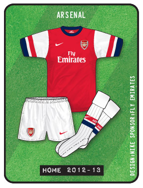
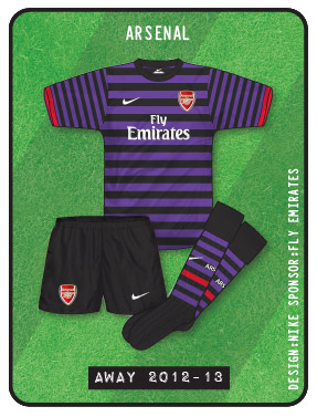
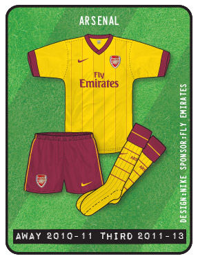
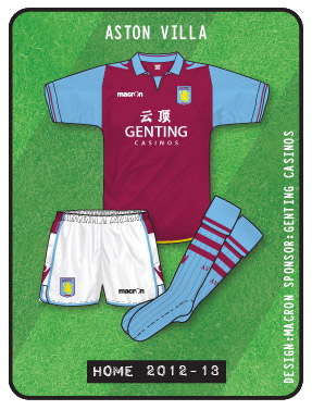
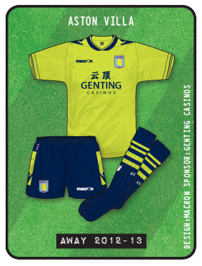
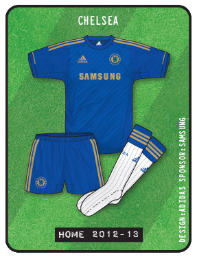
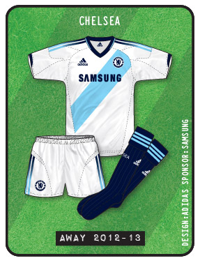
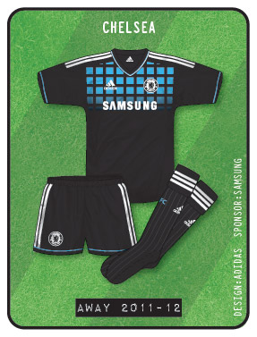
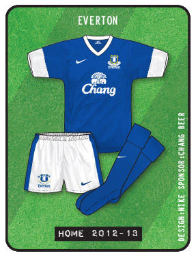
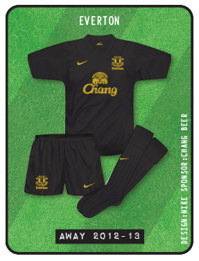
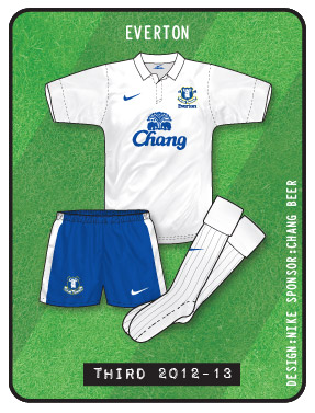
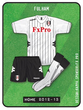
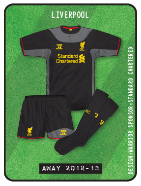
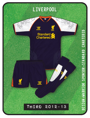
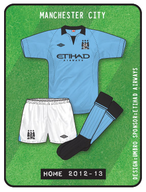
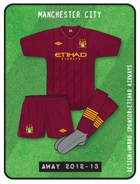
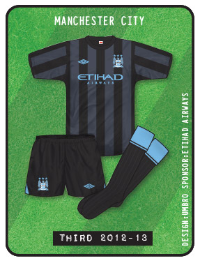
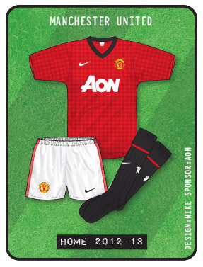
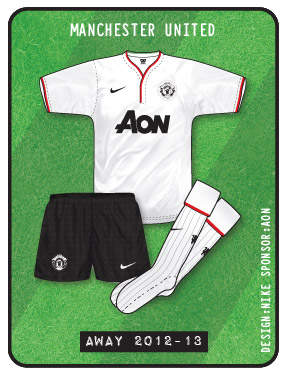
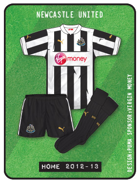
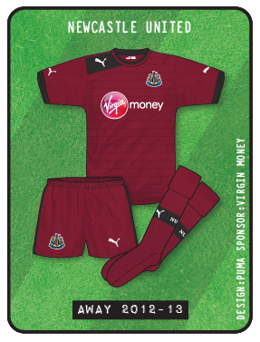
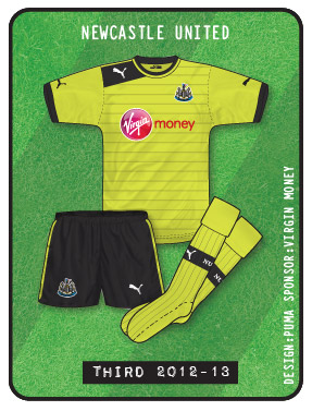
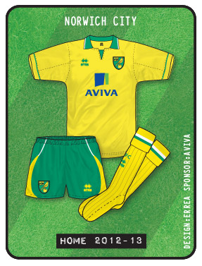
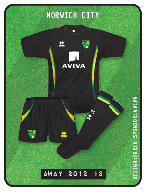
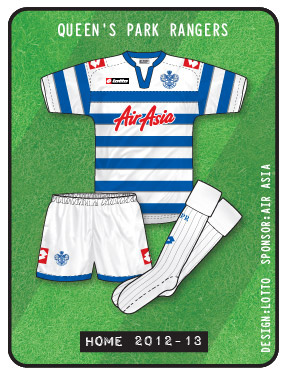
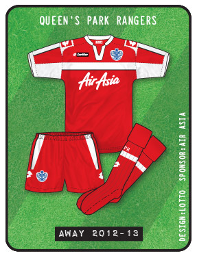
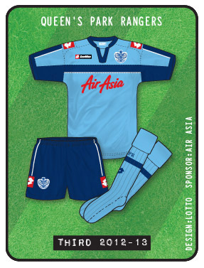
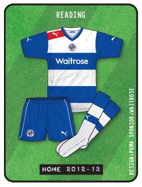
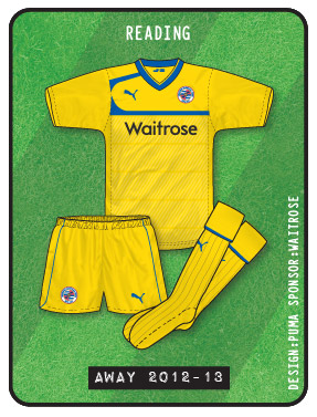
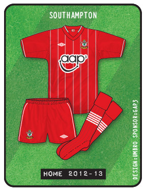
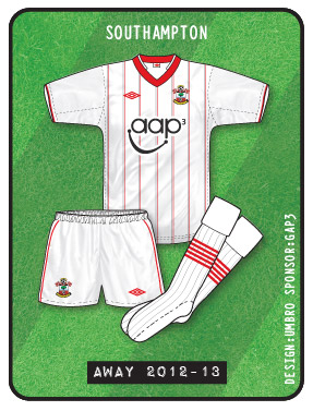
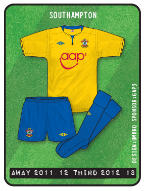
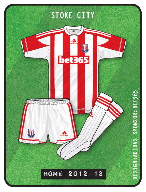
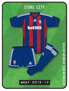
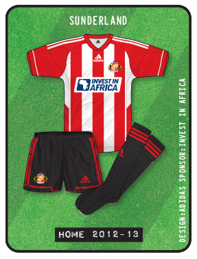
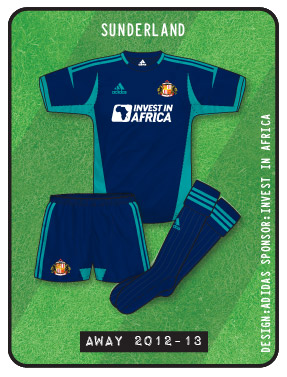
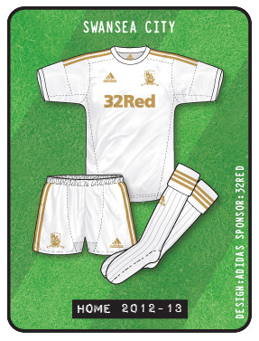
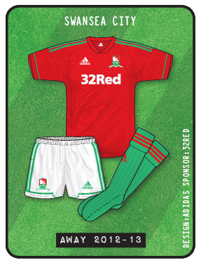
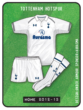
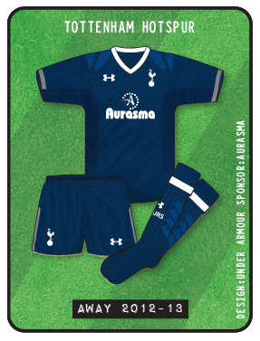
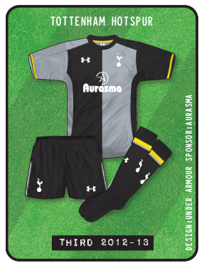
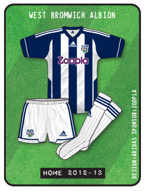
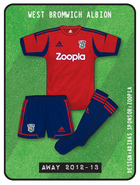
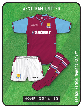
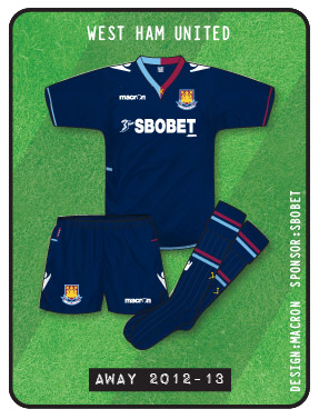
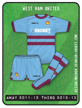
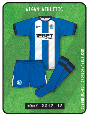
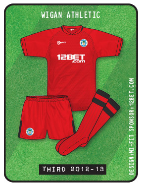
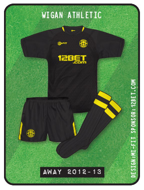
The liverpool kit is the best by far,its only missing a white v-neck!
Favourite of mine so far is definately Arsenal away! Closely followed by Swansea, stunning kit
Hate the Liverpool home – plain and boring, the only saving grace is the return of the Liverbird, and in answer to the controversy re. the Hilsborough tribute, the twin flames and the ’96’ on the back of the collar arguably give more exposure than everything being squashed into one badge. But why, oh why, didn’t they give it a white V-neck? one tiny detail could have changed a glorified polo shirt into one of the all time great retro/modern combinations. As far as the rest go, the Nike kits are just missing something in my opinion – best home/away sets come from adidas – Chelsea kits are classy, Swansea’s are simply stunning – away is gorgeous, using the Welsh colours is inspired. And on a final note, what is going on with Macron? their kits are just weird – I know it’s Championship rather than Prem, but Leeds new away kit has the most bizarre shorts design I have ever seen!
…I think Villa are wearing something similar as well Martyn! Difficult to get them across in my illustration style. Something about Macron I kinda like though
After some of the horrible change kits Chelsea have had in recent years, the white shirt with the sky blue sash looks really classy, and the faded effect on the three stripes looks brilliant. The home is not too shabby either.
Aston Villa have a really nice home shirt, but the less said about the monstrosity that is the change, the better.
Im not too impressed with the Man City home (mostly due to the monotone badge, though this does work better than on the current England kit), but I am very impressed with the change shirt, which has a wonderful burgundy and gold colour combo.
So far ….
Everton HOME
Fulham AWAY
are my faves
I’m not usually a Nike fan but really like the Arsenal kits. I just hope they look as good in the flesh as recent Nike kits have looked a bit ‘cheap & nasty’
A lot of sites seem to be carrying pictures of a grey & white Liverpool third kit which looks fantastic but there seems to be some doubt as to their authenticity.
@Mark Jessop
Isn’t the Liverpool third kit supposed to be purple? I’m I heard somebody mention that, as they criticising it for now really helping alleviate clashes, with the black away kit?
Excellent work, as usual, John!
Just some thoughts…
I love the Chelsea home kit. Simply stunning, and kind of appropriate now with the gold after the Champions League win. As most people do, I really like the away too.
The Liverpool home kit is great. Really smart from Warrior to just keep it simple. Especially after like seven years with the mandatory Adidas stripes. Not too sure about the way though. Just a bit too busy.
Man City home is nice, although I think it would have been better with plain black socks.
I don’t like the Arsenal kits, at all. The away is just an abomination, and is symbolic of Nike seemingly losing their minds. The home would have been fine, had it not been for the red stripe on the sleeves. Just odd.
The Everton away kit is good. I know that black kits tend to get a hard time on here, but I like them. Just simple and classy. The home is rubbish though, those cuffs, blimey… it looks even worse in action.
I like the Fulham kits. I have a soft spot for Kappa. There kits never seem to really change, and I mean that in a good way.
I’m not usually a fan of Macron, but I think their kits for Villa this season are okay. The home kit is very big though. I’m fine with the away, although I know most people hate it. I know fluorescent yellow is a bit out of fashion, but they have really run their course with white and black kits at Villa Park – so it’s nice to see something different.
Can’t wait to see the next lot…
Just out of interest, will you be doing article about the new kits, John? Also, will you be illustrating the new Championship kits?
Yes, the Liverpool third kit is purple:
http://www.dailymail.co.uk/sport/football/article-2168700/Liverpool-unveil-new-kit.html
Thanks, Andrew.
That’s horrible, isn’t it?
I don’t know why Warrior didn’t just do the away and third, just like the home kit, but in white, and yellow.
Seeing as though it’s their first Liverpool kit.
The Liverpool 3rd kit is so dark that I can’t think of a situation where they could wear this rather than the red home shirt or black away shirt.
It is silly, Andrew.
They’ll probably just use it as “alternative away kit”.
You know, when they play teams in red, they’ll sometimes wear the black away, and sometimes wear the purple third.
Nice job again with the kits, John.
I’m a bit surprised there hasn’t been more discussion about the Man Utd home shirt. The gingham effect is terrible.
I am not a fan of the Liverpool away shirt, didn’t like grey and black in 2002-03 either but I think Warrior have done a great job with the home. It’s exciting to see both Warrior and Under Armour in the Premier League.
@waywardeffort
I think that’s because the Man United home has only been uploaded in the past hour, or so, along with the Newcastle away, and Man City away.
Yeah, the Man United home is awful. Just more proof that Nike have lost their minds. On that subject, I’m sure I heard that their away was going to be the same, but blue, but there are pictures going around of a white (in a different design) kit as the new away today…
The Liverpool third kit will be used more in Europe I believe.
Good point, Tardisblue.
EricGeneric: The blue United “away kit” you’ve seen is actually one of the keeper’s shirts.
I agree the Gingham is dreadful though. So galling to see City get so many classic kits in recent years while Nike give us rubbish like this. Suppose they’ve got that to look forward to next season though.
Rumour on the ground is that Arsenal will return to adidas from next season 13/14. To be honest this years Nike set are absolutely dreadful. Cheap looking rubbish. If that is how they plan on Kitting out Arsenal in the future then good luck to them. I actually don’t mind the gingham on United’s kit strangely enough.
best kits are liverpool’s home and city’s away. dont know how arsenal will manage away from home against villa or west ham this season. im assuming a white or yellow third kit will follow.
Most disappointed with Everton kits from Nike, well the home, as the away is quite smart but the home ones looks like average team wear kit and im presuming it is due to lack of team name on socks (which is usually the tell tale sign between team wear and bespoke with Nike and Adidas) and also them using the park gk kit where arsenal have a different design. Much preferred the Le Coq effort last year
@Tim
Thanks for that mate.
@David Morissey
Personally, I don’t think Arsenal will have a problem wearing their new away kit against Villa or West Ham, but they probably should retain the yellow kit again (obviously, it would pointless retaining last season’s blue away kit) just incase. I don’t think they will be launching a new third kit. None of the big Nike teams (Man United, Barcelona, Arsenal) seem to anymore, for the past three or four years. It seems to be a new home kit, and a new away, with last season’s away being the new third kit.
Actually, Arsenal are in the Champions League and I think you need to register three kits if you are playing in the Champions League or Europa League.
@David1986
Yeah, it seems Everton have took over from Fulham (from a couple of years ago) as the average Nike Premier League who don’t get unique designs…
By the way, what do people think of the Newcastle away kit? Have they used maroon as a change colour in the past?
The new Man.Utd home kit is awful,worst effort so far from Nike,its being marketed as ‘Made of Manchester’ as a referance to the cotton industry in Manchester.The irony being that the cotton trade died a death because of cheaper materials from the far east where the shirts are now made.
Couldn’t agree more john. I am not a fan of Man Utd but it’s interesting to read that even their fans don’t seem to like it. I’m all for experimentation (up to a point) on kits, but I thought it looked bad in pictures and then I saw it ‘in the flesh’…oh dear. One of my favourites now added to the site is the Reading home – restrained and classy use of red for the shoulder flash, and wider hoops that make the sponsor stand out better. Puma really seem to THINK about kits, unlike Nike and to a lesser extent Umbro who just seem to throw ideas out and hope that they stick. Honourable mention also to Kappa and the Fulham away – orange is an unusual colour choice for them, but with white and black is really classy.
With you on Reading, Martyn. That new Puma template has been modeled in XXL by the likes of Sheffield Wednesday but Reading have worn it in the right size and it looks fantastic.
Notice that the (short) sleeves are still slim cut but are now longer. Sure it’s either following fashions (what do I know?) or just trying to step away from the pack. Looks great either way, as does the larger profile sponsor and use of red. One of my favourites for the new season.
Sorry to go off topic, but I’m watching my recording of the Team GB versus Brazil match, as I couldn’t watch it live.
Anyway, I was just wondering, have Team GB got an away kit for the Olympics?
Yes they do, it’s the same design as the home short which the UJ in silver/grey
Thanks, Davidr1986.
What are people’s thoughts on the kit? I don’t like it at all, really. It’s just trying to be too clever. Maybe I am boring but I think they would have been better off with a basic Adidas design, in a red shirt, white shorts, and blue socks.
The thing is Eric, Team GB have that design in all of the sports so it has to fit into that rather than being a stand-alone
I do agree, Eric, but I would have liked to see the proper UJ colours used instead of that turquoise colour – I wondered what Stella McCartney was thinking when I saw it unveiled! But it’s true – if it had been designed by the adidas team instead of a fashion designer it would have been much nicer. Missed opportunity in my opinion. Nb. They should have stuck with the initial designs as modelled by Gareth Bale last year.
nike have done 2 nice kit’s for Celtic this year. not sure about both kit’s having dark sock’s though. the Arsenal away has the same design as Celtic’s away.
I think there is a rational explanation for Everton having teamwear kits. The deal with Nike was only signed back in March, and I’ve read that Nike get their bespoke kit designs off the drawing board and into production well in advance of the following season. As a result of the deal being signed after the cut-off point, Everton had to settle for teamwear designs in the colours of their choosing, which have a quicker lead-time for production. I know this happened with Galatasaray, who signed a late deal with Nike and had to wear teamwear designs in their colours last season.
They have a bespoke set of kits for this coming season, so my guess is that Everton will follow suit for season 2013/14.
I know Fulham wore a few Nike Teamwear kits a few years back, but their deal was with Just Sport, who I think also arrange deals with other clubs wearing Nike Teamwear style designs.
Eric, David, Martyn & Denis, the Away shirt is white with very light silver/grey Union Flag stuff. Personally I would have liked to have seen GB wear white shirt, blue shorts and red socks like the hockey team (who didn’t really get the Stella McCartney treatment it seems http://bit.ly/PqNUIf, save for the bizarre ladies’ skirt).
Plus, and I do go on about this but I maintain it’s a valid point http://bit.ly/HpZil8, the Team GB shirt has one navy sleeve and one predominantly white sleeve, so it’s about time we had baselayers that matched. In Blackburn games last season you had players with one white sleeved forearm and one blue (wearing long sleeves) and some with two white sleeved forearms (wearing short sleeves over baselayers).
Also, am I right in thinking that national association logos are banned from the Olympic football tournament? So what Brazil were wearing last night would go against regulations and they’ll have to put a flag over the crest?
How does it work in terms of national association manufacturer v olympic kit manufacturer? Will Spain wear adidas or something along these lines? http://bit.ly/OfXNsT
Jay,
My understanding is that the Great Britain situation is unique in world football – it’ll probably just be the badges that change, as you say. Sweden ladies played GB last night and just wore the same Umbro kit that the ‘full’ team wear, so Spain will probably do the same – obviously the star for the World Cup win will be removed, but I would expect it to be the EC ’12 template – of course, adidas brought out a special Spain kit for the last Confederations Cup, so I wouldn’t be surprised if they do the same for the Olympics.
adidas aren’t making the Spain kit, apparently it’s this http://p.twimg.com/AyAeswECEAE3jFS.jpg
As well, Spurs’ new third kit is meant to be navy and grey stripes, which will hardly solve a clash against West Brom
Yeah, that’s what linked to, Denis. It won’t be that though, will it? That’s a leisure top or shooting or something isn’t it? Look forward to seeing it if it is that brand. I quite like the track tops http://bit.ly/LAZ5fO
It think it’s inevitable that Spurs will wear a goalkeeper kit outfield against West Brom.
Sorry, missed that Jay. Inevitable, indeed
That spain gear is awful,is it supplied by the same firm who make the fake barca/real madrid/man utd etc gear you see hanging outside beach chops in Spain!
Spain is the talk of the kit world right now.What about this monstrosity
http://tinyurl.com/brgf34l
I love the line in the article that said Hummel had only 10 days to think up both home and away kits. I believe them.
I’m sure Tottenham will just wear their home kit at the Hawthornes, with the navy blue away shorts and socks.
We have seen lots of teams wear white against stripes…
I do agree though, having a white home, navy blue away, and dark grey third – is not ideal.
I can’t imagine any ref allowing navy/white-white-white against white-navy-navy
Really? I don’t think it’s a problem, although I know you have more of a problem with “overall clashes” than I do, Denis.
I remember going to West Brom versus Sheffield United during the 1999/2000 season, as I was living near the Hawthornes at the time, and Sheffield United turned up in their away kit, which was white-black-black – against Albion’s navy/white-white-white – and I had no problem with it.
Actually, I just found it on YouTube, amazingly!
http://www.youtube.com/watch?v=SqOWUDvXxJM
That’s shockingly bad, almost as bad as Arsenal v Charlton in 2000!
Yeah, a prime example of why “overall clashes” can be the worst. In fact, surely they’re the worst by definition?
The Spurs/West Brom situation would be best resolved by Spurs wearing all white and WBA wearing navy change shorts and socks.
Or Spurs wearing a goalkeeper kit!
Maybe in practice Spurs in the away kit won’t be that much of a clash, I can recall Newcastle wearing home shirts with white shorts and socks away to Wimbledon in mid-90s.
Though I’ve just realised that WBA’s home has navy sleeves this year, so maybe not
The worst bit about the West Brom v Sheffield United game from 99/00 was the fact that the Blades had retained the previous season’s illuminous yellow away strip as a third choice kit. Why didn’t they wear that?
It’s annoying when a team has a change strip which resolves a kit clash issue but wears a home or away strip which results in a clash. Arsenal did that at Blackpool last season of course.
As for Spurs, someone in their management who decided on the kits should have realised that the silver/black kit is completely superfluous and does not in any way resolve colour clashes for the home and away shirts. Whilst they may get away with wearing navy at Newcastle (given their new home kit is 80% white), the West Brom fixture is a different proposition.
Ironically Newcastle had a pointless away kit in the 02/03 season in silver and some bluey-green colour, which they ended up wearing at….. yes you guessed it, West Brom, on the final day of the season (a shocking kit clash).
I guess I was the only who didn’t have a problem with the Albion/Sheffield United kits then? haha!
I just found a picture of the Arsenal/Charlton game from 2000, Denis. I really don’t see the problem. I guess I just don’t get this “overall clash” thing. I mean, I see your point, but I just don’t agree.
You have to go with “does the home shirt clash the away shirt”, “do the shorts clash with the shorts?” and “do the socks clash with the socks?”.
To be honest, I think that is the way most referees look at it too…
I’m not so sure that they do Eric – for example, take Watford v Southampton in the 2003 FA Cup semi-final – Watford changed from red to black shorts and socks, which were Southampton’s normal first-choice colours, and the Saints had to wear white shorts and socks.
Looking at something in a close-up picture is fine and it’s easy to tell teams apart, but in a match situation, where it often seems like a blur of players, it can be very difficult.
Like I say, I see your point, I guess we just have to agree to disagree buddy 🙂
I suppose it’s the whole teams wearing the same colour thing, which I have a bit of a problem with. What I mean is, I remember when Chelsea played Birmingham in the FA Cup last season. Chelsea obviously wear blue-blue-white, and Birmingham’s change kit is yellow-white-white. But Birmingham changed to blue socks, because of Chelsea wearing white.
I remember you saying that “Birmingham changing to blue socks, actually caused more of a overall clash” Meaning they maybe should of wore white sock, like Chelsea. That just seems all wrong to me. I’d rather there be more of a “overall clash”, than both teams wearing the same colour socks.
Did I say that it’d have been better with Brum in white socks? If so, then I’ve changed my mind now as I don’t think two teams should have the same socks either, they should have had yellow!
Oh and similar to Arsenal-Charlton, in 2008 at the Emirates Liverpool wore their home shorts and socks with their grey away, caused quite the confusion
I’m with Denis on this one. Something to consider is perspective with one player standing yards behind another. White, blue, white can be confused with blue, white, blue in the eyeline to seem like, at a glance, two players are teammates. This is particularly important for the linesman when deciding on offsides when there’s a crowded area.
I agree that no teams should wear the same colour socks – that’s even more important, for tackles etc – but if there’s a socks clash then the replacement socks chosen should not be in the colour of the opposition’s shorts.
…This is why I see method in the madness of the – supposed – one colour kits Uefa directive. Italy vs France is generally all blue v all white (or all white v all blue) and if it was blue, white, blue v white, blue, white or even white, blue, white v blue, white, red then it could cause difficulty for officials and compromise the ease of viewing for spectators.
the worst kit clash i saw was my team Ipswich wearing their abbot ale sponsored cream(ecru) and back striped kit 2 years in a row at West Brom. even worse that one of the games was an evening game. seasons involved were 96/97 and 97/98. 96/97 town had the green and maroon away as a third kit as well. the only difference was Ipswich’s kit had black short’s.
Sounds Grim Scott (pun intended), any pics?
Anyone see the Team GB-New Zealand women’s game? Don’t worry if you didn’t, they’re rubbish, but I assume New Zealand’s women’s wear white as Home colours whereas they were wearing black and Team GB were in the white Away (shorts and socks are boring and plain).
The only thing I can think of is that because NZ were representing the Olympic team they were wearing the colours of that, which are probably predominantly black.
Also, France’s women were wearing adidas teamwear (reasonable style) rather than Nike so it does look as though Spain will be wearing something resembling the crap we’ve seen in pictures. Looking forward to that.
Wow, some GREAT comments here people, True Colours visitors are definitely the most intelligent football kit commentators out there!
Interesting to hear the clash arguments. Personally in theory I don’t have a problem with white shirts against striped shirts – however with designers these days obsessed with not keeping the stripes simple you do get occasions where there is a large proportion of white (eg on sleeves/yokes etc) where it does become an issue. Look at Man Utd’s 70s/80s penchant for wearing blue at Arsenal for example. The WBA/Sheff Wed was a good example of a situation that although wasn’t a drastic clash per se, visibilty all round for both teams, refs and fans could have been improved with sensible kit selection. Which is the point Denis made about Arsenal vs Blackpool a season or so ago.
In this day and age with awareness and experience of kits at a peak there is no reason why the teams cannot be attired in a way to make them clearly different. Surely it makes the refs job easier (although interestingly this is a topic that no pundits ever pick up on!) and makes the players jobs easier.
Anyone noticed Blackburn’s kits for next season? Blue/white halved home, navy away and white third….lights touch paper and stands back…
Questionable alright John (especially if they are drawn away to WBA in a cup), though the navy should just about work against royal and white sides, as it did for Everton a few years ago
I saw the new navy blue away kit being promoted, and just assumed they were retaining the yellow away kit from last season, as the third kit for the new season.
46. Jay, why should Albion change at home because of another club’s poor planning?
The Baggies kit does seem to be a problem for some clubs. I was at the Newcastle game and it was awful, as was the Stoke game last year. Our home kit had a lot of white last year, meaning dark kits were fine. This one has far more navy, so it should be interesting!
They are awful too. I know they don’t have a sponsor yet but they look like training tops. Terrible.
By the way, Denis, Birmingham actually did have yellow change socks, to go with that yellow-white-white third kit.
I saw a video of their academy wearing them.
Strangely though, the first team never did. If ever they needed to use change socks, they just used the blue pair from the home kit.
Oh I know Eric, I saw pics, just makes it odder!
I knew someone would pull me up on that, Statto.
They shouldn’t, but as they have often worn navy shorts and navy socks (though curiously not recently together) as first choice home items I didn’t think it was too much of an affront to their identity.
I doubt I need to assert again that my preference is Spurs wearing a goalkeeper kit.
You’re obsessed with teams wearing goalkeeper kits, Jay! 😛
I agree with Statto. If it is a problem, which I personally don’t think it is but anyway, then Tottenham should have to change.
I miss the old days when the away team would have to use the home teams away kit…
Yeah, but if Tottenham have nothing to change into that’ll help, which is the problem, then my idea is a solution.
I actually don’t think Spurs wearing ‘keeper kits would work. It’d have to be the green and it would actually look ridiculous. Not like if England wore their red gk kit…
Old days? Marseille wore Auxerre’s Away kit in 2007-08.
It just seems to happen less and less, that’s all. It seems that nine times out of ten, the home teams just wears their away kit.
Like the season before the last, which I think was the last time it happened in the Premier League, in the match between Aston Villa and West Ham. A few years before, it would have been West Ham having to borrow that white Villa kit.
That’s the way it should be, as it is their fault, as the away team.
Although, teams wearing different branding is probably a much bigger issue than it was at one time.
I just noticed on the Arsenal Wikipedia page (I know! Before anyone says anything) that they have last season’s navy and light blue away kit, as the third kit.
Has this been confirmed anywhere?
Seems pointless. You would think they would have to retain the yellow kit again…
Yeah, that’s been a confusing thing about the new away. They do need a light change kit and the only way would be to keep the 2010-11 Away for a third season (reverting to its original crest). I actually expected a new release third kit, which would be poor form for Arsenal, but surely they won’t keep the navy and sky blue thing.
…Unless they want to unveil a new range of Nike baselayers with alternate sleeves! If Van Persie toddles off then the new captain might be into that.
Isn’t it really odd that Portsmouth have worn the white and maroon 2010/11 away kit in their two pre-season.
It wasn’t even retained as a third kit, last season.
Just strange.
http://i.imgur.com/sdEsz.png
The Everton kit is nice, but it would look so much better with white socks. Last year’s blue socks looked good because of the amber trim, but this year’s kit should have white, to make it look more like an Everton kit, as opposed to so many teams that wear blue-white-blue kits.
Currently reading Paul Lake’s autobiography and there’s a picture in it from a game which is a good example of why solving a shorts clash can add to overall clash IMO.
In 89-90, City wore their away shorts at Villa, but rather than go with a mismatching sky-maroon-navy, they changed socks too:
http://www.gettyimages.co.uk/detail/news-photo/sport-football-league-division-one-villa-park-birmingham-news-photo/79024622
Just seen Chelsea’s new third kit – another stunning design from adidas. They will now be one of the best dressed teams in the Prem. Simple combination: Home – Blue & gold; Away – White & sky blue; Third – Black & yellow. Covers every eventuality, avoiding clashes as described above. Anyone agree?
Yeah, agree, Denis. Though I think the efforts now being put in to avoid “overall clashes” might spoil us a little and if we see games like that Villa-City example we may get lazy and tell ourselves we can’t make who’s who when really it’s not that bad.
Martyn, like the Chelsea Away, though the gradient on the stripes I think is overkill. Should’ve saved that for a plainer template. The sash was enough on that kit.
I think the Third is a great one to wear to football training but not ideal for wearing with jeans (I’m not being ironic here). adidas obviously decided they’d underused the “coloured abs” approach from the France 2010 World Cup shirt and it’s obviously done with techfit in mind. I think it works for its purpose but just on basic aesthetics (and on a standard replica) it’s a bit too modern.
@Martyn Ping
Erm, if a lot of you guys weren’t happy with the West Brom v Sheffield United kit clash from 99/00 – what will Chelsea do at the Hawthornes this season? It seems to me they can’t wear the home or third kit, so that means the away, no? 😛
Jay – Think we have to agree to disagree on that one. I’m an FC Bayern fan and I love our new third kit with the orangey red flashes on the chest – provided it’s not too OTT (like the mid 90’s Umbro paint splash effect used on Forest and Aberdeen to name but two) then I think its fine…the Chelsea one I thought was snazzy without pushing things too far.
Eric – Anticipated this one! I would think that as the WBA is mostly navy, Chelsea will use the standard away shirt, which is light enough to avoid clashing, with new shorts. The last Bayern away kit was initially unveiled with navy shorts but with the majority of red teams in the Bundesliga also wearing dark shorts adidas soon came out with a white alternative pair – maybe they will issue a sky blue pair to go with the shirt? Alternatively I can think of loads of occasions where a team playing primarily in blue use a black away kit against a blue & white striped team – maybe the amount of yellow will be seen as enough differentation?
They can wear the home, they’ve done it quite a bit, 02-03 for definite anyway
Have they, Denis? I never knew that :S
I reckon Chelsea’s away kit will have a pair of navy alternative shorts, to match the socks. They do have an alternative set of white socks for the kit too, having worn them in pre-season.
As for their choice of kit for the fixture at West Brom, I reckon they’ll use the home kit, it contrasts with West Brom’s new home shirts which are predominantly navy.
Last season Chelsea wore black, but that was down to West Brom’s shirts being predominantly white, plus the home shirt had the large white panels on the shoulders, which might have caused an issue.
Also forgot to mention, in the last decade Chelsea wore their home kit at the Hawthorns, because their change kits would have clashed.
02/03
Away – navy (the midnight navy strip)
Third – white
04/05
Away – black
Third – white (the Regal King Size strip)
05/06
Away – sky blue (very light shade almost like white)
Third – black
Another note in 05/06 – West Brom wore their home kit at Stamford Bridge, but also that season had these strange kit choices: _
Home – navy/white stripes (but plain white on the back)
Away – navy with red and white sash
Third – all white (previous season’s third strip)
They didn’t retain the perfectly suitable red strip from the previous season, and had to wear the navy strip at Blackburn and Newcastle.
Thanks for that, Jon.
I’ve never seen Chelsea wear their home kit at the Hawthornes. Must have just happened to miss Match of the Day on those weeks!
Interesting that Albion wore their home kit at Stamford Bridge in 05/06. They did at Birmingham also. You would have thought that at both Stamford Bridge and St. Andrews, they would have just worn the white third kit.
http://www.gettyimages.co.uk/detail/news-photo/martin-latka-of-birmingham-city-is-tackled-by-junichi-news-photo/57057444
I think if they can get away with it a lot of teams will try to wear Home kits in local derbies. Newcastle-Sunderland being a prime example.
With you on that again, Denis. The best thing for Chelsea at West Brom will be to wear their Home, probably with the change Home socks http://bit.ly/Pcxims
Martyn, I don’t necessarily have a problem with all garish details on football shirts, what I mean is that techfit shirts (or shirts with techfit in mind) that accentuate contours of a muscular physique probably don’t work too well on an overweight chap in the Blackbird or wherever before the game. It’d be a little bit like the copy, er, bats in The Dark Knight.
Jay,
Fair comment – I remember those skin tight Kappa shirts from a few years back – thankfully they didn’t supply Bayern kits! It’s not uncommon for kit suppliers to ‘map’ the outline of muscles on shirts – Nike did it a few years ago. I don’t neccesarily think adidas designed it purely with Techfit in mind though – they seem to use Chelsea away/third shirts to wildly experiment – I’m thinking of last seasons black with the sky blue ‘net’ on it, and I seem to remember their first away shirt (or it might have been third) was flourescent yellow! Interestingly, John has now added the Swansea away – I think that one is stunning as well.
One final point: Which bright spark at Umbro had the idea of getting rid of Southamptons traditional stripes for their return to the Prem? Surely a striped home shirt, and a yellow and blue away (ie. a bit of tradition) would have been the best policy?
I know they’re not in the Prem no more, but just seen the Blackburn third kit that John said about in post no. 60…… a crazy decision to choose to wear a white third kit, and also looks like an off-the-peg Umbro effort worn by lots of lower league, Sunday league and pub teams.
Mind you the way Venky’s run that club, I’m not surprised.
Back to the Premier League and as for Southampton, I heard their new kit has divided the Saints faithful. It looks more like a recreation of the final Umbro kit worn by the great Liverpool side in the 80’s.
It isn’t the first time Southampton have strayed away from the traditional stripes, such as the “reversed Ajax” kit from the early 80’s as worn by Kevin Keegan and co, the red shirt from 1985, and the half and half Hummel kit which was almost identical to the Danish kit from 1986….. but all those kits had black shorts and white socks for contrast. This is just an all-red strip that smells of “re-brand”. The away strip reminds me of Sunderland’s kit made by Le Coq Sportif in the early 80’s.
Though I’ve heard the yellow and blue away strip from last season is going to be retained, but not confirmed yet.
I don’t like these ‘rebrands’ that seem to be going around at the moment – I think the Cardiff situation is just horrendous. Being a fan of your books, I know which kits you mean, but the ‘reverse Ajax’ Southampton was a partial compromise between stripes and plain. As you said though, they at least had the black shorts to keep a part of tradition going! I personally am dissapointed by the majority of Umbro kits for this coming season – I don’t know if it’s the uncertainty of Nike selling the company, but I get the distinct impression their heart has gone out of it – too many templates are being used ad infinitum, where Nike, Puma, and adidas at least vary the trim/collar/shadow combination. All the more dissapointing when back in the mid 90’s they were nigh on untouchable. Anyone agree? What about Man Utd fans? would they rather have the classic Umbro home kit from 94-96 (with the Old Trafford shadow pattern) or this seasons gingham monstrosity?
…Not a fan of Nike’s new kits, as you can probably tell! New Arsenal home isn’t bad though – the arm stripes which people seem divided on reminds me of a sort of RAF/mod/Ben Sherman motif…Away shirt is hideous though.
I’m quite a fan of the Arsenal home too, always like it when navy is the third colour
If anyone wants to see a truly ridiculous clash, have a look on ITV player for the 8th July edition of the Big Match Revisited. Skip to the last game (through numerous adverts) and you can see Coventry wearing their TV kit, which had a sky blue T covering most of the front with a white back and a black number. They were playing Manchester City who were wearing white shirts… with a black number. From behind they look identical. I assume City only had the 2 kits at the time.
Something even dafter I remember from a few years back was Port Vale wearing black and white striped shirts with a plain white back and black number. They were playing Lincoln, who rather than wear their home red and stripes all the way round wore their away plain white shirt with a black number. I can only assume they forgot the home shirts.
Back on topic, Man City’s home kit would be greater if it had navy instead of black. QPR’s kits aren’t up yet, but if you want truly pointless, what’s the best colour to use for a 3rd kit if you wear blue and white hoops? Sky blue of course. I suppose they could wear it against West Brom…
Nice kit but utterly daft as a playing kit, though doubtless it’ll sell as well as any other kit. Possibly not as bad as Blackburn’s kits, which are.blue and white halves, blue and white. I suspect they might need a 4th kit for Sheffield Wednesday.
Agree with you on City kit James, they had navy trim when I began watching football so it’s part of their ‘proper’ colours in my book!
Can’t Blackburn wear Navy shirts with White shorts & socks at Hillsborough this season?
I think the white third kit would be the better option for the Hillsborough match.
Denis is going to hate that!
It’s unlikely Eric, but I wouldn’t hate it, as all-white would provide enough contrast IMO.
If Wednesday had white shorts though and Blackburn wore the third as is, then I think it would cause problems.
Do you mean “it’s unlikely” because you think Blackburn will wear the navy away kit?
I think so, but the more I think about it I’m not sure, especially as Wednesday have dark shorts and socks. We could well see a fourth kit
For the last 2 years whenever we (Barnsley) have played Sheffield United/Doncaster (Red/White Stripes/hoops) We’ve worn Away (white) shirts – I dont think the Referees are too fussed about it.
You haven’t had red shorts in either season though, I’d say that was a key factor in allowing it
Changing the subject…..I was watching ‘The Big Match Revisited’ recently from February 1983 and Arsenal were away to Middlesbrough in the cup. Being of a certain age and an Arsenal fan I remember the game well. What I can’t understand was ‘Boro (being the home team) wore that seasons red shirt / white shorts but with blue socks. Arsenal wore their tremendous green and blue of the time. Does anyone know why ‘Boro changed socks that day (the regular socks that year were white.)
Not sure, but on that Arsenal green kit, its been usurped as the worst change kit the gunners have had by this seasons effort IMHO. That template has been used by quite a few teams quite well (PSG, Monterrey, Kaizer Chiefs), but the Arsenal shirt is awful. It could have been decent if it was gold/yellow for the shirt and blue for the shorts.
Also, considering Reading are playing in the Premiership, its a bit of a let down them playing in cheap teamwear this season, the style used by the African teams or the top puma style would have been so much nicer than something picked from a catalogue.
Also, the new Norwich home kit is very nice, but as its very similar to the old one, was there really a need? Norwich have played in shirts with green sleeves, halved shirts and have had white shorts and black shorts in the past, so its a bit dissapointing not to see errea (Who have made some awesome kits in the past and made really good shirts for Boro in the past) sticking with yellow shirts/green shorts/yellow socks.
It was down to superstition Ronan, included a link while ago which is awaiting approval
Thanks for that Denis, quick one for you: Cork and Galway will lock horns again shortly, are you (like myself) thinking that neither team will change? (for those who are unaware, the Cork colours are red-white-red, Galway maroon-white-maroon and it’s rare that we see a change strip when they play). Agree with ‘Spiderbait’ about the new Arsenal away – a total disaster and embarrassment to a fine club.
Ronan, IMO there is zero chance of a change. Galway wore white for a football league game in 03 and Cork did so in hurling, but other than Galway wearing maroon shorts in a few meetings in the 80s, these are the only changes apart from the 1973 All-Ireland football final.
Re Boro, they had been forced to change socks in previous round v Notts County and Malcolm Allison decided to keep the blue for remainder of cup run
A mate of mine said it all about the Arsenal away shirt….. “looks like one of them hoodie tops worn by 15 year old emo girls”…… priceless!
I’d be surprised if Arsenal did retain the navy/turquoise strip from last season as a third strip, but mind you the yellow kit was no longer for sale this time last year and did get used against Milan…… though why they didn’t wear it at Villa I don’t know. We’ll have to see when the Premier League Handbook gets released, it did say July 2012 but whether that is just to the clubs and not in the public domain I’m unsure, but will be interesting to see the third kits that haven’t been revealed yet.
#104 – I thought of that myself yesterday Ronan.
They dont seem to change whenever they meet which is at least once every 1/2 years nowadays.
I dont about football but I’d be fairly certain that maroon and red clashes require a change.can any of the true colours flock sort this query out?
Any thoughts on Spurs new home shirt.
I like the style of shirt myself but I’m not so keen on the white shorts/socks that go with it.
Hvaing viewed it in a shop it is more like a running top than a traditional kit but thats Under Armour for you I suppose
I’ve seen teams wear plain red against claret (blue sleeves) in the past, but not for a good while. The last example I can think of was Man U wearing red at West Ham in 1996, possibly because they had lingering jitters about their grey kit before it went postal at The Dell.
I know Villa wore their home kit at Arsenal in 1999, but that was when they had the broad claret and blue striped kit. They wore alternate sky blue shorts that day too, though they had a turquoise third kit available which wasn’t called upon.
But as for plain claret, maroon, burgundy, cardinal red, whatever you want to call it, there’s usually been a change against a team in plain red.
Actually, I found a worse example from a bit sooner….. this time 96/97, when Arsenal wore their home kit at Villa. Worse, it was rather sunny too.
The result…
http://cache3.asset-cache.net/gc/1252230-sep-1996-ian-wright-of-arsenal-gets-to-the-gettyimages.jpg?v=1&c=IWSAsset&k=2&d=OCUJ5gVf7YdJQI2Xhkc2QHIG03%2biPFF%2bxup2ZX2%2bMkAdpqbHEdpX6JCpYjBzFdFpUsMqxcsre376T3za41aseA%3d%3d
From what I can gather, the yellow away kit Arsenal had that season wasn’t available until a few months later. In fact I remember they wore the previous away kit (navy with turquoise thunder flash) at Liverpool in the August, on TV.
Amazingly, these teams are wearing change kits http://www.sportsfile.com/id/470880/
You’re right about the 96-97 Arsenal away Jon, I remember McManaman scoring twice in a 2-0 win. I think yellow and navy was first worn at Old Trafford in October (Winterburn og)?
Interesting article on the official Liverpool site:
http://www.liverpoolfc.com/news/latest-news/lfc-to-wear-red-after-kit-clash
They’re going to wear the purple kit in EVERY European game unless there’s a clash.
That is stupid, to me Liverpool always wear red unless there is a clash…… also FK Homel’ wear a Hibs-like green and white, so unless it was the white sleeves that did it, who knows?
I can’t imagine them wearing it at Anfield…..
They’re getting like those French teams with their bizarre changed coloured strips in Europe.
I really would not like it if that were the case, it would be a sad day, especially for a club like Liverpool with such a strong pedigree of winning in Europe wearing red
Talk about a marketing fail. It’s officially the Third Kit but it’s first choice in Europe? At least adidas/Nike call kits released with that in mind “European” or “International”.
Saw a father and son wearing it in Cardiff earlier – father short sleeves, son long – and it doesn’t really seem purple. Navy with the slightest purple hue perhaps. Certainly not the “nightshade” of colour charts.
Oh and it’s awful. Truly, truly hideous.
…Crucially though, two people were wearing it. I saw no other Liverpool shirts in Cardiff.
Cha-ching.
Is anyone else annoyed by the fact that Spurs have white shorts?
IMO they should be reserved for European games only, or obviously matches where there is a clash.
Couldn’t agree more Denis, Spurs should always wear blue shorts. I’ve always thought that they’ve looked good in white shorts when they do play in Europe, can’t explain why though but I believe that’ve done it since the ’60’s (and this is from an Arsenal fan!), obviously a tradition of theirs and not a bad one. But other than that they should be wearing blue shorts and every Spurs fan I speak to seems to agree. Luckily for us traditionalists they will wear blue shorts in defeat at the Emirates this coming season………
Agreed Ronan. Another European shorts tradition, though one which we are not likely to see revived, is Man Utd with red shorts.
Not a hope in hell of ever seeing Man Unted in red shorts ever again. Strange to think that they wore that combination years before their old buddies along the M62 ever did.
On the same token you won’t see Liverpool wear white shorts with the home jerseys ever again either.
Or Chelsea with blue shirts and white shorts, I’d imagine.
Odd how they had no problem doing it as recently as 1990-91 (AFAIK), but then just stopped, even though Spurs would change for games at Stamford Bridge
87/88 was the last time Chelsea wore white shorts with the home shirt, and that was at Spurs.
Did they not do it in a Rumbelows Cup tie the night that the Gulf War started?
Not kit related at all so I apologise for going of topic but In Leeds game against Preston yesterday I’ve noticed that the Leeds team featured White, Gray, Green and Brown. Has a team ever featured more ‘colours’?
Apologies Jon, my memory playing tricks again http://www.youtube.com/watch?v=nBIrotjyNPE&feature=related
It’s nice to see that Kappa have finally given Portsmouth a new home kit, for the upcoming season.
Kinda thought they weren’t going to bother, at one point.
It looks like they are just having last seasons black, and red and black as the away and third kits though.
Post 128 Eric Generic, Portsmouth’s new kit for next season could yet become a collectors item the way things are going.
You might be right there, David.
Let’s hope not though…
are you goig to put the championship kits on here John?.
Im not sure what all the fuss is about the Man U home kit. I get the design is not for everyone but on the pitch the gingham pattern has a subtle effect and the actual design of the shirt with the black v collar and lack of piping and trim is undestated and classic. I think people feel the need to hate on it because it is United mostly. The white away kit is in a different class though. Really nice.
I don’t think it’s that Noel, I don’t like Man U at all and I loved last season’s home, quite like this year’s away too, apart from the shorts, just think that pattern doesn’t belong on a kit
You know, Noel, I didn’t like the Man United home kit when I first saw it, but it’s really started to grow on me.
The gingham is bit more subtle than I first thought it would be, and I’m kind of wishing the away kit was the same but in blue now! haha!
The actual away kit, which everyone else seems to like, does nothing for me at all.
But you know that they’d never do two blue away kits in a row?!
I wasnt a big fan of last seasons home kit. The collar seemed odd and the overall feel and quality of the shirt wasnt great. This seasons if you can get past the gingham ( and I realise that is a big ask for some people lol) has a much better overall design and quality. Gotta say though after watching the Real Madrid game this evening I am very impressed with the Madrid home jersey.
My main problem with the Man Utd home shirt is the lack of white in it. Man Utd shirt should be red and white not red and black
I know, Denis.
With the last away kit being blue (and black), I knew this years one would be white.
I just don’t really see what everyone sees in it, really.
As a United fan i can’t stand the home kit,its awful,looks like a thermos flask!! The Away kit at least goes back to the traditional away colours(in my eyes) but its not perfect,the badge needs to be in colour and the shorts are checkered for some reason,the best bit is the socks!
Yeah, the away shorts being checkered is odd.
Maybe Nike are cutting back on costs and had them checkered so they can be used as the home change shorts aswell! 😛
Oh why would you do it, Eric? Cue Denis…
I heard my name being mentioned?
I wonder what kit Liverpool will wear in Europe after being drawn against Hearts? Home shirt clashes with maroon, the Euro away/third clashes with maroon, the away kit is dubious due to the contrast in UEFA’s colourblind eyes…..
I saw Man U’s away kit in action the other day, the shorts make it look like a pyjama set in all honesty….. though not as bad as Celtic’s “international away kit” tartan shorts effort in 2009!
Loved those shorts, Jon. Won’t hear a word said against them. A pal constantly winds me up by reminding me that he has a pair and I don’t.
Liverpool will probably wear the black Away against Hearts. With Hearts wearing white shorts it shouldn’t be too bad.
On a somewhat related note, has anyone ever known a club to change kit manufacturer but keep the same bespoke lettering and numbering font? Incredibly cheap from Liverpool and in my own twisted head they’re now a laughing stock (due to this in particular, wags) whereas no one else has probably even noticed.
On a totally different sport but sportswear related,did anyone notice that whilst Great Britain(i refuse to use the marketing term ‘TeamGB’) all wore adidas in all sports,Germany..adidasland..wore different manufacturers in different sports.Thought all their gear would have been adidas? Even saw Germany athletics team in nike!!
Liverpool kept the same numbering ans lettering because it was the club that developed that custom font rather than adidas.
Yeah that was surprising alright John.
I see Rangers had to wear training tops yesterday at Peterhead as their black away with blue pinstripes was deemed to clash with Peterhead’s blue.
Anyone watching the Community Shield?
I’m amazed the referee is letting the Man City goalkeeper wear that kit!
And, just before kick off, the referee has made him change to yellow.
Good call, although you would think the referee would have noticed before the match!
AJ, I don’t actually believe that it was a pre-planned (or adequately planned) decision to keep the font, rather a marketing oversight. Is it not the third season of that style? I understand it’s likely to have been produced with Sporting ID in discussion with the club rather than adidas but a new kit should have a new font, as Chelsea have despite not even leaving adidas.
I agree with the white continuing despite the gold details but something could have been created to complement the style of the new kit. Retro white numbers with yellow/gold outline perhaps?
Surely the Man City kit manager would have known that the mauve kit would have caused a clash with Chelsea? To confuse matters even moreso, the yellow strip that Pantilimon wore was already prepared with logos and fonts applied, he even changed shorts and socks at half time…. why couldn’t he wear that from the start?
As for the thing about Liverpool carrying over fonts to a different supplier, I think Tottenham are doing likewise by wearing their custom typeface in cup competition. Also I know the FAW did it with the Welsh kits when changing over from Champion to Umbro in 2010.
Fabulous knowledge, Jon. Thanks for that. Still don’t agree with it but can partly understand Spurs doing it as their Euro name/numbering (especially the latter) are great.
Didn’t see Shield, was it difficult to tell teams apart? Is it the case that sky blue will be City’s best option at Stamford Bridge, as their away is dark too?
You know something, I kinda miss teams having their own typefaces on their shirts, it adds their own individuality to their kit, rather than having another money making arm of the corporate Premier League beast thrust upon them in the form of their own numbers and letters. UEFA even tried that trick and even though their font set is still used by a handful of teams, clubs have put whatever they want on shirts. Well except stripes on the back, but that’s another stupid regulation best kept to another forum for discussion.
I’ve noticed Premier League teams have started using their own fonts in domestic cups as well. Liverpool did in the 2010/11 season, but not last season, whereas Chelsea wore their 80’s style 3D block fonts in the FA Cup, and Man City wore a generic Umbro font today.
Talking of today’s match I could tell the two teams apart without any problems. The shade of sky blue on Man City’s new home shirts is darker than previous seasons, but it wouldn’t surprise me if they wore the away kit against teams who wear white. The third shirt has been leaked and will be dark grey (of a blue-ish hue) and black stripes, with the logos rendered in sky blue.
Sorry Jon, I realise now that the mauve you’re on about is the goalkeeper, thought you meant the actual away shirt
There’s a Uefa font set, Jon? Which teams have worn that? Sounds interesting. Wasn’t aware one existed.
I’m totally in favour of clubs having their own fonts like in European competition and in La Liga but it annoys me when they’re not made up to suit a specific kit (set), from a design and marketing point of view.
This is it, Jay…
http://www.gettyimages.co.uk/detail/news-photo/the-referee-massimo-busacca-shows-a-red-card-to-arsenals-news-photo/114261423
It’s used by Arsenal. Birmingham used it in the Europa League last season. And, I seem to remember Everton using it two or years ago.
Is that definitely a UEFA one Eric? Thought it was this? http://www.gettyimages.co.uk/detail/news-photo/robin-van-persie-of-arsenal-celebrates-scoring-from-the-news-photo/85042084
Arsenal have a new bespoke one this season anyway
That’s the old one, isn’t it?
I remember Celtic using it in 08-09.
Birmingham (Xtep) used the same one as Arsenal (Nike) in the Europa League last season, so I thought it must have been the standard UEFA one. Although there isn’t a UEFA logo on it, which is a little odd.
http://www.gettyimages.co.uk/detail/news-photo/adam-rooney-of-birmingham-city-celebrates-scoring-the-news-photo/135853160
The Spurs font is used on the website, letterheads and on all THFC branded merchandise.
Yeah that’s a good joined-up approach Andrew, it’s a recognisable font without deviating too much from the norm.
Apparently its been confirmed that Arsenal have retained last season’s away strip as the third kit for the new season. Which puts it right up there with Liverpool’s “nightshade” kit as being one of the most superfluous!
Was it confirmed somewhere other than HFK?
I find it funny that Arsenal still have the reputation as being a team who really care and put a lot of thought into their kits…
As an Arsenal fan I find that absolutely hilarious, looking at this year’s monstrosities……..
It’s not just that though.
I mean other things, like causing clashes, having goalkeeper kits that clash with their outfield players, amongst other things…
You’re spot on Eric – as others have mentioned Nike have offered some poor kits and designs for a few years now (and not just for Arsenal). Hopefully the Arsenal return to Adidas rumour turns out to be correct…..
I’m pretty sure many Gooners fans would agree with me that a return to the yellow shirts blue shorts away strip would be extremely welcome!
Jon, every proper Arsenal fan would agree with every single syllable of that comment, well said.
Bit O/T, watching England/Italy…
Italy in Blue/White/blue
England in White/Red/white (Although the red shorts dont look as dark as i remember..)
GK in the foul turquoise shirt/shorts with white socks
Would it not have been better for the GK to wear the red shirt with the black shorts from the 3rd GK kit????
In reference to Jon’s comment (162) regarding Arsenal retaining last season’s away shirt as this year’s third and Denis asking if the info came from HFK, interesting to see that HFK have changed the 3rd shirt to the yellow used over the last two years.
Interesting Ronan, there’s a link to the 2012-13 Premier League Handbook on the official PL site, but it’s dead when you click on it
Matt, the England Home change shorts are a slightly lighter red than the goalkeeper shorts.
I’m not sure which black GK shorts you’re referring to. As I understand it, England currently have three goalkeeper kits: the all red, The purple and lime green and the turquoise (with white socks).
I thought the Italy shirt (and goalkeeper kit) was great, though I thought more of Schillaci and Zenga than Tardelli and Zoff.
Given that the differences are negligible, I don’t know why Italy didn’t just have that as their normal kit for 2012-14. Disappointed with the GK kit I must say, it should have been silver rather than grey, and needed black shorts and blue socks to finish it off.
I think the subtle changes made to the Italy shirt make it look more retro and way classier. Saying that I agree they should have used this kit in the Euros. This is obviously mainly a marketing ploy by Puma to sell more shirts.
http://www.premierleague.com/content/dam/premierleague/site-content/News/publications/handbooks/premier-league-handbook-2012-2013.pdf
Yellow is still Arsenal third
Surprised that Arsenal have opted to retain a kit for a third season, rather than market a new third strip for extra coin, now that is a shock.
Also surprised Stoke and Swansea haven’t got third kits when they’ll need them. Perhaps the same apply to Sunderland and West Brom too. Spurs’ third strip is a waste of time, I forsee a clash incident at West Brom for sure.
That’s good to see.
By the way, I don’t know why they don’t just ask John to illustrate the kits for the handbook. The one’s they have look awful.
Especially when there’s no consistency
Yeah!
I love the way some of the kits are just randomly at an angle!
To be fair the Premier League haven’t made the kit images themselves, they are provided by the clubs, who in turn had the images provided by their respective kit manufacturers.
Denis, I think it’s actually luck rather than judgement that made the one-off Italy kit superior to the actual design. Less is more and all that. 1982 of them were available so it’s there if you want it…
This has surely already been discussed at length but the reason why the GK socks weren’t blue was that they would clash with the outfield players. But what’s the difference between a goalkeeper and an outfield teammate from the waist down anyway? Do we need to differentiate? Surely the major factor is the top, in particular the sleeves. Do we know why the change was brought about?
And you’d think the rule could have been relaxed slightly for a friendly too.
Jon, I know that the makers provide the images but they’re not even consistent themselves, see Arsenal (I know that the yellow was from 2010). PL should have a template drawn and all clubs should fill it in, so to speak
Maybe I’m nitpicking but you would think they would have illustrations of the goalkeeper kits, rather than just “blue”.
Or, whatever wacky name they’ve given a colour. Like there is one goalkeeper kit called “forest”…
Spurs’ lack of a viable third kit shown up on the first day, wearing navy-white-white against Newcastle. If Newcastle had a black back rather than white then all-white would have been fine for Spurs
Whilst I agree that Tottenham should have had something like yellow as a third colour, just looking at some pictures from the match, I don’t think there was really a problem.
We never seem to agree on anything, do we Denis? 😛
By the way, does anybody have a picture of the Tottenham third kit? I haven’t seen it and can’t seem to find a picture of it on Google…
Pictures are totally different from seeing the game live or on TV Eric!
Funnily enough, since posting that I saw the game on Match of the Day and still didn’t have a problem with it.
In an unrelated note from Newcastle v Tottenham, it’s nice to see Gareth Bale switch to number 11. Much more appropriate these days.
Cech wearing the ‘forest’ kit today and Chelsea in all-black, not easy to differentiate.
Agree with Bale in 11 and VdV 10, just wish Arsenal would stop with Diaby 2, Sagna 3 and Santos 11
Another spotter’s badge is for the socks that Wigan are wearing right now – white with blue turnovers.
However in the club shop, Premier League handbook and on last season’s final home match, Wigan had blue socks with navy turnovers, with no “WAFC” inscription on them. Not the first time they’ve had some sock inconsistency since getting supplied by Mi-Fit, that’s for sure.
As for Spurs’ third kit, I found another leak here
http://soccer.indonewyork.com/tottenham-hotspurs-away-third-kit-season-2012-2013-leaked/
If the shirt was just grey, then fair enough, but the black stripes make it superfluous, and will cause an issue at West Brom for certain. I’m sure had Blackburn stayed up, this shirt would have possibly clashed with theirs too in the eyes of some officials.
Also agree with Denis on the differentiation thing with Čech’s kit, bit hard to see in dull light, perhaps he’d have been better off wearing the “slime yellow” strip that Chelsea have retained for a third season.
Still, better than his choice of kit the last time Chelsea played at Wigan on the opening day – charcoal grey, while his team mates wore black (one that the ref missed!).
Talking of refs, what about yesterday’s incident with Chris Foy (not to be confused with the Olympic cycling hero) being a right pedant about the colour of TAPE on James McClean’s socks. That is ridiculous!
If he was being REALLY pedantic he wouldn’t have allowed McClean on the pitch, as his shirt said ‘McLean’!
Howard Webb has joined in by ordering David Silva to do likewise after he had white tape on his socks, which then got covered up with light blue tape. For the ultra pedants out there, the shade of blue wasn’t the same. Also, Joe Hart is wearing white tape by the looks of it over his green socks, but hasn’t been ordered off. Suppose its one rule for goalkeepers………
A truly ridiculous “directive” from FIFA, probably from the same guy who wanted to outlaw striped shirts just so the number could be “more visible”.
It reminds me of the time when FIFA tried to outlaw untucked shirts in the 1990 World Cup, telling referees to issue bookings for such misdemeanours. Thankfully common sense prevailed.
To be fair, a lot of players were using so much of the white tape, that it looked like they were wearing white socks. Which can cause a problem if the opposition are actually wearing white socks.
Instead of calling FIFA and the Officials pedants why not query the prima donna’s who insist on wearing white ankle socks tO show off, can’t think of any other reason why they’d wear them.
Don’t they wear ankle socks to help their feet fit the boots better?
It does look ugly though…
I’m sure that ankle socks can be bought in colours other than white, make it a rule like the undershirts and cycling shorts
apparently a lot of players cut the boot part of their football sock then wear a white normal pair of socks and then tape them together.
Yeah, I heard Cristiano Ronaldo did that at Manchester United, Scott.
#195 Then they can wear the ankle sock underneath.
I also wish to state how wrong it is to see Southampton in all red. #SaintsInStripes
Just looked at the Premier Lge Handbook, Fulham’s third kit will be all Black with a White/Gold sash. Newcastle’s third kit is Lime green shirts and Navy shorts. Arsenal are supposedly keepeing the Yellow/Claret 2010/11 away kit for a further year as a third strip.
Agreed re Southampton, it’s just not on
Yeah, I don’t like the all red Southampton either.
Although, according to the commentator in the Man City v Southampton match, it has gone down really well with the supporters.
By the way, did anybody else find it odd that Portsmouth didn’t have the Jobsite branding on their shirts for the Capital One Cup match against Plymouth.
But it was back for the first league game of the season against Bournemouth a few days later.
Strange.
Well I would say that it’s because they’ve decided to have separate deals for the cup competition and the league and have yet to sort the former, but it would imply financial nous.
Anyone notice the new number 8 for Man U yesterday? “ANDESRON”
Not as bad as “BECKAM” a full 15 years ago mind…..
RE Pompey. Glad to see us on a post relating to Prem 🙂
Firstly, All kits will be changing. Someone said above we would carry over, we arent.
Also we had no sponsor on our shirts for Plymouth as we had no sponsor at all at that point! Jobsite contract ran out at the end of last season. All preseason friendlies used kits from 10/11 seaon that had Jobsite already on them. Jobsite resigned as sponsor a day or 2 after the Plymouth game, days or so before the first league game.
New away shirt was used tonight v Colchester. Its an interesting orange affair.
Yeah, United are serial offenders http://ow.ly/1OrYUv
Have just sent John an article about clashes, I’ve no doubt Eric will disagree with a lot of it!
Haha!
Looking forward to reading it, Denis.
After the first weekend of Premiership action, I can now form a more complete opinion…Arsenal home is best Nike kit by far – navy trim is really classy; Villa/West Ham are both like mid 90’s Pony kits – very old fashioned; Fulham home I like – but not sure the pinstripes really work; Chelsea black and yellow third I still think is gorgeous, as is Swansea away; Spurs I wasn’t sure about until you see it in the flesh – the silver grey trim does work, but it should have navy home shorts; West Brom/Sunderland/Stoke nice but a bit ‘templatey’; Newcastle home I think would have worked better with reversed colours – too much white on the shirt; Liverpool still HIDEOUS – nothing works for me on that home shirt at all; Norwich like West Ham/Villa looks a bit dated – last seasons was nicer; Man City home would be more balanced if it had black on the shorts, but why not use navy as a second colour?; Man Utd is an experiment too far – gingham is a pattern, like burbery, plaid etc, that should NEVER be used on football kits; Everton is nice but the ‘armbands’ just look naff; Southampton is not bad but not traditional enough for me; Reading home is really nice – love the red shoulder flash; QPR quite classy but can they start using the old ‘initials’ club crest again please? Think thats it, apologies if I’ve missed anyone!
The United ‘gingham’ shirt looked like a tabletop from a backstreet cafe on monday,the sweat gave it a sheen that looked plastic and shiny!! Whats the purpose of those ‘T’s on the shoulder too?
Anyone watching Malaga-Panathinaikos? Pana keeper is wearing a greenish-grey shirt and the outfielders are in the usual dark green, very hard to tell apart from a distance.
The Panathinikos GK choice is a shocker, very bad clash when at a glance, also would have thought Malaga would have been worthy of a bespoke kit from Nike
Martin Ping I have to vehemently disagree with you about the Liverpool home shirt, in my view it isn’t just the best kit in the Prem this season, but the best for years. They could only have bettered it with a white V neck (I suspect that tweak to appear next time they change the kit). As for the Navy bands on the Arsenal kit, I think they are naff and pointless. About the only thing I agree with you is that Tottenham should have Navy shorts (white for Europe)
Recently I bought the book Football Manager Stole My Life and, rather predictably, it resulted in my downloading the 2012 version, so my hours are going to be taken up with it.
The data editor had some kit options though, with the possibility of including change shorts and socks, as well as making changes for different competitions!
Andrew,
My biggest objection to the Liverpool shirt is with just a little more thought it could have been so much more – the material looks like a polo shirt, the ribbing likewise, and despite intending to evoke their 70’s/80’s heyday, the yellow logos just make the whole thing look unbalanced and cheap. But this is the whole point of a football strip forum – we aren’t all going to like the same thing! Just my opinion, no offence meant. Warrior I think have just come up with three strips without too much thought…should have been plain red shirt with white V-neck, white sponsors logo but other logo’s in yellow (a la early 80’s Umbro), plain red shorts and socks with single white stripe down the side of the shorts, with the away a simple white/black/white combo and the third all yellow..I’m sure LFC fans would have preferred that?
In reference to Denis and Football Manager, if only Fifa creation centre had the same facility for change kit elements and different compositions!
Well I was right about Liverpool’s kits causing a problem tonight. Hearts are wearing white at home, with Liverpool in black, which is apparently registered as their third strip in European competition.
Just beat me to it Jon, exactly what I was going to say!
Martyn I agree with almost all of your assessments, especially that of the new Liverpool home shirt – like City’s away shirt of last season, having the sponsor trim in yellow/gold really distorts the balance of the shirt – both kits I feel would be better with white sponsors to offset the colour of the manufacturer’s logo. And as you say, the Liverpool shirt would look much better with a white v-neck.
Massive fan of the new Arsenal home kit – was a huge fan of the previous two, but this is great too. Love the navy trim – reminds of the 90s, and looks so smart on the collar.
My only qualm is as with those kits mentioned – why not red socks? When are Arsenal going to return to red, for the most part of their history the most traditional colour? The 10-11 and 11-12 kits looked, so, so much better when worn with red. Oh well.
Still, Gunners fans can be happy that this strip will have a two-year lifespan – if only all clubs adopted this policy. We can but dream.
I’m watching Barcelona v Real Madrid on Sky+, as I couldn’t watch it live.
Am I the only one who thinks the new Barcelona goalkeeper kit clashes with the outfield kit?
Arsenal home shirt has really grown on me. Hated it at first.
Aston villas home shirt has too much going on with the collar and the shors look naf.
Chelseas home and away are pretty good if nothing special. Third is horrendous.
Evertons home just doesnt look right with the armbands. Overall it is a cheap looking shirt.
Fulham kappa kits re meh.
Liverpools home kit s not bad but agree with the comments that there is too much yellow on it.
Man ctys kits are class. Best of the bunch in my opinion.
Man Utd . Big fan of the home kit, in the minority I know . Away kit looks great too but heads up I picked it up without tryin it on and the collar feels reallyuncomfortable
Spurs kits look pretty good but would have to say after seeing them i person they look really cheap.
Not much to say about all the generic adidas kits. Very uninspired and lazy.
And other crap looking Puma Newcastle shirt. They havte y et to make a decent looking shirt for them when compared to the Italyand African nations cup kits.
Is that the navy fading into light blue, Eric? I agree with you (for once!)
That’s the one, Denis.
John may aswell close the comments section down, if we start agreeing with each other! 😛
Re Barca v. Real Madrid. Barca always had really nice classy looking tradititional shirts until the last three or four. It now seems to be a case of what can we do next instead of traditional stripes to make them look as tacky as possible. The new Real Madrid shirt on the other hand is plain yet different to previous offerings. Having said that I always preferred Madrid kits with purple trim as was the case in the Hummel and Kelme kit days.
Mark,
I don’t know what has gone on with Barca/Nike either – nothing wrong with tweaking the width of the stripes slightly, or adding a third colour (navy or yellow are the most common), but last seasons was horrible, and just didn’t say ‘Barca’ to me, and this seasons is an experiment too far – like TV interference!
I like the Real kit – navy as trim with subtle hints of sky blue works well – but purple would make a nice change.
Have you seen the new Bundesliga kits? Some interesting kits there – as a fan of FC Bayern I love our new away shirt – wasn’t sure about the flourescent orange/red trim at first but it looks really fresh and they’ve used it loads in pre season.
Martyn, the Black/Grey third kit is the pick of the bunch for me in this years Bayern wardrobe. Having had a quick look at other Bundesliga offerings i’m really impressed by Hannover’s offerings especially the third kit.
Sorry to go off topic, but who produced the referee kits before Umbro?
I was looking for a picture of something and stumbled upon this picture, it’s from the Premier League in 2005/06, and I can’t work out the logo.
http://www.gettyimages.co.uk/detail/news-photo/referee-uriah-rennie-in-action-during-the-barclays-news-photo/56268709
Fairly sure that’s not a manufacturer’s logo Eric, think it could be a Kick Racism Out one or something similar
Pretty sure Nike used to make referees kits but didn’t put the Swoosh on them because dour authority doesn’t really fit in with their all action marketing angle. So it could be one of theirs.
This season they are putting the Swoosh on (France, Holland…) but they’re doing the tonal thing where it’s the same colour as the shirt.
To sum up, I’m pretty sure Rennie’s wearing a Nike shirt in that pic.
Thanks Denis and Jay.
Mark (228),
In Germany you usually get really interesting offerings from smaller companies, plus the larger ones use templates that you don’t see in England. For example, a couple of years ago adidas used a template for 1.FC Nurnberg and Carl Zeiss Jena that had asymetric sleeve colours – the former’s away kit was white with one red and one black sleeve, the latters home was white with yellow and blue. As you say, Hannover have had some interesting kits, and this season is no exception. Going back to FCB, the third shirt is different because of the orange and silver trim – Liverpool fans have pointed out the similarity to adidas’ last away shirt for them, but that was trimmed with grey – ours is a real silver shade. Interesting that the only English team that adidas experiment on with trim seems to be Chelsea. Biggest UK contract I suppose – but they do seem to try different things there.
229-232:
Don’t think I’ve seen that ref kit before – My theory is that it is from a pre season tournament – judging by the sleeve logos maybe the Emirates Cup? You do sometimes get different ref kits for those, but they’re still done under the auspices of the EPL, hence the logo…bit of a mystery is why the manufacturers logo is not visible/covered up? template looks like a Nike one (like the TC ones used on the top bar of this home page), but as you say, is probably a ‘kick racism out’ logo on the chest. Another mystery is where Uriah’s breast pocket is?
…Had another look – can see the breast pocket now – I was wondering how he’d get on without one of those!
It is from a Premier League match, Martyn.
Here’s the description…
“MIDDLESBROUGH, UNITED KINGDOM – NOVEMBER 20: Referee Uriah Rennie in action during the Barclays Premiership match between Middlesbrough and Fulham on November 20, 2005 at The Riverside Stadium in Middlesbrough, England. (Photo by Laurence Griffiths/Getty Images)”
If you search for Uriah Rennie on Getty Images, you’ll see lots more picture of Rennie wearing different referee kits, with that logo.
@Martyn – The Bayern kit in and of itself is nice, but unsurprisingly (http://www.truecoloursfootballkits.com/articles/mix-and-mismatch) if it had normal red trim I’d think it perfect foor Bayern!
Eric, the kit Uriah Rennie is wearing is an official sports kit, they had the contract for the premier league and football league after nike and before umbro. They have ceased trading in the UK but still provide most of the refs kits in the US (although not MLS as they have adidas). The nike ref kit had two narrow white lines going doen the sleeves on the black kit, the lines were black on the coloured kit.
Thanks for that, Will.
Denis,
Granted, the trim colour on the new Bayern away isn’t traditional ‘Bayern’ red – adidas call it ‘infrared’, and the overall effect in the flesh is a bright orangey red – the problem here is that unlike the strips referred to in your article, Bayern are (unusually for one of Europes big clubs these days) alternating the issuing of new shirts, so they are using last season’s red and gold home this year. Plus, I can’t think of an instant of Bayern using change shorts with the home kit – they have the same level of integrity as Liverpool and Arsenal when it comes to that. I would imagine that if we are playing a red shirt/white short team adidas will either come up with a bespoke change pair for the away, or we’ll use the third…Where I am going with this is that I would think adidas are thinking of making the red in the home shirt a much brighter hue next season. Our nickname is ‘Die Roten’, but there is no hard or fast rule as to the shade of red – up until the mid 60’s it was almost claret, so we’ve come full circle! Still love it though, traditional or not!
Oh I know that Martyn, and as I say it’s a nice kit, I’d just prefer if the shade of red matched. Were change shorts/socks used on the 03-04 home kit, the Arsenal-style one (I realise they were not the away versions)?
Denis,
Don’t think so on that one, but the one that followed it (retro styled with no adidas trim whatsoever in its first year) had white shorts & socks so neccesitated a red change pair – in its second year adidas changed it to all red. I don’t think when they have red shorts they have ever used a change pair. Socks are a different matter – the hooped style home kit that followed the above had white socks with red trim and a reverse as backup, and the striped ‘110th anniversary’ shirt from a couple of years ago was worn with navy or red in its lifetime. Being a Bayern fan, and a fan of football kit design, we have a very complicated history when it comes to strips, with some one off combinations that would no doubt cause Jon some headaches if he did do a European TC!
West Brom wearing blue numbering and lettering with the red away kit is just daft!
On the subject of referees’ kits, just noticed this season’s PL offerings, nice and retro!
Did anyone see the highlights of Wycombe v Bristol Rovers? Both team were in home kits. Wycombe Sky Blue and Navy halves and Rovers in Royal and white quarters. I know Bristol R have a black away kit which was more of a clash but I’m sure normally the do not play each other in home kits.
I did Andrew!
I was going to mention it here but assumed nobody else would have seen it!
Spotted it yesterday too guys, couldn’t believe it as halves and quarters so similar, and navy/sky is basically a ramped-up version of blue/white
Also watching the Football League Show made me annoyed at how many teams who wear red, having orange goalkeeper kits.
Middlesborough being the prime example.
This annoys me so much more than it should….
Im surprised we didn’t use last year’s Green/Black classic kit for the game. We will have to see what we wear in the replay 🙁
Denis, I am with you on the referee kit offerings this season, however just wish the Black kit had a white collar!
To be honest Alexander I think the green/black would be more of a clash contrast wise. I foresee another issue in the reverse fixture as Wycombe’s away strip is all white. Agian not a terrible clash but I suspect other clubs will change from white against Rovers.
One other thing from the weekend – WBA wore red shorts and socks with their new away at White Hart Lane, did they think Spurs still had navy shorts?
Denis – I know – so strange when teams (the kitman?) do that.
Does anyone else find it ridiculous that Aston Villa’s socks are quite obviously a darker shade of sky blue than the sleeves on the shirt? Seem to recall similar last season when West Ham paired their away shorts and socks with the home shirt.
Macron, just bizarre.
Very slack, Nick. Back in the late 90s, O’Neills, who manufacture most of the teams’ kits in Gaelic football and hurling, made the sleeves from a different material to the rest of the jersey, look at this for example: http://www.sportsfile.com/id/022389/
I remember those jerseys very well Denis, I used to wear a Cavan jersey around North London (the only blue shirt you’ll see me in) and the body material fading after many washes but the sleeves keeping it’s colour, didn’t look great.
I wonder what their rationale was
My own thought at the time Denis was that on the body of the shirt, the badge, sponsor and the GAA logo were all on the (cotton) shirt in felt. These were the first jersey’s O’Neills were producing with county crests etc on the sleeve as part of the colour of the sleeve (is this making sense?) I’m no expert in things ‘textile’ but perhaps they didn’t have expertise to do this in cotton and had to use that awful material instead.
I’d imagine that was the case alright, jersey torsos far plainer then
Anyone watching the Spanish Supercup? Barcelona’s kit looks very dark, yet Casillas is wearing a black shirt and shorts
Yeah, Denis.
He wore the bright orange away goalkeeper kit in the first leg.
Although, I think that was actually because Valdes was wearing the navy blue/light blue in that game.
None of it really makes sense. But in a way it does!
Something else I’ve noticed this evening. Fraser Forster in goal for Celtic is in all black and so are the officials – bear in mind you have the ones now placed to the side of the goal (who do nothing..) and that seems more than odd that it’s allowed.
Yeah Ronan.
You do often see the officials wearing the same colour as a goalkeeper, which I am fine with, and I believe is accepted.
But, as you say, in matches with the extra official standing by the side of the goal – I don’t think it should be allowed either.
You’ll find officials in the premier league do not allow it, actually I think kitmen in the prem sort it out in advance so the officials know what shirt to bring.
Goalkeepers wearing the same colours as the officials?
With all due respect that’s nonsense. I’ve seen it a million times in Premier League matches.
By the way, what is it with Pinto, the Barcelona substitute goalkeeper, wearing a different goalkeeper kit on the bench, as to what Valdes is wearing?
Valdes is wearing the green goalkeeper kit tonight, and Pinto is wearing red on the bench.
This also means that Barcelona have at least four (!) goalkeeper kits this season. Navy blue/light blue, grey, green, and red.
Goalkeepers wearing same as officials hardly ever happens in PL now Eric, really clamped down in past few years
Just from last weekend you had Stoke v Arsenal, with the Stoke goalkeeper in light blue, and the officials in light blue.
Tottenham v West Brom had the Tottenham goalkeeper in light blue, and the officials in light blue.
The officials were in green!
That isn’t green!
Well it’s certainly not the same colour as the Stoke or Spurs goalkeepers http://www.gettyimages.co.uk/detail/news-photo/lee-mason-the-referee-looks-on-during-the-barclays-premier-news-photo/150805754
It was considered green when it was introduced for officials in 1992-93, I can’t see what would have changed
That’s green and no mistake………
I believe Umbro call it Jade
Whether it is green, light blue, or jade.
You have to agree that you wouldn’t see two teams playing each other wearing those kits.
So, match officials kits do clash with goalkeepers in the Premier League! 😛
What? Lost. Weren’t the ‘keepers in light blue?
http://bit.ly/QE5SvV
I believe that in current academy football, if the home team is wearing any black kit (Player or GK) they must supply a kit for the referee.. if not (and the away team are) they the away team should fetch a referee kit… strange isnt it!
Seriously though, you do see a lot of goalkeepers and match officials wearing the same colour in the Premier League.
I’m going to keep an extra close eye on this at the weekend!
It does happen, but only if its unavoidable
The Umbro Diamond kit, available from A&H International, comes in 4 colours – Black, Green (Jade), Red & Yellow. So when Liverpool play Norwich at Anfield there may be a clash with the ref in Reina wears Green and Ruddy wears Black.
I’m watching Barcelona v Valencia, and Valdes is wearing the green goalkeeper kit, instead of the navy blue/light blue home kit.
I wonder if they noticed that the navy blue/light blue actually clashes with the outfield kit…
Some odd clashes in the Championship this weekend. The ref at Millwall wore black which in my view clashed with the home teams Navy (he could have worn yellow as neither keeper did) and Bolton’s Adam Bogdan wore Orange GK kit away at Hull. Surely that’s not on?
Yeah, Andrew, that’s another problem with Warrior in that we’re only aware of two goalkeeper kits as things stand. With other manufacturers you’re confident they’ve got another just in case. With Warrior, less so.
Usually it takes at least half an hour for me to prove myself wrong http://ow.ly/1OtX8j
Orange is a silly choice for a Liverpool goalkeeper kit.
I remember them having a red goalkeeper kit in 2007 aswell.
Stupid.
Did they Eric? Can’t recall that one
http://www.gettyimages.co.uk/detail/news-photo/pepe-reina-of-liverpool-celebrates-his-teams-first-goal-news-photo/78133986
That’s not red…
Sorry Denis, just realised I made a mistake.
When I said “I remember them having a red goalkeeper kit in 2007 aswell” – I meant to type “I remember them having an orange goalkeeper kit in 2007 aswell”
I blame not having any coffee this morning…
That one in 06-07 was more old gold in my view, zero clash. David Seaman had orange in 96-97, 97-98 and 98-99 too and there didnt appear to be any confusion.
Maybe you’re right, Denis, I don’t know.
Even if it is gold, to be honest, and I know I’m probably the only one, but I have never liked teams wearing red against Wolves either – but that has always been accepted within the game.
Although, maybe I have a friend in Alex Ferguson, from that game at Molinuex a couple of years ago!
Arsenal wore navy at Wolves in 09, but I don’t see any clash there – I would against Blackpool but I think the two clubs (Blackpool and Wolves) have very different colours
Re. GK kits – here’s one for everyone: Bayern’s home GK shirt is lime green and black (contrasting with the red home), but the away GK is red…now surely if Bayern are wearing their away shirt, then they would be playing a team in red, meaning that the GK shirt would clash with the opposition? They couldn’t wear it with the home shirt, meaning that it’s only use would be for European games where they might be wearing the third shirt when they don’t clash with the opposition (ie. last year they wore the black third away at Napoli).
Really, Martyn? That is very odd.
I know that David Seaman wore red against Blackburn in 1992-93 when Arsenal wore their away, but I can’t think of too many other examples of a goalkeeper wearing his club’s home colour, bar of course when French ones do it in the Champions League
Leeds currently have a white goalkeeper kit.
I saw Paddy Kenny wearing it against Peterborough the other week, when Leeds turned up in the black third kit.
Yes, it is a bit strange. adidas are marketing it as a ‘Limited Edition’, and it is a near replica of the club’s home kit from the 70’s – red with chunky white collar and cuffs…but a very strange choice nonetheless.
Just had a look, it’s wasted as a GK kit, very like the 2000-01 CL strip!
Oliver Kahn used to wear red (with blue) gk kits back when he was in his prime didn’t he? Sure the reverse of the one he wore in the CL Final shootout win over Valencia was red.
It’d be good to see a picture of the one you’re referring to, Martyn/Denis.
http://www.gettyimages.co.uk/detail/news-photo/manuel-neuer-goalkeeper-of-muenchen-gestures-during-the-news-photo/150245090
Kahn wore this in 01-20 http://www.gettyimages.co.uk/detail/news-photo/rotterdam-feyenoord-rotterdam-fc-bayern-muenchen-2-2-news-photo/52717897
Though I think that’s probably orange
And this in 1998-99 http://www.gettyimages.co.uk/detail/news-photo/torwart-oliver-kahn-news-photo/52942045, though Bayern had a navy home kit that season
Think that one’s red too. Yeah, found the current one and it is very nice.
Sorry, I linked to it but comment awaiting moderation, the orange is referring to 01-02 kit
Yes, as previously stated, Bayern had a navy home kit when Olly Kahn wore the red GK strip – the away during that period was either white with red stripes and navy trim or a horizontal twist on the same theme, and the third was the grey and red design as worn when we were robbed of the European cup in ’99, so a red GK kit wouldn’t really clash with any of those.
Sorry to go off topic (again!) but I was just reading some older posts.
Denis, you said that you can change the kits in Football Manager. I never knew this. To what extent can you alter the kits?
There is a data editor Eric which allows complete editing of kits, loads of styles available and the option for alternative shorts/socks and different kits for different competitions.
Just wish I’d explored it more before starting my game with Cork City!
Also, three goalkeeper kits too, so very comprehensive
Can you change kit manufacturers and sponsors?
Also, are the kits available generic designs, or from actual manufacturers?
Oh no, the designs are generic but most are catered for, and they’re unsponsored, no brand names mentioned
Thanks, Denis.
I might have to give FM13 a go now, haven’t played it for a couple of years…
Only if you want to become far less sociable!
@305/306… You can design your own kits with any manufacturers/sponsors and import them into the game.
regarding goalkeeper kits i am sure i have seen Buffon of Juve wearing the home kit as a keeper shirt. i think Juve had a salmon pink away kit which they were wearing at the time(early 2000’s) and whoever Juve were playing he was wearing that.
Yeah, I think he may have even kept it on for the following year too. Don’t quote me on that though.
Is the Portsmouth away kit, the same black with blue one that they had last season?
I can’t tell from the picture on Wikipedia, and they aren’t selling any of the new kits in the Portsmouth online store.
They released a new orange third kit for the new season, which they have used. Just seems odd that the black kit is still the away, if it is the same one as last season.
Bit O/T – Hartlepool’s new Away Kit (http://www.football-shirts.co.uk/fans/hartlepool-united-away-shirt-1213_17084) is all navy…
Bit strange seeing as their home kit is blue/white stripes and blue shorts/socks (albeit royal blue)… Surely they’d not be allowed to wear that if their home kit clashed (Or is Royal/Navy not a clash?)
Yeah, it is a silly choice, Matt.
Royal blue against navy blue is generally considered a clash. Last season, any team who played in royal blue and went to the Den to play Millwall (who wear navy blue) – wore a change kit.
Eric, actually I just remembered that in 1992-93, when PL refs began wearing green, goalkeepers were forced to change, with the exception of Peter Schmeichel for some reason
Bit Lazy of Warrior not to give Liverpool grey away change socks, isn’t it? I know that there is red on the shirts, but red socks still look out of place.
Agree with that Denis.The red socks dont suit them at all against a team like sunderland.Stranger still I find is that Sunderland are wearing Black shorts/socks which would be better on Liverpool.
Did Leeds wear their blue away kit at Cardiff to wind the ‘Bluebirds’ up? Paddy Kenny even wore White!
Ciaran, Denis, I was thinking about that myself. Sunderland were wearing their first choice kit and I have no problem with Liverpool wearing black shorts but the socks are an odd one (gr?).
Firstly, as you say, it’s technically not necessarily mismatching as the red and gold/yellow are used throughout – though this season’s kits are obviously not designed to be interchangeable – and I probably would have ended up loving it if the game had been won convincingly and memorably by Liverpool. However, the fact is it’s more evidence that Warrior have treated Liverpool’s kits with a lack of care and forethought.
Andrew, ordinarily there might be some doubt, but throw Neil Warnock into the equation…
Wouldn’t grey change socks for Liverpool have still clashed with Sunderland’s black socks?
It’s not ideal, but if I were Warrior I would have given them a simple white pair.
Why didn’t they wear the third kit? It’s shocking, but offered contrast to Sunderlands strip.
Not having that. Not having that at all. It had white sleeves.
and Sunderland have red sleeves, your problem is what?
I think you’re best going with a solid shirt v a striped shirt, and the white shorts when there’s so much white on the Sunderland shirt isn’t great either. Not necessarily a clash but just not better than black shirt and shorts. It may seem contradictory but for me the solid colour of black against red/white-black is easier to distinguish.
For peripheral vision, I think it’s better too if one team doesn’t have any white
Sorry, I’m talking out of my a*se aren’t I? The Liverpool Third has nightshade shorts, right? I imagined the white ones. But I stand by opinion regarding the shirt – the black works better.
Having worn all-red at White Hart Lane, West Brom wore their normal away against Fulham
What annoys me more Denis is the blue numbering and lettering that West Brom use on that kit. You can’t see it!
Was thinking the same, no excuse for not having white
I don’t think grey is a good choice for the Newcastle goalkeeper strip.
Fellaini just had a goal disallowed even though a defender’s trailing leg was playing him on. The exact reason why teams have to have different-coloured socks, but not caught.
Manchester United always change socks when away to a team with blue socks, is black and black enough of a contrast in such a situation?
I don’t want to be pedantic, but isn’t the reason why teams have different colour socks because it is football, and often players are looking down at the ball on the floor at a players feet?
Unless Stoke are playing West Ham, of course 😛
You are being pedantic, Eric.
As for Man United, they aren’t changing socks because the opposition are wearing blue socks. They are doing it for the Ferguson fetish! As I’m sure you know, Denis.
It’s just that it’s only more obvious when playing teams in blue, as not many teams have red socks, but not a red shirt (which means Man United have to wear a change kit anyway) and obviously they can’t switch to white, if the opposition are wearing white socks, like many teams do. And not many teams wear black socks. And if they do, they usually have a red shirt.
Okay, my brain is starting to hurt.
I’m not really helping, am I? 😛
Watching the Everton-Newcastle game tonight I was surprised that Newcastle didnt switch to their away shirts.
Although it worked well enough under lights it must be said.
Arsenal wearing red socks on Sunday http://www.arsenal.com/news/news-archive/45047/manchester-city-v-arsenal-kit-selection?utm_source=feedburner&utm_medium=feed&utm_campaign=Feed%3A+arsenal-news+%28News+Feed%29
Should be in red socks every time they wear the home kit….
They don’t need to change away to City, Sky v White should be OK. Though I agree Red socks are more traditional.
Why haven’t Arsenal opted for red socks as their first choice in recent years? Each of the last five strips has looked so much better for having them, particularly the 10-11 home strip.
Hopefully they’ll return to this tradition in two years with the next home strip.
I don’t think Wenger likes them, Nick.
Last season the official home socks were red, but were only used away from home in the event of a clash.
Also, interesting to see Malaga wearing their away kit at to Zenit (who turned up in all light-blue) last night. You don’t see many kit mix ups in the Champions League normally.
Does Joe Hart have another variation of his green kit to wear with City’s third strip?
In April Spurs play at Stamford Bridge, as normal they will switch to navy socks to avaoid a clash but my question is will they change shorts too? Usually they wear Navy but this years kit has white shorts. In my opinion I hate the white shirts, white shorts and dark socks look, it looks unbalanced. Anyone else care?
They’ve often wore white-white-navy at the Bridge though haven’t they? Even though I think Jon said Chelsea haven’t wore blue on white since about 1987
Interesting to see the match officials wearing different kits in the Champions League and in the Europa League this season. Adidas usually just give out one set, don’t they?
Like the one’s used in La Liga and the SPL are usually the same for Europe.
The Champions League kits are nice, but the Europa League kits are… wacky.
Lazio must be well chuffed seeing the Officials decked out in Roma colours……
haha!
I wonder if that is the first choice kit, as it is the same colours as the Europa League branding.
Agreed, the EL ones are awful, though the CL refs have had different kits to the rest for the past two seasons at least
Are you sure Denis?
Andrew, I think Spurs will change just their socks – although I’m simply using the last time they sported an all-white kit as a guide, as this picture indicates:http://www.gettyimages.com.au/detail/news-photo/nicolas-anelka-of-chelsea-shoots-at-goal-as-michael-dawson-news-photo/78913816
And on Spurs’ strips: for those who’ve seen them in the flesh, do you agree with me in saying that they look cheap? I’m not a big fan of all the unnecessary design flourishes on the away in particular, very dated.
What I dislike most about the Spurs kits, after the white shorts obviously, is that the trim on the home is beige rather than navy
Is it? I thought it was a metallic grey effect?
It is definately not beige. Silver/Grey/Metallic call it what you like.
It looks beige in some lights but that’s a moot point, it’s not navy and it should be
Great neat uncomplicated Wigan designs, however can’t see the real need for three kits.
Spurs trim: Silver – looks better in the flesh than on TV. Despite the third being superfluous, it’s really nice – yellow trim at least HINTS at classic Spurs kits of old. Really like Fulham’s away, unusual colour choice for them, but it works, and their third, which I saw for the first time here, is stunning (though I’m not sure where the green comes from). Best Man City kit is the third – when it was unveiled I thought ‘oh great, trying too hard again’, but I like it. Best Prem sets IMO still Chelsea and Swansea (if you count last season’s SCFC black effort being this seasons third). And I’m sorry, I still think that Liverpool’s three are the WORST combination of strips in the history of the Premiership…
Both goalkeepers at the Emirates wearing dark green
Um, was about to complain about Liverpool “inexplicably” (explanation: it needs to sell) wearing the Third kit at Norwich but…
It actually looks alright on tv, which I suspected it might, but it doesn’t look like Liverpool one bit.
And, no, that has nothing to do with the scoreline.
Officials in red. That’s definitely not the reason.
I would just like to apologise to Andrew, and to a lesser extent Denis, for the the whole “match officials wearing the same colour as goalkeepers in the Premier League” thing.
I was wrong. I’ve kept a close eye on it the past few weeks, and I got it wrong.
I’m mainly apologising for calling Andrew’s comment “nonsense”. Sorry Andrew.
Sorry to go off subject (and return to my pet subject) but Bayern Munchen were away at Werder Bremen today and unveiled a dedicated pair of change shorts to go with the away shirt (yes I know that red doesn’t strictly speaking clash with green but they ARE both dark-ish strips neccessitating the change)…They are flourescent orange/red (matching the trim on the shirt) – looks classy when you see the whole outfit, and should please the contributors to this site who complain about teams wearing the same coloured shorts. ALSO – Haven’t seen the highlights yet but I would guess that Neuer had the all red GK strip on (much lighter shade than the outfield red meaning no clash).
Yeah, love those Bayern Away change shorts. On the same subject, Swansea wore black (with gold) change shorts and socks but, whilst being very nice, didn’t quite avoid an overall clash with Stoke, in my opinion.
No Worries Eric. Clash of the day for me was at Bramall Lane. Notts County in Pink against Sheffield Utd just does not offer any contrast. Surely their Gold/Orange and Navy hoops would have been better?
Even the home kit would have been better than the pink one.
By the way, has anyone noticed the three goalkeeper kits that Adidas have given to most of their clubs this season?
Here’s a picture – http://i.imgur.com/yhFaI.png
They could have offered a bit more variation. I mean, God knows what an Adidas team who play in blue are supposed to do when they face a team like Wolves.
The Liverpool 3rd kit seems to look a lot darker on the field. I was listening to the Norwich game on the radio and they described the Liverpool kit as black. Then on Match of the Day they had black as Liverpool’s colour when they were going through the starting line-ups. So, in effect,Liverpool have two black kits this season!
Just noticed that Arsenal are away to West Ham next Saturday, will they be allowed to wear the away or will we see the yellow third?
Had the same conversation last night whilst enjoying several pints with the Arsenal Tralee Supporters lads who were in town for yesterdays game. As far as I can see both shirts clash with West Ham, as you know we’ve worn red at Upton (and Villa) Park before and it looked wrong. Common sense says wear the yellow but common sense didn’t prevail at Blackpool the season before last….
Great minds Ronan, did the Kerry lads agree?!
They did of course Denis! Sensible people from ‘The Kingdom’ (have to say that as I’m married to a Kerrywoman!!)
In person the Liverpool Third does look like a dark navy. It would be good to see the Arsenal “Third” for a third season. But will they revert back to the crest from 2010-11 or keep the one from last season? I have the feeling it’ll be the latter as all the original stock will be gone.
PL Handbook has it as it was in 2010-11
Well good for Arsenal/Nike if that’s the case. I now, however, have a feeling that the 2011-12 handbook had the Third kit crest as it was in ’10-11 too. You able to check that?
Personally I think the away kit is dark enough to be a contrast to West Ham’s.
@Jay – in 2011-12 the handbook had the anniversary crest on the third kit.
Good ol’ handbook! Never in doubt. Saturday will be interesting.
I don’t think there will be a problem with Arsenal wearing the new away kit at Upton Park.
By the way, Iker Cassillas wore the green outfield third kit against Deportivo tonight. Iker has worn outfield kits in the past, in the event of a clash. But tonight there was no reason why he didn’t just wear the bright pink, or black goalkeeper kit.
Claret v black is not often allowed, for example in 2007-08 Manchester United wore the previous season’s white away when they went to Villa Park while Liverpool did the same in 2002-03.
Both Arsenal and Manchester City wore navy at Villa Park last season and both instances caused confusion
Man United wore the black away kit at Villa Park in 07-08, Denis. They did switch to white for the FA Cup match with Villa a few months later though.
I did post the pics, but I think they were eaten by the spam filter…
League match – http://www.gettyimages.co.uk/detail/news-photo/nani-of-manchester-united-clashes-with-martin-laursen-of-news-photo/77427552
FA Cup match – http://www.gettyimages.co.uk/detail/news-photo/ji-sung-park-of-manchester-united-clashes-with-stiliyan-news-photo/78787990
Only missing Tottenham’s third and a couple of last season’s away strips that this year are used as third strips! (Arsenal 3rd, Man Utd, Reading, Southampton)
Only just seeing highlights of Villa v West Brom for first time – both in white shorts and sky blue socks against white, which Arsenal considered enough of a clash to change from last week.
Why didn’t WBA wear navy shorts and socks?
It seems that some clubs just aren’t that bothered about clashes!
I thought the same thing about Villa v West Brom.
Anyway, maybe it’s just me but I always think West Brom look better with navy socks.
With striped shirts like that, I’d be in favour of same shorts and socks, with dark shots and socks then preferred above white shorts/dark socks.
I think a lot has to do with the most predominant Albion kit in my mind from childhood is the 1999-2001 kit.
http://www.gettyimages.co.uk/detail/news-photo/lee-hughes-of-west-bromwich-albion-holds-off-otto-bragstad-news-photo/1065296
On Match of the Day 3, they go through and review all of the kits in the Premier League this season!
http://www.bbc.co.uk/sport/0/football/19780609
Go to 11:58 for the kit talk with Pat Nevin and Steven Reid.
That was fun viewing! So many times I wanted to hurl my iPhone out of the window though, and also several moments that demonstrated surprising astuteness.
The manufacturer that Pat Nevin refers to, in case you haven’t worked it out, is Xara.
Full of errors, that clip, but entertaining all the same.
Maybe I am showing my age here but West Brom in wide stripes with white shorts and socks are best.
http://www.whoateallthepies.tv/kits/50305/my-favourite-kit-west-bromwich-albion-1977-81.html/attachment/soccer-football-league-division-one-west-bromwich-albion-v-manchester-city
Though the often had alternative navy shorts and socks, which was rare in the late 70’s/ early 80’s
It was mentioned on this site that Manchester United would never wear all-red when shorts clashed due to the all-red connection with a certain team from Merseyside. Now, I’m not the youngest bloke to contribute to this site but I cannot remember the last time I saw them in all-white. Very similar to their old buddies from Yorkshire, nice of them……
Man United used to wear all white on almost every visit to Anfield, Ronan.
It was something Gary Neville wanted, for some reason. Since he left, they seem to have stopped doing it.
Looking at HFK, it’s much more recent than I thought. They’ve worn all-white very recently, but to me it looks wrong!
By the way, if anybody here is on Twitter and isn’t following this guy, you’re mental!
http://twitter.com/kitnerd
Barcelona wore their home kit away to Benfica tonight, which I think is fine.
Although, I’m sure they switched to the orange and yellow away kit when they played a team in red in La Liga a few weeks ago.
Arsenal wore the away in an U21 game away to West Ham recently: http://www.whufc.com/page/TV/OtherHighlightsDetail/0,,12562~2928792,00.html
Can’t view video (any Hammers here who can?!) but from the still teams can be differentiated although some refs are more picky than others.
Yeah, could be argued that the sleeves and shorts help dodge the overall clash. Socks may be an issue for some.
Agreed with that 100% Jay. But after having a close-up look at the shirt in the club shop before the game tonight I can really see a Ref not allowing it to be worn at the weekend.
I wonder what Bordeaux will wear tonight at Newcastle?
Or rather, what will Newcastle wear? I have a feeling they’ll be wearing the glow-in-the-dark lime green kit at home again, just as they did at home to Atromitos in the last round.
Bordeaux are a bit like Liverpool and a few others in that their third kit is entirely superfluous. Navy home kit, white away kit, and what appears to be a more purpley shade of navy for a third kit, complete with white Vee, and a PINK sash! Looks more like a Miss World pageant outfit!
Agreed Jon, that’s an awful shirt!
Jon, Denis, that shirt is sublime.
Sub – lime
1. Characterized by nobility; majestic.
2.
a. Of high spiritual, moral, or intellectual worth.
b. Not to be excelled; supreme.
3. Inspiring awe; impressive.
4. French for wierd!
I think Jay means that Newcastle’s is lime and Bordeaux’s is worse, i.e. sub lime.
Good call Jon btw
One final word on West Ham v Arsenal before I’m no doubt proven wrong: in 2009-10 Arsenal wore their white third rather than the navy away, which would have clashed less than the current one would
Looks like Arsenal are wearing the yellow….
I think the shorts are those made for last season, even though they weren’t actually worn before today
Yeah, reckon you’re bang on with the shorts. I think they may have had to manufacture new old shirts as I doubt the stock would’ve been kept until now (as I have a pretty good idea where it goes) but last season’s shorts – Home, Away or Third change – didn’t have the laurel and oak leaves so work ok. A hybrid kit, whatever next…
Didn’t watch the game but thinking…borderline overall clash? Arsenal didn’t wear those shorts all of last season but chose to wear them on a day they matched their opponents’ shirts? Should have worn the yellows I reckon.
When I turned it on, I did say that the yellow shorts would have been a better idea!
I thought that the claret shorts were first choice when it was unveiled? didn’t Arsenal wear the clarets until they went to Anfield? In a related note, Arsenal/Nike have changed the crest/sponsor to keep a kits lifespan going before (the unveiling of the new crest overlapped, as did changing from Sega to 02). Don’t think any problems were caused by the shorts though – without wishing to open a can of worms AGAIN, but Spurs rarely changed their shorts (when navy was first choice) when they played Everton. Surely the issue of shorts clashing with opposing shirts is irrelevant? Especially when a vivid yellow shirt (like Arsenal’s) is used. I know there are some exceptions, but I really don’t think its an issue (sorry). Moving on, Hoffenheim (all blue) played Bayern (all red) yesterday, yet turned up in their black away strip…confused?
So, you guys were right about Arsenal wearing yellow at Upton Park. Personally, I still think the away kit would have been okay.
Is that the first kit in the Premier League to be used in three season’s since the white Man United 2002-05 away kit?
The redcurrant are first choice Martyn, though Anfield was the first game of the 2010-11 season.
I don’t think it’s a problem in all cases about shorts clashing with opposition shirts, but I think that there can be issues with peripheral vision. In the comments on my article, John linked to a college study on this, with interesting results.
What Man Utd kit are you referring to Eric?
In any case, I just realised that the answer to your question is no, as the yellow kit was only worn against Milan last season
Actually, it was the 2003/04 and 2004/05 away kit, Denis. It was retained as a third kit for 2005/06.
I’ll post the photos. I’ll stagger them to avoid getting eaten by the spam filter.
In 03/04 at Anfield
http://www.gettyimages.co.uk/detail/news-photo/sami-hyypia-of-liverpool-clashes-with-ruud-van-nistelrooy-news-photo/2711902
In 04/05 at Villa Park
http://www.gettyimages.co.uk/detail/news-photo/john-oshea-of-manchester-united-tangles-with-carlton-cole-news-photo/51898830
In 05/06 against Lille
http://www.gettyimages.co.uk/detail/news-photo/wayne-rooney-of-manchester-united-and-efstathios-tavlaridis-news-photo/56058581
05-06 wasn’t PL either 😉
Watching Real Madrid v Barcelona now, no way should the referee be wearing black
Damn you Denis! 😛
By the way, totally agree about the referee in El Clasico. I mentioned it to my Dad, who didn’t care at all!
Close-up it was distinguishable, but from the normal view it was very confusing.
At least Casillas didn’t wear the black goalkeeper kit this time, like he did in the Super Copa match at the Nou Camp.
Why is there such a big deal being made about Newcastle getting Wonga as a sponsor? Nothing was said when they sponsored Hearts or Blackpool
There was a lot of objection when Blackpool got Wonga as sponsor, maybe we never heard much about it given their lower profile compared to Newcastle. Having said that I think a lot of the objection to Wonga is down to people not understanding the market place in which they are operating. The ridicoulously high interest rates quoted by them are based on borrowing a loan over a minimum of 12 months (APR). This is the figure they are required to quote by law however loans offered by companies like Wonga are intended to be very short term.
Eric and Denis, of course the referee should be in black.
The referee should always be in black! Unless its a game involving the Scottish national side.
That may be Andrew, but I meant in the context of Sunday, where the existing situation was that one team had a mainly-navy kit
I noticed when Aaron Lennon came on as a substitute for England last night, he was wearing number 19.
Have they increased the number of subs for qualifiers? It used to be 7, numbered 12 to 18 – although I know some national teams use squad numbers.
Eric,
I believe that the official line is that they still have to name 23 players, given 1-23, but only 18 actually in the squad. But as you say, a lot of national teams persist with the numbers from the previous tournament. As a fan of German football, I know Germany do.
I’m not at all happy with this new development.
It’s an interesting one. Discussed the number 10 missing for Ireland against Germany with Denis yesterday. Both theories above could well apply, Denis would have to confirm (because I can’t be bothered). The thinking would be a Euro 2012 squad picked based around what the expected starting lineup would be, then for the next games the players from the Euros keep their numbers with those missing again being replaced based on expected starting lineup and, with Robbie Keane out, that resulted in the ten not appearing.
Never mind the “10” not appearing in that absolute shambles last night, I don’t think “1-9 & 11” put in much of an appearance either…..
Is that right? Hmmm. Is that based on the ‘keeper holding onto the number he had in the Euros? Was it Westwood?
To be honest, I watched HIGNFY so what happened may have flown under my radar.
Jay, Ronan is making a joke about the performance.
Martyn is right, as the Ireland numbers last night were different to the Kazakhstan game, which were in turn different from the European Championship.
Ah, sorry. I read the dash as a comma.
I just checked TheFA.com and England has eleven substitutes for the San Marino game!
http://www.thefa.com/England/News/match-centre/2012/england-v-san-marino
Just click on “team sheet”
Yeah, it was the same for Ireland according to UEFA.com and the TV graphics
doesn’t Australia have 2 squad’s?. one a european and the other “home” based. i say this as i’m sure i’ve seen them on tv with silly numbers like 57.
Denis is right Jay, I was making a joke about the performance as it was, well, a joke I suppose! Didn’t see HIGNFY myself but turned to Sky 1 to watch ‘Moone Boy’ and very good it was too! By the way noticed that we have another new kit. It’s ok but I’d love to see us go back to the circa 1978 O’Neills number.
Yeah, the joke wasn’t too subtle, Ronan, it was me being an idiot. Moone Boy was a good choice, as it’s set bang in between Euro ’88 and Italia ’90 isn’t it? A happier time for Irish football. Think he wears a Crown Paints Liverpool shirt (’87-88) in one episode, or certainly in publicity shots.
I’ve checked it and I’m sure it’s a reproduction. I don’t think adidas Originals ever did that one so it’s probably Score Draw or something. The sponsor’s too big – not to mention in too good condition – for it to be an adidas replica from the time.
Think you’re spot on with the Liverpool shirt Jay. Plenty of Liverpool fans around in Ireland back then (and of course a fair few today). Also correct to say that it was a better time for Irish football – they were wearing the Adidas shirt with the ‘mesh’ sleeve if I recall correctly. Met a bloke once wearing the away one that he said once belonged to Niall Quinn – it was about 8 sizes too big for him so he could have been telling the truth….
Well Jay, if they used a real replica from that time, it’d look too old in the show, wouldn’t it?
Was surprised that Friday’s final was set on June 25, 1990, the day Ireland beat Romania, but no mention of Italia 90
That would be a fair point, Denis, if I’d actually advocated using an original shirt rather than a reproduction. I don’t think it would have been a good idea, and I’ll tell you for why: if I saw a show had gone to the length of sourcing an original shirt I would have been in such awe that I might have missed some lines of dialogue.
Actually, I’ve seen a few of those shirts in mint condition – the kids’ ones aren’t that rare.
On that same theme, there’s a new Gerard Butler film – Playing For Keeps – where he plays an ex-Celtic and Liverpool player and there’s flashback footage of him wearing an ’89-91 Celtic Home shirt. It’s a sourced original but there’s a problem: it’s a replica so the sponsor’s far too small.
adidas Originals re-issued the 1985-6 Liverpool shirt (in 2009) with a different collar and different material than the original: http://www.melmorgansports.co.uk/shop/images/crown1.jpg
The 87-88 shirt was never re-issued.
Yeah, Denis and I were discussing how bad that one was just the other day. I saw someone at training with that on once and wasn’t even immediately sure of what it was trying to be.
I don’t understand how they managed to get the collar wrong, especially when the one they’ve chosen is more complicated than the original!
Amazing lack of attention to detail
Oh there must be method to the madness. It’s not difficult to replicate a kit. There must be some sort of benefit in the two being easily distinguishable, though what that is I have no idea.
Have heard the excuse that differentiation is required so that those with originals (as opposed to Originals) don’t lose out if they’re selling, but you could easily just put that on the tag
I don’t see why adidas would care about that, unless managers (designers twenty years ago?) have a stash of the originals ready to sell for their retirement. And the problem with just adding the label is that people will swap them. Some people buy old kids’ Umbro shirts for the diamond strip so they can make up men’s shirts to sell as original 70s/80s stuff, so I don’t think an exchanging of labels would be beyond them.
With England playing tonight, I was thinking about the upcoming switch from Umbro to Nike.
It’s obviously been a long time since England changed kit manufacturer, so I was just wondering about what they are going to do.
Do you think they will release a new home and away kit at the same time, and just release new kits every two years at the same time? Or will they go back to staggering the release dates, which will lead to a kit only lasting one year?
What do the good folk of this website think they will do?
What England match is that Eric?
wrt Nike- Hope England fans dont get their hopes up.The hype will be driven up tenfold before the world cup-more so than normal- with nike involved.
Assuming good old England qualify of course!
Joe Hart wearing Red Shirt and Navy shorts because the Referee wouldn’t change so he could wear his blue/green shirt.
Clash tastic….
Why couldn’t Hart wear all red? A keeper can have the same coloured shorts as the oppo for gods sake
What are the shorts? They’re not the outfield Away change because they have a full colour crest, if memory serves me correctly. My initial thought was that they were the “Galaxy” training shorts.
And the ref shouldn’t’ve been wearing dark shorts with a light blue top anyway. Back to the findings of that study again…
No issue, according to Eric!
Eric, the precedent that springs to mind regarding the England kits would be France. Nike took over the FFF contract in 2011, I think, immediately released two beautiful kits, then released two more beautiful kits for Euro 2012.
To sum up, England will have lots of beautiful kits.
What could the referee switch to anyway, to allow Hart to change?
They have four kits. Black, yellow, grey and light blue. Black would have clashed with England. Grey would have caused an issue with Poland. And the Poland keeper wore yellow.
Not that I have a problem with refs wearing the same colour as keepers.
Oh and I actually agree with Hart having to wear change shorts.
Sorry Eric, I should have been clearer, I meant you had no issue with the ref in light blue/black and England in dark blue/light blue
Oh yeah, I know Denis. I was actually talking about Matt’s post.
I decided to leave the overall clash thing. I, unsurprisingly, had no issue with it, but the thought did occur to me during the game that you and Jay would bring it up! haha!
I didn’t see the game – still celebrating the win over the Faroes – so I must decide later
What was the order I said for precedence on changing? Home outfield, away outfield, away goalkeeper, officials, home goalkeeper? That would have worked today. Officials would have worn yellow and the home ‘keeper would have had to find another top. If only there was a website that could tell us what options he would have…
…All blue then? Apparently this would have caused a shorts clash issue with England but, I’d argue, not necessarily an overall clash.
Hart in the aqua green kit, Polish GK in all-yellow, officials in grey. Simples.
The ref/England situation caused some confusion on the Football365 Forum:
http://imageshack.us/a/img132/1338/polveng.jpg
But using The Jayworth-29eris Method, Joe Hart would have first choice of gk kit, so could wear all red if he liked.
Do you not think the grey might have caused a problem with Poland’s white shirts, Denis?
It’s very light grey, almost silver.
By the way, if people want to start being picky about refs kits, maybe we should mention them wearing the same colour shorts and socks as teams….
Especially in games like this http://www.youtube.com/watch?v=EahV3oC2qf0
I remember that game, Denis.
Didn’t Arsenal turn up with the same kit again the following season, and Man United decided to change to white socks. Which, I guess isn’t too much of a problem, as they like to do that.
By the way, a sign of the kit changing world…
http://twitter.com/HullCityKits/status/258914042779947008
Even our Denis has got involved.
Also, I noticed from one of @hullcitykits tweets, that the ill thought out Adidas goalkeeper kits are causing a problem. Something which I mentioned on here a few weeks ago…
Yeah I thought of you when I saw that tweet Eric.
It was later that season that Arsenal also wore that at OT, but as it was the FA Cup Man Utd were wearing white socks anyway.
Not sure why Arsenal didn’t just wear white socks in the league, especially as white shorts and socks were worn with that shirt against Roma.
From 94-95 to 99-00 inclusive, as well as 01-02 and 02-03, Arsenal wore navy socks at OT but in 00-01 they changed to yellow
@457 – The shorts are from the England 3rd Gk Kit (They have one that the Mens team have never used but the u21’s downwards and ladies have.. think we had a pic on here somewhere)
@466/468 Poland do have a Green GK shirt (That design is available in Green/Yellow/Red/Black/White/Purple) which of those colours they could have worn green (which they used at Euro 2012 I think..) and put the Referee in Yellow (and therefore Joe Hart in the Light blue/green effort..)
A little known fact regarding the Man U Arsenal cup game that season……now we all know that Arsenal will either wear all short sleeves or all long sleeves (never a mix) except for that game. What happened was all the Arsenal team wore long sleeves in the first half but changed at half-time to short sleeves (haven’t got a clue why). Thierry Henry came on as a second-half sub but hadn’t changed his shirt at half time, so it’s the only time you’ll ever see a mix on the same pitch where Arsenal are concerned. Unless anyone out there knows different…….
Very interesting Ronan!
as far as i am aware the arsenal captain decides what sleeve length the team wears.
Yeah that’s the tradition Scott, back as far as Herbert Chapman’s days!
I’ve often wondered as to what happens when the goalkeeper is captain, does he canvass opinion from the rest or what?!
Just reading some old posts…
We missed a trick when talking about which kit Arsenal would wear at Upton Park, and whether if it is the yellow third kit, if it will have the anniversary badge, or not. When they turned at Upton Park with the new/old crest, somebody should have said…
“They’ve re-badged it you fool…”
I’m up too early, might go back to bed 😛
Matt (476), what shorts are those? The Home change gk kit, which I think you’re referring to, is purple (though it looks like navy) with apparently luminous lime green details. There’s no way those are the shorts. I’m sticking with them being the “galaxy” training shorts http://amzn.to/OQIo6c
There’s a whole load of colours for that Nike goalkeeper template but this site doesn’t give Poland the green version, certainly not in Euro 2012.
Good call, Eric. A missed opportunity there.
“I’m not wearing a three season old kit, I’m not wearing a three season old kit.”
Lovely stuff, Jay.
I presume this won’t set a trend? http://news.nationalpost.com/2012/10/18/he-scores-he-scores-again-cash-strapped-greek-soccer-team-takes-on-brothel-sponsorship/
Also, what are the views on Stoke’s away kit as a solution for games against teams in red, now that they have played at Old Trafford and Anfield?
Celtic wore their away at St Mirren today too, no real problems in my view http://www.gettyimages.co.uk/detail/news-photo/celtic-player-victor-wanyama-in-action-during-the-news-photo/154450635
I think the biggest issue I had with the United-Stoke game was United wearing white shorts with dark socks and Stoke the reverse, but it still didn’t really cause a problem. The Stoke shirt is predominantly blue and the continuation of that to the shorts was easily distinguishable from United’s red with white shorts.
Certainly no issue with the Celtic game, though the St Murn players who went with a black baselayer could’ve helped out by wearing a white one (the shirt’s sleeves are striped). I thought I saw a guy wearing a white one in the first half but it might have just been my stream confusing me.
Eric, Jay and I may need to get a room at the Linton Travel Tavern, Kit aficionados and Partridge fans too!
I like that Stoke’s socks weren’t just the home ones but alternative away ones.
Yes you’re right about that fact Ronan, as this photo confirms!: http://www.gettyimages.com.au/detail/news-photo/arsenal-players-celebrat-victory-after-the-fa-cup-fifth-news-photo/1798516
Oh, regarding Stoke (*takes deep breath*), I’ve thought about this long and hard and I reckon they had time to put together a green Third kit for the United game, in the wake of Alex Ferguson’s “jolly green giants” comments. It would, of course, have just been teamwear but they could have called the Premier League, got it cleared and printed up/had the crests affixed during the night.
It would’ve been a great response to the jibe and surely would have brought such a cheer from the fans that it would’ve acted as a shot in the arm. They might have then gone on to score first and… Oh.
Nice one Nick! Can’t believe that game was so long ago….
I know! Almost a decade since Fergie’s flying boot, and the days Giggs was booed by his own fans!
I thought the Stoke away kit was a stupid idea when I first saw it, but yeah, after seeing it at Anfield and Old Trafford, there isn’t really a problem at all.
Is it an anniversary kit, or something? And, have they retained a third kit?
Adam Bogdan, the Bolton goalkeeper, wore orange in the match with Wolves last night, who were in old gold obviously.
The mind boggles…
It boggles or bogdans? That’s one of the worst clashes I’ve seen involving a GK
Hello all. Wow, I’ve just spent far too much time reading every comment! Great discussion, with some fantastic points to peruse over. If I may go all the way back to the comments around the 190ish mark about socks and tape, does anyone have any opinions on boot colours? Maybe it’s just me but it’s something that bugs me, especially when it comes to officials insisting players ‘colour in’ the tape/wear the correct colour tape around the ankle but every boot colour under the sun is fine. I don’t believe there are any guidelines regarding boot colour whereas there are for socks. Personally I’d like to see black boots for all, but I doubt that will ever return! Should the boots match the sock colour or should a team all wear the same colour? Should tape colour matter in this context?I’m just interested in peoples opinions on this as I haven’t seen it discussed elsewhere – possibly because I’m the only one bothered by it!
I’ve never had a problem with boots and colours, to be honest. I’ve seen it mentioned on here before. Personally, I think it’s kit geeks having a bit of an existential moment really. Ha!
Karris, in my ‘career’ I have never worn anything but black boots, but unfortunately not everybody is as sensible as you and I!
I think for me it’s more about the lack of any decisions about the boots. I remember back in the 80’s when players started wearing cycling shorts under their shorts, now that didn’t bother me but was soon ‘regulated’ so that they had to match the shorts, the same as now with the long sleeved thingees they wear. Now of course we have the ankle tape having to be coloured in which I think is a bit silly if for example a player has red socks (v blue socks) and is wearing blue boots, wouldn’t the boots be more of a problem that a bit of white tape?
The ‘Arsenal to Adidas’ story seems to be gathering pace according to today’s ‘Daily Telegraph.’ anyone else heard anything? What about my fellow Gooner Denis??
Karris the issue isn’t strictly speaking tape, it’s the use of white ankle socks over coloured football socks that cause a clash with white stockinged teams. The tape generally isn’t used that excessively, though I suspect there were isolated incidents.
Usually, the ankle socks are not worn over the football socks – the foot of the football sock is cut off and then the rest of the football sock is taped on to the ankle sock.
The reason is that many players like to wear a particular kind of ankle sock with their boot.
But why can’t they wear them in a matching colour? It harks back to that Prima Dona Ponce Ronaldo wanting to show off and have his feet more visable. Tosser!
Just in case we needed reminding that Spurs’ third is one of the most superfluous in history, they wore it at Southampton today
Denis, while I agree that the Spurs 3rd is superfluous, don’t you think its a fantastic original design.
Original definitely, and black and silver always go well together, not really a fan of halves though
Agreed that the second kit would suffice but even so Denis I thought even a kit fanatic like yourself could appreciate that a newcomer like under armour needs to showcase its designs to a greater audience.
The first kit would have sufficed too! But that is a consideration too I suppose Ciarán
Your right about the home kit.was a gaa-heavy weekend so didnt see the game.Forgot the traditional design was gone from southampton (along with form too it seems!).was thinking back to the sunderland/bolton game last year which was a bad clash in my view.
Yeah that was bad as both had dark shorts too
Anyone see the London Irish-Harlequins game? No? You missed a cracker (probably. It caught my eye when I was watching the news – didn’t listen).
The reason I mention it is that if anyone still is of the opinion that the “overall clash” is just some fantastical idea that Denis Hurley has dreamt up (Eric) then watch this http://bit.ly/S8jmNf
On paper it’s light shirts and dark shorts against the reverse, but throw in number patches, side panels, several sponsors, collar designs and God knows what else and it becomes an unsightly mess and very unpleasant to watch – and not just because it’s rugby union!
Granted, it’s an extreme example, but football (whatever the code) looks better when a team wears as much as possible of their primary colour and as little as possible of anything else, and the opposition does the same.
I’m really looking forward to West Brom-Spurs.
Scotland v New Zealand from the 2007 World Cup was also a prime example http://www.youtube.com/watch?v=8LCsDkmwszU
Yeah, I remember that one. But I think the key difference is that the Scotland-Somewhat Blacks game, on paper, and if the shirts were accurately depicted, could have been a clash. That’s not necessarily the case with the London Irish-Harlequins one – especially if the submitted illustrations of the playing wear were devoid of added details, as is possible.
I’m not so sure that you would have had flagged Jay – http://2.bp.blogspot.com/_qDvLM4MHG6s/TNyjwQaiK5I/AAAAAAAABKs/FagoQNkpEmI/s1600/DSC03075.JPG and http://2.bp.blogspot.com/–ho6WsgF_So/Tz4oxOQhdrI/AAAAAAAACQU/e1rIOMRf8oY/s1600/IMG_2852%2B%25282%2529.JPG
i don’t know if anyone else watched the football league show this weekend. both sheff wed and hull wore their 3rd/last seasons away kits at their respective away games. sheff wed in all silver/grey , hull in light blue and white.
Hull City wore their third kit as they were using the ‘tash converters’ sponsor. They had a batch of unprinted third kits and it would be easier than reprinting their black kits.
Haven’t seen any footage of the Sunderland – Middlesbrough game from last night but somebody mentioned to me today that ‘Boro wore their light blue away kit (no surprise there, of course) but their keeper was also decked out in light blue. Surely not!!
Well they must have been having you on, Ronan.
Middlesbrough’s keeper wore orange, in fact both he and Sunderland’s keeper wore identical kits!
Yeah, both goalkeepers wearing the same colour (let alone kit!) is frowned upon these days. But I think most of the Adidas teams have only been given the orange and light blue goalkeeper kits, very few teams seem to have been given the ‘tan’ kit.
I think this is the case for both Sunderland and Middlesbrough. So it was either both wear the orange, which isn’t ideal, but doesn’t really cause a problem. Or, one of the teams wearing the light blue goalkeeper kit. Which obviously wouldn’t as Middlesbrough away kit is light blue.
I’m not sure why Adidas haven’t given everyone the tan goalkeeper kit, aswell. Only Bolton do, as far as I know. And Hull, after they asked for it.
Seen it myself now Jon. Trip to ‘Specsavers’ for my mate I reckon (or cut down on the pints!….)
Any chance there may have been a half-time change? Neither scenario is really acceptable so either could have been changed for a perceived lesser evil.
Hull City played Leicester in there home kit with the Goalie in all orange.
Goalkeepers are allowed the same kit on the assumption they can’t go up for corners.
Arsenal kit man has had a shocker here. Surely they’d normally change the whole strip rather than compromise the integrity of a kit. Red socks with the purple kit looks awful.
Goalkeepers should always have a completely different kit to the outfielders, you wouldn’t have two teams wearing the same colour.
Sorry, Matt, are you saying that a goalkeeper is allowed to clash with his opposite number on the proviso he won’t come up for a corner even if the side is losing late on? Surely a match-specific rule shouldn’t be implemented just because the referee hasn’t done his job properly beforehand?
Andrew, I disagree. Yes, there’s an issue with the navy on the socks not matching but that could be (has been) interpreted as black or purple. Otherwise the red and white links in reasonably well. It was the best option as the Away socks would have clashed and the Home first choice ones would have created an unideal white/dark vs dark/white below waist conflict (overall clash territory).
Personally I would have loved to see them wear their yellow socks but that’s just me…
I suspect Matt’s comment was made with tongue firmly in cheek.
The Goons should be in yellow, this kit doesn’t work. Arguably white socks would have been better than red.
Why would white be better than red in that situation? For aesthetics or functionality?
Ah, Matt’s sarcasm may have gone over my head there.
Agreed about the ManU/Arsenal game. I feel in situations like this that Home team could help out a little. We all know Fergie likes the white socks; surely this would be solving the clash. At the end of the day any clash affects both teams and does it really matter who solves it! I’m obviously not insinuating that the home team should ever change their home strip fully; I’m just saying ManU could have made things easier by wearing white socks, it’s not exactly like it’s against their kit history (i.e. Liverpool). Got to agree that either team in White socks looks better than what we saw today.
As for the goalkeeper situation I feel that predominantly one teams Goalkeeper shirt should be different colour to everyone else on the pitch. What happened to the days when teams played in Red & Blue with GK’s in Green & Yellow with the Referee in Black!! Sadly I don’t feel this will happen any time soon! But as for having a GK shirt the same colour as the outfield shirt is just daft. Royal Blue & Sky Blue I can understand, but not Amber & Orange!
I know it isn’t as much of an issue but the Arsenal ‘Keeper kit was the same as the referee and linesman, don’t they have other options, for the Goalie or Ref
The officials have 4 options in the Umbro Diamond Kit. Black, Yellow, Red and Jade (Green) with Black pinstripes.
De Gea could have surely worn the blue ‘keeper shirt (wouldn’t’v clashed with the purple and black would it?) and then the officials could have worn green.
Re. Changing Socks
In the Bundesliga yesterday, FC Bayern played Hamburger SV. Bayern haven’t worn away shorts with the home strip for a long time, preferring the integrity of their all red strip, and couldn’t wear the standard away strip as it would have also clashed (HSV are known as the ‘Rote Hosen’ – Red Shorts, and never change these at home). This meant wearing the dark grey third, where the socks would have clashed. What was the outcome? ignoring it and hoping for the best? wearing the home or away socks where the colour/trim would’ve clashed horribly? no. adidas issued a pair of dedicated second choice socks, white with dark grey trim. Is it just me, or are clubs/the FA missing something in England that seems to be simplicity in Germany?
All the teams in the Premier League need to do is to organise what kits each other are going to wear before the season starts. And if there is a clash, just get alternate shorts/socks that won’t.
There seems to be a lack of planning in the Premier League and Football League unless individual teams do it themselves
I think the officials should wear black wherever possible, except if a team wears a strip that is too similar in colour or contrast. Also on the subject of goalkeeper kit clashes with the officials, I don’t recall anyone batting an eyelid in the days when goalkeepers, particularly in internationals, often wore a black strip.
And as for the comment about the Hull goalie, agree with that, and it ain’t the first time it’s happened – a few seasons ago Hull’s goalie wore a yellow jersey, whilst his team mates wore the amber home strip with had black stripes on the front. You would have thought Adidas would supply additional colours for their teams’ goalie strips, instead of just orange, gold or light blue; they’ve got other shirt designs of different colours available.
In addition I was quite surprised at Arsenal wearing a pair of alternate home socks with the away strip yesterday, given that in the past they’ve had an alternate pair for each of their choice of strips for quite a while. Mind you there was a time when Man U would often change their black socks for a white pair for a home match in the league as well, has that quirk been stopped?
United wore white socks v newcastle in the league cup,quite glad they never changed yesterday,not keen on it to be honest,United should always wear black socks at home and that includes european matches.
I haven’t watched as many games as I would like to have this season, so it may have slipped past past me, but have Chelsea worn their (very nice) white away kit yet?
Think they MAY have worn it in Europe, or maybe in one of the domestic cups, but the black (alleged) third kit has been used more in the league…can’t remember seeing Chelsea wear the white in the Prem. Most of the ‘blue’ teams have large quantities of white on their strips so the white (sadly) probably won’t get much use.
yesterday(tues 7th) Swansea’s U-21’s played at Ipswich. they wore their red away kit but with red short’s instead of the white pair they have worn in the premier league. seem’s team’s can wear proper non-clash kit’s when they want to.
Spurs will wear the Black and Silver halved shirt at City on Sunday. Surely all Navy would offer a better contrast as Silver and Sky Blue are quite similar? Madness
Not sarcasm….
2 Keepers can have the same colour/similar on, as long as they don’t appear in the opposing area. It’s not supposed to happen but does when kitmen can’t agree and referees allow.
Matt nobody can prevent a keeper from going up to the other penalty area, it’s not ideal if they have similar colours, the officials just have to be extra vigilant. All keepers wore green for years and years and it was never a problem.
John I know the Tottenham third kit is superfluous, but it seems to be the only new kit this season, as yet, unillustrated.
Thanks Martyn.
Yeah, it’s a shame it probably won’t get used much. Looking at John’s illustrations, the only place it’s almost guaranteed to be used is against Everton.
They might use it against West Brom, I suppose. What with West Brom’s home kit being predominately navy blue this season. Although I have a feeling that Chelsea will turn up at the Hawthornes with the black third kit.
Just flicked over to Middlesborough v Sheffield Wednesday live on Sky Sports, and Wednesday are wearing their yellow away kit for no reason.
Adam,
Think you’re probably right – WBA’s white shorts and socks will probably be considered sufficient to tell apart, even though navy and black could be considered a clash…I think that Chelsea should have called the white the third kit, seeing as it will get so little use. In the Bundesliga, my team FC Bayern have a white away kit and dark grey third, because the teams in Germany that play in red normally do so coupled with black, meaning that a white away sees plenty of action. It always boggles the mind that in England, where there are a LOT of blue and white striped teams right through the league, that kit suppliers don’t react in the same way. Surely it makes more sense from a marketing point of view? ie. more on the pitch use equals more cash through the till? Bayern’s white and flourescent red/orange shirt has had loads of use this season, and the dark grey third (officially called the ‘international’ strip) has been used for most of our games in Europe, meaning a good spread of sales for FCB and adidas. If I put my cynical head on, is that one of the reasons that Bayern have posted a profit for twelve years in a row and so many English clubs are in financial jeopardy? Every aspect counts, and strip choice/selection/marketing is surely as important as spending within your means and filling the stadium every week?
@543 – Our kitman told me thats what the Referee told him for a game last season.. For some reason the referee wouldn’t let us wear 2 of our 3 gk shirts and we have to wear one the same colour as the other keeper. The only condition was that as we couldn’t provide a suitably different colour shirt, he couldn’t go up for any last minute corners..
Bit far fetched if he was going to to lie…
Fulham are another team that seem to use their 3rd kit more often than their away kit. I thought that first kit should be used where possible, then away kit and 3rd kit was only used where home and away both clashed.
If the home kit clashes, then I don’t mind teams mixing it up and wearing the away kit sometimes, and the third kit sometimes.
It’s when teams just wear a change kit when they could wear the home kit, which annoys me.
Matt, your Ref sounds like a bit of a meverick. I always seem to do sides who’ve had such a ref the week before. “Last weeks Ref was OK with it…” or maybe they are trying to ‘play me’?
Matt, what team are we talking about here? I take it if you have a kitman it’s a decent level? It’s a ridiculous ruling from the ref, as surely one of the other two ‘keeper kits wouldn’t have caused a serious clash with outfield players or the opposition ‘keeper and if it was due to a clash with him (the ref) then it’d’ve been a better option.
I posed a trivia question on Twitter earlier and it didn’t get a sniff so I’ll try again here. The Spurs Third shirts today differed between themselves in that the long sleeved version had misaligned badges. Anyone know why that is? I’m 99.9% sure I know the answer…
http://www.youtube.com/watch?v=c0Tp0bHt5CE
Interesting and (as far as I can see) unnecessary socks change for Chelsea’s U18 team. I wonder if we’ll see this on the senior squad against Man. City later this season?
I can’t help thinking that Barcelona would have been better off wearing their home kit at Mallorca last night, rather than the orange and yellow away kit.
Barça had apparently retained last season’s black away strip as their third choice for this season, so why they haven’t worn that I don’t know.
Al, it may have been to avoid a clash with the referee, who was also wearing black shorts.
Adam, good call. Though I do love that Away kit.
They need to sell the Away, Jon, simple as that.
I see your point, Jon, but the third kit wasn’t really needed in the Mallorca game. The home would have sufficed.
They used the home kit away to Benfica in the Champions League, and they even have a red goalkeeper kit, which has been used with the home kit a few times this season. So it seems that red isn’t considered to clash with the home kit. Which I agree with.
Jay, a stab in the dark says that the long-sleeved shirts had misaligned badges as they were the ones that were always going to have a poppy printed on them but some Spurs players chose short sleeves instead. Have I won anything??
I believe, and I may be wrong, that a lot of manufacturers actually apply distinguishing details to (or remove them from) the upper central section of the front of long-sleeved football shirts so they can be easily identified when they are folded and packaged in a cellophane square for dispatch to clubs and retailers. Yes, they will generally have a serial number sticker and other identifying labels but stickers can fall off and mistakes can be made.
I’m not sure I’ve seen misaligned badges before but I have seen watermarks being removed and collars differing.
Check these two pictures of Paolo Maldini in the “same” shirt. The long-sleeved version has a round rather than v neck and moves the three gold stars to the sleeve too.
http://bit.ly/TBU4Gy
http://bit.ly/TBUbSi
@ Jay29ers. Good point about the ref which makes me think the combination will be seen again with the first team. I think it may have been an inadvertent joke on your part too. After all Chelsea are good at “clashing” with referees lately!
Was anybody else surprised that in the Sweden v England match, both team wore their home kits?
Usually somebody wears an away kit in games between the two…
Maybe the 2 countries just decided amongst themselves rather than having some FIFA bigwig choose.
You might be right, there Andrew.
Maybe things are relaxed for friendly matches? I just remembered a friendly between the two at Old Trafford in 2001, where both teams wore their home kit.
Also, it’s the same thing between England and Brazil. One team usually changes, an example being the match at the 2002 World Cup, when Brazil wore blue.
Yet when the two teams played each in other in friendlies in 2007, at Wembley, and in 2009, in Doha, both teams wore their home kits.
Adam,
You’re right, England normally play in their away kit when they play Sweden (most recently I think in the 2006 World Cup – featuring Joe Cole’s 30 yarder), but England tend to be more fluid when it comes to friendlies…maybe because their away strip at the mo is that dodgy navy and sky blue concoction and that was deemed to clash with Sweden’s home as well.
Have we forgotten Euro 2012 already? They did indeed wear the navy kit (with navy change shorts) against Sweden then.
Did they? Can’t honestly remember that game…But then Euro 2012 was a bit forgettable so I’m not surprised!
I’m surprised nobody has yet mentioned Spurs wearing their third kit for the north London derby, instead of white-navy-navy as they usually do at Arsenal.
Not that it did them much good, mind!
Well that’s likely to be due to Spurs’ white sleeves this season being combined with white shorts and socks and the whole “integrity of the kit” thing stopping them wearing the navy Away lower half. Wearing the whole Home kit would’ve clashed too much though the Away could have been chosen.
Sorry, Jon, I’m really just expanding on what you said there aren’t I? Do they tend to wear change items (shorts and socks) or has it just worked out that way in recent years? I assume the former on occasion, right? They’ve had a couple of kits with white shorts/socks haven’t they?
Incidentally, have Spurs worn that Third kit in Europe this season? Was it designed for exactly that? I ask because those crests on the socks look bound to be too large to be cleared by Uefa.
Sorry to bring up the Rugby Union code again but has anyone seen the images from the Scotland-South Africa game? It’s a joke. Horrendous clash.
Rugby is different to football because of the two lines of players rather than everyone fighting for the same space like football.
Still shouldn’t have happened though, they were both almost black.
The last time Spurs had an all-white kit and they came to our place they just changed to blue shorts (proper Spurs kit). I have a feeling that ‘Under Armour’ haven’t supplied blue shorts so they were forced to wear that awful thing that turned up in today. I was at the game and it looked rubbish, luckily the game was superb…..
Seeing WBA v Chelsea today, I can’t see Spurs’ away clashing at the Hawthorns, so the much hoped-for wearing of GK kits won’t materialise. 🙁
I went to the Birmingham v Hull match yesterday (who would have guessed?!) and Hull turned up in their home kit (although they wore change amber shorts, for no apparent reason) and their goalkeeper in, wait for it, orange!
Burning Issue:
Should Away Kits been worn at home?
Having witnessed Newcastle when in Europe aswell as Rochdale v Bristol Rovers yesterday (Rochdale in Yellow, BRFC in Blue/White) my opinion is no.
but I’d like to hear what you guys think 🙂
Ha! HArry: A man after my own heart. There surely has to be a strong argument that Chelsea should have worn their Home kit with the blue Home change socks (which earlier this season were even being retailed). Navy v that blue would have caused less confusion than navy v black, no?
The problem, as must have occurred yesterday, is the side-on view, where the two teams must clash when, say, they’re running out after a corner, the ball is played back in and there’s an offside decision to make. Navy sleeves vs navy sleeves when West Brom play Spurs could be an issue.
Unfortunately I still don’t foresee our goalkeeper kit idealism coming to fruition.
I’m watching Millwall v Leeds live on Sky Sports. Leeds have turned up in their blue away kit, presumably because Millwall have white shorts with their navy blue kit, and they don’t want to compromise the integrity of the all-white home kit.
I’m not saying it’s the worse clash I have ever seen, or anything, but it certainly doesn’t help. This “integrity of the kit” is utter tosh. Especially when they went years wearing a pair of navy blue change shorts with the home kit.
Yeah, Leeds have seemed overly keen to wear that blue kit this season.
I see value in the “integrity of the kit” argument but I think the problem is exacerbated by kit elements not being interchangeable, or a reluctance to wear Away/Third shorts/socks with a Home shirt they weren’t designed to suit, even when it still works aesthetically.
Have you read Denis Hurley’s fascinating piece on interchangeable kits on this site? It’s called Mix and Mismatch. Definitely worth a look. I wrote a response to it here too http://ow.ly/1PCkjp
Integrity of home colours is one thing, but as you’ve mentioned, Leeds have worn away shorts since the early seventies, and even interchanged elements of all three of their kits at times, so I don’t know why they couldn’t have worn their home shirts with the away kit shorts. As far as WBA vs Chelsea, I think the yellow on the shirts prevented a clash. The home and away shirts, even with swapping the socks over, would’ve caused a much worse clash IMO. I personally don’t think this debate about GK kits is too much of an issue – I wouldn’t want to go back to the bad old days of the 90’s when (particularly Umbro) GK shirts looked like a kit designers wild experiments gone wrong…I’m thinking of the England away GK shirt that David Seaman said made him feel ‘like a tube of refreshers’. I think similar colours are OK – and not to be pedantic, but Hull City play in amber, not orange. If the ref said its OK, then its OK, yes? This would be more of an issue if a goal was conceded because of it, but that hasn’t happened (though I bet Alex Ferguson has it on standby for one of his legendary excuses!). Come on people, lighten up!
Looking again at some of the pictures from yesterday, you’re probably right, Martyn. The West Brom shade of blue is lighter than I thought and the white details on the sleeves were probably more distinguishable from the bright yellow than they would have been from the reflective gold. I still think it poses problems for Spurs though.
As for goalkeepers, it’s not just about referees making decisions. Fans should experience an absolute minimum of confusion (or none at all) when the ball is played into the box for freekicks and the goalkeeper is involved. It might not be a clash but you’re asking, in effect, five people to wear easily distinguishable clothing and that should be easy. Why can’t they manage that?
(One reason is adidas releasing a teamwear goalkeeper set of orange, blue and tan. Ridiculous)
Come on guys, amber and orange, whilst not technically the same colour, is certainly a clash!
Hull, as you said, wore amber shorts for know reason. But Amos, in goal, wore what I think were the black training shorts. Why didn’t they where the same shorts as usual? It would have been a lot simpler.
Yeah, Martyn, I think I’m probably with Adam on this. In the case of Hull, I think orange and tan goalkeeper kits should be a no-no. That leaves them with blue and nothing else. Far from ideal.
I think Hull are using the amber shorts as away shorts and black shorts at home only.
Might be alone on this! But I would go back to my original point: I don’t think this issue has been blamed for anyone actually conceding a goal, has it? And distinguishing between goal and outfield shouldn’t be that difficult, surely? After all, as stated, every keepers strip in the 70’s, certainly in England, seemed to be green, whether the opposition wore green, or even their own team mates…The main variations were only in internationals (Gordon Banks I think wore yellow a lot, Lev Yashin preferred black, Sepp Maier sky blue, Dino Zoff silver, and so on). Why should we be different today? Now goalies don’t have padded elbows, surely the ‘team wear’ issue could be remedied by them donning the alternate home/away kits? After all, my team FC Bayern have a red third GK strip which, while seeming a little pointless at first, was worn by Manu Neuer against Lille at home. Bayern wore their third strip at home and Lille arrived in their white away, meaning the red GK strip worked perfectly. Now, if Hull remedied the GK situation by sending their keeper out with their away kit on (which correct me if I’m wrong is black), wouldn’t that solve the problem?
I’m generally in agreement, Martyn. But I do think that even if it’s never been the cause of confusion from players/officials which has led to a goal – which I’m sure it must have done – there is also a responsibility to fans in upper tiers trying to follow the action. Making the kits distinct isn’t difficult so it should be ensured.
I agree that outfield shirts should be worn by goalkeepers in a lot of these circumstances, as is the way with Olympique de Marseille and others. Steve Mandanda has at least a couple of ‘keeper kits every season and then also wears any of the outfield kits that solve the problem/take his fancy.
I think it’s been done in Italy a lot too. Generally in the Bundesliga (which as an FC Bayern fan I follow more than any other), GK kits tend to alternate away from the respective teams home and away shirts. Roman Weidenfeller at Dortmund wears lurid coloured bespoke kits, which was the case when Kappa supplied the club, so I think its his own choice!
I see Real Madrid are wearing their green third kit at Man City tonight. I was expecting them to be in the navy blue away kit.
Is this one of those third kit/Euro away kit things?
Yes, Adam, I think the green Real kit is marketed as the “European” or “International” kit or some such. I believe it may even be retailed with a starball patch as standard but don’t quote me on that.
Thanks Jay.
Just looked on Getty Images and they wore the green kit away to Ajax last month, so as you say, I’m pretty sure it’s the third kit/Euro away.
I´m currently in Bolivia, home Monday and will contribute properly again then, just registering my surprise at Jay´s lack of comment re Arsenal´s breaking of a UEFA kit rule tonight
Jay/Adam,
Real Madrid green is the Euro/International kit. You’re quite right, you can buy it from UK sports chains with the CL sleeve logos, same as Bayern’s charcoal grey third (though we have used it domestically with a few tweaks).
Look at that, I got something right. Denis, you disappoint me. I saw your name on the sidebar and immediately shrieked “He’s back!”
Now, Arsenal…
…I can’t work it out. Are we saying the sponsor’s too big? I’m sure it is but Arsenal always seem to ignore that (as do Spurs – perhaps it’s a North London thing).
Is it the sleeve hoops? Did we not find when checking those rules that sleeve hoops were outlawed? Or a particularly type were perhaps. Too many colours of sleeve hoop?
If it’s there I’ll give you the money myself.
Back on the goalkeeper/outfield player clash thing, a while ago Steevo – one of the designers from DesignFootball.com – suggested something to me which is controversial but would solve these issues, so I got him to post it on DF… http://ow.ly/1PDv0n
The only way I can see that Arsenal were breaking any kit rules last night is that the CL patch was too high on the sleeve as it was placed above the hoops (but surely not….). or maybe they didn’t wear the ‘Respect’ badge on the other sleeve? We may have to wait until Monday’s Bolivian return to find out…..
…Surely Manchester United’s current home kit breaks UEFA rules by being a crime against fashion…Just a thought 😉
Could Hull where their white goalie kit from last season?
A little bit if time to kill in Santiago before flying home tonight so here is the big reveal: According to Article 8.09 of UEFA’s Kit Regulations, a long-sleeved undershirt under a short-sleeved shirt must have the same appearance as the team’s long-sleeved shirts.
Arsenal’s (and most other Nike teams) goalkeeper shirts this year have a different colour from the elbow to the wrist, with the green shirt having yellow lower sleeves. Against Montpellier, however, Wojciech Szczesny wore a short-sleeved shirt and his baselayer was in the same shade of green. Far better visually but still technically illegal.
Good old article 8.09 caught us all out!! Get us 200 fags and a bottle of Jamieson’s if you’re in duty free Denis. Cheers!
as much as i like our 3rd kit this year (even though 99% of the time i normaley hate outfielders black and/or grey change kits with an passion… unless its for an ac milian/liverpool or say new zealand) would anybody know why spurs navy/blue away kit for this season has disappered quicker then an turkey at christmas!!!!
Dave,
If I was a betting man I’d guess that one or the other shirts will be carried over to next year (probably the navy away because it’s more ‘Spurs’), but it will be interesting to see how Under Armour react, being as they are an unknown quantity to the football kit world. If they pay attention to sites like this, they will hopefully have the good sense to switch the home shorts colour (officially) to navy, retaining the white/silver shirt (which personally I like), and bringing out a new, more traditional third – all yellow would seem logical (the early 90’s Umbro kit was a really nice looking shirt that lasted for four seasons). But back to your original point, the grey/black shirt does seem to have become first choice away – similar to Chelsea’s black and yellow third, which they seem to wear for most away games (as discussed earlier on this forum).
Denis,
Interesting, that. But the UEFA guidelines also make it clear that if a player goes down pleading for a foul and the referee doesn’t blow the whistle, it is classed as ‘simulation’ and therefore should be a booking. If that was enforced, I can think of a few players who wouldn’t finish ANY games in Europe because they’d all be sent off! Basically it’s fair to say that all UEFA regulations seem to be guidelines rather than rules (or is that just the cynic in me?).
Saw a terrible clash today on the train back to London. As it passed through Beckenham, there was a pitch where one team was in orange shirts, black shorts and orange socks (think blood orange, like Holland in France 98) and the other side in red shirts, black shorts and red socks.
If anyone reffed that game is reading this, hang your head in shame.
Whilst it is always interesting to hear new ideas, I think people are over-complicating things with goalkeeper kits.
I don’t think teams need to do away with goalkeeper kits and have four or five kits for everyone to wear. It shouldn’t be too hard for kit manufacturers too give a team three goalkeeper kits that provide a clear alternative.
Like with Hull, where this discussion started with. Adidas should really provide a better selection than orange, cyan, and tan. Would it have killed Adidas to have also provided green and grey? I might be wrong but I’m sure Nike provide six or seven teamwear goalkeeper colours.
Okay, back on terra cotta as Del Boy would say and sifting through things properly.
To start with Jay’s comment re my article (no. 578), here’s a link to my favourite set of matching kits, made all the more poignant by today’s news about Roma cancelling their deal with Kappa: http://www.corkcitykits.com/roma.html
Also, can we please ban any phrases to do with “integrity of a kit”? If you have matching change shorts or socks for a kit, it still remains integrated when they are worn.
To talk about kits’ integrity is to make them sentient beings, which unfortunately they are not. To talk about Spurs not wanting to change from all-white due to the integrity of the kit is especially silly, as all-white is not their *proper* look.
@ Martyn Ping talking about Bayern wearing special white socks with their third kit rather than wearing something which doesn’t match, Arsenal have often done that, in 2009-10 for example, three different styles of white socks were worn, one with each kit.
I had expected similar to happen at Old Trafford, plain purple socks perhaps or white with purple and black trim, the home change socks just looked terrible. I am working on something in this subject though and hope to have it by the end of the week.
Adidas have black kits at West Brom and about every colour possible in the MLS it’s not that hard to give something like that to Hull or use their away and 3rd kits.
What do the other contributors to this site think about the ‘Arsenal return to adidas’? Personally I think it would be a good thing – IMO the last few Nike Gunners kits have been disappointing, so it would be interesting to see what adidas could do. Also, the figure being bandied around is £20m, which implies that it would be an ‘exclusive’ rather than teamwear deal, meaning there would be a good chance of bespoke kits. I think that they would stay within the traditional look of both kits, which would hopefully mean a return to yellow and blue away…I just think that Nike have lost their way, and adidas have been consistently strong for 5-6 years now. Any thoughts?
As an Arsenal fan since 1990, I’m hugely in favour! What I predict is that Nike will give Arsenal a great yellow and blue away as their last kit for the club, then adidas come in with some classics for 2014-15.
Like Denis I’m also a supporter of North London’s finest. I’m also a firm believer of Arsenal having a yellow and blue away kit. It wasn’t until the 1994 Nike deal that the away colours were tampered with. Been a supporter since about ’72 (yeah, I’m knocking on a bit) and our best away kits were always the Umbro yellow and royal (not navy) blue numbers. Here’s hoping…..
Can Arsenal go back to red home socks as well as yellow/blue away kit please?
Agree with both of you, I was gutted when Nike came in in 1994.
One other thing, in response to Ronan in 572 – Spurs definitely do have navy shorts, they’re with the away kit
Of course they do! Makes it even odder that they wore the 3rd strip at our place. In the mid-eighties Spurs wore all-white for a couple of seasons and if memory serves me right we turned up in yellow at WHL which just looked wrong. The following year I believe that Spurs reverted to blue shorts for the fixture to enable us to wear red. Can any Tottenham fans back that story up for me??
Sounds interesting if true! What used to annoy me was when Arsenal played at Southampton/Sunderland/Sheffield United/other sides beginning in ‘S’ who wore red and white stripes with black shorts and the white home shorts would be used with the yellow away shirt and socks, looked terrible.
It looked absolutely cheap and very ‘Sunday League’ then they got yellow shorts for the ‘bruised banana’ kit so it was just the shirts that looked terrible! I blame teams that begin with ‘S’ that wear red and white stripes and black shorts myself….
Agreed Ronan, interesting you mentioned the yellow shorts with the bruised banana, they form part of what I’m currently working on 😉
Oh and it looks like I was right in the first part of my Nike/adidas handover prediction http://angryofislington.com/2012/11/27/arsenal-away-kit-2013-14-back-to-yellow-via-arsenal-brasil/?
Hopefully your prediction will be spot-on, that shirt would go down a storm round these parts. It looks fabulous, even ‘Angry of Islington’ might cheer up!! When will know more about your latest project Denis? Sounds interesting…..
As I’ve said before on these pages, I’m all for traditional home and away colours just updated with the latest templates…so Arsenal for me should have red shirts and white sleeves, that is, straightforward sleeves, not raglan sleeves or funny white bars and side panels, and the away should always be yellow and royal blue. As a Bayern fan, imagine that one using our away template from this year – yellow with self coloured stripes, and a royal blue collar with either the gun from the club badge or just a gothic AFC monogram…mouthwatering, eh?
Going back to the socks point, I agree that they should be red, but didn’t someone say that Wenger prefers white? Of course, if they don’t win anything for this season or next, Wenger might not be the manager anymore, meaning adidas would be free to bring red socks back!
Personally I don’t think managers should EVER dictate any kit elements. Gullit changing Newcastle’s socks to white just looked WRONG. On the subject of Spurs, to me, blue shorts should be the norm, and being as their last league title was in ’61 (with blue shorts) surely that is as good an omen as ever?
I think the best away kit Nike made for Arsenal was the one from their invincibles season – yellow jersey, blue shorts, yellow socks….. the one year they did get it right!
Spot-on Jon, it was impossible to quibble with that, though I did like the following season’s one in blue with yellow and red trim, nice and modern in keeping with that new home, though I would have it as a third with a yellow away.
Martyn – managers changing things is not necessarily bad, it’s how Arsenal ended up with white sleeves!
Apologies for the two ‘though’ clauses there, I’m supposed to be a journalist!
It’s jetlag Denis. You’ll be fine in a few days…..
Martin is on the money about tradition though. I still look back at the 1971 double footage and see how fantastic the plain yellow and blue away kit against Stoke (also looking brilliant in all-white) was, not forgetting the short-sleeved version with blue trim for the final against Liverpool, surely the greatest away shirt ever! Home kit should, without any doubt, have red socks with a single white band.
Denis,
True, Herbert Chapman came up with the white sleeves, Don Revie changed Leeds to match Real Madrid, and Bill Shankly ditched white shorts, to name but three. Also in Germany, Borussia Monchengladbach in the late sixties ditched their then all black strip to all white on the advice of the coaches’ wife…What I was referring to is in the modern era, when a manager says ‘no, I don’t like that’ and a well established kit element has to be changed. Generally, I accept it went on a lot as recently as the sixties, but honestly, Herbert Chapman was a true visionary, years ahead of his time, who recognised that because of the glut of red shirted teams in the league his team needed something distinctive, whereas Wenger, Gullit, Ferguson et al are just being picky. Just my opinion.
I understand the case you’re making Martyn, though when Chapman made his change Arsenal as a club (in different guises) was 47 years old, with a tradition built up of red shirts, albeit in different shades.
Not saying I’m in favour of every single manager stamping their authority, just that it shouldn’t be completely banned!
Denis (606), I have to take issue with you resorting to semantics on the “integrity of the kit” debate. I doubt many of us would be posting here if we didn’t take a somewhat anthropomorphic view of football kits, not to mention that the notion of a designer pouring his heart and soul into every creation – and thus transferring his own code of ethics and morality – is something we cling to. As I’ve said, it’s the reason your beloved interchangeability is so rare and if we dispute its denotative importance then we are left with an unpalatable straightforward oversight.
On that subject, are we saying the Spurs Away shorts are designed to be worn with the Home shirt on occasion? The Home and Away shirts have a different cut as far as I can tell so I’d be surprised if their respective shorts and socks were meant for mixing and matching.
Nice find on the supposed Arsenal Away kit, though wasn’t there talk of adidas buying out the contract from next season onwards? And it will most certainly be a bespoke kit. Chelsea don’t wear teamwear – even in goal – so there’s no way Arsenal would either.
The Arsenal deal with Nike ends at the end of 2013-14, which is when any new deal with adidas would begin.
I think you’re wrong with regard to Tottenham, especially as the home shorts and socks have been worn with the away shirt.
Yeah, I did hear that’s when the deal ended but I had heard adidas would be buying out the final year.
Re Spurs, possibly, but there’s a world of difference between “have been worn with” and “are designed to be worn with”.
I didn’t read anywhere about the final year being bought out, and Arsenal is the kind of Old Etonian club that would see out a deal rather than terminate it in favour of a better one.
And Spurs’ home and away shorts are exactly the same style, on their site they even use the same pair and change the colour, see the creases
http://shop.tottenhamhotspur.com/product/tottenham-hotspur-mens-home-shorts-12/13/mhsh12
http://shop.tottenhamhotspur.com/product/tottenham-hotspur-mens-away-shorts-12/13/mash12
The game that Arsenal wore their yellow away kit at Tottenham was on 29th March 1986, what was the score? I’d love to tell you but I only talk about kits on this site……….
I think someone is going to have a field day about Premier League kits tonight, particularly Newcastle.
These are currently the worst circumstances to fall in love with a football kit in – both football-wise and for playing wear choice reasons – but that Liverpool Away is fantastic.
That’s an opinion you’re entitled to, but there is absolutely no excuse for it being worn at Spurs
Agree with that. But better to lose in something we can’t be recognised in…
Yes, bizarre kit choices in the Prem last night…Re. Stoke/Newcastle: I know black & white has been worn against red & white before, but did I miss something, or did Newcastle not have a lime green third kit available? I accept they couldn’t have worn their away kit (as it is maroon), but surely the third would’ve done the trick?
Spurs/Liverpool: For the love of all that is good about football, why oh why did a team that plays in all red choose to don their away against a (this season at least) all white team? This makes NO sense at all, other than Warrior’s marketing bods perhaps leaning on Liverpool to wear it because it isn’t selling as well (tenuous, I know, but really it’s the only explanation).
We have all been discussing this for weeks now, surely its time the FA stepped in? Because whatever regulations are in place, this is getting rediculous…
As soon as I walked in to WHL last night and realised Liverpool had changed I was disgusted. All Red epitomises Liverpool and they should NEVER deviate from it unless necessary. It is the first time I can recall them changing at Spurs (mainly cos they frequently have White away shirts).
Oh and for anyone wondering about what Ronan said, the mighty Spurs beat the Ox 1-0 in March 1986. The goal scored by a World Cup bound Gary Stevens.
I actually said in my clashing article that Stoke-Newcastle wasn’t an issue but the vast amounts of white on Newcastle’s shirt made it problematic, surely it’s obvious that the overall clash concept exists?
Martyn – I don’t think there’s any doubt that Newcastle’s away would have provided more contrast, Villa and West Ham often wear their home against teams in red and white stripes without confusion and in 2005-06 Sunderland wore their home shirts at Highbury when Arsenal had their redcurrant shirts.
Incidentally, last season, when Newcastle had more black on their home, they wore the all-black third at Stoke.
the one that gets me is why have a third kit and then not use it when it would be appropriate?
For example Newcastle wearing fluorescent yellow at Sunderland, but wearing the home kit as Stoke despite both opponents wearing red and white stripes. Likewise QPR against both those teams, having worn their sky blue kit at Stoke, they wore the home kit at Sunderland.
It’s the inconsistency which kills one when it comes to kits 🙁
Yes, consistency would be nice, wouldn’t it? Re. Newcastle’s away – I was just saying that I could understand them not wearing it at Stoke, because of it being from the same colour type. Personally I always cringe when I see any team with large areas of red in the strips not switching to play Villa/West Ham/Burnley. Claret is after all dark red.
Its times like this I’m thankful I support a team that plays in Germany – apart from a few ‘regrettable’ away short decisions (such as pairing white home shorts with a metallic gold away shirt), Bayern, and all of the rest of the teams seem to actually think things through when selecting colour combos, and later, which ones to wear. I’ll give you a recent example: Hamburger SV have an away strip that is sky blue shirts, navy shorts, and sky blue socks, with their third kit being all black. When they recently played a team wearing dark shorts with a light shirt, they actually unveiled a bespoke pair of white shorts with navy trim to go with the shirt. Bayern did a similar thing with their away shirt and came up with a bespoke reverse of their normal away shorts. Elsewhere, most teams at least have the provision to mix and match (VfB Stuttgart could come up with several combinations between their three kits if they wanted to). There is a Bundesliga highlights program on ITV4 tonight at 10:00 – take a look and see what I mean.
I wouldn’t be so quick to seize the moral high ground Martyn! http://www.gettyimages.co.uk/detail/news-photo/koeln-1-fc-koeln-fc-bayern-muenchen-0-2-alexander-zickler-news-photo/52720711
Haha! I didn’t say they ALWAYS got it right, just in recent years. To be fair to our kitmen at the time, that would have been 2001/02, when our away shirt was still red and white stripes and the third was all red…Yes I know it doesn’t make much sense, but there you go. I remember in the same season Dortmund played Leverkusen at home, and switched their usual yellow shirts for a black and yellow striped version, for no apparent reason. Leverkusen at least had the decency to turn up in red away shorts. I think the early to mid 00’s were a very strange time for kits in Germany, which they’ve thankfully recovered from…Maybe the DFB (German FA) clamped down after Bayern’s very artfully improvised training bibs as shown?
has anyone seen England U/16 in plain black shorts against Scotland on Sky?
Going back to (for the last time, I promise!). The ‘Arsenal in yellow at Tottenham’ thing. I can confirm that the following season Spurs changed from white shorts to blue to enable The Gunners to wear red (and fair play to them as well). This actually happened not just once, but on 3 occasions that season. The League game was played on the 4th January ’87 and the League Cup semi-final (2nd leg) & subsequent replay took place in March. Now, as I said, I’m not one for saying what the score was (it was the same on each occasion) but I’ll hand you to Andrew Rockall in the studio, over to you Andy…….
@Martyn – Dortmund have been very bad IMO with their away kit choices over the years, and I can’t believe that Bayern were allowed to play that game effectively with no numbers (the backs of the bibs had the adidas logo)
Oh and what’s the story with England, just a plain shorts clash and nothing else to hand?
They only brought white shorts so had to get some black spares from the Burton kit room.
Arsenal v Everton both wore white shorts and Celtic v Hearts did too last week. So why are they so picky when it’s only an U/16 game?
Denis (648),
I was wondering that myself…Wasn’t there an instance a few years ago of someone having to change kits last minute and scribbling the numbers on with black marker pen? I think it may have been in Africa, a WC qualifier, someone like Mali perhaps? But back to the Bundesliga, Dortmund seem to forget that they have a VERY distinctive home and don’t need to change, change for the sake of it, and end up clashing even more! Plus, this season, they have a yellow home, black away, silver grey third, black and yellow striped Euro, and a ‘Festive Run Up’ home with a different collar and trim…FIVE kits? Actually, thats a good one for you, Denis or Jon – is that the most kits a club have worn in one season? I know Crystal Palace wore four in the early 90’s, but has anyone ever worn five?
Great question Martyn! Off the top of my head it was easy to think of teams that had four kits in one season – European giants Liverpool (2000/01, probably more), Manchester United (1996/97-1999/2000) and Milan (1995-96 and 1996-97, probably more).
I was thinking the best way to find it was a team that had three ‘normal’ kits, a European kit and then wore their new strip for the following season in their last match, but then it hit me: http://www.corkcitykits.com/2005.html
Thanks for that Denis,
That started me thinking – in Germany, as in other countries, it’s commonplace to also unveil your new kit on the last game of a season (our new white and flourescent red/orange kit was worn at home in the last match of 2011/12), and if Dortmund did that, that would mean SIX kits (a record?) in one season. I’ll have to keep an eye on this, because they haven’t to my knowledge worn their away or third yet (no other yellow teams in the top flight, though as I recall, that’s never stopped Norwich or Wolves in England). The yellow used in the Dortmund kit is such a bright shade this year that I don’t THINK they’ll wear them, but we will see…
My team has worn five kits in a season!
Although, I’m sure you stick in the muds will say that it doesn’t count.
For the 1996/97 season, we had a blue home kit. A red and black stripes away kit. And a light blue and black stipes third kit.
When we turned up at Selhurst Park towards the end of the season to play Crystal Palace, all three kits were judged to clash with the blue and red stripes of Palace. So we wore Palace’s yellow with red shorts and socks third kit.
Funnily enough, two weeks later we turned up at Oldham, who had blue and red hoops, and the same thing happened again. We ended up wearing Oldham’s green and black third shirt, with shorts and socks from our third kit.
I think it counts Adam! Incidentally, from five kits in a season to kits worn only once, here’s what I’ve been working on this week: http://www.corkcitykits.com/arsenal.html
I know there are a lot of teams in Turkey who wear more than four kits in a single season, more often than not some of the kits are variations of the same colours, which in my opinion is a waste of time.
For example I remember Bursaspor had something daft like 7 kits in one season, of which four were all green and white jerseys of different designs (hoops, stripes, halves and Ajax style), a white kit, a green kit and…. surprisingly, an orange kit for when the other 6 shirts deemed to clash.
Chelsea are wearing their lovely white away kit (with change shorts) at Upton Park.
I always find it a little odd that they always seem to change against West Ham.
Everton wearing blue at Man City.
Curious?
Indeed, but they’ve done it quite a bit over the past few seasons
That’s a bit daft, isn’t it? Especially when Everton have a white away shirt and a black third – surely either would have worked better? going back to the multiple strips in one season, interesting debate, isn’t it? The old ‘borrow the home team’s strip’ strategy I think has been done quite a few times, as has the variations on the same home kit, which as you say, is utterly pointless. Going back to Dortmund, they are multiple offenders, and had an all yellow home and yellow and black striped alternative home in 01/02, and in 2005 wore a yellow with black sleeve trim Nike (training?) kit when they played Bayern (which was equally bizarre when we had an all red kit on at the time)…
As a ref I’ve had an issue with Everton wearing Blue at City or Chavski wearing their home kit v Villa or Spammers.
Just watching some La Liga on Sky+
Surely Athletic Bilbao should have worn change shorts and socks at the Nou Camp last night. Barcelona’s blue this season is so dark, and has to be defined as navy blue, which clash with black.
And Bilbao’s goalkeeper wearing black against the Barcelona home kit is a silly move.
in other news, in the Real Madrid v Athletico Madrid match, Athletico have turned up with red shorts, for no reason…
Just saw the goals from Rangers v Elgin on Sky Sports News.
Elgin wear black and white stripes, and the referee chose to wear grey! I suppose wearing yellow was too simple……
One from yesterday that doesn’t make any sense whatsoever. Rotherham United v Notts County – red shirts, white shorts for Rotherham, black and white stripes, black shorts for County. Should be simple enough. County having none of that common sense rubbish and decide to change to their orange and black shirts causing IMO a real clash, absolute madness!
re Jon, post #657. If you are into Turkish football can you possibly have a look at post #29 on ‘top flight kit count’, and throw any light on this for me? Cheers.
Mark,
Don’t know much about Turkish football, as it’s not very well publicised, and their teams don’t seem to do too well in Europe these days. As a fan of German football for eleven years, I’ve had to wait all that time to get a highlights program on UK TV, so maybe Turkey soon, who knows?
I’ve just finished compiling a full list of every Bundesliga home, away, and third strip, and I’ve had to go to club’s own websites to find out the ones I didn’t know about…Time consuming, but kinda fun.
Will you be publishing the results Martyn?
Ooops, that should have read
“As a ref I’ve NEVER had an issue with Everton wearing Blue at City or Chavski wearing their home kit v Villa or Spammers.”
Quite a critical typo. D’oh!
Good clarification Andrew! I felt that there was plenty contrast between City and Everton, though it just seemed odd coming so soon after Liverpool and Spurs changed at Spurs and Arsenal respectively
I’m not saying it was a 100% clash between Man City and Everton, but why not just wear the black kit just to make things easier?
It also seems odd in this day and age when teams wear change kits for no reason other than seemingly to help sales, in a situation wear you would be better off wearing a change kit, you decide not to.
Although, I would have preferred Everton to wear the black kit. I’m glad they wore the royal blue rather than the white. City’s sky blue is very pale this year and clashes with white, in my opinion. It annoyed me when Swansea wore there home kit at the Etihad a few weeks ago. With white shorts too!
You might want to sit down, Eric – I agree with everything in that post.
It’s obviously time to permanently close the comments section, Denis. 😛
Denis,
I would be glad too – I’m only missing a few, though I don’t have access to the superb illustrative styles that you and John use, so I’m afraid it would be text only. Would you prefer me to put it on here (it would be quite a long post)? Let me know, and I’d be glad to do it. There are some interesting kits in germany this year.
I’d love to Martyn, but then I’m a geek!
OK Denis, will do it in the next day or so…Just a small teaser: Fortuna Dusseldorf’s third kit uses the current ‘shoulder flash’ Puma template, but in predominantly green shirts, shorts and socks with red trim…Once seen, never forgotten!
Martyn and Denis (637 & 640), after the Sunderland-Newcastle game I actually tried to post (occasionally TC gets sick of me and blocks me) that I thought the Newcastle Home, perhaps with white change shorts and socks, would have been a better option than the Third. It might sound controversial but I was of the opinion that in the sun the shirt/shorts combinations of partially light/dark vs somewhat light/dark was occasionally confusing, and when a blind eye is turned so regularly to the two North East sides wearing their Home shirts, a solution could have been found.
However, after seeing the Stoke-Newcastle highlights I didn’t know what to think, but wholeheartedly agree with Denis that Newcastle in all red – against a side in predominant white – would have provided a much better contrast.
Re those England kids’ black (?) shorts (646), that’s an odd one. They don’t appear to be the galaxy shorts worn by Joe Hart in Poland the other week and I agree that the change is entirely unnecessary – especially as rules were then broken by some players wearing white cycling shorts beneath them. Do Burton Albion really wear entirely plain shorts? Looks like something from a local school’s registered supplier.
Martyn (652), are you thinking of Richard Dunne requiring his number to be felt-tipped on to a plain second shirt in Russia after his head bled onto his first? The FAI, eh? Always prepared.
Denis (653), do you mean Liverpool had four kits – including the Euro Home – in 2001-02 rather than 2000-01?
Denis (656), that piece on Arsenal one-off combinations is genius. Though I do dispute how much of a mismatch the Arsenal Home change socks looked with the Away kit the other day. Yes there’s the issue with the navy but I doubt too many would have been shocked if that had been more or less the look of the standard Away kit. Ditto the Liverpool Away worn with the Home socks at Sunderland – technically not mismatching at all.
Adam (658), I think those Chelsea shorts are the greatest things ever (probably an exaggeration), particularly the change versions. Though it’s a shame they’ve gone with the heat-transfer stripes even on the replicas (shirts and shorts) rather than managing to gain the gradient effect on stitched on fabric versions.
Martyn (661), I have never seen that Dortmund shirt before! It looks like something from the late 90s. That game was on 17th December so any chance it was a Christmas kit?
Eric (663), is it just me or have you been posting a lot less recently? I had put it down to a rigorous self-flagelation routine in response to finally accepting that the overall clash not only exists but is the only sort of clash, aside from clashing socks, worth worrying about. And Bilbao should have worn their green and white (now) Third kit, because it would have solved the problem and is superb.
Jay, no it was 2000-01. Red home, gold and navy away, previous green away worn at Bradford and future white away worn at Barcelona
Well I have no recollection of that! I wonder what I was doing in 2001 that I didn’t notice them debuting that Away early. In fact, I don’t even remember that tie. I remember the Roma game and the Barça masterclass the following season but I’d completely forgotten that semi-final.
Jay,
Don’t know the reason behind that Dortmund one-off – can’t think why they would have needed it, so may have been a special Xmas shirt, though the style resembled the Nike training kits of the time. But it was the most bizarre one off I can recall, being as the home shirt presented no clash whatsoever with ours.
Denis,
Ok, here goes : Bundesliga 2012/13 (nb. Where a side uses a popular template, I have put the English/international team name in brackets for ease of identification).
Borussia Dortmund(Puma): Home: (Italy Euro 2012 H)- Yellow shirts with black trim, black shorts with yellow trim, black and yellow hooped socks; Home(2-November/December 2012): Shorts and socks as above, shirt yellow with floppy black collar and bars on the shoulders/sleeves; Away: (Czech Rep. Euro 2012 H) Black shirts with yellow chest stripe and checkerboard shadow pattern, yellow shorts with black trim, black socks with yellow trim; Third: All silver grey with black trim; Euro: As home in shorts and socks, but with yellow and black ‘thorny’ striped shirt (Newcastle H)
Bayern Munchen(adidas): Home: All red with gold trim; Away: All white with flourescent red/orange trim (alternative shorts flourescent red/orange with white trim); Third: All charcoal grey with silver trim/ flourescent red/orange ‘dots’ on chest and edging (alternative socks white with charcoal trim)
Schalke 04(adidas): Home: Royal blue shirts with white trim, white shorts with royal blue trim, royal blue socks with white trim; Away: White with sky blue pinstripes and sky and royal blue trim, white shorts and socks with royal and sky trim; Third: Cerise shirts with white trim, navy shorts with cerise and white trim, navy socks with white trim
Borussia Monchengladbach(Lotto): Home: all white with black and green trim(alternative black shorts); Away: all grey with diagonal green stripes on shirt and white and green trim; Third: white and black hooped shirt with green trim, black shorts with green and black trim, black socks with green and white trim
Bayer Leverkusen(adidas): Home: red shirts with black pinstripes and trim, black shorts with red trim, red socks with black trim(alternative red shorts with black trim); Away: all white with red trim, ecru offset cross on shirt; Third: All navy with orange trim (Chelsea 2011/12)
VfB Stuttgart(Puma): Home(Newcastle 3): All white with red chest band and trim; Away: all red with white chest band and trim; Third: all black with white chest band and trim
Hannover 96(Jako): Home: red shirts with white trim, black shorts with white trim, white socks with black and red trim; Away: green shirts with black trim and white edging, black shorts and socks with white trim; Third: all white with twin black and green chest stripes and black and green trim
VfL Wolfsburg(adidas): Home: all lime green with white trim; Away: All white with green trim, and black shoulder bars; Third: no official, though last seasons all black and grey striped away shirt with green trim would probably be used
Werder Bremen(Nike):Home: green shirts with shadow diamond pattern, white shorts, green socks; Away: All black with grey hoops on shirt and green trim, Third: Orange shirts with downwards pointing ‘v’ shapes fading into green, green shorts and socks
1.FC Nurnberg(adidas):Home: red shirts with maroon hoops and white trim, black shorts and socks with white trim; Away: all white with maroon pinstripes and trim; Third: all black with white trim
Hoffenheim(Puma): Home(Newcastle 3): All mid blue with white pinstripes and white trim; Away(current Switzerland A): all white with mid blue trim; Third(same template as A): all black with sky blue trim
SC Freiburg(Nike): Home: red shirts, black shorts, red socks; Away: All white; Third: All black with white trim
Mainz(Nike): Home(Everton H):red shirts with white trim, white shorts, red socks(alternative black shorts with white trim); Away(Arsenal 2011/12): All navy with teal angled halves; Third: No official, but may use yellow and black hooped shirts, black shorts and black socks, or all white from 2011/12
Augsburg(Jako): Home: All white with green and red offset stripe on shirt and red and green trim; Away: All black with red and green chest stripe and trim;Third: all red with white trim
Hamburger SV(adidas): Home: white shirts with red trim, red shorts with white trim, royal blue socks with black and white broad striped turnovers; Away: All navy with silver trim, sock turnovers as home; Third: sky blue with navy trim shirts, navy shorts and socks with sky blue trim(alternative shorts: white with navy trim)
SpVgg Greuther Furth(Jako):Home: green and white hooped shirts with lime green trim, white shorts and socks with green trim; Away: all black with green trim; Third: orange shirts with green and white chest band, green shorts and socks(also used as home alternatives)
Eintracht Frankfurt(Jako):Home: red and black striped shirts, black shorts and socks; Away: all white with black trim; Third: all black with white trim
Fortuna Dusseldorf(Puma): Home:(Newcastle 3) all red with white horizontal pinstripes and white trim; Away(same template as H): all white with beige and red trim; Third(same template as H): all green with red trim
That’s it, Denis! Hope that satisfies your inner geek!
Arsenal have red numbers on their purple away kit… Horrible!
Everything about that kit is horrible Matt. I would say that I’m amazed UEFA allow it but Athletic Bilbao and Atletico Madrid have black and blue numbers respectively on red backgrounds, making a mockery of the rule that numbers have to be in a solid-coloured box.
Martyn – very interesting stuff, any particular reason why there are so many teams with red shirts and black shorts?
I did wonder if the reason many teams wear red, black and or white is due to the original flag of the German Empire being a black white red tricolour and the colours therefore being ‘patrotic’. Most English teams seem to play in red and white or blue and white – British colours (if you look at the England – West Germany game of 1966 you see Union flags rather than St George flags everywhere). However I don’t have any real evidence, so it’s just a rather vague theory.
It’s curious though that blue isn’t very popular in Germany compared to England, Italy or Spain for example. Only 2 Bundesliga teams have it as a first choice and the only other top flight regular-ish teams I can think of are 1860 Munich, Hertha Berlin and Hansa Rostock. There are more teams wearing green in the Bundesliga this season – a far contrast from England.
Also notable that stripes don’t seem very popular – again in contrast to England, Italy and Spain.
Very good point about the original colours James!
Hadn’t noticed about the stripes, though one thing to note is that German clubs often change their pattern while keeping the same colours, so stripes come and go in phases, I’d wager (Bayern, for example, have worn red and blue stripes and red and white stripes in the past 20 years, as well as a white and red striped away)
Bayern seem to go through several changes to their home kit – when I first started watching Bundesliga on German satellite TV in the early 90’s (ran on Sat.1 mainly!) they typically wore all red with white trim, but since 1991 they seem to have changed the home kit quite a lot.
91-95 – red with large blue adidas “branding”
95-97 – red and blue stripes
97-99 – NAVY (!!!!!) with red chest band
99-01 – red with navy shoulders and white adidas trim
01-03 – burgundy and dark grey/black sleeves
03-05 – all red with white sleeves
05-07 – red with white collar
07-09 – red with white hoops on front
09-10 – red with white trim
10-11 – red and white stripes, red shorts, black socks
11-13 – all red with gold trim
The 97-99 kit sticks out like a sore thumb!
Too true, when I first saw it I was convinced it had to be an away!
Bayern also like to do the ‘French thing’ of having a European kit of a different colour, often navy or black but the silver one from 1998-99 stands out
Thanks all for your comments re. Bundesliga strips. As far as red being the dominant colour, I’m not sure of the exact reason, only that most of the teams have stuck with the colour for most of their history. Black shorts seem to come and go (Freiburg seem to regularly switch from red and white to black and white), but Hannover and Nurnberg have always worn them, and Leverkusen have done so since the 70’s, at least. I would imagine that the reason is heraldic (the blue and white diamonds in Bayern’s strip for example come from the Bavarian coat of arms).
Green IS popular in Germany, not considered bad luck like in England, and I’ve always wondered if the reason that Werder Bremen play in predominantly green strips is that ‘Werder’ is an old Germanic word for a large piece of land next to a river (their Weserstadion is indeed next to a river), and the green comes from the colour of grass, which seems feasible.
Re. Bayern strips – right up my street as a Bayern fan! the club played from 1909 in white shirts and red shorts, most commonly paired with red sleeves and navy socks (apart from a brief period in the 1920’s when they wore red and white and sky blue and white striped shirts). The arrival of adidas in 1965 saw wild experimentation for a few years (all red, all white with red and blue offset stripe, red and white stripes, and blue and white stripes, to name but a few), but after a brief period with white pinstripes on red, they switched to all red in the mid 70’s, which stayed the home colours all the way up to the early 90’s, when blue came back. Agreed, the 97-99 shirt seemed a bit bizarre, and being as 1860 usually play in sky blue, for the Munchen derby in these years, Bayern had a short lived all red strip. Sorry to be pedantic Jon, but the 01/03 burgundy is actually closer to original Bayern red, and the trim was definitely navy; the 05/07 started out as red shirts with minimal trim, no adidas stripes, with white shorts and socks, and the late 60’s/early 70’s badge (the familiar round badge placed in a rounded off shield with twin red and blue stripe on the top edge), before switching the following season to all red with adidas stripes added, hooped socks, and the more modern badge; and the 10/11 socks were navy, not black. The shirt had minimal navy trim on the side seams which ‘flicked’ onto the shorts.
Thanks for listening, people, and allowing me to share a passion of mine.
Fascinating as always Martyn! I think you’ve linked to it before but for anybody who hasn’t seen it there is a Bayern kit history here: http://www.stickerfreak.de/FC%20Bayern%20Seiten/Trikot%20Historie%20FCB.html
Denis,
Thanks, it was my pleasure. Stickerfreak is a good site, not only for the Bayern history but also the archived squad photos of the other Bundesliga clubs…Also I realised when I read back the above that I’d made a couple of typo’s (oops!): Freiburg either play in red and white or red and black home, and Bayern’s other striped shirts from the 20’s were sky blue and red.
Interestingly, there is a lot of talk on these pages about ‘teamwear’ strips, but Freiburg must have a good deal with Nike, because both the home and away shirts feature a large offset shadow pattern of the club badge…also Werder Bremen’s home features a shadow pattern of diamonds, which I can only think is in deference to the shape of the badge.
Reading another post of yours, Denis, you’re right: Leverkusen for one spent at least fifteen years alternating between plain red shirts with black trim and red and black stripes, though the last few shirts have been (mainly) solid colours (the pinstripes on this years appear almost like a shadow pattern from a distance)- they did have an unexpected reverse version starting in 10/11 – all black with a diagonal red sash and red trim – that was unlike anything I’ve ever seen them in.
However, German clubs are not immune from fashion disasters – VfL Bochum had a multi coloured monstrosity in the early 90’s that has to be seen to be believed and regularly turns up in ‘worst kits of all time’ books.
Finally, did I dream it or did Uwe Seeler play a few times for Cork City in the 70’s? I’ve always wondered about that, being as it came several years after he retired (officially). Could you shed any light on it?
You’re half-right Martyn – it was Cork Celtic, one of Cork City’s forerunners (Cork clubs have tended to have short lifespans!)
Ah, nearly but not quite! That was a particular piece of trivia that occurred to me as I was in a ‘Bundesliga headspace’. Interestingly, Seeler played his entire German career for Hamburger SV, who have the unusual distinction of having a set home socks design (royal blue with white and black blocked turnovers). This has remained for decades (I’ve seen a picture of Uwe Seeler in his teens (early 50’s) wearing the design. Is this unique in world football? HSV are known as the ‘Rote Hosen’ (red shorts), always paired with mainly white shirts, but where these have changed to reflect manufacturer’s templates, the socks have stayed exactly the same, whether supplied by adidas (early 80’s – mid 90’s), Fila (late 90’s), Nike (late 90’s, early 00’s), Puma (mid 00’s) or adidas again (in place for the last few years). I just think it’s interesting that a socks design hasn’t changed, where the rest of the strip does, regularly.
That is interesting Martyn, I’ve often wondered as to the origins of Hamburg’s unique style.
I suppose the closest would be Rangers’ black socks with red tops, which have been in place almost continuously since 1992 (not this season as it’s a throwback, and at the start of 01-02 they were originally red with red tops before switching back). There is a myth that the style refers to the sectarian song The Billy Boys, which has a line about being “up to our knees in Fenian blood”, but I think it’s just that, a myth.
Just to clarify, the original lyrics of The Billy Boys were not sectarian as far as I know, but it has been subsequently modified
Martyn, I support Manchester City and often I feel like I’d like City to do something similar, the home socks permanently featuring maroon turnovers with two white bars, as per the 10-11 season and reminiscent of the late 60s/early 70s.
As it is our kits have been quite varied/experimental over the years, on a scale perhaps similar but not quite to the level of your team, Bayern. But on many occasions I’ve yearned for the constancy of a Liverpool, Arsenal or, dare I say it, Manchester United.
I think the time is right now we have more of a profile to stick to an image that respects our traditions and past successes and screams instantly ‘Manchester City’. Sky-blue and maroon it is!
Thoughts, everyone?
Nick would you pair the iconic socks with White shorts? My earliest memories of City are from the late 70’s and in all Sky Blue. I personally think White shorts work best. Your best kit in many years was the round neck version you won the FA Cup in.
Navy socks are City’s ‘proper’ look IMO, purely because I began watching football in 1990!
Hi Andrew, I would to be honest. I love those all-blue numbers with Umbro diamond taping, but white is my preference. It’d be interesting to see what an all-blue kit would look like with the socks in question though, wouldn’t it?
I did like last season’s all-blue strip, but the horrendous white-sleeved effort from 06-07 is pretty much universally regarded as City’s worst ever home strip.
Agree with your comment about the 10-11 strip – the previous home shirt was great, but the cut and fit of 10-11 is just brilliant. Plain white shorts also a winner.
Denis, I too am a big fan of the navy, since City wore them for large periods when I was growing up during the 90s and 00s – always a good contrast and perhaps a more ‘intimidating’ colour.
Nick I confused myself. I meant the 09/10 home shirt with the traditional white round neck collar. Shame the maroon topped socks were never paired with this.
Actually my all time favourite kit is City’s 79-82 away kit. I love the bold white collar against the red and black stripes.
Nick,
For me, the classic Man City look would be sky blue shirts and socks, with white shorts, and white round neck with integral piping, but maroon is an important part of City’s history, so I see your point. Hamburger SV are the only club I could think of that had done it consistently, because its based on the badge (a royal blue rectangle with black and white diamonds in the centre).
As for City, I would be all for a return to sky and white hoops with maroon (or navy) turnovers – that would then give Nike the opportunity to carry the darker colour through the strip as a trim colour – but Man City shirts don’t look right with too much trim or fancy bits on them (my personal recent favourites were the Reebok kits – apart from the purple away or yellow third).
I’d like Bayern to return to hooped socks as well – but honestly, unlike City, we don’t really have a consistent ‘look’ that has remained for decades – the all red with white trim home is probably the nearest, but even that only lasted for 16 years. Red is our colour (the club nickname being ‘Die Roten’ – ‘The Reds’), but the design is fairly fluid – adidas have been very good for the past ten years at taking old designs, even from the days when we had predominantly white shirts, and just reversing the colours and adding modern trim.
One final question: Would you prefer City to be red and black stripes/black/black, all white with red and black sash, or all maroon with white pinstripes away? For me, either of these work, but as a City fan, what do you reckon?
…And what do you think of Nike’s impending arrival? I can’t think of anyone but adidas supplying Bayern, and as mentioned above, I love the fact that they respect our history but somehow make it fresh when it comes to new kit time, but IMO Nike have seriously gone off the boil in recent years.
Quick one for Denis:
Re. Bayern’s 2002 fallibility away from home – I’ve just seen a picture of Bastian Schweinsteiger when he made his debut 10 years ago, and he is wearing the really nice white away trimmed with grey/green (Germany WC 2002 template), but it is paired with the navy shorts and the navy and red hooped socks of the home kit!!!!! Thankfully now adidas make bespoke away shorts/socks, because that one just didn’t work!:)
Great posts Martyn! To answer your first question: My preferences would be for red and black away kit first, then all maroon/maroon with pinstripes next. I’d like to see us establish a tradition and wear these kits over a number of years without change a la AC Milan, or even alternate them as West Ham seem to do.
Sadly our respective kit manufacturers have had little respect for traditions at various times over the last 15 years or so, though it has been said on many occasions by the club/suppliers that these two kits simply aren’t big sellers – particularly the red and black.
Finally, a little fact. My Dad was there at Everton in 68-69 for the debut of the red and black stripes; as the chant went, ‘we don’t like the red, we don’t like the red…’ little did he know then the success of the kit over the next two seasons in triumphs he would all attend!
Personally I think that old line about kits not being big sellers is a cop out from suppliers – I heard the same one about Arsenal’s yellow away, but when Gunners fans post on here they all say how they’d love to see it back…I think the best effort at the classic black and red kit was the Reebok one in the first year of their deal – no additional details, no fancy coloured flashes, just black and red.
And would I be right in saying that the black and red comes from when City were known as Ardwick FC? wasn’t that about the time that a certain local team were still playing in green and yellow? So therefore you have more of a claim on those colours anyway…:)
Bit of history – my Mum and Dad met on FA Cup final day in 1969 through friends, and their first conversation began ‘so you like football, then?’…The match? Leicester City Vs Manchester City. City won, wearing black and red, so you could say I have a soft spot for them (and that kit) because of that.
Nike have gone off the boil, haven’t they? The last two Barca homes have been truly shocking – the less said the better about this season’s away! United’s is terrible, while I won’t speculate at the hallucinogens taken to ‘conjur’ the design for Arsenal’s away strip.
All terrible and complacent designs. Apologies if I’ve missed out any – I’m sure I probably have.
Two answer your second question: Firstly, I’m appalled and disgusted at Nike’s tactics in landing both our contract and England’s, but that’s another opinion for another time.
On a design level, I only hope they respect our traditions and retain Umbro’s simplicity and style, while making maroon a more regular feature of both kits. Concerned that quality-wise the kits won’t be as good, as I notice Arsenal’s home snags easily, while replica-wise all others seem very cheap in appearance. I fear for the badge quality also – there’s no way they’ll live up to Umbro here. And can you imagine plastic badges on the player versions – particularly England – sacrilege!
Finally, I would like them to return City to a darker blue similar to that of the 70s; the 09-11 homes were a step in the right direction but City need to get back to a more ‘intimidating’ blue!
Overall, though, couldn’t be more saddened at the impending switchover to Nike for both City and England. Suffice to say, I won’t be buying any of their products.
Martyn, I agree about it being a cop-out – a lazy line centred wholly around commercial rather than design imperatives.
Loved your little personal fact, brilliant!
As for the origins of the red and black, I believe and I’m quite certain it’s because assistant boss and the legendary Malcom Allison wanted to ape AC Milan and inspire the team to success:
http://www.guardian.co.uk/football/2005/nov/23/theknowledge.sport
That’s certainly the story that’s always being doing the rounds surrounding the kit’s inception.
I read that in True Colours Volume 1 – John says in there that upon formation in 1887 City played in red and black stripes, before switching to sky blue in 1894 – Utd started wearing red in 1902, but had been green and yellow until then.
Being as how thorough John is, I would think this is correct. Also, Malcolm Allison might have meant that they should RETURN to red and black in deference to Milan, and it’s been embellished over the years – could also be an enormous (if unlikely) coincidence.
On to Nike – I think those ‘T’ shaped things on the shoulders look cheap and tacky, and agreed, badges should ALWAYS be embroidered, IMO (Bayern’s always are, at least on the replica shirts)…Some of Nike’s recent kits have been bizarre in the extreme, and how a company that large manage to mess up a simple colour scheme like Barcelona’s is beyond me – the current kit looks like TV interference to me!
Lets hope that when Nike arrive in the Summer they actually SPEAK to City fans, rather than just thinking ‘yeah, that’ll do’ – if that is the case you might end up with silver and lime green again!
As regards England, we’ll have to wait and see – Nike have usually done solid international kits even when their club kits have been bad. If, for example, they had a plain white shirt with a red stripe under the badge (like the Holland Euro 2012 away shirt) and navy trim, I think that would be classy. Even plain white with the tiniest bit of trim would be OK.
Tottenham went white-navy-white at Goodison yesterday, dispelling any notions that they don’t want to mix and match
I agree that it will be very interesting to see how Nike present the England crest on the new kit. Obviously Umbro did it a disservice by rendering it in red but if it’s suddenly a heat-transfer/plastic thing then it’ll be massively disappointing.
That said, I’m pretty confident they’ll do a good job.
Oh, going back to the question of how West Brom and Spurs will deal with none of the latter’s kits being appropriate for the match at The Hawthorns, I see West Brom wore their Home change shorts and socks against Arsenal. Have these been seen before this season?
I made this exact point several weeks/months ago, but West Brom looked unmistakably like West Brom and, as I’ve said, I bet a decent proportion of the stadium didn’t even realise it wasn’t their first choice kit. Now, granted, they were away from home, but it would solve the problem against Tottenham if the London side wore their all-white Home kit and West Brom turned out in what they were wearing at the weekend.
It would Jay, but it would be almost unprecedented, wouldn’t it?
I’m still holding out hope that Spurs wear a special all-yellow fourth kit, but I fear they’ll be in white-navy-navy
Am I the only one who doesn’t think Tottenham wearing the black and grey third kit at West Brom will be a problem then?
Does anybody have FIFA 13? Maybe play that game with the various combos and provide screenshots?
I’ll try to get some screenshots
Eric, yes?
Denis, does any version of Fifa 13 allow interchanging of kit elements or change items? PC perhaps?
I don’t think so, PES5 (I think) the only example I know of that happening
Denis, do you not think the all yellow Third goalkeeper kit is outfield-y enough? I think I’d feel a bit shortchanged if they turned out in an all yellow new kit at The Hawthorns simply as I can’t imagine how it will be obviously distinguishable from something already on sale.
Teams have often had outfield kits and gk strips which were if similar colours. Arsenal 1997-98, Chelsea 2006-07 and Bayern this year off the top of my head
Teams have often had outfield kits and gk strips which were if similar colours. Arsenal 1997-98, Chelsea 2006-07 and Bayern this year off the top of my head.
Apologies for the double-post
Chelsea wore their black kit at West Brom a few weeks ago and it didn’t cause a problem, and I would think Tottenham’s third kit is more distinctive with the large amounts of grey on it…
Jay you are obsessed with teams wearing goalkeeper kits!
Most of my posts seem to start this way these days, but here goes anyway: As a referee, I would have an issue with the Spurs third shirt being used at the Hawthorns.
From side on it looks striped, the contrast is dark and light just as West Broms kit is.
I fear they will be forced into fudging it and wearing White – Navy – Navy, which I definately wouldnt be happy with either.
It beggars belief that this eventuality wasn’t considered, it’s not as if its a surprise cup game that has thrown this up.
Eric, Chelsea’s kit worked (just about, I’d have preferred them in all-blue as Everton were) because of the blackness, introducing a light colour that is not dissimilar to white makes things problematic. Look at WBA v Newcastle from 2002-03
I like the Chelsea third kit blackness. It could be none more black.
I think it was the yellow areas that distinguished it from WBA at the Hawthorns. I personally think that the best Spurs solution would be their home shirts coupled with navy shorts and socks would (just about) work. The silver and navy third would IMO clash too much, even if it was coupled with white shorts and socks – the silver would look too close to the white of WBA as noted above.
Also, Re. my earlier posting on Bundesliga strips – Hoffenheim turned up at Hamburg last weekend with a bespoke away short design of sky blue trimmed with black, to go with their (normally) all black and sky blue third shirt.
Eric – Smell The Glove!
Enough with the Spinal Tap references. Marshall used to sponsor MK Dons and their logo was on every shirt, up to 11. (Damn you, squad numbers.)
Eric (721), guilty, and I make no apologies for it.
Denis, I wasn’t suggesting that an outfield kit similar to a goalkeeper kit would be unprecedented, just that it would disappoint me as many have done before. In this particular case, judging from the Home and Away kits (not the Third), I just can’t imagine an all-yellow Fourth kit’s design being obviously distinguishable from the goalkeeper kit.
I think, assuming no Fourth kit will be unveiled nor a goalkeeper kit used nor West Brom changing shorts and socks, the least of many evils would actually be Spurs wearing the navy Away in its entirety. This may be seem ridiculous as, obviously, the West Brom sleeves are considered navy, but it would be far less overall clash-y than white-navy-navy (which I agree they’ll probably wear) and, please humour me, I’d suggest that West Brom should not be allowed to wear long sleeves, rather short sleeves with WHITE baselayers.
I don’t believe a single West Brom player wore long sleeves against Arsenal – several wore navy baselayers – and, with the white adidas stripes and white Premier League patches, you could argue that West Brom’s sleeves are striped, which, as I’m sure you’re aware, allows the team to choose between the two colours for the baselayer. Yes, the Spurs Away does have more white on it than we’d like but I think the white baselayers – on some West Brom players – would help distinguish the two teams.
That sound? Yeah, it’s me winning the internet.
An interesting thought occurred to me earlier today – the other night when Bradford beat Arsenal, I caught a little bit of the commentary on 5 Live, and the commentator grumbled about Bradford’s home shirt being ‘more like a rugby shirt’ – the inference being that hoops are somehow more rugby than football and shouldn’t be allowed.
I will ignore the established teams who play in hoops, and just say that I like to see them used by teams not normally associated with the design – Bradford’s template this season is the same as Mainz’s ‘bumblebee’ away/third from last season in the Bundesliga. I loved the Bayern home shirt from 07-09, which while not true hoops, certainly resembled them with it’s three broad horizontal stripes on the front – similarly, our away shirt from 10-12 used a silver hoop like design on the front and was really effective.
So I guess my point is this : Why NOT hoops (providing they’re not purple and black of course…)?
Odd that they’d complain about Bradford’s hoops and not Arsenal’s!
They probably didn’t notice the Arsenal hoops, Denis. I know that seems strange, but they probably thought the kit was purple, or black. Commentators say the most stupid things when it comes to kits, I’ve noticed.
By the way, I’m watching Match of the Day, and QPR v Fulham is on. Fulham obviously had to change kit, but they are in the black third kit. Whenever I have seen Fulham this season, and they have had to change kit, they have always been in the black third kit.
Have they used the orange away kit yet?
Don’t think so, Eric – I was only thinking that on Final Score last night when I saw the post match footage. It’s a shame, because I think it’s a nice kit. Kappa are very underrated IMO as a kit supplier – they did some stunning kits for Werder Bremen from 2004 onwards – the strip they wore to win the Bundesliga in 2004, with green shirts, orange sleeves, white shorts, and orange and green hooped socks, possibly shouldn’t have worked, but in actual fact, was a bold and uncompromising kit choice that firmly divided observers. Personally I loved it!
Going back to commentators, generally the BBC are much better, as over on ITV they are so inept, particularly with regards to German football, that to be honest I watch most ECL matches with the sound off! But I know what you mean – they were possibly being a bit patronising – ‘oh look at the lower league team with their quaint little strip’. As any of us who post on this site would agree, a strip is a strip; nice or ugly, top of the league or bottom, we know what we like!
Thanks Martyn.
By the way, while I am here, can you guys settle an argument between a friend and I?
What are the two colours on the Sunderland away kit?
@EricGeneric
Navy & Jade I would say, No doub’t adidas will come up with their own colours for it!
I’d say navy and jade as well, but the trim might be termed as teal – it’s definitely got a green tint to it. Interestingly, Bayern’s away shirt trim is a flourescent red/orange colour, but adidas call it ‘infrared’…
It’s orange Martyn, however much I wish it were not!
Navy and jade, a winner is me!
Thanks guys.
I’m just watching some highlights from yesterdays matches.
Does the red, white and green Swansea away kit have any historical significance? Just seems an odd kit if it doesn’t. I quite like it, though. Although, having the same colour shorts (or socks) on both a home and away kit annoys me for some reason…
Whoah, can the universe implode AGAIN?! Denis is about to agree with you, Eric.
Yeah, the Swansea kit is deliberately in Welsh colours to celebrate the club’s nation.
Jay, Is there a certain irony in Swansea wearing a kit which ‘celebrates the club’s nation’ yet spuring said nation to play in the English league?
How refreshing that Swansea don’t care about short clashes. They’ve played both Spurs and the mob from the other end of the Seven Sisters Road and worn both the home and away white shorts.
Presumably Andrew you’d reserve similar congratulations to Arsenal for ignoring shorts clashes so often too?
Dennis – Looks orange in the flesh, so I’d have to agree – still lovely though.
Eric – As stated later, it is in deference to the Welsh flag, and I’m not going to get started on the ‘Welsh team playing in the English league’ debate. Interestingly though, I’m sure Swansea have worn black away shorts (from last season’s away strip) this season. Did I imagine that?
I don’t think they have, Martyn.
I seem to remember someone, I think it was Jay, mention that they played Ipswich in a under-16 match and switched to red shorts.
I think Swansea are one of those teams who don’t give a hoot about shorts clashes.
Not sure Martyn, I do know that at the Emirates they wore white shorts with special black socks that had gold stripes
By the way, talking of Swansea, Man City v Swansea is my pick for worst clash of the season in the Premier League so far!
I chatted with the Swansea kitman, Michael Eames, on twitter yesterday, he said they are told what to wear by the Premier League, but as both, home & away shorts are white that’s why they don’t have to change.
As Everton, Man Utd etc. have alternate shorts, they have to change. Which seems daft to me.
Historically Arsenal seem more interested in changing to an away kit rather than change shorts Denis.
I know that Andrew, so doesn’t it make it refreshing that they’re not doing it the past two seasons?
I have posted this before but when Swansea’s U21’s played at Ipswich’s U21’s they wore red short’s with green adidas stripes. It annoy’s me when premier league teams will wear clash short’s in the league but when it comes to playing in the cup they’ll put change short’s on.
As a ref I am only interested in sleeves or socks clashing. Obviously the body of the shirt cannot clash either but that is more for team mates being able to identify each other.
When GK’s started wearing short sleeved shirts (or cut offs more like) officials were clambering for this to be outlawed.
On this subject, as an interesting piece of trivia, does anyone know when the first instances of change shorts came about? I don’t think it became common place in England until the early seventies, and I think it was probably Leeds with yellow or royal blue. Interestingly, Germany switched their shorts for matches in the ’70 and ’74 World Cups, meaning they turned out in all white. They haven’t to my knowledge done this since, preferring instead to wear the green (and later red) away strip, but wore their home shorts with the away shirts in the ’12 World Cup, which would have been a perfect switch if the adidas stripe colour had matched!
*Following my Bundesliga round up, Freiburg’s home change shorts are red with white stripes; Hamburg’s home change shorts are white with red trim, the change socks white with black and white turnovers.
Oh, it was you Scott, not Jay, who mentioned about Swansea switching to red shorts in a youth game.
Manchester United wore red shorts in Europe for a time but these weren’t ‘change’ shorts per se.
Chelsea and Leeds changed socks in the 1970 FA Cup final and replay
Yes, I remember seeing the footage of that game – didn’t Chelsea wear yellow socks at Old Trafford?
Does anyone know why Spurs, at the Weekend against Swansea, changed their shorts to white which meant they clashed with the shorts on Swansea’s away kit?
They did Martyn, as well as yellow numbers on the shirts and yellow stripes on their shorts! Why they couldn’t have just worn blue socks is a mystery!
Jeff – Spurs have an all-white home kit this year!
Maybe they didn’t have blue socks, Denis.
I remember them wearing blue-blue-yellow at White Hart Lane in 1997/98, presumably because Umbro didn’t give them any blue change socks, so they just wore the yellow ones from the away kit to avoid a clash.
http://www.gettyimages.co.uk/detail/news-photo/dennis-wise-of-chelsea-is-pulled-back-by-colin-calderwood-news-photo/1629511
Similar with red away socks in 93-94.
My point is though that if they could get customised home shirts and shorts made at short notice then plain blue socks wouldn’t have been that hard to find!
I see, Denis.
As the kids say… “my bad…”
It’s okay Eric, for a split-second I thought you had turned on your ‘Automatically Disagree With Denis’ button!
I think it is worn out, Denis.
I’m taking it to the repair shop tomorrow, so be prepared!
I’m going to take advantage of its absence to have some fun so – Arsenal and Liverpool could conceivably work with both sides in long-sleeved home kits (only joking)
Don’t make me bring up this match again, Denis.
http://www.youtube.com/watch?v=SqOWUDvXxJM
“I was there man….” 😛
So, Bradford v Aston Villa in the Capital One Cup.
Is an emergency third kit required for Villa? I know they’ll probably just wear their away, but a bit too similar for me…
Good question, it’s a 50/50!
Did anyone see Torquay v Northampton from League 2 this weekend? Northampton changed from Claret to an all Flouro Green away kit which was so similar to Torquay’s yellow that they (the home tram) were forced to switch to Navy in the second half. Ludicrous!
Eric,
It’s got to be an emergency third kit, hasn’t it? Bradford’s shorts are white too, the shirt has large amounts of claret on it…Although knowing match officials in this country, they’ll probably say yellow/green doesn’t clash with amber, and make Villa wear the away…
Yeah, personally I think Villa will just wear the away kit…
Not that they should…
It won’t be the worst clash ever though as there will be contrast with the shorts and socks
To EricGeneric . i only saw pictures of Swansea in the red shorts in the east anglian daily times. At the time i wondered why they wore the red away kit instead of the home. Perhaps adidas haven’t given them black shorts to go with the home kit.
You are the King of Anglia, Scott.
Scott, were Swansea red-red-green for that Ipswich game so?
I think that in the FA Cup shorts clashes have to be dealt with, don’t they? We’ll see when Arsenal go to Swansea I guess
I am in no doubt that we’ll change for the Swansea cup game. Years ago we played Ipswich in the cup and changed to the ‘bruised banana’ but in the league game we wore the home kit. Ipswich had white sleeves on their home shirt as well that season so it would have been a bit of of ‘mare to watch it in black-and-white.
Same situation with Leeds that season Ronan!
Arsenal in red socks today, did they just think Wigan’s were white or is it that red are worn for all away games with the home kit? I think they did at Everton too
Forgotten about the Leeds game Denis…. I see the red socks are on again today (and how much better they look than white) even though there’s no clash.
I’m sure the eagle eyed amongst us would have noticed Sunderland wearing turquoise socks instead of the first choice navy pair with their away strip for the trip to Southampton, despite there being no sock clash.
Ronan i went to both Ipswich v Arsenal games that year(92/93). I personally don’t like teams that will change in the cup but not the league.
I noticed that too, Jon.
Maybe after the trip to Old Trafford, where they had to use the change jade socks, they thought it looked better?!
@Scott – They’re only following the rules!
I think it’s interesting that a lot of clubs seem to follow a ‘theoretical clash’ principle – ie. the situation mentioned above with Sunderland changing the away kit socks for Southampton. If the Saints had their traditional colours this season, rather than the all red strip, then teams in dark socks would have to change. It’s almost like they’re thinking ‘well we had to do it in the past, we’ll do it again’ regardless of whether it’s needed. It’s happened a few times like that in Germany this season, too.
Man U changed at Southampton in the cup a few years ago when Southampton had their white anniversary kit
Whilst obviously the “theoretical clash” exists, as their are many examples, I can’t help but think there was another reason why Sunderland wore change socks at Southampton yesterday…
I actually love this idea of the “theoretical clash” or a “traditional clash”. In my warped mind it actually involves traditionalist kitmen saying “Well, you SHOULD be wearing x, y and z, which would clash with our kit so we’ll wear…”
We saw it in the Spurs-West Brom game where the away side wore red change shorts and socks. I’d imagine the real reason has more to do with kitmen not checking the handbook for the new season’s kits.
Oh, so Swansea’s u-21s wore red-red-green then? I was hoping they’d worn white, red, white. And following the logic of the current – soon to be obsolete and swept under the carpet – England kit, Swansea’s Home change shorts should be gold shouldn’t they? France’s should be too but they’re actually white. It’s a pity as I haven’t seen anyone rock a pair of gold shorts since, oh, er, we won’t talk about him…
I think kitmen should take a principled approach more often. Like, perhaps, mixing and matching (and begging, borrowing and stealing) kit to ensure they wear blue-white-blue/white at Cardiff – regardless of necessity – to make a mockery of their colour change. Teams wearing all-white at Barça is probably not psychological warfare, but it should be.
Liverpool wore a pair of gold change shorts in the infamous “Beach Ball Game” if I remember rightly.
Anyway wearing a combination of kit to mimick an opponent’s rivals doesn’t always work. Just ask Southampton in 1986, when they wore all-red at Everton, despite only the white socks clashing, only to get absolutely tonked something like 6-0.
How dare you, Jon.
They were khaki shorts. Apparently.
I’d call them gold, because the trim on the shirt for that season was gold and red (similar to Germany’s away shirt from the 2010 World Cup).
Bayern didn’t have an official pair of change shorts for the 04-06 metallic gold away shirt (paired normally with anthracite grey shorts), so they wore the white pair from the home strip a few times…and it looked awful. They also wore the blue/green shorts from the ‘Kaiserslautern’ third shirt a few times as home change shorts (most famously in the ’87 EC final), and it just looked WRONG. Which is why if we have a shorts clash these days we change the whole strip.
Interesting story behind the ‘Kaiserslautern’ strip – we traditionally had trouble playing at the Betzenberg (now called the Fritz Walter Stadion), so came up with the quite surreal idea that if we played in a strip similar to Brazil, we might play better there!
Good call, Jon. I had forgotten about those Liverpool shorts (and socks). They were surely gold but a little bit dull for my liking.
Did the Barça 2001 Away have any matching shorts? I think it was usually paired with navy or red.
See, wearing special kits at certain grounds is fantastic. All red at Everton or the Brazil colours at Kaiserslautern is great.
Having said that, weren’t Rapid Vienna going to wear all-red against Celtic to commemorate the 1984 game? In the end they went with red shirt and blue shorts and socks.
The khaki thing was just what the commentators described them as on 5 Live.
Add that to the list of stupid things football commentators say about football kits.
Ron Jones, who commentates on Today FM in Ireland, always annoys me. When he’s describing the colours at the start, he will simply call navy, black or charcoal ‘dark’.
I love old school commentators like that, they still think we’re watching in Black & White. They’ll say something like ‘Ipswich are in the light shorts’
It annoys me when some commentators say “change kit” in a slightly mocking way. Like anything introduced after 1979 is ridiculous…
Now you’ve mentioned it Denis, when I’m in Ireland I find that Today FM’s football coverage is pretty good. Michael McMullan’s voice is a bit annoying though!
When I used to live in the Midlands the commentators there used to say ‘stockings’ instead of ‘socks’, which always used to amuse me! Commentators are a bit lazy though when it comes to strips – in the defense of the 5 Live commentator who called the Liverpool change shorts khaki, they probably looked beige in the flesh – the 1980’s JPS Lotus car in F1, which looked black and gold, was actually a shade of beige that looked gold when TV cameras caught it – they tried gold paint that never worked on TV. Beige is quite close to khaki so that’s probably his excuse.
Personally I have to ignore English TV commentators because they never get Bundesliga facts right! Don’t know what they’ll say in February when we play Arsenal – we’ll probably wear the charcoal grey and silver third home and away, which will no doubt confuse them! (Though thinking about it we might have to wear our regular home at the Allianz because of the purple peril)
Very annoying Ronan, another thing of Jones’s is that when a team is wearing a change kit he’ll almost always tells us why, in case we’re not aware.
“Liverpool today in black as of course their red would clash with Stoke’s stripes.”
Denis, how can that possibly be a bad thing? With the amount of unnecessary changes he surely regularly comments that he doesn’t understand why a team has changed, something we can all empathise with.
Those who have been involved in the West Brom-Tottenham discussion may be interested in this http://bit.ly/VdKawG
No, I’ve never heard him say that. There was a brief conversation with Mick Martin, the co-commentator, on the day that Manchester City hosted Everton.
Martin said that, with Christmas approaching, he would have thought that they would look to showcase an away kit.
Mick “The Marketeer” Martin, eh? Good on him.
“Various solutions have been discussed, including West Brom changing to navy shorts and socks, Spurs wearing their full navy Away kit with West Brom wearing white baselayers, Spurs wearing one of their goalkeeper kits outfield and, finally, Spurs releasing a yellow Fourth kit for that game.”
1) Jay, 2) Jay, 3) Jay and 4) a token non-Jay one from me.
I think the black and grey third kit would be fine, but if it’s that much of a problem, maybe West Brom should just wear their red away kit. Or, Spurs wear it. After all, it’s their fault. And that’s what teams used to do.
Much better than having an extensional crisis talking about wearing a certain colour baselayer, or goalkeeper kits…
Must….not…..bite
Ha ha!
I’m not trolling, Denis, honest.
I just think, whilst it is fun being a kit geek, as we all are, I think sometimes we are all in danger of disappearing up own backsides.
Releasing an emergency fourth kit, I wouldn’t be against that. But demanding a certain baselayer? Really? Personally I’m fine with Tottenham wearing the third kit, or white-navy-navy, but I can see why some see it as a problem. Why not just have Albion wear their away kit? I don’t think home teams should ever change, it’s the away teams fault after all. But if we talking about Albion wearing navy change shorts and socks, why not just go the whole hog and change shirts? If the referee deems all three Tottenham kits to clash, they should wear the Albion red away kit. Teams have done it many many times in the past. Maybe things are a bit more sensitive now regarding teams promoting other brands. Or maybe it is just easier for the home team to dig out away shirts which are already printed up and the correct size and ready to go. I just think talking about baselayers, or wearing goalkeeper kits, kit geeks trying to eat themselves.
Oh I know that Jay is talking through his hoop with the baselayers and the GK kits, but (at least I hope) he is doing it in a half-self-mocking way.
I think there is a strong possibility that the referee will ask WBA to change, as with that Villa-West Ham game a while back. Ultimately though I reckon it’ll be white-navy-navy
How about these:
Scenario A) WBA – Full home; Spurs – White/Navy/Navy
Scenario B) WBA – Home shirts/Change Navy Shorts & Socks; Spurs – All white
Scenario C) WBA – All red (away kit); Spurs – All white/Complete 3rd
Personally I think Scenario B) would make more sense, if WBA agree to it.
While I’m on the subject, nice though it is, why did Chelsea have their away strip on at Norwich yesterday? and why did Newcastle have theirs on at Man Utd? In previous years Newcastle have just worn white change socks, so why not yesterday? I can’t figure out the logic on either of these…
Thinking about it there could be a chance of West Brom changing kit at home for the fixture, after all there are precedents in the past, such as Villa wearing white at home to West Ham in 08/09, or more infamously Newcastle wearing blue at home to Sheffield Wednesday in 93/94.
…And Eric Cantona once scored a famous goal from the edge of the box against Wimbledon at Selhurst Park – Man Utd had the ‘Newton Heath’ green and yellow third on, while Wimbledon wore their red away strip…at home.
Firstly, Martyn, great idea with Scenario B. I can only think that anyone who would come up with something like that would be incredibly intelligent and strikingly handsome too. But imagine if someone had come up with it before West Brom had even worn those navy change shorts and socks…
I’m not talking through my hoop. We know Hibs have worn goalkeeper kits outfield – converted into a Third kit – to solve a problem, and the colour of baselayer worn is always “demanded” prior to the season/game so all I’m suggesting is that, if Spurs wear all navy, it be switched to white for West Brom – for those players that choose to wear one.
Now, whether or not I think either of those scenarios will come to pass is a very different question. I don’t. I think Spurs will wear white-navy-navy or the Third kit. That doesn’t stop all of my suggestions being practical and straightforward. Any implausibility reflects the deficiencies of the people involved not flaws in my theory.
My money is on WBA in full home kit, Spurs in white shirts, white shorts and navy socks.
See, this is where we need that study again. Although theoretically more clashy than the white-navy-navy, I think you’re right that in practice the overall clash may actually be lessened by both sides wearing the same colour shorts.
However, I’m not sure those involved are capable of thinking outside the box so I’d be surprised to see it. And it would mean a hell of a lot of white on show.
My Money is on Black/Silver 3rd kit. I know it is impractial, but as we all know, anything can happen nowadays!
Martyn, Wimbledon were forced to change by the FA as their kit was navy and refs wore black in the FA Cup, they could have chosen their white/black/white away kit but chose the all red third kit to make United change too.
Jay, I don’t think you are talking our of your behind, by the way, it wasn’t me who said that. I just think we are all guilty of sometimes over-thinking these things. The baselayer thing, I just think is a bit ridiculous. Not baselayers generally, just the colour of them. Maybe I am being a bit flippant, but it wasn’t a problem before. What about players who don’t wear them and wear short sleeves? Should players with white or black arms only be allowed on a certain team? 😛
I don’t think home teams should change in any circumstance. It is up to the away team to bring a kit which provides an alternative. And, I was just making the point, if we are going to ask West Brom to wear navy change shorts and socks, why not just have them wear the away kit? You are already changing two parts of the kit, which shouldn’t be changed as the home team. I know I am alone on this, but I don’t have much of a problem with Tottenham wearing white-navy-navy, or the third kit. Although, I can see why you guys see it as an issue. If it is then simply Tottenham should wear the red West Brom away kit. As I said before, maybe things are more sensitive now regarding teams promoting other brands, but it is one match, and it is Tottenham’s fault. West Brom should not have to change anything. And if Aurasma are not happy, it is only one match, and then maybe it will force Under Armour to actually do their job properly next season, and provide Tottenham with kits that provide a clear alternative.
I agree Eric – more than ever this season we’ve seen the tail wagging the dog when it comes to kit with ‘stealth’ sales tactics more than ever (wearing/promoting away kits at a drop of a hat, not providing adequate colour options e.g.Spurs & Liverpool).
Clubs and suppliers are forgetting the true purpose of a set of kits, not to sell replicas but to dress the side. If they do this properly with well designed, considered strips the sales will follow, I’m sure of it. They don’t need to pander to the marketplace like this. People will still want to wear the team strip.
No home kit should ever change. Should be down to the away side. Spurs have no decent alternative? It should be skins then with Aurasma and Under Armour crudely applied with marker pen.
Eric, I don’t know if you’ve read this but you *might* like it http://bit.ly/TmIjdo John, maybe not so much.
I know your tongue’s in your cheek, Eric, re forearms, but there is possibly a question in that – which I think we may have touched on. The baselayer issue does seem to occasionally ignore the fact that players in short-sleeved shirts wouldn’t be classed as having forearms which “match” the rest of their team. A debate which broaches ethnicity is not something I want to get into but it is an elephant in the baselayer room – albeit a miniature one.
As I’ve said before, West Brom are recognisible as wearing navy and white stripes with white OR navy shorts and socks. So generally I’d agree with you that home sides shouldn’t change, but West Brom could without it really meaning they were not in their home colours.
Back to my baselayer suggestion, I’m not classing it as part of the stipulated kit that must be worn, just as something that would help a bad situation. If West Brom’s players all turned out in short sleeves, so be it, but if any did want to wear baselayers as well then it’d be best if they were white, and that would be the only acceptable way that Spurs could wear their navy Away. It might sound ridiculous but there is method in that madness, and it’s an incredibly straightforward solution – one that I maintain is the best option if West Brom won’t change shorts and socks and Spurs only have their current outfield wardrobe to choose from.
How do you think “He was the miniature elephant in the baselayer room” would read as an epitaph?
—–
By the way, “skins and marker pen”, superb.
By the way, when was the last time the away team wore the home team’s away/third kit because of a clash in the Premier League.
The most recent clashes which spring to mind, always seemed to have the home team changing. Villa v West Ham in 08/09 and Fulham v Newcastle in 03/04…
Jay(808),
I shall ignore the sarcasm! WBA have usually had navy away shorts & socks if they’ve not been the first choice, and they could always use the ones from the away kit (even though the trim is red).
Personally I think that the likely scenario is the grey & navy third.
There have been dozens of cases of this happening over the years, as well as needless away kit usage (as with Norwich/Chelsea & Man Utd/Newcastle on boxing day). A new fourth kit would solve the problem, and would give Under Armour an excuse for more revenue generating.
How about this? an all yellow fourth kit is brought out for the WBA game, with UA marketing it as the 13/14 away/third kit, just unveiled half a season early…Implausible? Barcelona’s 13/14 kits have already been leaked, and the switch to a yellow and red away was announced at the start of this season, making the ‘used cotton bud’ away of this season COMPLETELY superfluous. What price UA pulling the same trick?
I remember Chelsea wearing Coventry’s “Roger the Dodger” style away shirts in 96/97, after they turned up in their home kit, for some reason……. presumably they thought the sky blue on the front on their yellow away kit would clash.
Martyn, that’s a great shout. Denis recently brought to my attention Liverpool wearing the following season’s Away against Barça in 2001, Spurs could do something similar.
Your used cotton buds look like Barça’s current Away? What the hell have you got in your ears?! They do tell you not to go too deep.
West Brom don’t need to wear the Away shorts and socks, they have worn navy Home change versions already this season (against Arsenal).
I too think I’m starting to shift back to a belief that Spurs’ll turn out in the Third kit.
Not my used cotton buds – but to be honest it was the first thing that came to mind to describe the monstrosity that didn’t involve anything too disgusting! I could have been more gross than that!
Seriously, I can remember Barca turning out in orange away with blue trim, or sky blue. What possessed Nike to issue a psychedelic piece of hideousness that is surely one of the worst kits I have ever seen? I’d rather have Coventry’s brown early 80’s kit!
(Interestingly, St Pauli (who play in Hamburg) play in various shades of brown, and being subversive (their alternative badge is a skull & crossbones, their primary badge carries the slogan – in English – ‘NOT established since 1910’), they actually see playing in the colour as a badge of honour).
I might be wrong, but I’m sure the current Barcelona home and away kits were designed by art students. I think Nike handed the thing over to them, or something. It would explain a lot…
http://www.guardian.co.uk/football/2011/oct/05/knowledge-teams-wearing-opponents-kit
http://www.guardian.co.uk/football/2011/oct/12/knowledge-playing-for-wrong-result
Two lists of instances of away teams having the wear the hosts’ home.
As a Cork City fan, I can recall fout teams wearing City kits – Dundalk in 1990, Derry City in 1998, Galway United in 1999 and Bray Wanderers in 2007.
There’s only one kind of ‘Artist’ that designed those kits…….
I think Barca’s away kit this season is magnificent. I love the gradient effect, the striking colour and the lack of flashy flicks or flaps.
I think a gradient is the embodiment of flashy!
I’m with you HArry, and I particularly love that if the shirt’s not your cup of tea you’ve got classic socks and shorts that don’t even hint at what’s going on above the waist.
Still not convinced. The Barca strip to me resembles the mid 90’s Ipswich one – the one that had the blue fading into white, and was described at the time as looking like it had been dipped in bleach.
I’m all for experimentation, but two contrasting colours look better – for example, Werder Bremen have a third strip this season (also made by Nike) that was last seasons away – it’s orange shirts with downward pointing ‘V’ shapes that get closer together, subtly fading into green by the bottom of the shirt, coupled with green shorts. The overall effect is nice, and also affords them the opportunity to use the shorts as home alternatives. Barca’s yellow and orange is too colours that are far too close, so the overall effect is – shall we say – a bit messy…
…Many years ago I read a magazine article which had Barry Fry, then Birmingham manager, modelling several kits throughout the English and Scottish top flights – at the time Celtic had a weird away shirt that was yellow with black hoops that ‘swished’ into a dark charcoal colour. Fry said that someone had ‘dreamed a dodgy curry all over that one’ 🙂 Are ex-Umbro designers now working for Nike?
I’m kinda intrigued as to which kit Tottenham will wear against Sunderland at the Stadium of Light today. Not as much as what they will wear at the Hawthornes, but still…
It’s live on Sky Sports, so I’ll keep you posted.
I’m hoping for navy-white-white…
Navy-white-white it is! Yay! 😀
I had expected the same but all-white would have been fine in my view
I think you’re talking about the original Bumblebee there, Martyn, possibly the most iconic Celtic change shirt ever. And, to answer your question, yes, they are.
And of course, having changed at OT, Newcastle don’t today despite Arsenal being more of a clash (admittedly not much of one)
For some reason, Swansea wore their black home change socks rather than their green away set at Fulham
OK, so let me get this right: Two tone red gingham with black trim is more of a clash with a (predominantly) white and black striped shirt? And red socks clash with white? Is it me, or has Premiership strip selection taken a turn to the bizarre recently…
Sorry Denis, I meant green socks
Jay (831),
Yeah, it’s the 95-97 away shirt. Just had a look on a retro shirt sight, and it’s even worse than I remember it!
Actually, it wasn’t just Celtic that Umbro assaulted at that time – they did the same thing with Everton’s away.
How about a new debate? Worst Premiership strips of all time? I’ll start the ball rolling: Nottingham Forest away 95-97 (Sorry, Umbro again): How to take a straightforward colour scheme like yellow/blue/yellow, and totally ruin it. Both sides of the chest were splashed with a psychedelic pattern vaguely containing the club badge, and even worse, it intruded on the sponsor, meaning they had to render it in another colour, decreasing visibility…
Or Man Utd’s grey horror show, this seasons Man Utd home, Man City’s silver and lime away, the current Arsenal away…
Newcastle away 97-98 the Navy, Green & Amber monstrosity. Especially as it came so soon after adidas’ excellent first away shirt with the Grandad collar.
It would appear that I am turning into Jay, as I typed a response on my phone but it hasn’t come up.
Basically, I was hoping that any discussion on such a subject would up to our usual high standards rather than the usual Daily Mail or Sun features on hideous kits:
Coventry brown away – “OMG it’s brown!” (ignoring Spurs’ 06-07 kit, for instance. Not that either was bad IMO)
Arsenal 1991-93 away – “Is it a bruised banana or a tractor tyre lol?” (to pick a random example, Manchester United’s 90-92 away, also by adidas, was fairly bad but never features in these lists)
Chelsea 94-96 away – “Haha worst colour-combo evah!!!”
Manchester United 95-96 away – “It made the players invisible!” (often erroneously described as being worn in the 6-3 at Southampton in 1996-97)
Fulham 2010-11 third kit – “Green?! What’s going on there?!”
Look away now Eric – Chelsea in all-white at Everton
I was about to say the same thing myself!
And Liverpool in their away at QPR :'(
Yeah, I was really happy to see Chelsea in white shorts, with overall clash philosophy winning out. Then I saw what Liverpool did, which was absolutely shameful. To do it again is embarrassing.
Definitely getting that shirt though. So I guess it works.
I was going to say Chelsea’s grey and tangerine kit myself, but there are many worse than that! adidas did go a bit funny in the early 90’s – hence the ‘bruised banana’ – and would I be right in saying that the Newcastle green, navy and amber away was withdrawn because it kept clashing with ref’s outfits?
As far as the green and gold Fulham third, I believe it was designed as a tribute to outgoing chairman Mohamed Al Fayed (green and gold being Harrod’s colours).
So another needless use of away kits then…Liverpool under Warrior don’t seem to care about the integrity of the home kit (arguably one of the most famous in world football), and have changed needlessly many times this season. Why? Money of course – they’ll be a new one out next season.
And would someone kindly explain to me why Chelsea turn up at Norwich in the away shirt with change navy shorts and socks (when none of it was needed) and go to Goodison in all white (when the change away shorts ARE needed)? Better still, why wear the black and yellow third at Wigan, and the all white at Everton? Are we living in the Twilight Zone, where nothing makes sense…?
That’s a lot of questions but I’m just gonna reiterate that I’m totally in favour of Chelsea changing socks (I believe the navy ones are first choice) against Everton, though there’d be an argument for the Third kit to be used.
…and, crucially, sticking with the white shorts.
Martyn – that list wasn’t necessarily my own opinion, rather a lampooning of lazy newspaper features!
Liverpool must be under orders to wear that black away kit at every opportunity.
I just find it highly ironic that Liverpool wore the black at Spurs and today, and the purple at Norwich, yet against Hearts they could not provide a kit which differentiated
Couldn’t agree more Denis – I can’t understand why they want to wear black at night. Obviously there’s floodlights but even so I would have thought a brighter coloured shirt would give great visibility? Take Man Utd’s nighttime sock change for example…
It’s obviously a decision that’s come straight from a marketing department and, really, Liverpool should be above that. I’ve paused before typing this but I think it might be the most disappointing thing about this season for me (as a Liverpool fan). I can handle defeats but after last season’s loose talk from St*ndard Ch*rtered about how they influence transfer policy – fortunately not in evidence since – the notion of what colours Liverpool Football Club wear in each game being dictated by moneymen/salesmen is nauseating.
If only the Premier League had the same rules as what the Football League stipulated about colour clashes and use of change kits back in the early 90’s……… we’d all be in the pub right now with nothing to talk about 🙂
I’m watching the Football League Show on iPlayer.
You see this a lot, but it still annoys me. Middlesbrough are playing Blackpool. Blackpool have turned up in their navy change kit, because their orange home kit would clash with Middlesbrough’s red. Fair enough.
Yet the Middlesbrough goalkeeper is wearing orange :S
I personally have no problem with that Eric, it is clearly distinguishable from the rest of the field, the GK is only one player, 11 players wearing orange definitely be a clash.
According to the commentary on the Liverpool Game, it was the club’s choice as to which colour they wore. I don’t know if I’m missing something Jay29ers but surely it the kit man’s choice and not Standard Chartereds? If the ruling still stands that each PL team should wear each kit a certain number of times, than unfortunately clubs have no other option to don kits where totally unnecessary. As soon as this stupid and money spinning rule is gone, the sooner we will have nothing to discuss about! (That’s it the Ruling still stands of course!)
sorry, entered Name & email in wrong box 🙂
I think you’re wrong on the rule Alexander, I thought it was that the away kits could only be worn a maximum of eight times
Alexander, sorry, I’m talking about two separate situations. The shirt sponsor, as you say, has no influence over which kit is worn…as far as I know.
…But there’s no way the kitman has chosen the black kit for Liverpool to wear away at Spurs and QPR. He was told what kit the team should wear.
@Alex
I just don’t understand that logic. If it would be deemed a clash with the outfield players, it should also be the same for goalkeepers. Whether it is one player, eleven players, or the match officials, a clash is a clash. Middlesbrough have a light blue, sorry super cyan, goalkeeper kit which they could have used.
@Denis
Isn’t that rule also nonsense? Didn’t Portsmouth wear their away kit in every away game in their first season in the Premier League?
They only had to play 10 away games and some of them were against teams in blue so the third kit was worn, they never broke any rules though the PL were foolish for allowing it
I’ve just had a look on Getty Images and Portsmouth wore the navy blue away kit nine times in the Premier League during the 03-04 season. At least nine times, as I don’t know if Getty Images have photos from every single match. I would post the links, but I would probably have my email removed! haha
They wore it against Manchester United, Middlesbrough, Arsenal, Manchester City, Bolton, Liverpool, Blackburn, Charlton, and Leeds.
Denis surely they had to play 19 away games? They didn’t go bust that year!
Re. Liverpool strip choice – I have no access to strip sales figures, but I would say that the home shirt sales are probably strong (return of the Liverbird and all that), but the away and third less so, therefore commercial considerations ARE influencing kit choice.
It is a very American way of doing things, as in Indycar racing in the US the drivers often change their helmet colours in deference to sponsors – the purple peril has apparently been designed as a piece of ‘leisurewear’ primarily…Makes those of us who love football strips for their sporting use first, commercial viability second, spit venom!
It’s like when Umbro brought the grey England away shirt out in ’96 – as pointed out on Fantasy Football at the time, it was designed specifically to be worn with blue jeans, meaning that decades of England wearing red away were wiped out because some bod in a marketing department decided the high street was priority.
Warrior are obviously doing the same thing with Liverpool, and what is really sad is that they are going along with it.
Sorry Andrew, huge maths fail!
As much as i dislike Liverpool fc they should be bigger than being dictated to by Warrior or whoever!!
Watching WBA v Fulham now, I think that Spurs in all-navy will suffice as the West Brom white shorts help to show up the white stripes more.
Ben Foster is wearing all-black and there is no issue. Some refs may have an issue with a sleeve clash if Spurs were to wear their away, but Swansea wore white at Arsenal, for instance, and there was no problem
Exactly what I said in post 573 after watching WBA v Chelsea, Denis. It’ll be fine. The third kit on the other hand would be a mare.
So you did HArry, sorry for not spotting that, time to compartmentalise comments into specific sections, hurry up with the new forum John! Oh and happy new year!
Disagree with both Denis and HArry here, a similar scenario would be Liverpool wearing their home kit (that’ll be a novelty…) at say, Stoke. I would imagine everyone would see that as a clash.
I don’t think it would be as bad as you think Ronan, Stoke’s white shorts and socks would aid differentiation, it’s just that we’re conditioned to expect a change.
On the other hand, Artur Boruc wearing black against Arsenal now is a recipe for disaster
I am amazed the referee has allowed Boruc to wear that black kit.
Hopefully we will get a change for the second half. I’m sure Southampton have that standard yellow goalkeeper kit that all of the Umbro team seem to have.
I’ve had to pop out of the house, and can’t watch the rest of Southampton v Arsenal, has Boruc changed kit for the second half?
He didn’t Eric, though Martin Tyler just commented on it
Thanks Denis
Understand your point 100% Denis, but without the West Brom / Spuds debate, the thought of Liverpool turning up at Stoke in red would be unthinkable because we all know that it will never happen. As for for Boruc clashing with our crap away kit, I’ve mentioned before on this site that David Seaman wore a black kit against Sheffield United’s navy away kit at Highbury years ago and had to change at half time, the same thing should have happened today. Away from football, this Van Gerwin bloke can certainly through a dart….,
Or even “throw a dart!!”
No darts talk here, let John set up a site where we can discuss their stylish shirts!
Good point about Seaman, in 94-95 and 95-96 the away was navy and he had black strips, check the game at Old Trafford in 96 where Cantona scored the screamer for a good example. Carlos Roa in the England-Argentina WC98 game is another similar instance.
I know what you’re saying that we wouldn’t even consider Pool in red at Stoke without the WBA-Spurs debate and I agree -I think all of Spurs’ options are problematic but all-navy is the least worst.
What about the stoke away kit? Basically blue and red stripes . There was no issues with it clashing with united red shirts as its mainly blue. surely west brom kit is mainly white? when do west brom play spurs?
For once I am happy to be a Pedant, The WBA home shirt is predominantly Navy, there is no chance Tottenham can wear the Away shirt.
I am now inclined to think that Spurs will wear the Third kit but that’s not to say they “can’t” wear the Away. I still think the whole Away kit would be the best option (baselayers blah blah blah) and whilst I agree the majority of the West Brom Home shirt is navy, I’d say it’s 60% (to 40%) at most (disregarding other colours).
Jay, the body of the shirt maybe 60/40 but the sleeves are 95/5 in favour of Navy
But referees have allowed sleeve clashes the last three times Arsenal and Swansea have played in the league Andrew, not to mention Arsenal and Tottenham.
While it is normally catered for, Man City and Villa had a sleeve-clash in 2011-12 too http://www.gettyimages.co.uk/detail/news-photo/emile-heskey-of-aston-villa-during-the-barclays-premier-news-photo/129272823
No, I’d say it’s 60-40 with the whole (short sleeved) shirt taken into consideration. The body is much closer.
Regardless, surely the colour of the sleeve specifically is most pertinent when the player is side on, in which case the stripes take the white percentage to at least 20%.
Man City and Villa have played each other many many times, with both teams wearing their home kits.
And as you say, Arsenal against teams in white seems to be allowed. It seems people pick and choose when sleeve clashes are a problem, or not.
In 03-04 Man City must have suddenly decided it was a problem, and we ended up with this…
http://www.gettyimages.co.uk/detail/news-photo/steve-mcmanaman-of-manchester-city-is-tackled-by-gavin-news-photo/3216696
:S
Last season was almost as bad, when City wore navy shirts and white shorts at Villa Park
Back to Artur Boruc, I believe he wears black as a personal (superstitious) choice, like Fabien Barthez or Lev Yashin…I’m sure I heard that a few years ago when he was at Celtic…And as for this WBA/Spurs thing I think it’s going to be the most eagerly anticipated game in quite a while! I still think it should be Spurs in white/navy/navy and the base layers will probably be navy for WBA and white for Spurs. That would be logical, but we all know Spurs’ll wear the third.
I think it looks bad when a team has big cuffs, as Everton do, and some players wear baselayers and some wear long sleeves
Agree with that. I was just thinking earlier that Everton this season should have the Arsenal rule, as their short-sleeved and long-sleeved shirts have different designs, whereas Arsenal don’t really need it as their long-sleeved shirt looks like a short-sleeved shirt being worn with a baselayer.
So where do the English FA stand on baselayers? Is it the same as the ‘cycling short rule’ – because when that was introduced the under shorts had to (apparently) be the same as the main ones, but I’ve seen plenty of players ignoring that and getting away with it.
Call me old fashioned but I think only shirts, shorts, and socks should fall under FA regulations. I generally think that players have enough common sense to be able to select an appropriate base layer, without yet another rule being waved under their noses.
It’s the reason that refs are accused of making so many errors – if all of us had to remember all of the different permutations of the offside rule, fouls, etc, AND have to contend with strips and baselayers (as well as experienced managers screaming at them if they give even a slightly contentious decision against their team), don’t you think we’d make mistakes?
Basically there is so much money in the modern game that if a team wants to wear a strip that clashes, they will probably get away with it. Sad but true, and evidence this season bears it out.
PS. Glad to see QPR in their red away last night – given what has gone before I half expected to see them in hoops!
Yes, Martyn, the rule on baselayers is more or less the same as the one on cycling shorts. There’s a Uefa guideline that says the baselayer paired with the short-sleeved shirt should resemble a long-sleeved shirt and this means, generally, that you match the baselayer to the sleeve or, if the sleeve is striped, choose one of the colours of the sleeve – but that colour should be worn throughout the team.
Hearts v Hibs on now, both in normal strips while refs in black. Not saying there’ll be a clash but mightn’t be ideal, two teams in dark shirts and socks with white shorts.
Martyn, trust me, players are devoid of common sense. If it weren’t for kitmen at the higher levels of the game we’d see players in trainers or wearing bibs and odd socks.
I have to agree with Andrew, if there were no guidelines on undershirts and cycling shorts, you can be guaranteed that a player would wear one in the colours of the opposition and there’d be outcry if and when it contributed to a goal
I knew crediting footballers in England with intelligence was asking for trouble!
I just went on to the Guardian’s football page and they have a picture from Southampton v Chelsea, with Southampton wearing the white away kit, and Chelsea in all blue :S
Is that their first time wearing it this season Eric?
I think his point is Southampton are wearing White at home.
I know it is, Andrew. Apparently it was their ‘FA Cup kit’, my point was that this might be a retrospective decision in light of the white being unsuitable for so many away league games
I didn’t know it was their ‘FA Cup kit’.
I see the possible problem with it being used against Stoke, Arsenal and Sunderland. But you still have Aston Villa, West Ham, Liverpool and Manchester United. Four times is an okay amount for an away kit to be used, in my opinion.
I agree Eric, but they wore yellow at Upton Park, which doesn’t bode we’ll for Villa Park
I’d hope that they’d wear it at Anfield and Old Trafford but you’d never know
Am I imagining things ‘cos I’m pretty sure that they’ve been to Anfield already and worn the all-white…
Maybe so Ronan, I didn’t check their fixtures fully
Re Southampton in white, in fairness to them the launch of the kits did seem to imply that the Home and Away versions actually formed the traditional stripes so it could be argued that they have two “home” kits.
Here you go: http://bit.ly/N31D9Q
I remember the press release at the time, and despaired at another clubs heritage being stamped all over by marketing men…Fair enough, the all white with red sash from a few years ago WAS lovely, but was a special centenary kit…The Saints for me should ALWAYS be in red and white stripes and black shorts home, yellow shirts and blue shorts away.
We have been contributing comments about this seasons kits in the Prem for months now (which I would agree with a newspaper article, are probably the worst line up in Premiership history), and I yearn for the late 90’s/early 00’s – Umbro still really smart and classy, Nike still innovative and trendsetting without being OTT, adidas modern with a retro edge, Reebok with daring asymetrical designs, Le Coq Sportif with their own takes on traditional colours, and Puma with their design innovations.
Now I may be biased (being as Bayern have a long association with them) but I think the only one of those suppliers still on the top of their game is adidas. Yes, people go on about the repetition of the three stripes, but it IS the company trademark…The early 90’s and the adidas equipment era showed what could happen if they tried a new direction (most of the kits from that era being too ‘in your face’), so why not the three stripes? Granted, a new placement (like the mid 90’s templates: offset on the front of the shirt or swooping over the shoulders and down) is probably a little overdue, but I for one love our kits when adidas keep it relatively simple.
Honourable mention to Puma – I like this seasons templates – the ‘shoulder flash’ (used by Newcastle and Reading), and the ‘multiple shards’ (Switzerland and Hoffenheim away) to name but two.
…apparently the Southampton all-red / all-white kits were a club decision and a specific request…
I was slightly surprised to see Stoke wear their home kit at Palace yesterday, given that Palace’s shirt is predominantly red. However on TV it looked absolutely fine, though that may be because for some bizarre reason ITV’s camera angle at most games was either far away or close up rather than ‘normal’ and so you saw the game at a distance. Stoke’s away kit really wouldn’t have worked. Another thing I noticed was that Forest’s keeper was wearing all bluish-purple and this clashed very badly with Oldham’s all dark blue kit.
I don’t like teams wearing their away kit needlessly but I can understand the logic – some teams like Norwich and Yeovil would never need to change otherwise. However it infuriates me when teams needlessly wear their away kit and cause a colour clash which wouldn’t otherwise exist. I suspect this year’s winner will be the incident mentioned at 765 by Andrew Rockall where Northampton brilliantly decided that lime green wouldn’t clash with Torquay’s yellow. Given that Torquay have played in predominantly yellow shirts for around 30 years, you’d think the kitman might have noticed this could be a problem. Torquay do often play in white socks, but Northampton could just have brought their away socks – claret-white-lime green might not be stylish, but it’d do the job.
Incidentally. on the subject of proper home and away kits, you might like this from Twohundredpercent. Not meant to be taken too seriously though.
http://www.twohundredpercent.net/?p=20132
http://www.twohundredpercent.net/?p=20158
I think my biggest problem with the Southampton kits is that they’re rubbish. It’s one thing being told that the designs should be one main colour with a minimal use of the secondary and Home and Away should be the same with just the colours switched but surely that means you have to create a decent design to make up for the lack of variety. Maybe it’s the sponsor making it look cheap. Maybe.
I think we may be looking back on past kits – certainly whole seasons collectively – through rose-tinted spectacles. I think this season’s kits, on the whole, are very, very good.
Personally I yearn for those adidas Equipment designs now. I think their retro time has come. Of course they won’t produce kits like that again because the big stripes would have Nike and Puma up in arms, as they must be furious about the three stripes even being on kits at all – particularly in European/international competition.
Ha, James, I’d never seen that before. Sublime. Agree with most all of it. Some of the comments sadly seem to miss the point.
Is he saying that Reading should be sponsored by the pastime of “reading”? If so, that’s fantastic.
That was enjoyable James, as you say, not to be taken too seriously. Although one or two people at Nike would do well to have a look at it….
Jay (908),
Granted, some of the kits made in the period I refer to were not so great, but I think the Premiership kits are at least 50% pedestrian.
I know what you’re saying about the three stripes, but adidas is a powerful company in world football, so that’s probably why there isn’t a massive fuss made.
In terms of Bayern, I did like the V2 adidas equipment home shirt (when white trim was added to the previously just red and blue, and blue sleeves were added), but our best kits were the ones with traditional three stripe trim (with the exception of the midnight blue home strip).
Like I say, I’m biased, but I can recognise when adidas were not so great (91-95/ 98-01/ 04-05 were ‘off’ years). But I shall finish by saying this: if the rumours ARE correct about adidas returning to Arsenal, imagine how great their kits could be with the current templates…Just saying.
Pointless pedantry from me Martyn, but the white trim was on the first version in 1991-92 and 92-93 as well!
Speaking of Arsenal and Adidas, a friend of mine from Ireland contacted me yesterday telling me to have a look at boxoffice.com (never heard of them). They’ve put up a “leaked” graphic of the Adidas kits for 2014. The home looks ok but white shirts and blue shorts for the away! – not for any team I’ll cheer on thank you….
That’s actually boxofficefootball.com. Too busy watching Barca to actually type things correctly!
I saw those “leaks” on 101GreatGoals.com (did you mean boxofficefootball.com?) and I’d be really surprised if they’re correct. To me it just looks like standard fare from FootballShirtCulture.com’s Fantasy Kit Designs section, though I haven’t found the source as yet.
It does look as though the shorts and socks are interchangeable – which might be a sign that they’re not real designs – but the most interesting thing for me is that the Third looks very similar to the current Away. That seems a very unlikely choice from adidas. I think the crest moving back to the centre again is also a bit suspicious.
I don’t think there is any chance that they are real. If adidas get the contract, I would wager big money that their first away will be very like the 86-88 one
That’s very interesting. What’s your thinking on that? It’s the one that’s easiest to replicate with the current styles? Or because it was the first one from the first adidas deal?
Yeah, because it was the first one, though maybe on second thoughts they might go for the populist route and have navy sleeves like the 88-91 strip. Either way it’ll be a rich shade of yellow, a good bit of navy and red trim
Yeah, that’s why I asked, because the latter to me would be a marketing no brainer, although Nike obviously went down that route relatively recently.
I’m thinking green and navy though…
Dennis,
Sorry, memory was playing tricks on me, I forgot that the adidas equipment shoulder stripes had white edges, but what I meant was that the V2 version was much more elaborate, with double piping on the cuffs, extra trim on the collar etc.
Re. Arsenal adidas shirt: I would think that the home would be a similar template to our away, ie. retro round neck and cuffs and possibly a shadow stripe. Away would have to be either yellow and royal or navy blue wouldn’t it? When adidas returned to Liverpool in ’06 they went straight to away colours that they’d used in their first spell (green and white/ yellow and red). I’d be very surprised if they didn’t take this approach with the Gunners.
While we’re on the subject, any rumours of other impending kit supplier changes in the Prem for 13-14?
Martyn, adidas’s approach with Liverpool is what I’m basing most of my theory on, in their previous spell at Arsenal every away kit was yellow and navy with red as the tertiary colour.
I saw Bayern in the V1 version when they played Cork City in the UEFA Cup in 1991, but I preferred the second version!
Me too, Dennis. I don’t mind a bit of minimalism, but adding trim here and there just seemed to lift the kit and make it, I dunno, less pedestrian. They did the same thing in 05-06, as that seasons kit was paired with white shorts and socks, and no adidas stripes…In 06-07 it was switched to all red with the three stripes returning. Just looked more ‘Bayern’. Although we’ve only played around a quarter of our history in all red, it’s the kit that I think a lot of people associate us with. I wait to see what our kit in 13-14 will be…will blue/navy be making a return?
I’d like if it did, it’s been a while – the 1999-01 kit was the last home to have navy (excluding the 02-03 Euro kit and not counting the charcoal on the 01-03 strip as blue!)
Aston Villa in Lime Green against Bradford :/
We will have to see how it pans out, was rather hoping for a new 3rd kit to appear
I looks fine
Villa in their away kit at Bradford, zero confusion IMO
Yup got to agree there.
What about the keeper wearing orange? I suppose it’s distinguishable enough, though I’m sure Villa have a black keeper kit as well.
Yeah, it Villa wearing their away kit isn’t really a problem at all.
I actually have much more of a problem with Shay Given wearing orange. You’re right Jon, Villa do have a black goalkeeper kit. I can only assume they are not wearing it because the Bradford goalkeeper, and the match officials are in black.
Which, when you think about it, is really daft.
Yep. Again, it should be home, away, away gk, officials, home gk.
Not even that, Jay.
I really don’t see the problem with Given wearing black, when the match officials and opposition goalkeeper are wearing black also. Sure it’s not ideal, but it’s highly unlikely to cause a problem. Certainly nothing like a goalkeeper clashing with the outfield opposition players.
I agree with Eric, the potential for confusion is minimal
I agree it’s not as much of a problem, but still don’t see why it can’t be avoided. It’s really not that hard.
Swansea in their away at Stamford Bridge and Ross Turnbull is wearing the normal Chelsea GK shit, causing a socks clash.
Not end-of-the-world stuff but it is often catered for – going back a bit but Stuart Taylor wore the white Arsenal home socks against Manchester United in 2001-02, and two years before that Alex Manninger was asked to change his socks at half-time against the same opposition.
In the early 00s as well, Arsenal goalkeepers often wore the team white shorts and socks against sides in black shorts and socks in the Champions League. Or am I stuck in a time warp and it hasn’t been an issue in the past 10 years?
I don’t like it either, Denis.
A couple of seasons ago Joe Hart wore the black goalkeeper kit at Old Trafford, and changed to white socks. And I’m sure, either this season, or last, when Norwich went to Old Trafford John Ruddy had a black goalkeeper kit, and wore yellow socks. Sure not a great look, but better than wearing the same as the opposition. Although, I’m sure some would argue clashing with your own team is a problem also.
To be honest, you seem to see it has become more of an issue in the past 10 years. I went to a lot of Football League matches in the mid-to-late 1990s, and not only would you regularly see socks clashes with goalkeepers, often goalkeepers would be wearing very similar shirts to the outfield players.
I think that may have had something to do with the strange designs many goalkeepers in the Football League had at that time. Some of them were actually hard to define what the principal colour of the goalkeeper shirt actually was. Now goalkeeper kits are generally a lot less busier, and it has almost become standard for teams to be given three goalkeeper kits, where as I’m pretty sure a lot of goalkeepers at that time in the lower divisions were just given the one.
When I first started following football in the mid 90’s, I latched onto the team my Dad supported for a while, Forest, and I remember some of the GK strips – in 94/95 it was a green one with blue flashes all over it that was used by most of Umbro’s roster at the time, in 95/96 it was yellow with grey swirls (also a standard template) and in 96/97 it was an extraordinary orange and black creation…Only Man Utd had bespoke GK strips that (from memory) were mostly green.
I think that GK strips these days have none of the extra padding that they used to, which is why they are much more restrained – designers with one eye on kit sales. I know in Germany the Bayern GK shirts are readily available and are big sellers (which is why the away GK shirt for this season is modeled after the mid 70’s home shirt).
Yeah the padding was clearly a gimmick as it wasn’t needed before the mid 80s and it’s not needed now.
Did Neuer have a ‘classic away’ style kit recently too Martyn?
Spurs playing QPR wearing their 3rd kit.The 2nd kit would have done today I believe.
West Ham are wearing their home kit against Sunderland at the Stadium of Light.
*shakes head*
@ciaran – Yeah I think the away would have been the best choice, but there were not too many problems overall. That should not act as an endorsement for it to be used against WBA, however.
@Eric – That irritates more than annoys me, I don’t think there’s too much potential for confusion.
I was reporting on a game this afternoon, green and black stripes against yellow and blue. The green/black team’s goalkeeper had yellow on and kick-off was delayed while a replacement was found.
Fine and dandy, but look at what the yellow team’s GK was wearing – http://img191.imageshack.us/img191/6329/mucbc.jpg
Oh and Southampton wore their yellow and blue kit at Villa Park
Yeah, just saw that (Southampton) on Soccer Saturday and was going to post it.
Another odd choice. Wigan wore their home kit at Fulham. I’m not saying it was a full on clash, but I can’t help but think they should have used the red kit. Especially when they changed at Villa Park a few weeks ago!
Dennis (936),
Last season’s Bayern GK strip was white with red trim – I think it has been worn in Europe this year. The primary GK strip is lime green and black, away is charcoal grey/silver, and ‘Limited Edition’ third choice is all red with white trim. These three don’t give great cover for every eventuality, which is why you’re right, the white and red has been used.
I hadn’t seen it in action, just spotted a kid in a supermarket wearing it and thought it’d have been a great away!
Just watching MOTD now, I’d actually say that the socks clash was worse than that of the shirts in the Sunderland-West Ham game
I’d have thought West Ham would have worn the sky blue kit for the match to be honest.
Also noteworthy was Swansea wearing the red kit again, this time at Everton. Though I do admit red, white and green is a good colour combination, without trying to sound biased 😉
The worst clash from yesterday was at the Stevenage v Doncaster game. Both teams in home kits. Stevenage in their white shirts with red chest band and Donny in their red-and-white hoops.
Much as I like Liverpool’s home kit this season, the away kits are simply not fit for the job. Today, the black kit is being worn with red socks to avoid a clash. Warrior really do need to put more thought into next year’s design.
Are you serious Ronan?
http://www.thecomet.net/stevenage-fc/stevenage_1_doncaster_2_1_1790904?storyId=1.1790905.1358082000
Too right I am Denis, that’s two Stevenage players in that photo as well……
Doncaster have got a green third jersey with a white V in the standard Nike template style, so quite why they didn’t wear that I don’t know.
Shocking clash if you ask me!
That clash wont be bettered all year.
Dont think we mention serie a round here much but watching sampdoria-ac milan tonight its odd that sampdoria’s home kit has ac’s primary colours of red,white and black across the chest but both are playing in their first kit.
Did you see the clash yesterday between Burton Albion and Torquay. Burton wore their home kit of Black/yellow wide stripes/black shorts and socks – Torquay wore Black shirts/yellow shorts and white socks. It was almost impossible to tell the differende
Re. Sampdoria – it’s something to do with the colours of the region/city. The away shirt is usually the same but primarily in white – if that is also the case this year, the blue home was probably considered the lesser of two evils…A similar problem is encountered by VfB Stuttgart – primarily white home with a broad red chest band, the away is normally a straight reverse, neccessitating a third kit, which is (take note English clubs) usually either black or occasionally yellow, meaning clashes are nearly always avoided. This seasons three are co-ordinated so mix and match is always possible (Stuttgart are not precious about switching their traditional home colours away from home when playing someone in white shorts or socks).
Ah lads come on, there are no circumstances – none – where you might be confused between Milan and Sampdoria. I’d nearly go so far as to say that Inter and Samp could play each other in their home kits.
Oh and @John Gordon – just had a look and that’s very bad!
Torquay actually wore Navy, but the shirt has yellow side panels, which exacerbated the clash. Why didn’t Sondico make a white third kit like Vandanel did last season?
Even though I’m an Arsenal fan I enjoy visiting http://www.unitedkits.com, so I was saddened to see today that the site is closed at the moment due to payment demands for copyrighted images.
Seems a bit much when the people running the site were not making any money from it and were doing it as a labour of love.
I was just coming here to post the same thing. A very sad state of affairs. Gettyimages, PA and the like – hang your sorry heads in shame.
The site could still be run with just Paul and Tim’s images though, couldn’t it? This doesn’t have too many real pics and it doesn’t affect it
That’s a real pity. It’s a hugely informative site. Just the other day I found out from there that Peter Schmeichel had worn a short-sleeved shirt for United before Barthez did.
Not brushing over the unitedkits.com news at all, but just gonna post the reason I came here this evening.
Don’t know if anyone’s noticed this but Liverpool’s Chinese online store has white Away change shorts http://bit.ly/UtgkWP Haven’t seen them before and they’re not on the UK site.
The Asian Warrior online store also has simplified versions of the shirts – Home shirt with no pinstripe detail and heat transfer badges rather than embroidered http://bit.ly/UthCRC (second page)
Also on the Asian Warrior site are these orange shorts which aren’t available from Liverpool’s online store http://bit.ly/UtfObn
They’re listed as Third change (and might remind some people of the version of the Third kit that was doing the rounds before the launch) but they’re actually the Third goalkeeper shorts that double as training shorts.
More oddness from Warrior.
(Hat tip to Steevo, a contributor to DesignFootball.com, who brought them to my attention.)
Oh for a game away to Mallorca, they could wear those white shorts and the home socks and look like an anti-Man Utd
Oh and Swansea wearing black shorts at Arsenal now, confirmation that the cup has stricter clashing rules than the PL?
I thought the same Denis, but Birmingham and Leeds both wore white shorts last night in their replay.
Didn’t realise that Ronan, interesting
Maybe either the ref in the Arsenal game was stricter, or the Arsenal sleeves and socks made a difference – Birmingham – Leeds is less of a clash as it’s only the shorts.
Accrington have just brought out a third kit in yellow and blue – https://twitter.com/KIPAX_dot_com/status/291135760642498560/photo/1.
They’re planning to wear it at home to Wimbledon on Saturday – whose home and away kits are blue and yellow respectively. I hope the kitman remembers to bring their red third kit. Might confuse some fans having Accy in blue/yellow and the Wombles in red!
There was a comment further up the thread about Rochdale wearing yellow at home this season. V Bristol Rovers it was announced in advance as Rovers have their usual home kit and a black away kit – the black probably would have clashed with our blue/black stripes but we changed anyway. We’d been successful away from home in yellow up until then and many suspected this was the real reason.
We wore yellow v Exeter for no reason at all. So I asked the kitman why, his reply? “because I like it”. He was left in no doubt that fans didn’t approve on the fans forum, and we haven’t seen it happen again since. We did actually break a little known rule about only being able to change at home once in a season, I know this because I found it!
Did you inform the relevant authorities?!
Can I assume the “only allowed to change once at Home” rule is due to Clubs asking to be allowed to show off a new strip at the end of the season? Was that in the early 00’s it became the fashion?
I’m not sure about that, Andrew. I think it probably means change from stated home colours, rather than specific kit, though you’d technically still be breaking that rule if you wore next season’s Home kit in your last home game of the season.
Good job teams don’t wear Christmas kits here in the Premier League like some German clubs do. Dortmund and Bremen spring to mind.
I just happened to see the highlights from the Arsenal v Swansea replay.
That is how it should be!
It looked so much better/easier than when they played each other in the league game at the Emirates. I really wish shorts clashes would be enforced again in the Premier League.
Okay, time for Andrew and Eric to go at it in a great debate. Andrew doesn’t mind shorts clashes but isn’t keen on sleeve clashes, while Eric is the opposite.
Lay out your arguments, gentlemen…
I probably agree with that in this case, Eric, but, like I think kit choice should be ordered as home team, away team, away goalkeeper, officials, home goalkeeper, I think that should be based around prioritisation of the avoidance of other types of clashes, ie. sock clash, shirt clash, overall clash and then shorts clash, with the lattermost being disregarded if the previous three have been avoided and avoiding the shorts clash will actually create an overall clash.
The shorts clashing thing, I admit, is more a personal preference.
I went to a match at the weekend, which had blue-white-blue versus red-white-white. It didn’t cause confusion to me, but I would have preferred the away team to switch to red change shorts. To me, the shirts shouldn’t clash with the shirts, the shorts shouldn’t clash with shorts, and the socks shouldn’t clash with the socks. Which I realise, on this website, probably makes me something of a dinosaur.
As I have said before, I think this is due to growing up in the mid-to-late 1990s and going to see mostly Football League matches, where shorts clashes hardly ever occurred. I think we all have out little likes and dislikes, when it comes to kit selection.
And of course, it does make things easier. Take the Arsenal v Swansea game, of course Swansea wearing white-black-black, instead of white-white-black is better, against Arsenal’s red-white-white. I don’t think anybody here would disagree. It’s when we get in to the issue of say, red-white-white versus white-red-red, when the overall clash comes into play. Which, obviously, I do see logic in. I admit that I was too quick to mock it in the past. It’s just something which I have never had an issue with. The thing about players “becoming a blur” is something I don’t really see.
I would rather have blue-white-blue versus white-blue-blue, than as Denis and Jay would prefer, blue-white-blue versus all-white. I guess I’m just a stubborn old mule who doesn’t like a part of the kit clashing. To be honest, it has always annoyed that, apart from the shirt, the match officials can wear the same shorts, and especially socks, as one of the teams. But I let this go, as this is way it done.
As for the sleeves clashing. I am not in favour of them, I just don’t have a big issue with them. I’ve always, perhaps naively, thought of a shirt as having a predominant colour, and that is the colour to which to judge clashes. But then you get into the area of ‘paper clashes’ and real clashes. Which has been talked about on here before.
Although, when you think about it, if two arms go up in the air and their is a hand ball, and both sleeves are white, that does make it very difficult for the referee – which is maybe Andrew point, I’m not sure, as a referee himself.
But me just being a viewer, I have seen numerous Arsenal v Tottenham, or Aston Villa v Man City matches, with both teams in their home kits over the years, and as a viewer, not having a problem distinguishing the teams as the main body of the shirt is clearly different. I think most of this comes down to personal preference really, no matter how much we debate it. Which is why I suppose things are interesting. To one referee it is a clash, to another it isn’t.
Well that was as clear as mud! It must be the snow and cabin fever setting in! 😛
I’ll give you an example of why sleeve clashes are bad:
It is hard to distinguish between 2 sleeves of the same colour for a handball in the penalty area. Wrongly award a pen and you have massively changed a game, wrongly turn down a pen and you have massively changed a game.
Avoiding a sock clash is equally vital as you can clearly differentiate as to whom the ball came off if the colours socks differ.
Short clashes just don’t have any baring on the game as the ball is played so infrequently from that part of the body.
Yeah, I don’t really disagree with any of that, Andrew.
As I say, short clashes are more a personal preference of mine.
Re Sunderland’s GK kit having black and white stripes – I pointed out before to Jay that their 91-94 home shorts had them too in the form of hummel chevrons
Just watching MOTD and, while I may be on my own here, I don’t think WBA v Villa was dealt with satisfactorily kit-wise.
Both teams had white shorts, West Brom had white socks and Villa light club, and the sides of West Brom’s shirts are almost totally navy, making differentiation with Villa’s claret difficult when the WBA players are side-on
I didn’t have a problem with the shirts, but didn’t like the shorts and socks. It was the same at Villa Park. I really thought West Brom should have used their navy blue change shorts and socks in that game.
By the way, do Villa have any change shorts and socks for the home kit this season? I can’t remember them wearing any. In the past they have often had two lots. One in claret and one in light blue, and white.
I don’t think they do, Eric.
According to HFK (http://historicalkits.co.uk/Scottish_Football_League/season/2012-2013/third-division.html), Peterhead have all-blue and Rangers’ away is white-blue-white, but in today’s cup game it was blue-white-blue against all-white, I wonder if there was a reason for this?
I was just wondering what change kit Bradford would wear at Villa Park tonight, as obviously their claret and amber will clash.
I checked Wikipedia, as I had no idea what their away (and possibly third) kit are. They have a gold away kit, and pink third kit. What silly choices when your home colours are claret amber! When will kit manufacturers learn?
Obviously, the gold will be fine tonight, but I’m more making a general point.
But if you think about it, there aren’t too many teams that they wouldn’t have a solution against – that Champions League game against Partick Thistle is a few years away yet!
After all, the reason that Melchester Rovers were red and yellow was because it was a seldom-used colour scheme
I suppose you’re right, Denis. I’m just not really comfortable with teams have away and third kits which clash with the home. Maybe an away kit, if the third kit is a clear alternative. Like you say though, it’s unlikely to be a problem in practice.
Although, Bradford will be in real trouble if they decide to have a testimonial against an ex-players XI :p
Then you’d just have away versus third!
I never find that a probem though, it’s an example I’ve given before but I think that Newcastle’s third from last season was fine as it allowed them to wear traditional colours against teams in white or stripes
Oh and the white numbers on the Bradford away are awful
I don’t understand why some teams do that, Denis. It doesn’t make any sense at all!
As somebody who makes a living reporting on matches, it’s one of my pet hates
And West Ham’s sky blue kit is the same, can’t believe I didn’t notice that until now
Stoke v city on itv . never a clash red and white stripes v sky blue but already i am confusing the two teams due to the glare of Sun. an example of a need to have contrasting shorts. i do think its down the tv camera
It’s interesting that shorts clashes seem to be against the rules in the FA Cup, yet some teams seem to just ignore it.
Blackburn turned up at Pride Park today in all navy blue, against Derby’s white-black-white.
Couldn’t Blackburn just have taken their white home shorts with them?
Notts County wore pink at Leyton Orient today
Arsenal wearing red socks at Brighton yesterday look so much better than the white socks.. dont know why we changed to white .. bring back the red socks please.
Spurs are wearing their light grey and black halves at Leeds creating a clash when they could have worn navy – daft decision. It’s not as though Leeds are prone to changing their kit every season.
This ain’t Premier League but seeing as this is a popular discussion area, did you know there was a kit incident in the Dutch Eredivisie which certainly would have had Denis in a frenzy…… Vitesse v Ajax.
Vitesse this season are wearing Nike Teamwear kits, and their home strip is a yellow and black version of the “Inter III” shirt, with more or less a plain black back, with white shorts and socks. Now, you’d think Ajax would still turn up in their home kit, or at the very least wear a pair of alternate socks to avoid clashes, which they have done in the past – usually a black pair with red tops. But no, Ajax went and “did an Arsenal”, and turned up in their navy change strip, with fluorescent yellow/green shorts, to create what was in my opinion a rather poor and unnecessary clash of shirts when viewed from behind.
In their infinite wisdom Ajax don’t have a third kit, and haven’t designated the use of one for a few years, despite their away kits causing clashes in both domestic and European competition in recent times, such as wearing blue at Heerenveen and black at Juventus.
On the subject of black and white versus plain black, another one was St. Mirren vs Celtic from today……. I’m sure Denis has got a good reply lined up!!!
Okay, here goes! St Mirren v Celtic, I’m okay with really, because I don’t think there are any circumstances where confusion would arise. If, though, St Mirren had black socks and Celtic white shorts, for example, I would have a big problems!
The Heerenveen-Ajax game sounds like a nightmare, Ajax of course never change shorts or socks but a red set of each here would have solved any problems.
Or Ajax could have simply retained the light blue away kit from last season , as this season’s third kit.
I think it’s absurd that some teams don’t have three kits.
Especially, by the way, when you don’t want to wear change shorts and/or socks with the home kit – as Ajax do.
Referee Kevin Friend and Liverpool goalkeeper Jose Manuel Reina both wearing yellow tonight.
The need for a third kit depends what colours your 1st and 2nd kit are. Wear red and white or blue and white as your two kits in this country and you’re likely to need one at some point. However if you take Norwich, their away this season is black and last season was green. Unless they play Burton in the Cups or Den Haag in Europe, there’s not much point them having a third kit other than for marketing.
Having said that, if you want an utterly pointless 3rd kit though, QPR’s does the job nicely. It might come in useful against Palace, although since Palace’s shirt is predominantly red and QPR’s white and both colours stand out more strongly than blue I think their home kit would be fine. Otherwise I fail to see where QPR are likely to need a 3rd kit.
I’ve always assumed the popularity of all yellow kits historically as away kits is that they tend to render a 3rd kit unnecessary. Stripes can cause problems and the only teams who tend to wear yellow-ish stripes are Bradford and Shrewsbury. All black is now seems to be the all purpose solution although it can lead to problems if you play Newcastle or Notts County and your home kit has significant white sections.
Denis I found it easy to tell them apart as one ran around with a whistle, the other wore gloves and tended to hang around the goal for the most part!
I didn’t have a problem either Andrew, and I don’t mind GKs wearing the same colour as each other either, was just pointing it out as it doesn’t seem to happen much anymore
Re Arsenal vs Liverpool, I notice that Szczesny was wearing a short sleeve goalie top, I do love the traditional where Arsenal turn out in either all long or all short sleeve shirts, I take it the goalie is exempt?
I think he is, Steve, for two reasons: first of all the players all have the same sleeves to ensure uniformity and the GK isn’t subject to do this anyway; and secondly, there have been thousands of times where the Arsenal players have worn short sleeves with the goalkeeper in long sleeves!
There was always going to be some kind of ‘clash’ in the Arsenal v Liverpool, Denis.
The match officials have four kits to choose from this season; black, red, yellow and jade.
Black clashed with Liverpool, red clashed with Arsenal, jade clashed with the Arsenal goalkeeper, and yellow clashed with the Liverpool goalkeeper. Even the alternate goalkeeper kits wouldn’t have worked. Arsenal have pink (clashes with their own kit) and yellow (clashes with the Liverpool goalkeeper). Liverpool have green (clashes with the Arsenal goalkeeper) and orange (clashes with Arsenal).
Reins has worn the orange with Liverpool’s home this season, theoretically Arsenal should be less of a clash due to having more white: http://www.gettyimages.co.uk/detail/news-photo/christian-benteke-of-aston-villa-watches-his-shot-go-wide-news-photo/158394101
Maybe they finally saw sense though, Denis?
Red and orange shouldn’t be used together….
Got around to watching Real Madrid v Barcelona on Sky+
Antonio Adan is wearing the black away goalkeeper kit, clashing with the Barcelona kit, which could basically be defined as navy blue this season.
Couldn’t Adan have just used the orange home goalkeeper kit?
That has happened numerous times this season, amazed it’s allowed.
Re red and orange, I’m broadly in agreement but Reina’s kit is a fairly light orange, and Arsenal themselves have had orange GK kits over the years.
The bottom line, though, is that if ref and GK in same colour wasn’t a problem on Wednesday, it shouldn’t be a problem full stop.
Oh, I agree with you, Denis.
I have no problem with the officials wearing the same colour as the goalkeeper. I actually went to a few matches in the late-90s where it was not uncommon to see both goalkeepers, and the match officials, all in black, and I had no problem with it.
Well, for all you guys wondering what Spurs would wear at West Brom, the weekend of the game has finally arrived. Does anyone yet know what they will be wearing tomorrow? My money would be on the awful black and grey number that served them so well on their visit to The Emirates where they shipped just the five goals (again….)
I think we’ve discussed it so much that I’m drained! Still hoping for a yellow fourth but I think we know that it’s out of the question.
Eric – one guess as to what colour Begovic wore at the Emirates today 😀
Oh, I know, Denis.
It has been happening for years now, it’s just something I don’t think should be allowed. It is (generally, although there is an exception to every rule) not allowed to have red v orange for the outfield players. So why is it okay for a goalkeeper?
As for THE BIGGEST MATCH OF THE SEASON this afternoon 😛
I’m sure Tottenham will simply turn up in the third kit. They love wearing it, and I think the general thought will be “well, West Brom wear navy blue and white stripes… our home kit is white, our away kit is navy… the third kit it is then”
I agree Eric, just pointing out the inconsistency more than anything. One ref won’t allow it, meaning he and the GK have the same, then three days later, at the same venue, another ref has no problem!
Of course, adidas’s paucity of GK options doesn’t help either…
Spurs not in Yellow as that’s what Friedel is warming up wearing.
The third kit it is. I really believe that the away would have caused less of an issue than this might.
I agree, HArry
Not that much of a clash really. WBA white shorts/socks help with any problems the linesmen may have had.
Whilst I agree that Adidas should have provided more colour options for their standard goalkeeper kits this season, Stoke do have the light blue (sorry super cyna) goalkeeper kit which they could have used at the Emirates.
Have to say I’m a little bit surprised at the lack of reaction to today.
I thought it was far from ideal, and while the shorts and socks helped to lessen the clash somewhat, things were confusing when, for example, the ball was being crossed into a crowded box.
I had a bit of trouble watching the game I have to admit.
There have been worse examples at the Hawthorns though – Blackburn in 2006 with their own black/grey kit, Newcastle on the last day of 02/03 and Ipswich town wearing a cream and black striped kit in 96/97 which was a shocking clash!
Definitely a clash today that should have been avoided (even Mrs Smith thought so). As I said the other day, folk on here have been going on about it for months so surely THFC with Under Amour could have sorted out an all-yellow (or possibly all sky blue) number for today. Hopefully both parties will put a bit more thought into next season’s (inevitable) new kits.
Yeah, I think it was a clash, even with the shorts and socks helping. Shoddy.
I think I did settle on them going with the Third in the end didn’t I? What do those who guessed right win?
@Jay – The winners receive a special edition Tottenham yellow goalkeeper kit which has been adjusted to have short sleeves to be worn as an outfield kit.
@Jon – I can’t believe Ipswich wore that cream and black against West Brom! That is incredible.
Didnt get a look at the game yesterday but its very surprising spurs dont have a 2nd or 3rd shirt different to the home kit.
I like some of Under Armour’s sportswear but it was avoidable given that they had announced the Spurs deal well over a year ago and given that WBA finished mid table they had a bit more time than they would if WBA were involved in a relegation battle.
I dont follow American Football but with the superbowl coverage hard to miss am I right in saying Under Armour has some a wide range of sports kit to cater for nearly all american sport.I’m asking this because you rarely come across any of these clashes that you get in football.Maybe the design team at under armour took this attitude to europe not realizing the vast crossover in shirt colours between clubs.
I’d give under Armour a first offender charge but willing to give them a second chance!
I think you’re being very kind to Under Armour, ciaran.
It’s like when teams have a slightly different kit to usual, and an away team turns up wearing a poor selected strip and people say “well, they probably thought they had their normal kit…”
I just don’t think in this day and age it’s not really a valid excuse with this little thing called the Internet…
The US system is quite straightforward isn’t it? Don’t NFL teams have a coloured Home shirt and a white, um, Road shirt?
Not even really related but I don’t need much excuse to share the greatest baselayer ever:
http://bit.ly/SV9EN4
http://bit.ly/11lIn1c
Not trying to defend under armour really Eric. I reckon it was a very poor choice of 2nd/3rd kits given that teams such as wba an newcastle were going to be the premiership.Very valid point about the internet though alright.
I was trying to figure out why under armour got caught out so badly here as opposed to leaping to their defence. A european company will know what the market is like but an american one may be prone to making errors due to not understanding the market in europe.
Of the more recent kit makers Under Armour is one of few created in the US (founded by a former american footballer AFAIK) so the differences in sports culture between England and America may account for yesterdays folly.
If it’s a mistake they dont learn from then theres a problem.
I see your point, ciaran.
Personally, I think Under Armour, as something we spoke about on here before, knew what they were doing and didn’t really care, as the tail as started to wag the dog when it comes to kit designs, as the priority has become to sell as many replicas as possible.
Whilst I understand that is something which has to be considered, I still think providing teams with clear alternatives should still be a prominent a thought when kit manufacturers are designing kits.
There should be a happy middle ground, between making shirts which will sell, and providing clear alternatives for match days. Which there is, actually. Not every team has this problem. It’s just some kit manufacturers care less than others – would be my guess.
Eric Ipswich wore the cream & black stripes 2 years running. once on a night game. i saw both .
They are talking about kits on Football Weekly!
Blimey…
What are they saying?
It was just a little thing about why Watford are called The Hornets, yet wear yellow. One of the hacks on the show is a Watford fan, and an expert on their history, or something.
Nothing too exciting really. I just get a little excited when people talk about kits, as everybody in football seems to be above them. Or, that’s the impression I get.
Did they ask why Brentford are The Bees but wear red and white?
No, but funnily enough I mentioned that to my Dad, who has very little interest in kits/colours but indulges me from time to time, when we were watching their match with Chelsea in the FA Cup the other week.
He said they are called The Bees because of the B at the start of Brentford.
Hmm…
Students from the local college would shout “Buck up the B’s” which stuck and was stretched out to the Bees by the local press according to the HFK site.
End of an era tonight for England tonight with Umbro’s farewell game.
Sad to see.Any chance John you could do a list of favourite umbro kits for the faithful here?
Cheers Tony, hadn’t known that!
Good idea Ciarán, I think John is in the process of doing that. The Football Attic did a five best and five worst England kits (all, not just Umbro) feature the other day
Ok. not premier league but ipswich v orient or big match revisited 1979 ipswich are wearing white away kit at ho me orient are in red with braces . any body know why ipswich wore white at home?
Arsenal away to Sunderland on Saturday, are we expecting shorts/socks changes?
Last year light blue change versions were used, I’d prefer the third kit rather than the away with elements of the home, I have to say.
Though, given WBA-Spurs, you could argue that both teams in home kits wouldn’t be a clash
I think it would be a little worse than West Brom v Tottenham, Denis 😛
Personally, I think we’ll see Arsenal in the same uncoordinated kit as they wore at Old Trafford. Purple/Black-Black-Red. Ignoring the shorts clash, as Arsenal often do. Although they do often wear change shorts with away kits, so…
3rd kit would be best for Arsenal Saturday.. only other option is away shirt with home shorts/socks ?
That’s what I’m thinking, Tony – from a distance it mightn’t look bad, but up close it’d be revealed to be very unco-ordinated.
@Eric – sacrilegious to say it, but it wouldn’t be *that* bad in reality. 1936 FA Cup final, Arsenal v Sheff Utd – http://www.gettyimages.co.uk/detail/news-photo/sheffield-uniteds-goalkeeper-smith-making-a-save-from-news-photo/3426522
Great photo, couldn’t you find one a tad more recent?
I would argue though that Sheff Utd’s shirts are white with red stripes where as Sunderland’s current kit is red shirts (and sleeves) with white stripes. Making it a clash.
Lest we forget, Celtic and Hibs often wore their home kits when playing each other for many years, until the early 90’s when someone finally realised both teams were in green and white.
Any one have an issue with Celtic & Juventus both playing in home shirts this week? It won’t happen but would it trouble you?
But Arsenal have white sleeves Andrew 😉
Celtic in home kit and Juve with black shorts and socks would be manageable, I think
I have a feeling Juve will wear their black change kit for both legs
Speaking of Juve, they have a home NextGen game coming up against Rosenborg whose choices appear to be white/black/white or black/white/black – or a combination thereof. We all know Juves traditional kit and as Jon says above they have an all black away kit, so they could wear all black if Rosenborg wear all white!
To that Denis, I would use the phrase “Overall Shirt Clash”
Match of the 70’s 75-76 Leeds in all white at home to qpr . red and white halves black shorts. now that was a clash
Journalist Iain Macintosh just posted this on Twitter, the Spurs teamsheet for today. Note how there is no box for goalkeeper shorts:
http://twitter.com/iainmacintosh/status/300215883790438402/photo/1
The third kit is the obvious choice for Arsenal today.
An interesting youtube find is the FA cup match between both sides in 1997 in which its hard to tell apart the socks and shorts under lights. http://www.youtube.com/watch?v=yyTjpNhG2L8 – Great goal it was.
@Denis
I think the strangest thing about that team sheet is the goalkeeper isn’t first on the list. The usually are, regardless of squad number.
As for Sunderland v Arsenal. Maybe Arsenal will just turn with the away kit, ignoring the shorts and socks clash completely. They have before.
http://www.gettyimages.co.uk/detail/news-photo/kanu-of-arsenal-gets-past-darren-holloway-of-sunderland-news-photo/1033256
They just showed the pre-kick off footage on Soccer Saturday from the Stadium of Light.
Arsenal are in their yellow third kit.
Has there ever been a three-season kit that was only worn once in its second season?
Eric – It always me in the Champions League when the goalkeeper is listed first regardless of number AND has (GK) after his name, there is no need for both
Ciarán – in the example you posted Sunderland have red and white socks!
Arsenal wore the yellow kit 2 years ago at Sunderland (I know that’s obvious, it being their away kit at the time) on that occasion with yellow shorts. Today they have gone with the ‘redcurrant’. I wonder why we couldn’t have done that on the previous visit?
Because red currant and black don’t clash?
Yeah, Denis is going to punch me…
Julio Cesar is wearing a bright pink goalkeeper kit against Swansea. Don’t think I’ve seen that before.
Might be an idea to read my comment again Eric as that was exactly the point I was making……
I see, Ronan.
I was just having a little joke about the guys who have a problem with claret/red currant/maroon clashing with black. Something which I’ve never quite saw…
Now, who could you possibly be referring to Eric!!
That should be “never quite seen”, Eric 😉
😛
I bet you loved the Marseille team sheet in the Champions League, Denis…
30. Steve Mandanda (GK) (C)
Too many brackets!!!!
Im going to (braveley) point your attention to the game with the funny shaped ball, and Italy v Scotland.
http://www.gettyimages.co.uk/detail/news-photo/tim-visser-of-scotland-breaks-through-the-tackle-of-sergio-news-photo/161132916
Oh dear :/
Even without the clash I feel that “oh dear” is appropriate in any reference to rugby…
Did anyone else think Scunthorpe v Crawley was a bit of a clash today with the home kits.
will West Hams’ blue away shirt not be too much of a clash with Villa tomorrow ?
Have other teams woen their blue home at Villa Park this year ?
Tony – West Ham were wearing similar the day that Villa were forced to wear white, so we’ll see!
Re the rugby, Scotland and Italy in their home strips wouldn’t have been a clash.
George – just had a look at Crawley-Scunthorpe, definitely far from ideal
Not in the Prem, but spot the Hull goalie
http://cache1.asset-cache.net/gc/161171174-vicente-rodriguez-of-brighton-hove-albion-gettyimages.jpg?v=1&c=IWSAsset&k=2&d=GkZZ8bf5zL1ZiijUmxa7QVZre%2fyi8ZMUdmAT1hufE7q1kBUn0Q1rkScz68jlP6jkmyuG93WMaYfICsWLmpzbAQ%3d%3d
Adidas do have more goalie kit templates available, they just need to be used.
Regarding goalkeeper jerseys.. is it not time to restrict them to being only green other than worn against Plymouth/Yeovil .. ??
I wonder what Denis is thinking right now – West Ham playing at Villa in their sky blue third kit with the home socks.
When I was growing up it was rare to see a goalie wearing anything other than green, except of course if Plymouth Argyle were playing………… now it’s as if every goalie is wearing a completely random colour that goes as far as clashing with his own team mates.
The irony of that is that I’ve seen Plymouth’s keeper a few times this season wear a GREEN kit, albeit a light green as favoured by many other “poor man’s Puma” teams this season.
I didn’t really have a problem with West Ham wearing light blue-light blue-claret, but I can’t understand why they couldn’t just wear their navy blue away kit.
@Jon. I have been complaining about Hull using that orange goalkeeper kit all season. Adidas have actually only provided three goalkeeper kits. Orange, light blue, and ‘tan’. They probably didn’t want to use the light blue as Brighton were wearing blue and white stripes, and the tan kit is actually not much different to the orange really.
I don’t think it is necessary to bring back a mandatory “all goalkeepers must wear green rule”. Kit suppliers just need to provide more variations. Orange, light blue and tan are not good enough alternatives. Look at Nike, they have provided goalkeeper kits in five colours this season. Green, white, blue, black, and yellow. That is what kit suppliers should be offering, as these goalkeeper kits are for many teams who obviously have different colours.
Would it have killed Adidas to have provided five colour options? Orange, light blue, tan and say…. black, and grey?
The leaks of next year’s Liverpool away kits… oh dear. If real, I’d like to think the club will veto them but I won’t hold my breath. I won’t post links as they should only be viewed behind smoked glass. I don’t think they address the fundamental flaws in this season’s kits either.
I never had a problem with Wham wearing their sky blue at Villa, it’s the same as Arsenal playing a team in white IMO, but the referee for the game a few years ago wouldn’t allow it and it’s rare to see a team wear blue at Villa Park.
The claret socks weren’t an issue either as they are separate from the rest of the kit. If West Ham had claret shorts, then it would have been creeping into overall clash territory
Jay is running a comp on DF at the moment, to recolour a kit from a club’s history while retaining the same design. I entered one of the worst things my mind has ever conceived http://www.designfootball.com/design-galleries/competitions/existing-template-with-new-colourway-competition/arsenal-third-1991-93-10990/
@Denis Hurley
Your ‘overly bruised and bleeding’ banana is certainly very striking Denis 😉
Have to say it might be a kit that would be popular with the ladies as a supporters top if Arsenal ever returned to adidas there could be a market there.
You’re probably not wrong David, once it’s never seen on the pitch again I’ll be happy!
I have seen a few purported designs for new adidas home, but they all look fake
To E137 Ipswich also wore their white away kit at home in another FA Cup tie around the same time against Bristol Rovers. Rovers played in yellow shirts, white shorts and yellow socks. Why Town didn’t were all blue if anything i don’t know. It was mid-week as well.
Scot, I can’t see the comment you are replying to but is it about the time Ipswich wore the White/Black away kit v Orient,FACup tie in the snow, in a recently repeated Big Match?
Yeah Andrew, that’s the game E137 was on about.
Could it have been the case that Ipswich didn’t have an unsponsored set of blue shirts and changed because of that?
Ajax v Steaua in the Europa League last night.
http://www.gettyimages.co.uk/detail/news-photo/kolbeinn-sigthorsson-of-ajax-florin-gardos-of-steaua-news-photo/161699854
*shakes head*
Just looked at the highlights there and there’s no real fear of confusing the teams from the TV view, though there is potential for a mistake up close, especially in a tightly-bunched group of players.
Very strange to have the backs, and especially where the numbers are housed, so similar
Ipswich weren’t sponsored at the time of the 2 occassions they wore the white away kit at home. We did put blue home shorts on in 99/00 when Swindon turned up with white shorts. I also remember Middlesboro wearing our black away shorts in 97/98 in the for the same reason.
Oh Scott, how I miss the days when away teams used to have to borrow kit from the home team when they turned up with the wrong kit, the way it should be!
Has anybody else noticed that Celtic have stopped wearing their black home socks and reverted to the white ones?
Yeah, there’s a few statistics (lies, damned lies etc) about Celtic’s performance in the black socks so there was something resembling a campaign to revert to the white. They were wearing the white ones a lot anyway, due to clashes etc so they might have packed in the black versions. Haven’t heard anything official.
Oldham surely clashed with Phil Dowd in the late game today? http://bit.ly/XgJAzt
You’d imagine the reason Everton wore white was because black clashed with navy, so yeah, very surprising
I’ll think you’ll find that it was Phil Dowd clashing with Oldham (not the other way round), as they had every right to wear their home kit at Boundary Park, something that Dowd should have been aware of when packing his gear.
The FA Cup rules do state that sides should not clash with the referee’s black and white, so Oldham were clashing with him 😉
Yeah, the old Wimbledon red kit thing.
on Celtic appearing to have stopping wearing the black socks with their home kit. i think a lot of the players have said they like wearing the white socks instead of the black pair. they have been wearing them for their european games all the time anyway so i think they will be wearing the white socks more often than not.
Interesting to see Leeds ignoring the (apparent) stricter rules on shorts clashes in the FA Cup yesterday.
Actually, I think they should have used the black third kit. I have a problem with teams wearing white against the current Man City home kit, as it is very light. The same shorts didn’t help either.
Kinda silly really, considering Leeds switching to change kits in the league, when there is not a clash to avoid messing with the “integrity” of their all-white. And actually causing problem too! As the game at Millwall shown. Yet when they could have done with wearing a change kit yesterday, they didn’t bother!
Madness!
Agree fully Eric, so much wrong with that kit choice.
Just seen highlights of Scunthorpe v Crawley from the weekend, red v claret.
Yeah, they showed a clip of Scunthorpe v Crawley on Sky Sports News this afternoon for some reason, and I thought it was bizarre. I just checked on Wikipedia and Crawley have a black away kit, and white third kit, yet turned up in red :/
Stupid choice too for Barcelona ladies against Arsenal: http://www.arsenal.com/assets/_files/scaled/696×392/jan_13/gun__1357902854_ladies_barcelonah.jpg
Denis, that kit is a stupid choice for Barcelona against anybody.
dont see that as stupid Denis.. no colour clash . Maybe a bad choice as the home wouldnt be a clash as its nearly all blue now.
That’s what I meant Tony, no need for it when the home is so different.
I’d argue about there being no clash too, it’s not the worse I’ve seen but it does cause needless problems. When Barca were away to Mallorca it wasn’t ideal.
http://www.indyrs.co.uk/wp-content/uploads/2012/06/Macca-Sept-1-1990.jpg
came across this photo of a Chelsea mix and match up kit .Guess it must be 1990-91 season going by the QPR shirt yet Kerry Dixon wearing the 88-89 away shirt matched with the 90/91 shorts & socks .. Didnt they have the 3rd red shirt when this game was played ?
Anyone see the LA Galaxy friendly? No? Well they played Tijuana or something, who were in all navy I think, but LA still “changed” to what I s’pose you’d call “indigo blue” shorts and socks. Could it be they’re abandoning the all-white as Beckham’s now gone? They switched to that outfit as a marketing nod to Real Madrid didn’t they?
Re Ronan 1103. Whe I first saw this kit I thought it was hideous but I have to say worringly I quite like it now.
Re: Tony 1106. It was 1990/91 and they did have a red/white 3rd kit then too. Vid from the game. http://www.youtube.com/watch?v=JlPMKXI8748
Mark, Ronan, I think that Barça Away’s fantastic.
It’s a really clever way of linking the shirt, shorts as one unit, with there being no obvious “breaks” in the design between the composite parts, rather a gradual blend which happens to occur entirely on the shirt.
The bonus of this is that if you don’t like the modern shirt you’ve got a pair of shorts and socks that are about as “classic Barça Away” as you’ll find – yellow with the discrete blue and red stripe – and give no indication that the shirt would be so controversial.
Spot on, Jay lad.
Ah, we’ve already had that conversation two months ago, HArry. I need to get out more.
Re: 1106 and 1109. Chelsea’s choice could have been influenced by the fact the QPR goalie was wearing an orangey/red colour!
It’s more like they avoided the white/red kit as it clashed with QPR’s home shirts, shorts & socks.
Yes they avoided the “harlequin” 2nd kit but they could have gone with the red third shirt as only the collar was white (if this was the 90-91 season). It also had red socks, only the shorts would have been a problem.
Anyone know why Cech wore White/White/Burgandy at the weekend? Surely all white would have been better as there’s no other colour on his kit!
Matt that is how the kit was designed, I believe it’s for him to wear away from when the outfield players are in the home kit.
Also to avoid a clash with Joe Hart
I thought Cech wearing the white goalkeeper kit was a poor choice, considering Man City’s (very) light blue kit. I know that he didn’t want to wear the green home goalkeeper kit because Joe Hart was in green but that is hardly likely to cause a problem.
Certainly much less of a problem than clashing with the outfield players, as I thought he did. And seemingly what Chelsea thought too, considering they wore the black third kit, instead of the white away kit!
I’m also surprised he didn’t use the change maroon shorts, as he did against Napoli last season.
Chelsea’s away kit has a very light blue chevron which I imagine would have been a problem
Chelsea haven’t had 3 decent kits to chose from since 2006/07.
Celtic have a green goalkeeper kit. That’s clever…
http://www.guardian.co.uk/football/2013/mar/09/ross-county-celtic-scottish-premier-league
*ME DISAGREEING WITH ERIC ALERT*
In my acclaimed article ‘What constitutes a Clash?’, I posited the theory that Celtic’s narrow hoops, couple with white shorts and socks, meant that they could play a team in all-green without a problem, and Fraser Forster’s choice here proves that.
It’s similar to how Celtic in their black away and Juventus in black & white stripes with white shorts and socks was easily workable last Wednesday night.
Quote: It’s similar to how Celtic in their black away and Juventus in black & white stripes with white shorts and socks was easily workable last Wednesday night.
Yet when Rosenborg travelled to Juve in the NextGen competion Juve played in their away kit. So I guess all black doesn’t clash with black/white stripes but white does! Referees influence I’m guessing!
http://www.nextgenseries.com/en/FixturesResultsTables/Results/7-March/Juventus-vs-Rosenborg/Match-Report
It’s not a case of all-black not clashing with black/white stripes and all-white clashing, Al – it’s all about the shorts and socks IMO, Juve in their home shirts but the away shorts and socks would have been fine against Rosenborg in all white
A friend just pointed out to me that Rosenborg have a third, mainly orange shirt, something I was previously unaware of, so I guess the whole thing with Juve wearing their away kit was avoidable.
Lyon wore their third kit at home to Marseille yesterday, while Marseille turned up in their home kit.
French teams are weird…
I’m going to New Zealand for three weeks so I’m self-imposing a ban. Before I go though, I felt I had to share some interesting overall clash news, especially as it comes from
Gaelic football, which often ignores actual clashes.
The All-Ireland club finals are always played on St Patrick’s Day, and in the football today St Brigid’s played Ballymun Kickhams: http://www.sportsfile.com/id/732967/
Look at Ballymun’s normal strip, however, and you’ll see that they removed a lot of green from the kit, on the sleeves, hoop and obviously shorts: http://www.sportsfile.com/id/722228/
We will miss you Denis. Have fun in New Zealand. Go to some matches and take photos of overall clashes for us!
By the way, while I am here, John if you happen to read this, the page for the 2010-11 kits is broken. Just thought you might want to know…
http://www.truecoloursfootballkits.com/10-11-kits
@ Denis
Was highly impressed with Ballymun’s shorts switch. Hope more teams take note. I would love to see both my county and club do likewise in events of a clash.
We would all love to see our club and county have the option of switching shorts in all all ireland final David.Getting there is the tricky part!
Denis I didnt notice the changes all that much yesterday apart from the shorts which I though was a bit odd.That said you wouldnt take much notice of club colours as you dont see them on TV that often.
The alterations worked well overall though.Not something you see that often in the likes of the premiership lets say.You mentioned it before on PITJ that certain colurs on shirts should be extended or narrowed in the event of a clash (Mayo/Kerry for example).As Tim Lovejoy once said about himself in his autobiography ‘your having a huge impact on the game.’
Superb Final.Had planned to go to Dublin for the weekend but decided not to bother.Enjoy the break in New Zealand.
The Guardian have done a little article about Umbro and England, what with the deal ending after Tuesday’s match with Montenegro. Just thought you guys may be interested…
http://www.guardian.co.uk/football/gallery/2013/mar/20/england-umbro-football-kits-pictures
This has gone a bit quiet in recent weeks.
Yesterday Wigan played Norwich with the canaries using their second kit. I wouldnt have thought there was a need for a change in kits myself.
I think Valencia are using a new black and orange 4th kit against A. Madrid. They have a blue kit to avoid a clash already though.
Norwich away kit was more of a clash than their home would have been.
Seems clubs want to wear the away just to push sales. Whenever i’ve seen Norwich fans 90% are wearing the home kit .
Barnsley will be wearing Crystal Palace’s away kit today.
How refreshing! Much better to see the away team having to borrow kit rather than the home team, a pet peeve of mine.
What did they do about names and numbers? Was it 1-11? With no names?
I’m assuming that Barnsley didn’t arrive at Palace with the red kit so the ref must have deemed the blue and black striped number as a clash?
http://uk.eurosport.yahoo.com/blogs/world-of-sport/barnsley-forced-borrow-crystal-palace-kit-match-against-175750850.html
“remarkably the Crystal Palace staff were able to quickly print the Barnsley players’ names on the backs of the shirts before kick off”
radio 5 said something about the kit change this afternoon. either there was a change of ref and he said he was not happy with barnsley wearing red or the booked ref changed his mind. apparently the barnsley kit man went out and bought 18 pairs of white socks because they were told only to change sock colour.
I’m surprised Barnsley didn’t retain last seasons White/Black/White away kit as a third.
The last bit of that Eurosport piece is soooooooooo pointless
Thanks Andrew.
The change socks thing is odd. Crystal Palace wear blue socks. So, if Barnsley were going to wear their home kit, it has red socks. And if they were going to wear their away kit, it has black socks.
But anyway, as I said, it’s nice to see a the away team having to wear the home team’s away kit, rather than the home team changing, as happens more often than not these days.
As Al said, it is surprising that Barnsley didn’t retain last season white away kit, as a third kit. It’s not like they have even changed sponsor, or anything.
A strange turn of events in Palace it seems. Although Palace have a history of sharing things like Selhurst Park with Wimbledon for years.
Funny that this happened the same weekend that the BBC website was getting all shirt nostalgic.
In the year 2013, in a game where the revenue stream is millions, its just inexcusable for this to happen. What are these kit men being paid for at all? The Football league is even worse to allow it to go on under their watch. I think either hefty fines or points deductions should be introduced to avoid this in future.
I agree that this shouldn’t be happening in the year 2013, and clubs ought to put more thourght into the kit selection. However I don’t feel that fines or point deductions is the right answer at all. I was very surpised not to see the White/Black shirt, especially as they were wearing white shorts/socks.
http://www4.pictures.zimbio.com/gi/Jonathan+Grounds+Crystal+Palace+v+Middlesbrough+fo1kHcVqRHAl.jpg
White socks may have been a solution. Its not perfect but its got to be better than wearing another teams shirt!
I believe someone at the Football League said the Palace home shirt v Barnsley Away shirt was OK but on the day the Referee said said no. Holloway made a statement saying he was OK with Barnsley in their away shirt, but it was down to Keith Stroud not him.
Am I right in thinking Sunday was the first occasion Fulham have worn their away kit all season?
No Andrew, I believe they wore it at West Brom at the turn of the year.
Of course, cheers Ronan
Another point id like to make is that what is or is not deemed as a colour clash is interpreted different in the stand to how its deemed to the most important man who is the man in the middle. the man who has to make split decisions and he becomes lost in the whole argument. The kits should be sent to him for approval as soon as possible first and foremost. if he says no then back to the drawing board.
David I know for a fact that in the Premier League the clubs have to nominate their colours for each game in the week prior to the game, someone in the Compliance Dept. signs this off and that is why you rarely see this issue in the top flight. The match refree does have the final say though.
I fear that before long we will see tradional fixtures like Tottenham v Arsenal, where change strips have rarely ever been used, under stricter scrutiny, i.e. both have white sleeves. The Tyne-Wear derby has also usually been played with both clubs in stripes, but this may not continue.
It’s annoying that posts are blaming the club (1146/1147), yet it was the referees decision that the red/white/white (passed by the ref/FL as ok to use) wasn’t suitable, and in the timeframe remaining there was no other choice.
1142/1144 The white shirt (11/12) had a different sponsor (Perrys instead of Hayseldens) plus a different badge (as its a 125yr one now) and not to mention different set of players so wouldn’t have been able to be used.
the premier league and football league before the start of every season should state what is a clash and what isn’t. they should turn round and say what kits are acceptable change kits and what aren’t. i could slightly understand if the palace v barnsley game was a cup game and both teams were in different leagues. surely someone should have thought of a probably kit clash as we all know that a number of teams over the years have had problems at palace. surely barnsley could have had a new set of the white kit made for this year to avoid this. my team ipswich retained last years black shirt as a 3rd kit as have a few other teams have done this year.
Anybody else watching Hibernian v Falkirk in the Scottish Cup semi-final? Dark green v navy and both in white shorts, a tad confusing, especially in the shadows
Welcome back Denis….. A similar scenario occurred recently in the Cavan v Meath National League (GAA) game played at Navan. The ‘Anglo Celt’ reporter mentioned that Cavan (blue, with black sleeves) were difficult to distinguish against Meath (who nowadays play in a darker green) under the floodlights. Any photos of that game Denis?
Why is de gea not wearing a green shirt today? Yellow clashes with ref.
In reference to Denis’ point, I was at that game between Hibs and Falkirk and agree that one of the teams should have been made to wear their away kit due to Hibs now playing in bottle green, the same thing happened when Dundee visited Easter Road and turned up wearing navy shorts with the standard navy shirts and socks which did not help at all watching from the stands, very avoidable as Dundee have a white away shirt and a red alternative shirt, sensibly Hibs wore all white at Dens in the reverse fixture, although in that game and also when Hibs went to McDairmaid Park v St Johnstone they caused unnessessary short clashes by wearing the white home shorts with the white shirt and socks instead of the standard green away shorts which was strange. Also sticking with Dundee, for the second time Dundee wore navy at Rugby Park versus Kilmarnock who wore their normal blue and white stripes when they have a red alternative shirt which would have contrasted perfectly from the Killie stripes, surely common sense should prevail in these circumstances?!
@Ronan – thanks, couldn’t find a good pic of Meath-Cavan but I’ve not problem believing that there was an issue. The GAA has improved on colour-clashes, but there is still a bit of a blind spot when it comes to contrast, such as when Waterford played Dublin on a sunny day a few years ago: http://www.sportsfile.com/id/404870/
@David – very odd re Dundee, I wouldn’t have a huge problem with navy against royal and white, but red is obviously far more preferable
Anyone watching Bayern vs Barca.. Not sure about a Yellow Barca GK shirt with yellow writing on the back… bit hard to read.
On a seperate note… Have you thought about a Forum/Message board for the site? Does seem a bit strange the Premier Kits post containing comments about other stuff, perhaps a forum/message board would allow different subjects?
Matt
I’ve thought that about the Barca GK shirt all season Matt!
Yes, first time I’ve seen the Barca GK shirt…reminded me of the mid 90’s Umbro and Asics ones before the PL introduced a standard typeface, when two colours were used and one of them was picked for the name/number. Clashed then, clashed now. Bit lazy with 2013 kit printing techniques, don’t you think?
West Brom wore navy shorts at Southampton today for some reason, while Saints goalkeeper Artur Boruc had black and so did the officials.
And Manchester United wearing white at Arsenal, first time since 2001-02? They did wear white in the cup semi-final at Villa Park in 03-04 as well though
Didn’t utd have a black away in 04. so not allowed to wear in fa cup. also a lot of colour on arsenal sleeves.
Love that MUFC combination..white/black/black.Reminds me of the 70’s admiral kits.
Just a general rant about modern football but how daft is it that Unted were wearing Alternative Away Socks rather than the Black Home Socks? they even have Alternative Home Shorts in Black as well as the Black Away Shorts.
Didn’t spot that Andrew, was aware of the two sets of shorts. My views on this are documented elsewhere on the site, but that’s inexcusable when both kits have the same palette
Just looking at pics though, are they actually different to the home?
Pet hate teams having multiple versions of things in the same colour
Re. Man Utd away shorts – I thought I’d read when they were unveiled that they carried a gingham shadow pattern so could be mixed and matched with the home?
I remember when Man Utd unveiled their gingham home shirt I commented ‘what next? argyle?’ – Just seen Sporting Kansas’ new third shirt…with an ARGYLE CHEST BAND!!!! Has the football kit world gone mad?
Marseille beat them to that Martyn, and Belgium in the 80s also had Argyle!
Re the United shorts, I guess somebody must have thought that gingham on gingham was too much!
I loved the Marseilles argyle pattern! One of my favourite shirts in my collection,
On a tangent, I was watching football league highlights the other night and spotted that Sheffield Wednesday were wearing yellow shirts with blue sleeves but players who wore long sleeve undershirts wore yellow, I also noticed a couple of League 2 sides wearing red shirts with white sleeves wearing red undershirts, I thought this wasn’t allowed? Especially given the fuss about Hull players being made to wear yellow undershirts instead of black ones by the Football League last season as they weren’t able to get a hold of amber ones
Denis 1166,
United wore gold and black at Arsenal in 01/02 but wore white and black in that epic 1999 FA cup clash and also in the 2004 clash. 1997 was the last time they wore white with black in the league away to Arsenal. On almost every other occasion, United have worn either primarily blue (royal or navy) or black at either Highbury or the Emirates. In the charity shield however they did wear white with navy back in 1999
You’re right David, not sure why my mind was playing tricks, for some reason I thought they had worn gold in the League Cup game at the start of November 01 and then white in the league at the end of the month.
I was wrong about the Alternative Black United socks, the first few pictures I saw, the players had the red band obscured.
It says much about the propensity for this to happen though that nobody ruled it out!
I hate the Barca crest on their pre-match jackets
I just hate pre-match jackets full stop! Stupid fad that will hopefully pass soon in club football!
I just hate pre-match jackets full stop! Stupid fad that will hopefully pass soon in club football!
Like tracksuit tops in the 70’s??
I’d like 5 minutes in a room with the person at Umbro who came up with the term “Anthem Jacket”
I don’t know if anyone has been watching the World Snooker just finished, but there is a chap who always sits in the front row sporting a variety of Coventry City shirts – sometimes one per session in a long match. This year, he has worn a 70’s design featuring a two colour round neck, a reproduction of the home ‘tramline’ kit, a reproduction of the ‘Talbot’ home kit, and finally in the last session of the final, the Puma 2012 commemorative FA Cup 25 years special. In previous years, he has worn reproductions of other ‘classic’ CCFC kits, including the infamous brown away! Has anyone else spotted him? he’s always at the Crucible, front row, just behind the players seats. Top marks for adding retro footy interest to World Snooker, whoever you are!
I’ve seen him too Martyn, albeit not much this year as I didn’t get to watch a lot!
According to the Mirror this morning, Arsenal have signed a 5 year kit deal with Puma worth £170m.
Anything to make snooker more exciting!!
It is a real coup for Puma to get Arsenal. Just hope they put a little bit of effort in!
Interesting to see Spurs change shorts as well as socks tonight.
I have to admit I liked the white blue blue combination Spurs had, was it not as far back as 2001ish that they last had that as their standard home combination with their first Adidas return of Holsten kit? Much prefer it to white blue white and especially compared to all white
Hallelujah! David1986 I 100% agree with you, they should always be our first choice colours.
Arguably we wore this colour sccheme in 2008-2009 when Puma gave us navy socks with white hoops.
Has it been that long since navy were the first choice socks? That’s amazing
Can’t believe I forgot about that kit with the hooped socks I really liked that one along with the 2006 puma effort which had blue sock bottoms which became a stripe up the middle
So the Gunners are wearing Puma next season? No doubt this will stir up debate about templates, being as Puma are very template based (but IMO their templates are fresh and interesting this season). But is this a bad thing? will Arsenal fans really mind as long as they get red shirts with white sleeves home and yellow and blue away? If anyone wants to check out how the possible away MIGHT look, Eintracht Braunschweig (who have just been promoted to the Bundesliga) wear those colours as their home strip, and are Puma. So, templates…as a Bayern fan, the collar and trim designs of our shirts are often taken from adidas international teams, or very similar to their other big contracts (such as Chelsea and Real Madrid), but with a twist. Our new home shirt (unveiled tomorrow) has been leaked and apparently will be very similar to Chelsea’s new home, but with a shadow pattern of Bavarian diamonds (as used in our badge), so therefore will be a template based, but at the same time, unique, shirt. And what is wrong with that? Don’t forget that in the 70’s, the only thing that distinguished most of adidas’ UK contracts was the club badge, so I would argue that TOTALLY bespoke kits are a myth – there are ALWAYS shared elements, even from bizarre ‘lets throw everything at a strip and hope some of it works’ company like Macron. Hopefully somebody will agree with me on this!
…Personally I am looking forward to West Ham’s new adidas kits…if they’re anything like the mid 80’s offerings, Hammers fans might be in for a treat!
Do you want to tell Robin Van Persie, or should I?
http://www.telegraph.co.uk/sport/football/teams/manchester-united/10039802/Manchester-United-striker-Robin-van-Persie-turns-down-number-nine-shirt-will-keep-20-for-fans-that-bought-shirts.html
I want to tell him that he had no problems changing from 11 to 10 at Arsenal
Just looking at all of the teamwear we’re being bombarded with and wondering – templates are nothing new but why in this day and age are professional clubs only able to choose frm designs which have just two colours?
Martyn, Woolwich have one more season with Nike. The deal with PUMA starts in season 2014/15.
Andrew – I know, I was just speculating about how it could look, based on Puma’s current templates – what I’ve seen of the leaked shirts for 2013/14 so far, Puma are still turning out excellent designs, so their arrival at the Emirates should mean a return to classy kits.
Denis – I know where you’re coming from – Bayern have had some stunning shirts in the past featuring blue and white on the home shirt. They do however listen to their fans, so I can only assume that the feedback is for red and white only. If the leaked pics I’ve seen are true, though, the 13/14 third shirt is going to have FOUR colours on it – mid blue, navy blue, black, and red trim. It won’t be unveiled officially for at least a couple of months so we’ll see. But I’m encouraged by the leaked pics of Man City’s new Nike shirt – sky blue, white round neck, with navy piping on the outside edge, which lifts it overall. Puma’s Newcastle shirt is apparently going to have blue on it as a side / collar and cuff trim colour, which looked really good back when adidas did it.
One final word – Warrior. New Liverpool home shirt is a STEP in the right direction, though still looks a little clumsy to me, but I’ve seen leaked pics of the away – white and red similar to Reebok’s away shirt of a few years back, but with what can best be described as black and red vomit all over the bottom of it; and a purple and black halved third with white trim and really weird shard shadow printing…someone needs to tell Warrior they are designing for a ‘soccer’ team, and not ‘football’ – all looks like the NFL to me…
Sorry Martyn, wasn’t on about Bayern, more the teamwear that adidas give Stoke, Sunderland, WBA etc, and Nike’s lower-league stuff
Have to admit I don’t mind most of Adidas’ stuff for likes of Middlesborough, Stoke, Aberdeen, Sunderland etc as there are usually some pieces of individuality for each team, whereas I despise Nike supplied teams like Southend, Barnsley, Dundee United and Hartlepool as there is just no personalisation at all, which is why I’ll be totally devastated if the rumours are true and hibs get Nike next season as it will be teamwear
SC Freiburg in the Bundesliga are Nike supplied and have a large offset shadow pattern of the club badge on the home and away shirts – maybe things are different for Bundesliga clubs?
@Davidr: I agree, Nike are worse than adidas in this field, Dundee United last year were terrible.
In the Bundesliga there are some brilliant bespoke kits made by the big companies, if I remember right Nurnberg have a lovely bespoke Adidas kit
The Dundee United kit was a farce last year, they eventually adopted an all tangerine look but still wasnt right as the socks used were a slightly different shade to the shirt and shorts, they also appeared to use a Nike sock style of sock used by their bigger clubs in circa 2007 with the swoosh on the back of the leg and the grey/white foot of the sock, incidentally United also used this sock in their first season with Nike in 2009
Of Chelsea’s three kits, the black clashes most with Villa, but that’s what they’re wearing today
David,
Yes, you’re right – 1.FC Nurnberg’s current home is two shades of red in a hooped design with a white collar and black shorts – really classy. The template is similar to Bayern’s away kit of 10/12, but with a different collar and shorts trim. I think that is the difference – rather than a standard ‘teamwear’ template that only varies in colour, in Germany there seems to be a ‘mix and match’ approach, meaning that most of the kits are fresh and different when compared to English clubs.
In a related note, what do TC contributors think of Jako? because their Eintracht Frankfurt home shirt this year is gorgeous – simple, understated, and slightly retro. Their Augsburg and Greuther Furth kits are interesting little numbers too. Thankfully there are no Macron teams in Germany!
Chelsea always seem to wear a change kit at Villa Park (and Upton Park) for some reason.
Not that I have a problem with them wearing black today. I don’t quite get the claret and black are a clash thing. Just another thing to add to the list, I suppose Denis. 😛
I notice it is the 125 year of the Football League next season. I wonder if we will get a new numbering and lettering font?
Personally, I can’t stand the current one. I find them very cheap looking and not very clear. I much preferred the previous design used from 1999 until 2005.
Also it’s about time to, after having this design for 8 seasons. The previous, much better design, only lasted 6 seasons.
http://www.gettyimages.co.uk/detail/news-photo/david-healey-of-leeds-united-is-surrounded-after-being-news-photo/51847275
Agree wholeheartedly, Eric. That old typeset was much more stylish and complementary to more or less any kit design.
My personal favourite.
And when I say favourite…
http://www.gettyimages.co.uk/detail/news-photo/luciano-becchio-of-leeds-celebrates-with-team-mates-after-news-photo/150728145
All 3 teams relegated from the Premier League this season wear blue and white horizontal stripes. That must be a first!
Well, blue and white stripes anyway (Wigan’s are vertical)
Interesting point about the PL font – personally I loved the mid 90’s Umbro fonts – proud and no nonsense; the adidas fonts fom the same time; and the Nike fonts from around ’98. My club, Bayern, have hardly varied theirs for several years (apart from the 10/11 home shirt), and I like the current Puma ‘graffiti’ style. But definitely, Mark 1 PL fonts were better, and IMO, much more legible with the white outline on black numbers and so on.
I hate the Puma font, so I’m glad it won’t be seen much on the Arsenal kits, if at all.
I always felt that the first PL font was a shade too narrow, my favourite – for purely nostalgic reasons – is the Ireland one from World Cup 90. Would agree with Martin re Umbro and adidas in the 90s too
I agree Denis, re: the Puma font and the old PL font.
I know it might not be cool but I love the current PL font. Simple, classy, and easy to read. It’s probably my all time favourite, actually.
I also have a real soft spot for the Pony font from the mid-to-late 1990s.
My favourite was the early 90’s Adidas font with the 3 stripes in the corner of the numbers that Rangers, Hibs, Liverpool, Newcastle and no doubt many others used between 90-97ish
Another nomination would the excellent Adidas font from WC in 2006 inspired by Bauhaus
It’s the most exciting day of the season, as we get to see some teams preview their new kit! 😛
The only one I know about though is Stoke wearing their new away kit against Southampton.
The ref at newcastle v arsenal why?
Stoke, Liverpool and Norwich are the only PL teams previewing next seasons kits today.
don’t like previewing new kits on the last day.
@E137 – Apparently the yellow kits were attracting the attention of biting midges
Greenflies, Denis, attracted by the yellow. I had the same problem walking around Enfield yesterday and I wasn’t even dressed like a ref!
The new England shirt, then. Um.
Anyone spot the teamwear Gk shirt… retailing at £55 in Sports Direct!
http://www.sportsdirect.com/football-shirts/england-football-shirts?src=sd-main-r2-england-130521
Not good Harry, not good at all. I don’t like round necked shirts and I’d have preferred a non contrasting white collar.
Not a fan either.Its a fairly ordinary shirt. The round neck is terrible
Nike must be the most consistently disappointing kit maker in the game.
Also the Goalkeeper kit is like the ones in the Teamwear Catalog… Looked on Sports Direct and they’re charging £55 for it! Thats a lot of money just for a bit of embroidery and nothing (not even a sponsor) extra like would be on a normal teams shirt…
I like the kit, but I have to say that I’m amazed that the GK strip uses a year-old template
I think the new England kit is horrendous if I were English I’d be very disappointed, sometimes plain shirts look classy but this looks well…. Just plain
I remember when Scotland first went to Adidas it was an older teamwear GK shirt (sky blue) which was used for only one or two games before two new ones were released (red kit and yellow kit) that teams participating in WC 2010 had used
Compared to what Nike did for Holland over the years, it’s horrendous. The keeper shirt is a joke.
Excellent point Matthew (see Twitter!)!!
Dennis, It’s longer that 1yr as the larger International teams (France/Holland) had it in the qualifying campaign for Euro 2012.
I like the kit but tbh its not original. Did they deviate much from the Aston Villa template from a few years back, badge and sponsor aside?
Shame England didnt go for the same design as the new Man City GK shirt..
It’d be a lot better alright Matthew:
http://cache1.asset-cache.net/gc/169389533-demba-ba-of-chelsea-scores-a-goal-against-gettyimages.jpg?v=1&c=IWSAsset&k=2&d=GkZZ8bf5zL1ZiijUmxa7QVFi6QArRGRDCBjIFPRgVWIJnFsBx3gSaFAURoXKZUdaeUh4IRT2zubwhkfKbmsJvQ%3d%3d
@David: I think the cut is a bit different to the Villa away
@Matt: Hadn’t realised that, cheers!
I think in Nike’s defense they’re waiting for a little while before unveiling the new GK templates…I can’t believe they wouldn’t show a new strip if it was ready…Seriously though, I quite like it (better than the last few Umbro ones), and the new City home is IMO a beut – is this a long overdue return to form for Nike? The new ‘side bar’ template as used by Mainz in the Bundesliga and Bradford in England is nice too. And before anybody reminds me that I’m a Bundesliga follower and why is the new Werder Bremen gingham a-la Man Utd…It’s diamonds, as per the club crest…Honest, it is (!)
…Honourable mention too to the new Hertha BSC home and away by Nike. They’re trying to evoke the strips (also made by Nike) as used ten or twelve years ago, when Hertha were a top six fixture and could have even finished higher if they’d kept their best players…the away is a straight copy of that used in the early 00’s, and the home is ‘traditional’ stripes (though Hertha have used many different designs over the years). Interestingly, they seem to get first dibs on a lot of new templates, and usually get different shadow patterns, trim, etc., meaning that they are on a par with enormous contracts like Man Utd and Barca. Not bad for a newly promoted side, eh?
(Before anyone corrects me, more like twelve or thirteen years ago – by the 01/02 season they were in blue and white halves home, red and black away)
Aren’t the Bradford and Mainz shirts just using the Australia template from last year?
It’s only come as teamwear this April, Australia’s is similar but has a small differance I think… Bit like Man Utd and the Chevron kit… starts as a one off but then spreads to teamwear… (Barca’s 12/13 shirts are available as teamwear now too)
Southampton have signed a deal with adidas, meaning that they, Stoke, Sunderland and Brentford will all have the same supplier
Sheffield United & Exeter beware! adidas seem hell bent on producing the kit of every club that wear Red & White stripes
I don’t think Saints fans will be too bothered by templates etc. , as long as they get red and white striped shirts and black shorts back…and of course a yellow and blue away.
Now they’re officially in the PL, what do TC contributors think about the Cardiff shorts controversy? two shades of red CAN work (Kappa did a gorgeous kit for 1.FC Kaiserslautern a few years ago that had two shades separated by reversed seams running from the shirts onto the shorts, and adidas’ first away shirt back with HSV used two shades in a similar way), but seriously, a DIFFERENT shade for the shorts with no continuity from the shirt? Puma have done some smart designs recently, but what was that all about? I hear ‘Bluebirds’ fans have been given the option of different shades of red, white, or black. Personally I think it should be white, to at least give a partial link to the clubs history…
The shirt does have minimal dark red trim Martyn.
I said to John on Twitter that a cynical person might think Cardiff planned it so that by giving fans a say on this they’d be indirectly accepting a red shirt and therefore the idea of blue kits is further diminished
Cardiff’s kit should simply be BLUE, nuff said!
Thats why I put ‘Bluebirds’ in inverted commas. My personal opinion is that a club should homour their traditional colours, regardless of who the rich owners are and whether the colour is lucky. Wouldn’t it have been sufficient to have a red away shirt always worn away regardless of clash? That would surely placate both sides…or replacing Cardiff’s traditional trim colour of yellow and using red? I did see an interesting comment from a CCFC fan on a forum – they said that most fans swallowed it because of promised ‘heavy’ investment, that so far hadn’t arrived…
Oh, and Denis: I did see the dark red trim on the shirts, but going for a complete dark colour on the shorts unblanced things IMO too much…the 1.FC Kaiserslautern and Hamburger SV strips I mentioned both had broad side panels on the shirts that continued onto the shorts, thereby maintaining consistency. Remember the Le Coq Sportif Birmingham home that used different shades of blue running through the whole strip? It was like that.
But I do agree – CCFC fans will feel betrayed if the heavy investment doesn’t arrive and they’re stuck at the bottom all season – the owners / PR department have played a blinder in trampling all over a clubs heritage and traditions. Interestingly, the stadium seats are still blue…
New Chelsea away kit launched today, and it’s beautiful.
Why, then, do I feel a little sad? Well, it’s mainly white, with blue trim but also a tiny bit of red, which is nowhere to be seen on the home.
This, of course, means that it falls foul (only just, it must be said) of my guidelines about kits being complementary sets, and also, it means that Chelsea have two pairs of blue socks this coming season: http://www.chelseamegastore.com/stores/chelsea/products/product_browse.aspx?category%7ccategory_root%7c3506=football+kits&category%7ccat_3506%7c41679=home+kit+2013%2f14&category%7ccat_41679%7c41683=mens+kit&category%7ccat_41683%7c41694=socks
Sorry Denis, it’s not white, it’s BLUE!
Of course, my mistake
There should really be a forum!
But changing the subject (again). Found this interesting article from the Daily Mail about Shirt Sponsorship.
Seems as though fans are starting to influence kits more and more these days (ala Bolton) but I personally can’t see Mike Ashley turning down £30m per year. See what you think
http://www.dailymail.co.uk/sport/football/article-2337828/Papiss-Cisse-refuse-wear-Newcastle-shirt-Wonga-sponsorship.html
Some nice kits released so far, does everyone agree? Just saw the new Villa home and away…I was a critic of Macron’s designs last season, because in style and fit they just screamed ‘mid 90’s Umbro’ at me, but I quite like these. I’ve always liked quartered strips anyway (not sure how popular purple will be with the fans though), and the retro elements on the home work well this time. As far as the new Chelsea away, Denis, I do tend to agree with you – fair enough if the home and away kits have gone out of sequence, the colours don’t always ‘fit’ (as has happened with Bayern’s a few times), but with adidas issuing three new kits a season now, surely red could have been used on the home for consistency? even if the blue line on the centre of the collar / cuffs was red, surely that would have worked better?
nb. It’s not purely an adidas thing – if the rumours are true, Bayern’s new third will have FOUR colours on it (if you count black as a colour)!
Oh, and the new Liverpool away shirt is disgusting…who thought of that? STILL not convinced about Warrior.