48 Replies to “Week 18 – Premier League Kits Round-up”
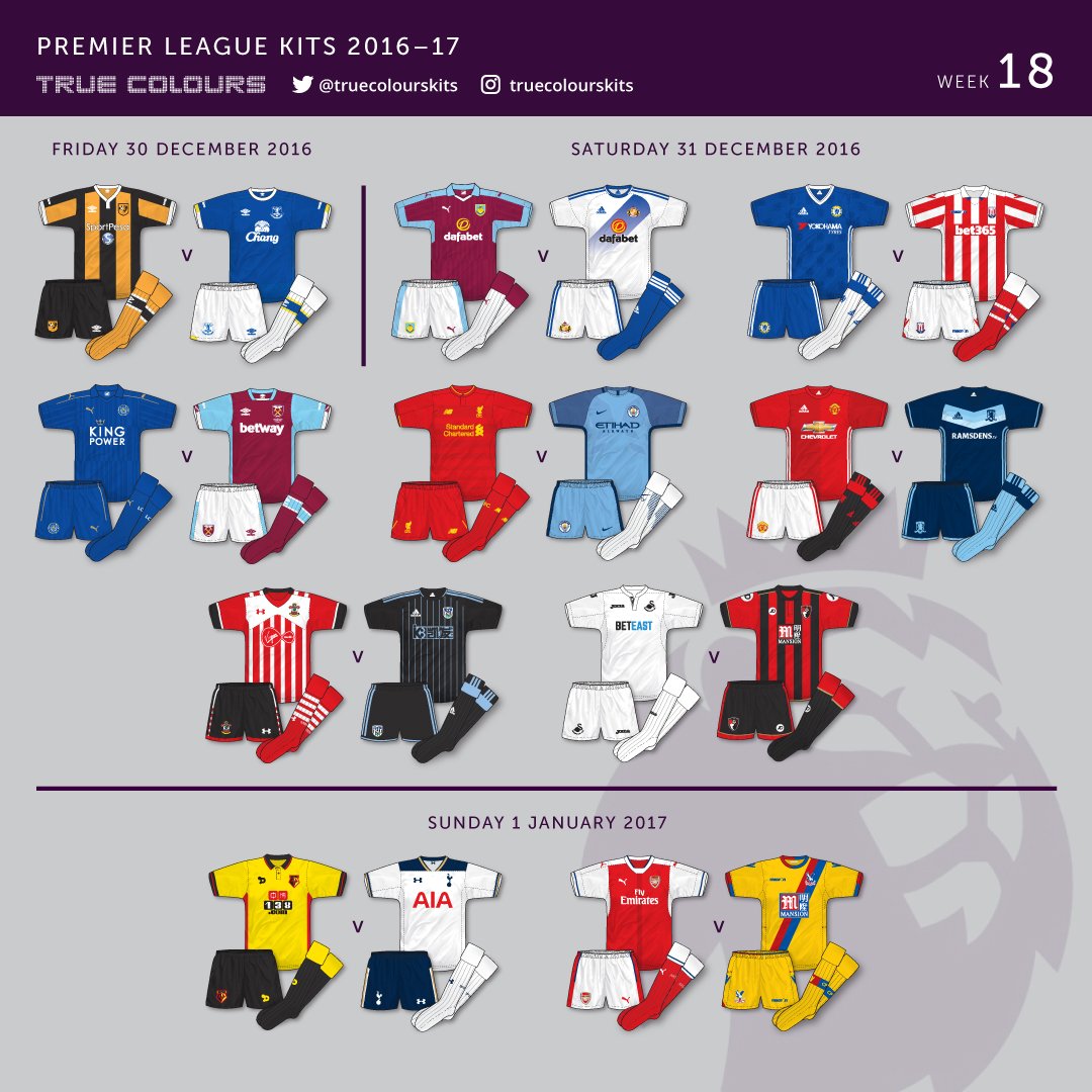
Still not a fan of the lack of change shorts these days. West Brom could have worn them – the trim colour is the same after all – as could Sunderland. The worst one though IMO is this past week; Man City v Burnley. OK, Burnley had dark shirts against City’s light, but white shorts against light blue, light blue socks against white, the light blue trim on the sleeves…I accept it may just be me being picky, but I didn’t think it was ideal.
So it seems that the Liverpool ‘toxic’ (official name, not opinion!) strip joins the long line of ‘cursed’ strips – the draw at Old Trafford yesterday one of the few times it’s been worn to anything other than a loss. Still don’t know why NB are resisting the red home / white away / yellow third that makes sense AND would be a hit with the clubs supporters. This is set to continue next season apparently, as one of the strips will be dark grey, according to leaks.
^
And the decision to let Walsall wear an identical GK strip to that of Sheffield didn’t help either! I’m surprised the referee didn’t wear yellow to complete the set!
Interesting, Denis, thanks. I often wondered why those particular kit anomalies occurred; now I know. Didn’t even realise a ‘same sponsor’ rule existed. I have seen occasional pictures of the Bayern 97/99 kit with Zafira on instead of Opel. Am I also right in thinking that sponsors were banned in the Cup Winners Cup final before 95?
Incredible to think that in 24 years we’ve gone from that to commercial over saturation in the game. There have been some stunning kits in France over the years but I hate to see the chests swamped with logos; similarly some of the Scandinavian leagues. There was a proposal a few years back to allow sponsorship on the rear of the shorts in Germany, but it never got beyond initial discussions. I like sponsors that sit nicely, don’t jar, and compliment the rest of the strip – single logotypes work better for me, with maybe one logo, otherwise I think things get too confused – so Bayern with ‘ —T-‘ works, as did the old Opel shirts – similarly the Fly Emirates logo works across all the licensees IMO. Also in Germany, the lilac Evonik logo works on Dortmund’s shirts, to the point that it now seems intrinsically linked to the clubs’ identity.
Did I read somewhere that around that time (I think at Euro ’80) even the three stripes and anything relating to a manufacturers trademark was removed? I always thought this was the reason why Germany switched from adidas to their smaller subsidiary Erima between 78 and 80. Could be my memory playing tricks on me! I do remember Leeds having to wear a special version in Europe of their Puma kit with the sleeve and short sides logos removed, but that one would be about 97ish.
OK. Norwich (yellow/green/yellow) vs Wolves (lime/black/black) yesterday. Seeing match photos of this in action it strikes me as one of the most bonkers kit combos in recent times…even Wolves in old gold wouldn’t have been as bad!
So the Nike ‘global template’ for next season (ie that used on their ‘main contract’ teams like Barca, Man City, Galatasaray and others) will be a ‘subtle camouflage pattern’…all well and good, and at least better than the horrific fading colour rubbish of this season, but google ’16/17 Dynamo Dresden away’ to see that Erima got there first!
In other Nike news, apparently Spurs WILL have bespoke designs, despite their departure from Under Armour being relatively late in the day. No word on Chelsea yet but I did hear they’d be teamwear in Y1.
I was surprised to see West Ham wearing white at Southampton, when they would usually wear their home kit. Even their Thames Ironworks retro-inspired “third” kit would have been ideal.
Tony,
Yeah, that’s right – Tim Howard in the second Le Coq Sportif era. I forgot about those! Needless to say it’ll be marketed by Nike as a ‘new idea’; that Dresden away is rather nice though!
In other news, sky blue Stoke away at West Brom : Why? Am I alone in thinking that was crazy? Especially with the white backs on the WBA shirts AND sky blue trim as well! Surely Stokes’ home with change shorts and socks would’ve been better?
Stoke’s home shirt had too much white on the back for it to be acceptable for use at West Brom. I didn’t see any issue with them wearing sky blue to be honest.
Did I imagine it though, or do Stoke have a black and green kit available that would’ve solved it better? Or away shorts / socks.
Re solid backs – not a new thing, as I saw an archived photo of MSV Duisburg in a mid 60’s cup final against Bayern ( when they were still known just as MSV). MSV play in QPR colours, and in that match had…solid backs.
How difficult/expensive would it be for a side to have two variations on a striped kit, EG Stoke, one with a white back, one with red, they could wear the alternate shirt at West Brom, Swansea & Tottenham.
Or, shock horror, have striped backs ALL THE TIME with a black / navy number??? Or failing that, the old fashioned ‘rectangle housing the number’ idea?
There are so many inconsistencies about what is legal and what is not these days that its beginning to grate a little. OK, so ban striped / hooped backs for legibility, fine. But if you’re going to do it, make it league and Europe wide. What I’m saying is that the English FA / PL shouldn’t just take it upon themselves to ban something, it should be in conjunction with all federations, as should (IMO) the use of change shorts. Such a basic thing that can make all the difference. For one example, Atletico in red shorts at Camp Nou last night. Fine, wasn’t it? I know you get problematic third colours that make policing it difficult, but specific allocated change shorts and socks for all three of a clubs strips would solve a lot of problems .
Years ago they used to have the number on a patch on striped and hooped shirts – for example, Newcastle had a red number on a white patch, likewise QPR. No harm in that at all and had been done even before football was regularly televised.
Even a thicker outline of the numbers on two contrasting colours is perfectly acceptable for legibility.
Unfortunately some myopic at UEFA in the early 2000’s came across a brainwave that supporters of striped and hooped shirts have to thank for spoiling their jerseys.
Never had a problem with red numbers on QPR kits, likewise black with Stoke, Sheff Utd, Sunderland et al. I always remember the first adidas Newcastle kit from 95/96, which had big, chunky (pre PL typeface) adidas numbers in (shock!) White on black and white stripes, and was equally legible. So if it is done right, no problem.
Just going onto the oval ball game for a sec, I have to say that France away kit (worn at home as seems to be the case in RU) is wonderful. Love it! Clever combination of the tricolour in a fresh and exciting design. Ironic that while the football team is stuck with one dimensional, rather plain designs, since the two sports ‘switched’, the RU team have been graced with some great designs. More ironic still, is that when Nike were RU suppliers for France they did some truly wonderful kits. Still not convinced, I have to say, with Under Armour’s Wales kits. High watermark there were still Reebok.
Yeah Martyn, France have two dynamic kits this year, the alternative works well with the new navy shirt, though it’s disappointing to see them have advertising on their kit, they were the last country to hold out.
Only thing for me that doesn’t work is the sponsor, like you say. Don’t like sponsors on international jerseys, but I guess it comes down to money- RU can’t compete with football on that front. Shame.
Yeah, thanks, just seen it. Interesting sub plot is that throughout the rest of the 80’s the shorts from that kit were regularly used as a change home pair – including the ’87 EC final against Porto – and looked bloody awful. Interestingly, there was actually no reason to wear a change pair as Porto wear blue, so Bayern should have been in their usual all red.
At least that was a logical use against HSV. Still looked wrong though. The white change pair for the away strip would surely have been better, and Udo Lattek’s assertion that the blue pair were lucky kind of failed after ’87…
Look like white to me, too. Bit closer to sky blue, as well, which must have really rubbed 1860 up the wrong way! I would guess (though I’m only speculating) that it may be part of a prototyped third kit – Bayern didn’t have an ‘official’ third until (from memory) 1992, when in the first season of the yellow / black / blue kit you mentioned, the previous white and red away was moved to third kit. Throughout most of the seventies and eighties they followed a strict policy of red home / white away, only broken by the ‘Kaiserslautern’ kit. Though, it must be said during this time there were a LOT of anomalies – kits worn once then discarded, different designs with the same colours used only in Europe, one off commemorative designs, etc. I was looking on Classic Football Shirts the other day, and they had the Opel 90th anniversary, blue and red striped shirt from just before the ‘equipment’ era – interestingly, an identical shirt in white and red stripes was used for Bayern’s own 90th anniversary. Nice shirt, lace up collar (a detail I adore), similar to a retro one I own (officially) based on the 1969 home shirt, but with a collar based on the strip from the 20’s.
A few details released this week of the new Spurs kit, but more important than that, I started wondering, amongst the top five clubs from the top leagues, has anyone ever changed supplier so frequently? If you take the birth of modern kits as 1980, since then, Spurs have had Le Coq Sportif, Hummel, Umbro, Pony, adidas, Kappa, Puma, Under Armour, and now Nike. That’s nine suppliers in 37 years. Compared with Man Utd (three, if you count both adidas spells together); Arsenal (four); Liverpool (five); Man City (five); and Chelsea (three when Nike take over), that’s an awful lot! In Germany, in the same period, Bayern have only had one (since 1965 as well, if anyone is keeping count) – adidas. Dortmund is five (adidas, Nike (two spells), Goooal, Kappa, Puma); Leverkusen two (adidas and Jako); Schalke one / two (adidas, though in common with the national team they did mysteriously switch to Erima for a time); Gladbach four (Puma, Reebok, Lotto, Kappa); HSV three (adidas twice, Fila, Puma); Bremen three (Puma, Kappa, Nike)and Wolfsburg four (Puma, Nike twice, adidas, Kappa). Out of the top flight, but champions in 2007, Stuttgart are only two as well (adidas and Puma).
few points i want to touch on before i disappear back into my hiding place
1) the Football Association runs the premier league thus it can do what it likes when it comes to rules for the English game, it dosnt (nor should it ever) need to have permission from FIFA, UEFA, the DFB, the LFP or any other footballing authority Global, Continental, National, Regional or otherwise
they simply do have a say on what goes on here in England
the FA runs the English game … period
if they want things to be legible then fine, they are entitled
i say this because over the years the FA has done its best to protect the English game, weather it be protection from the franchising of clubs (a la MK Dons) the protection of clubs and their heritages (like protecting hull city from its idiotic owner) or the protection from over sponsorship of shirts (something they plan to relax a little to have the current system the EFL uses)
sure i would like to go back to the days when teams like QPR and Sheffield Wednesday would sew a flap on their shirts and put the number on that
or the times when Newcastle used the club shield on the back of the shirts to house their squad numbers, its common sense
but i dont see the big deal about having one colour on the back of the shirt
Wednesday had all blue shirts a few years ago with the only stripes being on the front of the shirt but it wasn’t a problem for me
if anything it should be left to teams to decide, but the FA does need legibility rules or a team in blue could rock up with blue numbers if they wanted to ….and that would simply never do
2) on the subject of national team sponsorship i hate it to, but not as much as i hate it when teams look like an F1 team with sponsors (i know one Swedish side that has 18 in total) covering every inch of the shirt
i prefer shirts with no sponsorship altogether but hey ….its the modern thing now i guess and some have become integral to a club ..some are part of certain eras and remembered fondly (crown paints at Liverpool for example)
but im glad the FA has rules in place to protect this too
dont get me wrong i dont mind the EFL placement these days …their is nothing wrong with having one on the front, and a small one at the top of the backs of shirts, possibly the back of one leg of the shorts but any more is bloody overkill in my opinion
i for one hope things never get as ridiculous as the are in some parts of the world (Sweden is my previous example)
thats my just two-penneth on a few topics raised since i last posted
Hi Tony,
Welcome back!
My only objection with solid backs is that sometimes it’s not necessary; on many occasions (like the Newcastle one you mentioned) kit suppliers come up with innovative ways to get around legibility. If it’s a suppliers whim, then fine, but I would hate to see it come in as a rule (which apparently is being considered). The WBA one this season has actually caused a few clash problems that wouldn’t occur with striped backs. I don’t really mind a half and half policy, where the stripes go partially on the back and at the bottom – I seem to remember the Bayern kit of 10/11 using that – in Germany legibility all round is a problem because teams have to carry the name of the club on the backs (a unique idea I’ve always liked), but teams sometimes find cunning ways of getting round it.
My personal hate at the moment is no regulations in England governing away shorts – partial and total clashes could have been avoided on many occasions by this simple but effective method. Only Man Utd seem to regularly adhere to this, but their alternative home pair irritates me because it has red stripes when white would make more sense. But you can’t have everything! A regulation (as in the mid 90’s) would avoid a lot of unnecessary uses of a third kit (but cynic that I am, that’s probably why it ISN’T a rule anymore). I dont know if it was ever an OFFICIAL rule, but alt shorts back then used to be used all the time (with the exception of Liverpool – mostly – and Arsenal).
I too hate over saturation of sponsors – a lot of kits in Scandinavia, France, and South America would be design classics if they weren’t splashed in loads of sponsor logos. I suppose it comes down to revenue, but in that case I’ve always liked the idea of a different sponsor on the away kits (Aston Villa, Norwich and some others have done this).
I suppose the best sponsors are the ones that don’t override the shirts but are still recognisable – Bayern with the ‘T’ is a good example; Hertha Berlin when sponsored by DB, Wolfsburg with Volkswagen, etc. There is still something fundamentally wrong, for me, with Barcelona with a sponsor. They were rich enough to survive without it for decades, so why change? But good sponsors are the ones that just have a name, a logo (or just a logo in some cases), in simple to read, legible type. Your own club when sponsored by Sanderson are just one example; the company name with the logo. Simple. Didn’t override the shirt, people knew who they were, sponsors happy. Man Utd with Sharp, Arsenal with JVC, Liverpool with both Candy and Carslberg are just a few further examples.
Martyn, it became and official rule in the FL in the late 70s and has remained so, AFAIK. In 1992, the Premier League decided that it wasn’t an issue because – and you’ll like this – it was felt teams should have opportunity to wear their home shirts more often.
Mmmmmm, so nothing to do with the superfluous and unnecessary issuing of third kits? The PL is a money making machine top to bottom. When I first started watching football in ’94, I wasn’t even aware of such a thing as third kits…now, the routine issuing of thirds (often with similar colours to the away or homes) is epidemic. Sad but true. If you want a third, fine, but at least make it MEAN something, ie red home, dark away, white third. Sound like anyone you know? 😉 that team also has alt home and third shorts 🙂
Nice to be back martyn …but i dont really go anywhere i just pop out for 5 lol 😉
Yeah i didnt mind when people put secondary products on an away shirt
Sega put sega on arsenals away kit while the branded the home with the dreamcast console ….i thought that was pretty cool
Same with villa and MG/Rover and i believe sharp used to advertise the viewcam on united shirts
But i also didnt mind the year that wednesday and united teamed up with one having the same logo on their home kit that the other had on the away …and vise versa
Nice touch …and a football in the community nod too might i add
So, Man United had a special jersey for the League Cup final yesterday according to a “footwear freak” website not a million miles away. So, embroidery for a cup final makes it a special jersey does it? No different from when clubs do any for any other cup final.
Superlatives all round, just like Fred Bloggs wearing blacked out boots…….
Still not a fan of the lack of change shorts these days. West Brom could have worn them – the trim colour is the same after all – as could Sunderland. The worst one though IMO is this past week; Man City v Burnley. OK, Burnley had dark shirts against City’s light, but white shorts against light blue, light blue socks against white, the light blue trim on the sleeves…I accept it may just be me being picky, but I didn’t think it was ideal.
Hi I was wondering who does the graphics for the kits they look amazing?
So it seems that the Liverpool ‘toxic’ (official name, not opinion!) strip joins the long line of ‘cursed’ strips – the draw at Old Trafford yesterday one of the few times it’s been worn to anything other than a loss. Still don’t know why NB are resisting the red home / white away / yellow third that makes sense AND would be a hit with the clubs supporters. This is set to continue next season apparently, as one of the strips will be dark grey, according to leaks.
Whilst this isn’t from the Premier League…. Sheffield United’s goalkeeper clearly forgot the rules on goalkeepers’ kit changed a good 109 years ago.
https://www.youtube.com/watch?v=PRb2wljrwr4
How did the referee let this go by?
^
And the decision to let Walsall wear an identical GK strip to that of Sheffield didn’t help either! I’m surprised the referee didn’t wear yellow to complete the set!
New Juventus crest : Oh dear. Like, redesign the crest and the best they can do is a black ‘J’ ??? Poor, very poor.
Recalling when Opel-sponsored clubs met in Europe https://museumofjerseys.com/2017/01/17/how-bayern-munich-paris-st-german-ac-milan-and-sparta-prague-dealt-with-having-opel-as-sponsors-when-they-met-in-europe/
Interesting, Denis, thanks. I often wondered why those particular kit anomalies occurred; now I know. Didn’t even realise a ‘same sponsor’ rule existed. I have seen occasional pictures of the Bayern 97/99 kit with Zafira on instead of Opel. Am I also right in thinking that sponsors were banned in the Cup Winners Cup final before 95?
I think 95 was the first time they were allowed in Champions League final – they were allowed in ECWC and YEFA Cup finals from 96 on.
In the first season of the Champions League, 92-93, sponsors weren’t allowed in the group stage!
Incredible to think that in 24 years we’ve gone from that to commercial over saturation in the game. There have been some stunning kits in France over the years but I hate to see the chests swamped with logos; similarly some of the Scandinavian leagues. There was a proposal a few years back to allow sponsorship on the rear of the shorts in Germany, but it never got beyond initial discussions. I like sponsors that sit nicely, don’t jar, and compliment the rest of the strip – single logotypes work better for me, with maybe one logo, otherwise I think things get too confused – so Bayern with ‘ —T-‘ works, as did the old Opel shirts – similarly the Fly Emirates logo works across all the licensees IMO. Also in Germany, the lilac Evonik logo works on Dortmund’s shirts, to the point that it now seems intrinsically linked to the clubs’ identity.
It looks a lot better when all the sponsors are integrated and it flows smoothly
The ‘same sponsor’ rule saw Arsenal wear Dubai instead of Emirates in their away kit for a game in 06/07.
Yeah, I mentioned that in the blog piece, Phil – probably one of the last instances of it happening
That’s nothing, in 1980/81, UEFA even outlawed manufacturers’ logos on shirts.
Finicky.
Did I read somewhere that around that time (I think at Euro ’80) even the three stripes and anything relating to a manufacturers trademark was removed? I always thought this was the reason why Germany switched from adidas to their smaller subsidiary Erima between 78 and 80. Could be my memory playing tricks on me! I do remember Leeds having to wear a special version in Europe of their Puma kit with the sleeve and short sides logos removed, but that one would be about 97ish.
Well their was a time in english football where you had to wear a version of your kit with the sponsors removed for televised games
So it wouldnt surprise me if the reason leeds wore that kit was because of a sponsor ruling
Yeah exactly – too much Puma branding. Barcelona had to remove Kappa sleeve taping too
Belgium wore kits with the adidas stripes in the Euro 80 final, but the adidas logo was covered up.
OK. Norwich (yellow/green/yellow) vs Wolves (lime/black/black) yesterday. Seeing match photos of this in action it strikes me as one of the most bonkers kit combos in recent times…even Wolves in old gold wouldn’t have been as bad!
So the Nike ‘global template’ for next season (ie that used on their ‘main contract’ teams like Barca, Man City, Galatasaray and others) will be a ‘subtle camouflage pattern’…all well and good, and at least better than the horrific fading colour rubbish of this season, but google ’16/17 Dynamo Dresden away’ to see that Erima got there first!
In other Nike news, apparently Spurs WILL have bespoke designs, despite their departure from Under Armour being relatively late in the day. No word on Chelsea yet but I did hear they’d be teamwear in Y1.
Meanwhile, in Scotland……
http://i3.dailyrecord.co.uk/incoming/article9711426.ece/ALTERNATES/s1227b/JS110317827.jpg
Which team are in blue and white?
Jeezus liverpool
i would have at least worn a colour other than red at hull
You got a perfectly decent fluro kit you could have used
And sorry martyn
Didnt everton have a camo goalkeeper kit in 2011
I would say that was earlier
I think napoli have also had one
I was surprised to see West Ham wearing white at Southampton, when they would usually wear their home kit. Even their Thames Ironworks retro-inspired “third” kit would have been ideal.
Tony,
Yeah, that’s right – Tim Howard in the second Le Coq Sportif era. I forgot about those! Needless to say it’ll be marketed by Nike as a ‘new idea’; that Dresden away is rather nice though!
In other news, sky blue Stoke away at West Brom : Why? Am I alone in thinking that was crazy? Especially with the white backs on the WBA shirts AND sky blue trim as well! Surely Stokes’ home with change shorts and socks would’ve been better?
Stoke’s home shirt had too much white on the back for it to be acceptable for use at West Brom. I didn’t see any issue with them wearing sky blue to be honest.
Then you’d have had two white backs against each other Martyn, presume that was the reason.
Sky v navy/white is certainly very awkward – but it gives me a chance to plug the poll on my blog canvassing opinions on what is a clash and what isn’t: https://museumofjerseys.com/2017/01/31/the-great-kit-clash-poll/
Did I imagine it though, or do Stoke have a black and green kit available that would’ve solved it better? Or away shorts / socks.
Re solid backs – not a new thing, as I saw an archived photo of MSV Duisburg in a mid 60’s cup final against Bayern ( when they were still known just as MSV). MSV play in QPR colours, and in that match had…solid backs.
How difficult/expensive would it be for a side to have two variations on a striped kit, EG Stoke, one with a white back, one with red, they could wear the alternate shirt at West Brom, Swansea & Tottenham.
Or, shock horror, have striped backs ALL THE TIME with a black / navy number??? Or failing that, the old fashioned ‘rectangle housing the number’ idea?
There are so many inconsistencies about what is legal and what is not these days that its beginning to grate a little. OK, so ban striped / hooped backs for legibility, fine. But if you’re going to do it, make it league and Europe wide. What I’m saying is that the English FA / PL shouldn’t just take it upon themselves to ban something, it should be in conjunction with all federations, as should (IMO) the use of change shorts. Such a basic thing that can make all the difference. For one example, Atletico in red shorts at Camp Nou last night. Fine, wasn’t it? I know you get problematic third colours that make policing it difficult, but specific allocated change shorts and socks for all three of a clubs strips would solve a lot of problems .
Years ago they used to have the number on a patch on striped and hooped shirts – for example, Newcastle had a red number on a white patch, likewise QPR. No harm in that at all and had been done even before football was regularly televised.
Even a thicker outline of the numbers on two contrasting colours is perfectly acceptable for legibility.
Unfortunately some myopic at UEFA in the early 2000’s came across a brainwave that supporters of striped and hooped shirts have to thank for spoiling their jerseys.
Never had a problem with red numbers on QPR kits, likewise black with Stoke, Sheff Utd, Sunderland et al. I always remember the first adidas Newcastle kit from 95/96, which had big, chunky (pre PL typeface) adidas numbers in (shock!) White on black and white stripes, and was equally legible. So if it is done right, no problem.
Just going onto the oval ball game for a sec, I have to say that France away kit (worn at home as seems to be the case in RU) is wonderful. Love it! Clever combination of the tricolour in a fresh and exciting design. Ironic that while the football team is stuck with one dimensional, rather plain designs, since the two sports ‘switched’, the RU team have been graced with some great designs. More ironic still, is that when Nike were RU suppliers for France they did some truly wonderful kits. Still not convinced, I have to say, with Under Armour’s Wales kits. High watermark there were still Reebok.
Yeah Martyn, France have two dynamic kits this year, the alternative works well with the new navy shirt, though it’s disappointing to see them have advertising on their kit, they were the last country to hold out.
Only thing for me that doesn’t work is the sponsor, like you say. Don’t like sponsors on international jerseys, but I guess it comes down to money- RU can’t compete with football on that front. Shame.
Yeah, that’s it. The World Cup doesn’t allow them, at least.
BTW, I’ve a new post on my blog about Bayern’s ‘Brazil’ third kit
Yeah, thanks, just seen it. Interesting sub plot is that throughout the rest of the 80’s the shorts from that kit were regularly used as a change home pair – including the ’87 EC final against Porto – and looked bloody awful. Interestingly, there was actually no reason to wear a change pair as Porto wear blue, so Bayern should have been in their usual all red.
I was saving that for a future piece – as I mentioned at the bottom, Lattek seemed to regard them as lucky, hence why they were used in 87!
They had also been used with the home at Hamburg earlier that season http://media.gettyimages.com/photos/hamburg-hamburger-sv-bayern-muenchen-lothar-matthaeusbayern-manfred-picture-id52941016?s=594×594
At least that was a logical use against HSV. Still looked wrong though. The white change pair for the away strip would surely have been better, and Udo Lattek’s assertion that the blue pair were lucky kind of failed after ’87…
Exactly – which is why it was odd that they were still used after: https://www.youtube.com/watch?v=yUm3mvhEbq0 (though are the stripes white there?)
Look like white to me, too. Bit closer to sky blue, as well, which must have really rubbed 1860 up the wrong way! I would guess (though I’m only speculating) that it may be part of a prototyped third kit – Bayern didn’t have an ‘official’ third until (from memory) 1992, when in the first season of the yellow / black / blue kit you mentioned, the previous white and red away was moved to third kit. Throughout most of the seventies and eighties they followed a strict policy of red home / white away, only broken by the ‘Kaiserslautern’ kit. Though, it must be said during this time there were a LOT of anomalies – kits worn once then discarded, different designs with the same colours used only in Europe, one off commemorative designs, etc. I was looking on Classic Football Shirts the other day, and they had the Opel 90th anniversary, blue and red striped shirt from just before the ‘equipment’ era – interestingly, an identical shirt in white and red stripes was used for Bayern’s own 90th anniversary. Nice shirt, lace up collar (a detail I adore), similar to a retro one I own (officially) based on the 1969 home shirt, but with a collar based on the strip from the 20’s.
A few details released this week of the new Spurs kit, but more important than that, I started wondering, amongst the top five clubs from the top leagues, has anyone ever changed supplier so frequently? If you take the birth of modern kits as 1980, since then, Spurs have had Le Coq Sportif, Hummel, Umbro, Pony, adidas, Kappa, Puma, Under Armour, and now Nike. That’s nine suppliers in 37 years. Compared with Man Utd (three, if you count both adidas spells together); Arsenal (four); Liverpool (five); Man City (five); and Chelsea (three when Nike take over), that’s an awful lot! In Germany, in the same period, Bayern have only had one (since 1965 as well, if anyone is keeping count) – adidas. Dortmund is five (adidas, Nike (two spells), Goooal, Kappa, Puma); Leverkusen two (adidas and Jako); Schalke one / two (adidas, though in common with the national team they did mysteriously switch to Erima for a time); Gladbach four (Puma, Reebok, Lotto, Kappa); HSV three (adidas twice, Fila, Puma); Bremen three (Puma, Kappa, Nike)and Wolfsburg four (Puma, Nike twice, adidas, Kappa). Out of the top flight, but champions in 2007, Stuttgart are only two as well (adidas and Puma).
few points i want to touch on before i disappear back into my hiding place
1) the Football Association runs the premier league thus it can do what it likes when it comes to rules for the English game, it dosnt (nor should it ever) need to have permission from FIFA, UEFA, the DFB, the LFP or any other footballing authority Global, Continental, National, Regional or otherwise
they simply do have a say on what goes on here in England
the FA runs the English game … period
if they want things to be legible then fine, they are entitled
i say this because over the years the FA has done its best to protect the English game, weather it be protection from the franchising of clubs (a la MK Dons) the protection of clubs and their heritages (like protecting hull city from its idiotic owner) or the protection from over sponsorship of shirts (something they plan to relax a little to have the current system the EFL uses)
sure i would like to go back to the days when teams like QPR and Sheffield Wednesday would sew a flap on their shirts and put the number on that
or the times when Newcastle used the club shield on the back of the shirts to house their squad numbers, its common sense
but i dont see the big deal about having one colour on the back of the shirt
Wednesday had all blue shirts a few years ago with the only stripes being on the front of the shirt but it wasn’t a problem for me
if anything it should be left to teams to decide, but the FA does need legibility rules or a team in blue could rock up with blue numbers if they wanted to ….and that would simply never do
2) on the subject of national team sponsorship i hate it to, but not as much as i hate it when teams look like an F1 team with sponsors (i know one Swedish side that has 18 in total) covering every inch of the shirt
i prefer shirts with no sponsorship altogether but hey ….its the modern thing now i guess and some have become integral to a club ..some are part of certain eras and remembered fondly (crown paints at Liverpool for example)
but im glad the FA has rules in place to protect this too
dont get me wrong i dont mind the EFL placement these days …their is nothing wrong with having one on the front, and a small one at the top of the backs of shirts, possibly the back of one leg of the shorts but any more is bloody overkill in my opinion
i for one hope things never get as ridiculous as the are in some parts of the world (Sweden is my previous example)
thats my just two-penneth on a few topics raised since i last posted
Hi Tony,
Welcome back!
My only objection with solid backs is that sometimes it’s not necessary; on many occasions (like the Newcastle one you mentioned) kit suppliers come up with innovative ways to get around legibility. If it’s a suppliers whim, then fine, but I would hate to see it come in as a rule (which apparently is being considered). The WBA one this season has actually caused a few clash problems that wouldn’t occur with striped backs. I don’t really mind a half and half policy, where the stripes go partially on the back and at the bottom – I seem to remember the Bayern kit of 10/11 using that – in Germany legibility all round is a problem because teams have to carry the name of the club on the backs (a unique idea I’ve always liked), but teams sometimes find cunning ways of getting round it.
My personal hate at the moment is no regulations in England governing away shorts – partial and total clashes could have been avoided on many occasions by this simple but effective method. Only Man Utd seem to regularly adhere to this, but their alternative home pair irritates me because it has red stripes when white would make more sense. But you can’t have everything! A regulation (as in the mid 90’s) would avoid a lot of unnecessary uses of a third kit (but cynic that I am, that’s probably why it ISN’T a rule anymore). I dont know if it was ever an OFFICIAL rule, but alt shorts back then used to be used all the time (with the exception of Liverpool – mostly – and Arsenal).
I too hate over saturation of sponsors – a lot of kits in Scandinavia, France, and South America would be design classics if they weren’t splashed in loads of sponsor logos. I suppose it comes down to revenue, but in that case I’ve always liked the idea of a different sponsor on the away kits (Aston Villa, Norwich and some others have done this).
I suppose the best sponsors are the ones that don’t override the shirts but are still recognisable – Bayern with the ‘T’ is a good example; Hertha Berlin when sponsored by DB, Wolfsburg with Volkswagen, etc. There is still something fundamentally wrong, for me, with Barcelona with a sponsor. They were rich enough to survive without it for decades, so why change? But good sponsors are the ones that just have a name, a logo (or just a logo in some cases), in simple to read, legible type. Your own club when sponsored by Sanderson are just one example; the company name with the logo. Simple. Didn’t override the shirt, people knew who they were, sponsors happy. Man Utd with Sharp, Arsenal with JVC, Liverpool with both Candy and Carslberg are just a few further examples.
Martyn, it became and official rule in the FL in the late 70s and has remained so, AFAIK. In 1992, the Premier League decided that it wasn’t an issue because – and you’ll like this – it was felt teams should have opportunity to wear their home shirts more often.
Mmmmmm, so nothing to do with the superfluous and unnecessary issuing of third kits? The PL is a money making machine top to bottom. When I first started watching football in ’94, I wasn’t even aware of such a thing as third kits…now, the routine issuing of thirds (often with similar colours to the away or homes) is epidemic. Sad but true. If you want a third, fine, but at least make it MEAN something, ie red home, dark away, white third. Sound like anyone you know? 😉 that team also has alt home and third shorts 🙂
Nice to be back martyn …but i dont really go anywhere i just pop out for 5 lol 😉
Yeah i didnt mind when people put secondary products on an away shirt
Sega put sega on arsenals away kit while the branded the home with the dreamcast console ….i thought that was pretty cool
Same with villa and MG/Rover and i believe sharp used to advertise the viewcam on united shirts
But i also didnt mind the year that wednesday and united teamed up with one having the same logo on their home kit that the other had on the away …and vise versa
Nice touch …and a football in the community nod too might i add
So, Man United had a special jersey for the League Cup final yesterday according to a “footwear freak” website not a million miles away. So, embroidery for a cup final makes it a special jersey does it? No different from when clubs do any for any other cup final.
Superlatives all round, just like Fred Bloggs wearing blacked out boots…….