1976 was the first year to see logo taping adorn various team strips with no fewer than nine sides adopting the new kit innovation in some form or other. The trend was pioneered by Umbro (with their ‘solid’ diamond design that to some looked, at a glance, like adidas’ three stripes) and Admiral and its extraordinary to think how it emerged, almost over night.
Rather than a more general summary of what was happening kit-wise, I’ve decided to run through team by team what was going on this season.
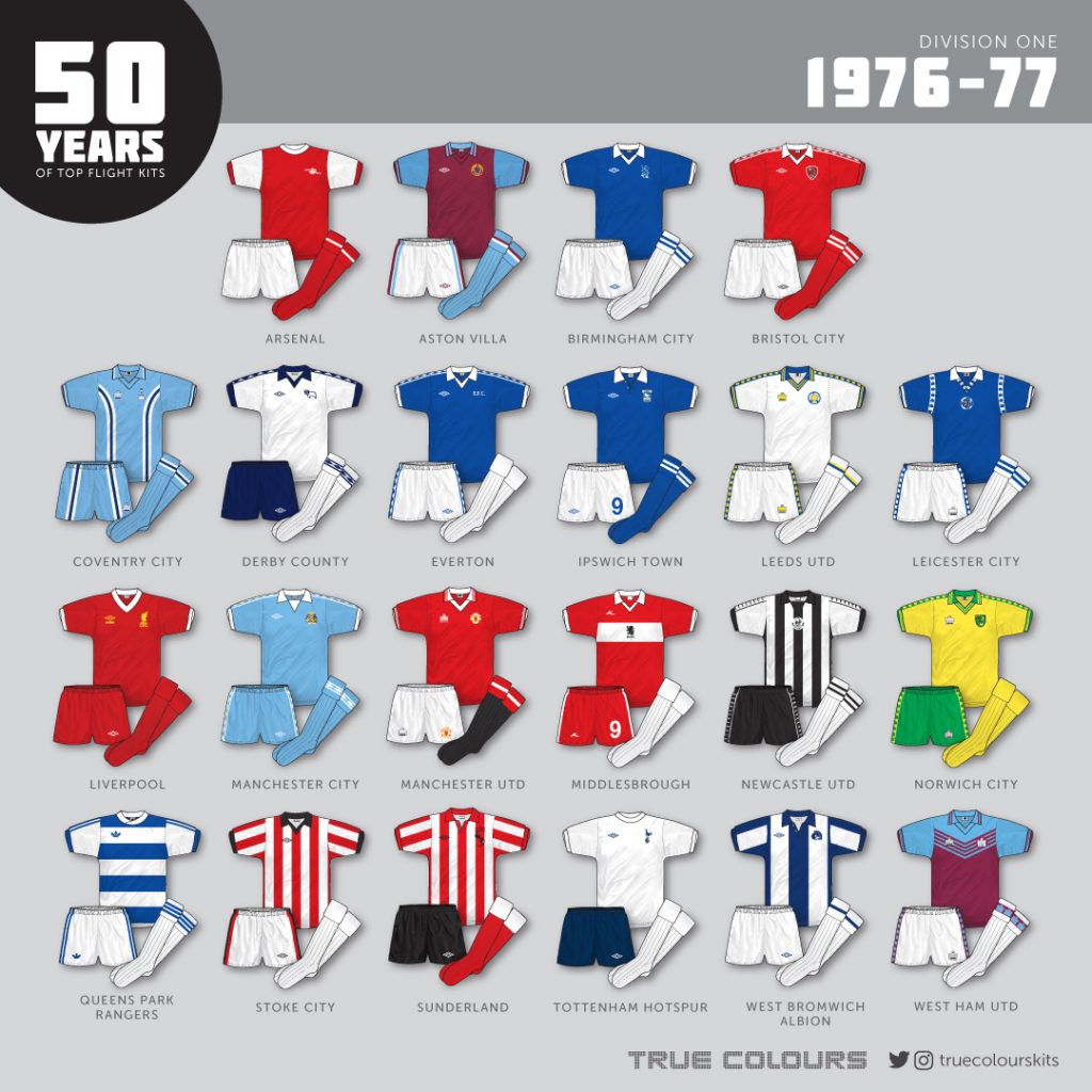
Arsenal – No change
Aston Villa – No change
Birmingham City – A move away from the distinctive ‘penguin’ kit to a more modest all blue shirt (curiously without Umbro diamond taping), now paired with white shorts and socks.
Bristol City – A new arrival to the top flight, the club wore a new home strip with Umbro taping and self coloured cuffs.
Coventry City – No change
Derby County – Essentially the same as the previous strip, but now with taping added.
Everton – The inset collar was replaced by a v-neck/wing collar combination with diamond taping throughout. A new more sober EFC monogram took over from the italicised crest.
Ipswich Town – appeared to make the button up placket collar shirt that had been worn on and off with long sleeves since 1974 their primary kit this season, now updated with a ‘double diamond’ Umbro logo. The club still persevered with shorts numbers.
Leeds United – A massive change in the shape of Admiral’s radical make over, adding blue and yellow trim and logo taping throughout the kit.
Leicester City – Admiral also got their hands on the Foxes’ outfits this year, adding a curious logo taping seam trim to the blue shirt and a centrally placed badge.
Liverpool – The classic Reds home kit was born this year, with a modern v-neck replacing the long out of date crew neck and rich yellow logos adding additional colour to the design.
Manchester City – Umbro’s solid logo taping reached Maine Road in 1976 with the club also deciding to introduce a new heraldic crest badge design to their wing collared/inset shirt and switch to blue shorts.
Manchester United – Essentially the same as the previous season, but now with a permanent addition of the Admiral logo to the jersey.
Middlesbrough – A slicker version of their home kit saw the stylish chest band remain, but with a collar/v-neck combination added alongside a small Bukta logo. Other than Ipswich, the only other side to stick with numbered shorts.
Newcastle United – This fondly remembered Bukta kit was launched this year that featured white, not striped, sleeves. A new roundel-based club badge was introduced and Bukta logo taping adorned the sleeves and shorts.
Norwich City – Admiral revamped the Canaries kit with logo taping and multi-trimmed collar and cuffs to create this superb strip.
QPR – The first club to sport adidas in England’s top flight! The team actually wore four different adidas home kits this season, all featuring a variety of hoop thickness and neck design. Curiously, all were badgeless however.
Stoke City – Stoke’s shortlived Admiral strip was replaced by a new Umbro affair this season. It appeared to be basic teamwear though, with still no club badge or diamond taping. The shirt featured a black v-neck/wing collar design.
Sunderland – New arrivals to Division 1, Sunderland made no change to their current outfit…apart from the addition of commemorative text that proudly reminded everyone that the side were Division 2 champions the season earlier.
Tottenham Hotspur – No change (the last year of the club’s long relationship with Umbro).
West Bromwich Albion – The final new side in the top flight, the Baggies started the season wearing their previous kit but updated the badge in December to a WBA italic monogram design.
West Ham United – Admiral shook up the long-standing incumbent Hammers strip with an absolute classic that featured a sky blue yoke and striped chest motif. Logo taping featured on the shorts and socks.
The season ended with Liverpool as champions and Sunderland, Stoke and Spurs all relegated.
Not wanting to be a pedant, John, however, West Ham started the season in white shorts with a claret and blue stripe, as per Leeds Utd away shorts. They didn’t change to logo taping until later in the season, but curiously they were reversed colours, with claret Admiral logos on a sky blue stripe. Socks were plain white all season.
That Leicester City design was a real one-off and always a favourite of mine, the away kit was even better!
John
The Spurs shirt did change for this season, with the crest returning to its standard size, after a larger crest being worn in the previous season, though the 75/76 shirts were also occasionally worn.
Leeds “Smiley” badge actually had inverted colouring, with blue being the dominant colour and yellow secondary. It also was turned slightly so that the “LU” motive was more obvious and less like a smile. The away shirt also gained the same badge arrangement. This change to the kits only lasted 1 season !