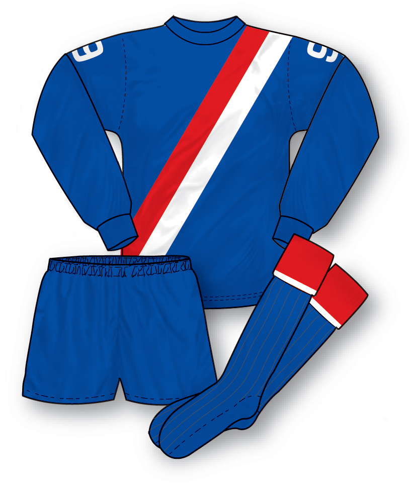
 This kit could be considered a myth-buster on two counts; firstly it proves that third kits were as common decades ago as they are now (most of us know that anyway of course) but secondly it shows that the recent trend for sporting away colours that are the same (albeit in a different shade) as the home kit is also not a modern day invention. City’s famous pale blue strip has often caused problems when featuring against teams wearing white as it can be just too light to always provide adequate colour differentiation. Therefore, back in the early 70s when the club favoured a white away kit (also with sash) a clash occured when playing away at teams with white jerseys; hence the need for this royal blue third kit. Clearly influenced by their flamboyant manager Malcolm Allison (who also introduced the sash at Palace when he managed them some years later) this smart, and pretty rare, kit also features player numbers on the sleeves – a short lived 70s trend.
Worn in: A great 3-2 win at Spurs with goals by Marsh and Lee (2).
Worn by: Rodney Marsh, Francis Lee and Mike Summerbee.
Thanks to Jon Jones for the suggestion.
Nice looking kit. I think sashes are underused in kits. They look quite classy. The numbers on the sleeves look very odd though…for some reason it makes me think it looks American…?
quite agree with sashes being used,the Peru kit from Argentina78 was great,even the current man city 3rd kit is quite nice.
One reason sashes are underused nowadays is that they make it difficult to place the sponsor’s logo on the shirt.
Sashes aren’t so underused in Italy however, where a number of shirts feature them, particularly change kits.
Juventus, for instance, have a black and white sash on a silver jersey for their away kit this season, whilst Bologna and Catania have blue and red sashes on their away strips. Inter Milan have, in the past, had black and blue sashes on their white away shirts on several occasions.
A lot of the teams have either placed the sponsor logo directly on top of the sash or broken the sash up with a gap to fit a sponsor logo. However, there have been other novel ways to fit a sponsor on a sash shirt, not just Man City’s current third shirt featuring a much-reduced Etihad logo under the badge so as to not “spoil” the sash, but I recall Crystal Palace having their then-sponsors AVR’s logo slanted in line with the sash on their Hummel kits of the 80’s.
Inter Milan’s Centenery kit had the George’s cross over it so Pirelli appeared as Etihad do in City’s third kit below the club badge, I think it’s more noticable in a way as you look for it.
Thats a good point Andrew – it is more noticeable. Problem would be if everybody was doing it and it became the norm – it would lose its novelty. All marketing people are concerned with is how large the logo is reproduced. Maybe this state of mind will change though as marketing becomes more sophisticated. I’d like to see more inventive ways to incorporate a sponsor.
There is a clip of Man City in this kit playing against Spurs in 1973 on you tube which I found whilst looking for other Spurs stuff- namely the Football Focus feature on the 1951 Division 1 winners that includes some film of Spurs in stripes.
City wore this kit away to Leeds United in November 1972. I definitely remember seeing it on Match of the Day.
I see both Rangers & Celtic are going with a smaller sponsors logo under the club badge next season like I mention above.
I have an old Man City shirt number 6 which I suspect belonged to Mike Summerbee who played for Port Elizabeth City as a quest star in 1973. Can anyone confirm this?? South African Football Historian – Peter Raath
I’m a West Ham fan but I loved Rodney Marsh and so I had a full set of this kit with a no 9 on the arms.
I think I saw the debut of this kit. They wore it at Elland Road where they were beaten 3-0.