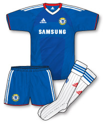
Now firmly settled into a system of three new kits every year, the new Chelsea home strip at first glance doesn’t feel like much of a progression from their last. There is now a contrasting white V-neck along with a subtle shadow-like two-tone design across the front of the jersey. This pretty average kit is given a splash of interest by the liberal dose of red trim throughout, most notably on the V-neck. Its the first time since their 93-95 kit that the colour has appeared on a Chelsea strip although it was commonplace throughout the eighties.
 Once again adidas have launched a pair of complementary change kits in challenging and innovative colourways. The new away is black and orange with an interesting striped design across the front of the shirt that on closer inspection is made up of tiny chevrons of various intensity. As with many of adidas’ Chelsea kits the badge is coloured up to match the kit.
 The completely unnecessary third kit reverts to a fluorescent style colour scheme comprising of ‘macaw’ green and navy. A faded bar of navy along with Chelsea’s regular blue shade runs vertically down the shirt. As is often the case with adidas, the away kits are interesting designs, let down only due to the fact that they don’t reflect the heritage of the club in any way.
The third recalls the away of 03-04, only the colourway on that kit was far better.
The only detail I like on any of these kits is the Lion emblem on the socks
Harsh Andrew!
I just can’t understand why teams in Europe (predominantly) would produce a uniform, pardon me, a kit that is not of your team colors, pardon me colours. If you are a blue team, waer blue, or white with blue trim….even gray, pardon me, grey or black with blue trim would be acceptable. How can Man City wear a white kit with red & black trim, when Man Utd’s colors are red & black. Blasphemy I say. If you bleed blue, wear blue!!
The Adidas logo on the back of the socks should be red!
….on the home kit that is…and are those champions (gold) patches on the sleeves, I can’t really tell.
Surely the third kit could be required if Chelsea were to meet Inter in the Champions League? Although there was no need for a new kit as one could have been kept on from last year. Also don’t UEFA require all clubs in their competitions submit three kits?
I’ll be the first one to say it…and possibly the last 😉 I really like the 3rd kit.
Rich – Man City’s away kit from 98-99 was one of my favourite kits of all time so needless to say I whole heartedly agree given that this is very similar.
I also quite like the black and orange away kit.
The red on the home kit does really refresh the home colours, in my opinion, it’s a nice little touch.
I really like the away kit. I wasn’t too sure about it, when I first saw pictures of it, but after seeing it in action, when they went to Wigan, I thought it looked great. Very stylish and modern. The bright orange works really well with the black. I also like the way Chelsea change the colour of the badge to blend in with the change kits.
The third kit is fine, (Chelsea seem to really like flouro, don’t they?) but it is unnecessary. Releasing three new kits each and every season does seem a bit silly. When did Chelsea have a kit lasting more than one season?
Was it the black and silver change kit in 04-06? Although, strangely, in the second year they changed the sponsor and the badge on the shirt.
In 04-05, with Fly Emirates and the silver badge – http://tinyurl.com/38ycgpl
In 05-06, with Samsung and the blue and white badge – http://tinyurl.com/2wv4dco
I think you are right, Will Padmore, Chelsea did need a third kit incase they play Inter, and I’m pretty sure UEFA do require teams to have three kits in their competitions. Infact, I think all clubs should have three kits, just to cover all eventualities.
But really, Chelsea should just have kept the white and navy third kit from last season.
Hurrah 🙂 that said, that Man City shirt makes this Chelsea one seem tame! 🙂 Only problem I have with the away is it looks like a slightly muddy black kit when in action…the orange is just a tad too dull…
I think both the away and third are as bad as the cobalt/tangerine effort from ’96. I wish Chelsea would stick to either white or yellow away kits, I just feel they look fresher and are at least a little more traditional. There was a jade green fake doing the rounds before the season started reminiscent of the ’87 away, even that would have been preferable to me.
I got the 3rd kit on launch day. I love it, green isn’t an all too common colour in English football kits, not since 04-05 have we had a green jersey(and that was the GK kit). The stripes remind me of 03-04’s away kit, and the white jersey from decades ago with red and green stripes in the middle.
Neil, wasn’t the 07-08 kit the same colour?
http://www.gettyimages.co.uk/detail/85606545/Chelsea-FC
chelsea seem to be one of those teams who dont have a traditional colour for away kits,these latest ones are awful!
Might be an adidas trait John – they did the same thing to Newcastle as well.
SuperChico, I wouldn’t call 07-08 green, was more of a fluorescent yellow in my opinion, like a hi-vis safety jacket.
Oh right, I thought the new Chelsea third kit was the same “hi-vis” as the 07-08 kit…
One more thing, it seems a little odd that the new third kit and the new goalkeeper kit are the same colour. :S
I’m watching highlights of Zilina v Chelsea, and I have a couple of things to say…
The numbering and lettering that Chelsea are using on their kit in Europe this season are awful. I suppose they are the generic Adidas fonts for their teams this season. They look like something you’d see an American football team from the early 90’s wearing.
This is the best picture I could find.
http://www.gettyimages.co.uk/detail/104124837/AFP
I’m actually surprised that UEFA don’t have a standard Champions League font for clubs. Would this be a good or bad thing?
Is there a reason why Premier League teams use a different font? Are they not allowed to use the standard Premier League one?
Anyway, the other thing, the Adidas stripes being cut short so the competition badges can be placed on the sleeves. I know it’s a subject that a lot of people have spoken at length about on here.
But watching Man United-Rangers last night, I noticed the white trim on the United kit, runs quite far down the sleeve, and the Champions League badge was simply placed over it. Here’s a picture…
http://www.gettyimages.co.uk/detail/104111003/AFP
So, what’s the difference? Why are Man United allowed to do that, but Adidas have been forced to cut short the three stripes on their teams kits?
Just a few little thoughts…
Thanks Norman – you make some very good points. Like you, I’ve struggled to find any CL shirt fonts that I think work well and don’t know why club’s just don’t use the PL typeface. Couldn’t be that they want to sell unique official CL replicas could it?!
I’d not twigged the situation with the Man Utd shirt but you are quite right! I personally hate the fact that adidas have to break their trademark stripes to accommodate patches. It makes no sense and lets be honest, are the patches really that important that they have to be allowed their own exclusion zone? The cynical part of my mind tells me that as adidas are so interlinked with FIFA / UEFA that this rule has been concocted so that stripes are deliberately broken – therefore on replicas there is a gaping obvious “hole” that needs to be filled with something…cue an official patch which no doubt FIFA / UEFA get a royalty with everyone sold.
Oh yeah, I see the Man United online store selling kits with Champions League patches and numbering/lettering, I’m just a bit surprised that FIFA/UEFA haven’t implemented a standard Champions League numbering/lettering font – as the Premier League did in, I think, 1997. It just seems like the sort of thing they would do.
If the adidas kits do have to have an “exclusion zone” then I think it’s better on the new Chelsea kits, where they just shorten the three stripes.
http://www.gettyimages.co.uk/detail/103535406/Getty-Images-Sport
That looks okay, in my opinion.
But the way they have done it on the Liverpool kits, sort of stopping the stripes, leaving a gap, and then continuing them, just looks ugly.
http://www.gettyimages.co.uk/detail/104023995/AFP
UEFA do have a standard kit typeface but it is not compulsory, and only a handful of teams have used it, notably Arsenal…
http://cache2.asset-cache.net/xc/106488419.jpg?v=1&c=NewsMaker&k=2&d=77BFBA49EF87892102A727B1636DE2E636C9C548B6170C2F27D29002DF3D1387590E3AA26AD48078
The font also got used by Everton last season, and maybe a few other clubs. UEFA also had two standard kit typefaces in use in the 08/09 season, one for the Champions League (which ironically was used by Chelsea, amongst others) and another for the then-UEFA Cup.
More often than not teams either wear the fonts they normally use domestically, or for teams in leagues that use a standard font (e.g. Premier League) they wear a specially commissioned typeface or the standard kit supplier font.
I agree about the Adidas stripe breaks, it does look daft, especially on replica shirts. Ridiculous.