Agree on Everton away, Martyn, not sure what they were thinking.
Swansea could have worn black change shorts but prefer to wear away kit (even though the black shorts and socks are included in PL handbook this year).
I was delighted when Watford were away to Swansea last weekend as they couldn’t wear their away. They shouldn’t be allowed to do it when it creates a shorts clash
In another case of a team wearing a colour of their local rivals, I was a bit surprised when Puma gave Leicester an all red away, being as red (or Garibaldi red, if you’re being pedantic) is the colour of Nottingham Forest. Similarly, Forest themselves have often worn a white away shirt with black shorts, the colours of Derby County. Derby themselves have however avoided red, apart from the early 90’s grey thing by Umbro; which it must be said was hugely unpopular amongst Rams fans. So why the sudden switch by Puma? I thought Leicester’s preferred away colours were either yellow / amber or white?
I think that’s a bit of a ‘storm in a teacup’, isn’t it? Surely the whole point should be that the design stays with white sleeves, and it’s also nice that they refuse change shorts. Does the length of the sleeves really matter? Sorry, Gunners fans, in these days of baselayers I think the impression of longsleeves is fine. it’s not selling out, it’s what the players are comfortable in. Isn’t it?
Due to the almost terminal decline in regular long sleeve shirts, I like that Arsenal still do the all short or all long sleeve approach, however if I was a player I’d probably not be a fan as I doubt the long sleeve Puma ACTV shirts would be particularly comfortable to wear so I can sympathise with both sides of argument!
As a general point, with so many teams wearing away kits at the drop of a hat these days, do many of them wear change shorts with the home kit any more? Man Utd are the only ones that spring to mind.
Ive not remembered Swansea in black shorts for ages, or Newcastle in white ones or Sunderland in white ones. They always used to? I suppose it strengthens the identity of the home kit if the shorts are always the same colour like Arsenal.
Hello Phil – basically teams are keen to promote the away kit as often as possible in order to stimulate replica sales. Its a shop window if you like. Everyone knows the home colours but they’re simply enticing people to buy the aways as well. Its a decision made my commercial people rather than kitmen I’m lead to believe.
There is no rules to say that if shorts clash the away team should change. The teams that do (Man Utd, West Ham this season spring to mind) do it purely for their own reasons presumably to maximise colour differentiation.
Thats interesting John. It puts the Arsenal kit choice at Watford into perspective. Perhaps the commercial people at Arsenal ordered the 3rd kit at Watford expecting people to comment on it and increase publicity.
Watching the CL last night, one thing intrigued me : why didn’t Porto have a CL badge with ‘2’ underneath it? Bayern and Barca have a ‘5’, Real an ’11’, and so on. Is there a reason?
Talking about random use of strips, it’s interesting, isn’t it? Certainly in the twenty odd years I’ve been watching football there has been a definite shift; back in the mid 90’s many clubs didn’t even have a third kit – Arsenal themselves took a few years to introduce a regular one, being that either yellow or teal/navy covered most clashes. But now, it seems that away kits are picked in combinations that deliberately prompt a third, or worse still, a third is used as an alternative away. The nadir was reached I think with that first wave of Liverpool Warrior kits; the third was officially called a ‘lifestyle kit’…I think suppliers need to understand that when three kits are released every year, they owe it to the fans to at least distinguish the three kits. Bayern are good at this, only the away and third occasionally swap between dark and white.
Speaking of Bayern, here’s one to annoy you Denis : Our home colours this season are red/white/red; away grey/black/black; third white/maroon/white. The alternative shorts for the home are red (and we look better in all red, IMO), none for the away, white for the third. The alt. home shorts are trimmed with white; alt. third with silver. That means that we have two strips with two sets of shorts that are very similar, but can’t be interchanged! Interestingly, the alt. third shorts were debuted on Wednesday at PSV, with the away shirt! The socks have also been used with the home kit, with the maroon trim clashing horribly. And we are 15 games in, and that third shirt hasn’t been worn yet – I think the only time domestically it WILL get used is against Freiburg. But again, this proves that Bayern have a bit more integrity when it comes to kit use – the black/grey strip IS the designated away.
I would’ve preferred orange to match the trim, personally. I don’t know why there isn’t an alt set for the away.
In other news, the DFB are teasing the Confed Cup home (which has also been leaked), with some of the players wearing the new strip and training wear (partially obscured, of course). Today, a head and shoulders shot of Mats Hummels wearing a black training top…with what appears to be ‘adidas Equipment’ stripes over the right shoulder! Does this mean they are set for a comeback? What would TC contributors think about that? Watch this space, as they say.
I would love a comeback of ‘Adidas Equipment’ stripes to make a comeback, on looking at what comes into stock at classic football shirts, I’d forgotten how nice some were
I liked the second wave of Bayern strips in the equipment era, where they basically added white and blue trim to the collar, socks and cuffs. The plain red and white away strip was nice, but the yellow, maroon and jade away strip that replaced it was marred somewhat by odd colour choice…otherwise it would’ve been great. I like a lot of the ‘second wave’ Arsenal and Liverpool strips from the era, too. Then there was the other type, with the stripes over both shoulders (Rangers and HSV had that one). Interesting that the lifespan was barely five years before the traditional stripes made a comeback, yet people always remember them. A personal favourite of mine were the 96-98 templates – the one where the stripes swooped over the shoulders and continued onto the shorts (worn by Romania, Germany away, Palace, and Leverkusen to name a few). Incredible that Euro ’96 was twenty years ago now!
That 96 design you mention didn’t really have the stripes continuing onto the shorts, Martyn, certainly not like the 93-94 kits – adidas used a similar shorts style across all of their styles that year.
Depends on your interpretation, Denis. They had a solid block of colour which had the stripes, reduced in size, inset into them. When worn with the ‘swooped’ shirt design the stripes lined up, thus creating the effect of a continuation. While I accept that the design was universal on the shorts, it was a clever example of adidas coming up with a new design that unified the various templates.
My point though is that I think it’s a stretch to say that the stripes did line up. Where they stopped on the shirt was still the front, while on the shorts they were clearly at the side.
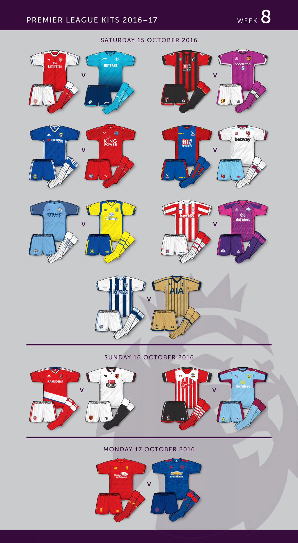
Every away team wearing an away/third kit – surely a rarity!
An otherwise lovely Everton away, ruined by a white sponsor logo. Why, Umbro?
Watford were the only team who didn’t need to wear a change kit
Agree on Everton away, Martyn, not sure what they were thinking.
Swansea could have worn black change shorts but prefer to wear away kit (even though the black shorts and socks are included in PL handbook this year).
I was delighted when Watford were away to Swansea last weekend as they couldn’t wear their away. They shouldn’t be allowed to do it when it creates a shorts clash
In another case of a team wearing a colour of their local rivals, I was a bit surprised when Puma gave Leicester an all red away, being as red (or Garibaldi red, if you’re being pedantic) is the colour of Nottingham Forest. Similarly, Forest themselves have often worn a white away shirt with black shorts, the colours of Derby County. Derby themselves have however avoided red, apart from the early 90’s grey thing by Umbro; which it must be said was hugely unpopular amongst Rams fans. So why the sudden switch by Puma? I thought Leicester’s preferred away colours were either yellow / amber or white?
Arsenal’s sleeves tradition under threat? https://museumofjerseys.com/2016/10/28/arsenal-kind-of-break-with-tradition/
I think that’s a bit of a ‘storm in a teacup’, isn’t it? Surely the whole point should be that the design stays with white sleeves, and it’s also nice that they refuse change shorts. Does the length of the sleeves really matter? Sorry, Gunners fans, in these days of baselayers I think the impression of longsleeves is fine. it’s not selling out, it’s what the players are comfortable in. Isn’t it?
Due to the almost terminal decline in regular long sleeve shirts, I like that Arsenal still do the all short or all long sleeve approach, however if I was a player I’d probably not be a fan as I doubt the long sleeve Puma ACTV shirts would be particularly comfortable to wear so I can sympathise with both sides of argument!
Martyn- I agree with you about the Everton kit.
As a general point, with so many teams wearing away kits at the drop of a hat these days, do many of them wear change shorts with the home kit any more? Man Utd are the only ones that spring to mind.
Ive not remembered Swansea in black shorts for ages, or Newcastle in white ones or Sunderland in white ones. They always used to? I suppose it strengthens the identity of the home kit if the shorts are always the same colour like Arsenal.
Hello Phil – basically teams are keen to promote the away kit as often as possible in order to stimulate replica sales. Its a shop window if you like. Everyone knows the home colours but they’re simply enticing people to buy the aways as well. Its a decision made my commercial people rather than kitmen I’m lead to believe.
There is no rules to say that if shorts clash the away team should change. The teams that do (Man Utd, West Ham this season spring to mind) do it purely for their own reasons presumably to maximise colour differentiation.
Thats interesting John. It puts the Arsenal kit choice at Watford into perspective. Perhaps the commercial people at Arsenal ordered the 3rd kit at Watford expecting people to comment on it and increase publicity.
Watching the CL last night, one thing intrigued me : why didn’t Porto have a CL badge with ‘2’ underneath it? Bayern and Barca have a ‘5’, Real an ’11’, and so on. Is there a reason?
Talking about random use of strips, it’s interesting, isn’t it? Certainly in the twenty odd years I’ve been watching football there has been a definite shift; back in the mid 90’s many clubs didn’t even have a third kit – Arsenal themselves took a few years to introduce a regular one, being that either yellow or teal/navy covered most clashes. But now, it seems that away kits are picked in combinations that deliberately prompt a third, or worse still, a third is used as an alternative away. The nadir was reached I think with that first wave of Liverpool Warrior kits; the third was officially called a ‘lifestyle kit’…I think suppliers need to understand that when three kits are released every year, they owe it to the fans to at least distinguish the three kits. Bayern are good at this, only the away and third occasionally swap between dark and white.
Speaking of Bayern, here’s one to annoy you Denis : Our home colours this season are red/white/red; away grey/black/black; third white/maroon/white. The alternative shorts for the home are red (and we look better in all red, IMO), none for the away, white for the third. The alt. home shorts are trimmed with white; alt. third with silver. That means that we have two strips with two sets of shorts that are very similar, but can’t be interchanged! Interestingly, the alt. third shorts were debuted on Wednesday at PSV, with the away shirt! The socks have also been used with the home kit, with the maroon trim clashing horribly. And we are 15 games in, and that third shirt hasn’t been worn yet – I think the only time domestically it WILL get used is against Freiburg. But again, this proves that Bayern have a bit more integrity when it comes to kit use – the black/grey strip IS the designated away.
That is kind of irritating, Martyn!
The white shorts weren’t ideal on Wednesday, bit of an overall clash at times.
I would’ve preferred orange to match the trim, personally. I don’t know why there isn’t an alt set for the away.
In other news, the DFB are teasing the Confed Cup home (which has also been leaked), with some of the players wearing the new strip and training wear (partially obscured, of course). Today, a head and shoulders shot of Mats Hummels wearing a black training top…with what appears to be ‘adidas Equipment’ stripes over the right shoulder! Does this mean they are set for a comeback? What would TC contributors think about that? Watch this space, as they say.
I would love a comeback of ‘Adidas Equipment’ stripes to make a comeback, on looking at what comes into stock at classic football shirts, I’d forgotten how nice some were
I liked the second wave of Bayern strips in the equipment era, where they basically added white and blue trim to the collar, socks and cuffs. The plain red and white away strip was nice, but the yellow, maroon and jade away strip that replaced it was marred somewhat by odd colour choice…otherwise it would’ve been great. I like a lot of the ‘second wave’ Arsenal and Liverpool strips from the era, too. Then there was the other type, with the stripes over both shoulders (Rangers and HSV had that one). Interesting that the lifespan was barely five years before the traditional stripes made a comeback, yet people always remember them. A personal favourite of mine were the 96-98 templates – the one where the stripes swooped over the shoulders and continued onto the shorts (worn by Romania, Germany away, Palace, and Leverkusen to name a few). Incredible that Euro ’96 was twenty years ago now!
That 96 design you mention didn’t really have the stripes continuing onto the shorts, Martyn, certainly not like the 93-94 kits – adidas used a similar shorts style across all of their styles that year.
Depends on your interpretation, Denis. They had a solid block of colour which had the stripes, reduced in size, inset into them. When worn with the ‘swooped’ shirt design the stripes lined up, thus creating the effect of a continuation. While I accept that the design was universal on the shorts, it was a clever example of adidas coming up with a new design that unified the various templates.
My point though is that I think it’s a stretch to say that the stripes did line up. Where they stopped on the shirt was still the front, while on the shorts they were clearly at the side.
http://euro2016-france.net/wp-content/uploads/france-euro-96-4.jpg
They look lined up to me, Denis! I think we’ll agree to disagree on this one! 🙂