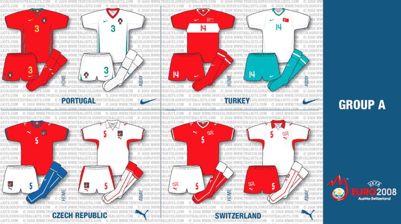
 Here is the first of four articles featuring the kits that are to be worn in Euro 2008.
Starting off with Group A where unbelievably every team has a red home kit and white away! Who says international kits are getting boring? There’s really only a few templates on view at this summer’s tournament so for those of you who love to see a wide and rich variety of different designs be warned!
The real kit of interest from this selection is the Turkey away kit that features a rather untraditional turquoise colour. The reason for this colour choice is that the origin of the word turquoise comes from the French word for Turkey. Its another example of Nike’s conceptual and intelligent approach to kit design.
Also, Portugal have ditched the darker red they have worn recently and reverted to a more familiar shade.
Part 2 of Euro 2008 kits to follow soon.
All illustrations are (C) 2008 www.truecoloursfootballkits.com and must not be reproduced without express permission.

Puma and their drab uniformity with the V1.08 range shows itself off rather brilliantly here. Just look at the differences between the Czech and Swiss away shirts, almost identical apart from the collar.
I quite like the Turkish kits this year, far better than the two-tone half and half efforts they had last time out – the home is very much traditional and the away is quite a smart kit, quite interesting is the choice of turquoise considering away kits tended to be white with red trim or red stripe on the front.
I still think the Portugal home kit would have been better off with the traditional green shorts, again a sign of Nike throwing the tradition concept out of the window, though the inclusion of red shorts I’ve seen from some bulletin boards hasn’t gone down too well with Portuguese fans keen for a return to red-green-red as seen in Euro 2004.
Can’t wait to see part 2 John!
It’s not much better on the czech and swiss home kits either (differences in design).
Maybe puma should learn from nike. Same basic designs but with small touches for each ‘client’ to differentiate kits.
Does anyone agree with me that the all red portugal design works better with a darker shade? I have warmed to the all red kit and am now equally pleased with either red or green shorts.
Its funny, I’ve recently come across a whole batch of Shoot magazines from the lates 70s/early 80s. Looking through them all the adidas kits were virtually the same (except different colours/badges obviously) likewise with the Umbro kits. Maybe we’ve become spoilt in recent years with the amazing quantity of unique kit designs but essentially kits are uniforms of work and there basic sole function is to ensure the teams can be distinguished separately on the pitch. It seems to be that kit designers might be returning to this ethic and abolishing wildly different designs? Subtle nuances seem to be en vogue. After meeting with two of Nike’s senior kit designers I know that they do try to make every kit slightly different though – plus they always like the designs to be conceptual or in other words have a bit of story behind them.
Look out for the second part of my Euro 2008 kits – I’m afraid you’ll see more templates though…