I’ve just posted my review of the new Scotland home kit. Read it here.
Category: True Colours
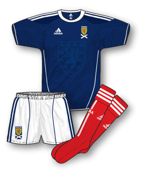
One of the most eagerly awaited kits of the season (well, in my house anyway) was the new Scotland home outfit – the first to […] Read More
At last, I’ve finished the QPR kit history from 1976 to date. You can find it here.
For me one of the best kits from the early 80s was Ipswich’s all blue adidas outfit with non-contrasting V-neck/cuffs and white pinstripes. North of […] Read More
In anticipation of the kit’s first taste of action this Wednesday, I’ve just posted a review of the new England away kit. You can read […] Read More
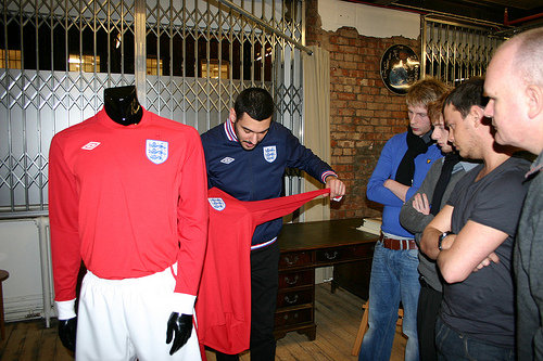
The new England away kit has a lot to live up to. Since the home design was rebooted by Umbro in 2009 questions were asked […] Read More
OK, now I’m excited!!! New kit being unveiled today…
Just started adding the 09-10 Championship to the main 09-10 kits page. You can view them here: http://www.truecoloursfootballkits.com/09-10-kits
At last! Bar the odd pair of change shorts/socks here and there I’ve finished the 09-10 Premier League kits (just in time for 10-11!). Sorry […] Read More