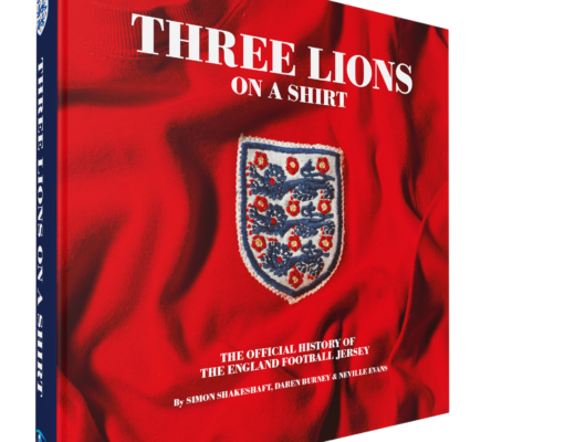
Nike Boot Room

Posted by John Devlin

Nike Boot Room 3How many times have you trudged off a five-a-side pitch in tattered and mis-matched shirt and shorts after being soundly beaten thinking that if only you had a top notch kit your team would play much better?

I know when I was playing football regularly in the late 80s/early 90s I would often pick up the latest Umbro catalogue from my local sports shop and try and persuade my team mates to club together and purchase the latest trendy strip. I spent hours working out which shirts would work best with which shorts and in which colour scheme. All to no avail, my chums were more interested in saving their money for records and beer and so sadly week in, week out we took to the pitch in a rag tag combination of various old replica shirts and fading shorts.

Nike Boot Room 2Now however, Nike offer the facility to select, design and customise your team’s very own kit in the Boot Room, housed within their Niketown Oxford Street flagship store and part of the Nike iD personalisation initative that the company have recently instigated. Customised boots have been offered by Nike for some time now, with bespoke sizing, colours, styles, materials and graphics able to be selected and combined, with the help of Nike iD design consultants, to create your own personal footwear. But now this ability to customise sportswear has been extended to the company’s football kit range.

When Nike very kindly recently invited me along to produce my very own special True Colours shirt I was momentarily transported back to Monday night five-a-sides – my 20 year old dream was coming true! So, with this thought in mind I set off to the bright lights of Oxford Street a couple of weeks ago to find out what the Boot Room was all about…

Nike Boot Room 1The Boot Room is, put simply, a glorious temple to football apparel – a vision in stylish wood panelling and glass, illuminated by carefully designed lighting and containing the power for you to put your mark on a Nike piece of kit. The boot section itself features row upon row of boot ’shells’ ready for complete customisation and personalisation. Next door to this is the area I was interested in – ‘Build Your Team Kit’ – and a little further on, the retail section selling a wide range of Nike replica shirts.

I was greeted by rows of mannequins sporting the full range of Nike teamwear jerseys that can be chosen for your final design. Along the walls sat rows of elegant, yet mysterious closed, drawers – no doubt packed with shirts, shorts and socks, giving the impression of a sportswear equivalent of a Saville Row high class tailors.

I was greeted by Conrad who was to be my guide through the Nike kit design experience. We sat at a Mac workstation and set to work, slightly intimidated by the fact that I had the power to create and design my own Nike kit at my fingertips. First step, the jersey.

Via a slick front-end interface a choice of the various Nike teamwear shirts appears. Many will be recognisable to anyone with a remote interest in kit design, and jerseys as worn by Fulham, Aberdeen and Southend Utd etc are presented in a variety of colourways alongside other established designs based on older strips worn by Celtic and Arsenal amongst others. Inspecting the fabrics helps decide which jersey to go for, other factors such as collar design, available colours etc may swing you one way or another. There are a specified set number of colour combinations available for each style, so there isn’t complete autonomy, but there are more than enough colour schemes to choose from. I opted for the very dashing symmetrical look of the Dynamic jersey (recently launched as Fulham’s third kit) in heroic white with black trim.

Once the choice of long or short sleeves is made, your club badge and sponsor’s logo are then uploaded and added to the shirt visual on screen. This is easier than it sounds and the graphics files you upload are checked through by Nike before they are adhered to the strip. Names and numbers for the reverse of the shirts can be added if you wish. You then go through the whole process again for the accompanying goalkeepers kit. This time I opted for the Park II design (as worn by Arsenal and Manchester Utd) in black and silver which I thought would be a suitable match to the white outfield shirt.

The final stage involves selecting from the wide range of shorts and socks designs to complement your shirt and then your strip is complete. Kit sets are available in quantities of 3, 5 or 12.

Conrad checked through my selection, filled out a form on-screen and that was it! I received a small wallet giving details of my design with the promise that within 3-4 weeks the shirts will be delivered.

Nike True Colours football shirtSo, just the other day, amidst eager and impatient anticipation, a parcel arrived stamped Nike. Feverishly ripping open the tape I was faced with the glorious sight of my very own True Colours Nike kit. The quality is as you would expect from Nike and its a great feeling to hold in your hands your very own customised jersey.

Sadly, with my age and waist measurement both rapidly approaching 40 my five-a-side days are over, so my shirt may not ever see active duty and will no doubt spend much of its time hanging in pride of place on my wall. But you never know, if I can get the guys together for one last football hurrah I will be able to don my official Nike True Colours shirt with pride.

Many thanks to Nike, Freud Communications and all at The Boot Room, Niketown.

More pics to follow soon.


Sign of the Times?

Posted by John Devlin

West Ham West Brom sponsorless shirts football jersey kit xl holidaysOne for pub quizzes of the future - ‘what was unusual about the Premier League fixture between West Brom & West Ham in September 2008?’ Of course…both sides played without a shirt sponsor’s logo - to my mind the only time this has happened since the Premier League’s formation in 1992 (apart from of course the ‘tribute’ Manchester derby last season).

Anyone following the sad demise of XL Holidays this week will no doubt be aware of the implications it has for West Ham, the side who the firm just recently signed a multi-million pound sponsorship deal. The rumours were that the side were going to sport the XL logo in the WBA game to fufill contractual requirements before removing it for future matches. It is relatively rare, certain in the top flight of English football, that a company who can afford to sponsor a shirt hit severe financial difficulties that threaten their existance mid-season. The only previous examples I can recall were:

Allsports who sponsored Charlton’s shirts until midway through the 05–06 season until they went bust (the shirts taken over by Spanish property company Llanera who ironically also hit problems a couple of seasons later);

First Advice who collapsed shortly before the start of the 03–04 season, although curiously Manchester City carried on sporting the company’s brand on their jerseys throughout the season (it seems it would have been more costly and politically problematic to alter the shirts - apparently a stock of 100,000 replica ‘First Advice’ home shirts still existed - Thomas Cook were lined up to sponsor the away shirt for the 03–04 campaign but this never materialised);

and Newcastle Utd sponsors Northern Rock whose fiscal problems were well documented last year. The company were actually taken over by the government at the start of 2008 and yet their shirt sponsorship deal with Newcastle continued – effectively meaning that the Government were spending tax-payers cash in supporting a football club. Understandably this move created some degree of controversy.

west bromwich albion wba sponsorless shirts advert umbro 08-09West Brom’s situation is different though – they have simply been unable to secure a sponsorship deal yet for this season – despite the club’s unashamed campaign to attract a suitable partner. Replica shirts are being sold without a logo although supporters will be able to return the shirts to the club for a sponsor’s logo to be added once a deal has been confirmed. It will be interesting to see just how many supporters take the club up on this offer.

The Baggies are not the first Premier League side to struggle to secure shirt sponsorship – West Ham played most of 97–98 without a sponsor before Dr Martens stepped in (did you see what I did there!) towards the end of the season and both Sheffield Wednesday and Wimbledon played with ‘empty’ shirts in the early days of the Premier League.

Although the purists may be pleased, sadly (financially at least – shirt sponsor deals are vital to football clubs these days), sponsorless shirts may become more common as the (and I hate to repeat this over-used phrase) ‘Credit Crunch’ bites. With many airlines/holiday companys rumoured to be in trouble several clubs may be affected and with most companies being more cautious with their pennies shirt deals may be some way down their list of priorities. The West Brom/West Ham game may prove to be the first of many.


Vintage Kit Advertisements

Posted by John Devlin

Probably like a lot of male 30-something football fans I was sad to hear about the closure of long-term football magazine ‘Shoot’ last week. The publication was a football institution as far as I was concerned and although it had lost its way over recent years I still have fond memories of poring over its pages as a small boy, looking at the latest kits and seldom seen away outfits.

I was lucky enough to come across a whole batch of Shoot magazines from the late 70s/early 80s recently and although the replica kit market was still relatively new I was delighted to see them packed with some memorable ads for replica outfits. Here are a selection of them:

vintage adidas ad 70s 80s shootvintage admiral ad 70s 80s shootvintage mc sports ad adidas 70s 80s shootvintage mc sports ad le coq sportif 70s 80s shootvintage mc sports ad umbro 70s 80s shootvintage mc sports ad umbro 70s 80s shootvintage mc sports ad umbro 70s 80s shootvintage mc sports ad umbro 70s 80s shoot


Euro 2008 kits – match by match

Posted by John Devlin

Here’s a handy reference guide to which kits were worn in which match in Euro 2008.

Group Stages

euro 2008 kits shirts jersey soccer uniform match home away

Euro 2008 kits match by match

Quarter Finals

Euro 2008 kits match by match quarter finals
Semi Finals
Euro 2008 kits match by match semi finals
Final
Euro 2008 kits match by match final


Euro 2008 Kits Pt 3 - Group D

Posted by John Devlin

euro 2008 kits shirts jersey soccer uniform group d spain greece sweden russiaHere is the fourth and final set of Euro 2008 kits – this time from Group D.

Its a mixed bag that features the only showing from English sportswear giants Umbro with their kits for Sweden. Their home outfit has been around for a while but the mean and moody navy away strip is brand new for the tournament and is a real classic with flashes of yellow and blue providing exciting highlights against the dark fabric.

Adidas have two showings in this group. The Spanish home shirt is a typically rich design but the real talking point here (and equally rich in some ways!) is the away kit that sees the side sporting gold although the shirt is unusually to be accompanied by white shorts and socks. The Greece kits are good solid bits of adidas two-colour design with the country’s flag cunningly incorporated within the shirt material as a shadow pattern.

Nike’s only kit in this group is for Russia and the firm have opted for identical designs in different colourways across the outfits. Both feature a really nice element of the flag colours displayed in a chest band – spoilt only by the placement of the squad number.

There you have it! All the kits for Euro 2008…all that remains is to see how many strips will be mixed up and customised with away shorts being worn with home shirts etc due to the regulations concerning colour clashes. Any anomalies will be documented on this site.

All illustrations are (C) 2008 www.truecoloursfootballkits.com and must not be reproduced without express permission.


Euro 2008 Kits Pt 3 - Group C

Posted by John Devlin

euro 2008 kits shirts jersey soccer uniform group c france romania italy holland adidas nike pumaHere is the third of four articles featuring the kits that are to be worn in Euro 2008.For me, Group C is the real pick of the bunch kit-wise with some great designs for some great teams. In my opinion these are the best strips of the tournament.

Adidas lead the way with their kits for France and Romania. The French of course playing in a change strip of red rather than their traditional white – a decision that got the purists hot and bothered. The home shirt features a dynamic chest graphic. As usual the shorts and socks have been designed to be interchangeable between the outfits. Whilst nothing spectacular, the Romanian kits are good solid designs that make the most of their dazzling colours.

The Holland strip features a masterstroke by Nike with the inclusion of ‘Nassau Blue’ – a colour traditionally associated with the Dutch Royal Family – in the kit. It really lifts the familiar orange and white colourway. The away shirt is another classic with the Dutch flag incorporated across the chest.

Finally, Puma’s typically elegant Italian kits make up the Group C selection. Although the designs are standard Puma templates the white and navy colour scheme of the away strip helps create a really classy looking strip.Part 4 of Euro 2008 kits to follow soon.

All illustrations are (C) 2008 www.truecoloursfootballkits.com and must not be reproduced without express permission.


Modern Life is Rubbish…

Posted by John Devlin

This is a great article courtesy of Gary Silke’s Leicester City fanzine ‘The Fox’. It brings back fond memories for me of being desperate to own a replica football shirt when I was a small boy…cheers Gary!

Modern Life is Rubbish, this isn’t just rose-tinted nostalgia specs, it really is…

Firstly we had to fund the expedition. Somehow you had to scrape together the princely sum of two pounds, which amounted to ten weeks’ pocket money. Washing a car or two might get you 10p if you were lucky. And if an uncle visited you might get 50p pressed into your sweaty little palm if he was trying to look better than your Dad. When enough of you had the necessary, off you would go. It was a mile and a half from Huncote to the middle of Narborough, and the hardware shop. We weren’t interested in the racks of brooms or buckets or saws. We were focussed on a cardboard box in one corner of the shop. Written on it in marker was the legend: ‘Shirts £2 - Shorts £1.’ It was a magical box stuffed with more highly fashionable cloth than a Milan catwalk.

It was the ‘Admiral Seconds’ box.

Someone obviously had a connection to the Admiral factory in Wigston and this early version of TK Maxx was created - highly desirable labels at affordable prices. Just as wannabe WAGS now fall upon labels like Gucci and Missoni we would dive into the box and rummage around for brightly coloured treasure…Tottenham, Leeds, Manchester United, Southampton, Norwich, Coventry, West Ham, England and Wales (though never Leicester) all bearing the jaunty yellow Admiral label.
There was no school uniform at Huncote Primary School so virtually every boy in J4 sported an Admiral. As Mr Hughes’ eye passed over his class he would have seen Luton Town, Coventry, Man United, Sheffield United, Leeds yellow away and the England goalkeeper’s shirt (though I doubt he would have recognised them as such, being more interested in folk singing than footy). The shirts you wore had absolutely no bearing on the team you supported. I was a devoted, match-going royal blue Leicester fan, but I was happy to wear West Ham’s claret and light blue chevrons on my chest. Alan had never heard of Luton but wore their orange shirt with the white and navy stripe down one side. Richard did support Leeds, but the shirt came before the affiliation. Steve wasn’t Welsh, as far as he knew, but was seldom seen without his gaudy red, yellow and green creation. Mitchell was a Leicester fan, and still is, but would carefully line up the tram lines on his Coventry shirt and shorts. And we all did this because, for just a couple of years, Admiral was IT!….

The Admiral brand can be traced back to 1914 when it was used by ABC Hosiery Ltd of Leicester who produced good quality underwear. By the early 1970’s the company producing the brand were Cook & Hurst Ltd of Wigston. At this time the first manufacturers logos were very gradually beginning to appear on football shirts and it was Admiral who first seized on the possibility of commercialising football strips. With a young and vibrant sales and marketing force, years ahead of their time, the Leicester company swiftly set about conquering the domestic market. Don Revie’s fondness for making a bit of brass to supplement his meagre salary at Leeds was a big help in the early days. Leeds United were the first to wear the nautical trademark. Then, when Revie became England boss, a £16,000 deal was cut and England’s traditional plain white shirt was suddenly adorned with red and blue sleeve stripes and a yellow logo, much to the horror of traditionalists and the delight of schoolboys across the nation. That shirt was the must have item of 1975 and when Manchester United were also signed up Admiral had the ‘Big Three’.
The rest fell into line.

Admiral replica football shirts kits jerseys 1970s 1980sThe Admiral agents had an eye for opportunity. When Southampton beat Manchester United in the 1976 FA Cup Final they wore an Admiral strip that had been designed and manufactured since their semi-final victory and they were adorned with repeated logos down sleeves and shorts. In every copy of Shoot! there would be a full page colour advert showing their latest designs. There was even an ‘Admiral Annual’ produced which showed only photos of games in which both sides wore the approved brand. You could also send away for a poster which displayed Admiral’s growing roster of clubs from Aberdeen to Orient. Admiral, operating from a much smaller financial base, had to be sharp to stay ahead of Umbro and adidas, who were now breathing down their necks. Umbro was being worn by Arsenal, Liverpool, Chelsea, Manchester City, Everton, Derby County and Scotland, while adidas clothed Ipswich Town, QPR, Birmingham and Nottingham Forest.

Admiral replica football shirts kits jerseys 1970s leicester cityAlthough Admiral, being a Leicester firm, had kitted City out for years only in 1976 did they introduce logos to the strip, and plenty of them.I still remember my Dad recoiling with horror when he saw Admiral’s typically unrestrained design. It was the end of football as we knew it, he reckoned. And he was probably right. But we loved it and after I got it for Christmas 1976 I seldom wore anything else for years.

Eventually, adidas and Umbro and French firm Le Coq Sportif caught up with and overtook the pioneering Admiral. They lost the England contract to Umbro in the early eighties and then went bust. Although the logo has often re-emerged over the years Admiral have never been a force in the kit market again.

But every time I see Nike or Umbro proudly, and with much gravitas, unveiling their latest ever so slight rearrangement of stripes and collars as if it were a cure for cancer, I think back to a firm from Leicester who did it first and did it best.

Gary Silke
The Fox fanzine


Euro 2008 Kits Pt 2 - Group B

Posted by John Devlin

euro 2008 kits shirts jersey soccer uniform group b austria germany croatia poland nike puma adidasHere is the second of four articles featuring the kits that are to be worn in Euro 2008.

Group B mixes Nike, Puma and adidas together. Adidas have come up with some superb designs for the Germany team that really lift their outfits away from the slightly formularic approach of Nike and Puma. Green is no longer the German’s away hue and instead a dynamic combination of red and black is preferred.

Euro 2008 also sees Austria abandon their traditional white home kit in favour of a clean red and white. This outfit is supplemented by a classy black and gold change affair.

As usual Croatia’s unique style brings a rich blend of colour to the competition.

Part 3 of Euro 2008 kits to follow soon.

All illustrations are (C) 2008 www.truecoloursfootballkits.com and must not be reproduced without express permission.


Euro 2008 Kits Pt 1 - Group A

Posted by John Devlin

euro 2008 kits shirts jersey soccer uniform group a turkey portugal switzerland czech republic nike pumaHere is the first of four articles featuring the kits that are to be worn in Euro 2008.

Starting off with Group A where unbelievably every team has a red home kit and white away! Who says international kits are getting boring? There’s really only a few templates on view at this summer’s tournament so for those of you who love to see a wide and rich variety of different designs be warned!

The real kit of interest from this selection is the Turkey away kit that features a rather untraditional turquoise colour. The reason for this colour choice is that the origin of the word turquoise comes from the French word for Turkey. Its another example of Nike’s conceptual and intelligent approach to kit design.

Also, Portugal have ditched the darker red they have worn recently and reverted to a more familiar shade.

Part 2 of Euro 2008 kits to follow soon.

All illustrations are (C) 2008 www.truecoloursfootballkits.com and must not be reproduced without express permission.


Liverpool’s league failures – all down to the badge?

Posted by John Devlin

On a recent visit to Sven’s excellent www.footballshirtculture.com site I was very interested to see what appears to be the 08-10 Liverpool home shirt. Its certainly a good looking adidas design and in my opinion one of the best the club have worn for many years, but one aspect of it made my heart sink a little.

Firstly, I must lay my cards on the table. If you’ve read a little more about me elsewhere on the site you will see that I am a Liverpool fan of old. I guess I stopped following them fanatically in my teens when I felt a bit of a fraud supporting a team I seldom saw play and that were not my local side. So although I no longer shed a tear when they lose, theirs is always the first result I look out for on a Saturday at 4.45 (older fans pre-Sky will know what I mean here!)

OK, that’s that out of the way. My work studying football shirt history over the years has led me to several conclusions: clubs have always changed their kit on a regular basis, some third strips are unnecessary (!), if you’re wearing a good looking kit it can have an influence on the pitch and that a change of sponsor/manufacturer/design CAN improve a club’s fortunes.

One of the other revelations I have also uncovered concerns Liverpool’s apparent inability to win the league title – an achievement that has escaped them for almost 20 years! Sure there have been several notable cup wins along the way, but not the elusive honour that confirms a club are simply the best in the land. The reason for this ‘failure’ in my view is not down to an aged team that has not been updated/refreshed (as was often the argument post-Dalglish) and its not down to any rotation systems. No, in my opinion the failure is, in part at least, down to the Liverpool crest that appears on the hallowed red (and sometimes white, yellow, green or black) shirt.

Liverpool current badge crestI’m sure you’re all familiar with the current rather elaborate shirt crest which has gone through several minor cosmetic changes since it was initially introduced in the 92-93 season. Liverpool last won the title in 89-90 when the club shirt (which at the time was the infamous paint splattered affair, but don’t let that dilute my argument!) featured a simple Liver Bird surrounded by a relatively simple and traditional crest that had replaced the classic icon of the Liver Bird standing alone above a base of ‘L.F.C.’ in 1987. Strong, direct, dynamic and to the point, with the club’s symbol or identity instantly recognisable and on view clearly and simply.

This identity is now hidden and diluted within a couple of shields, the Shankly gates (emblazoned with the ‘You’ll Never Walk Alone’ legend and second minature version of the Liver Bird badge), and the Hillsborough eternal flames all wrapped up with a hefty dose of scrolls. Of course I fully appreciate the significance of the flames and that is something, I believe, must not be ignored. But I do think the current badge is too wrapped up and lost in the past and the mythology of the club. It is not the crest of a forward-thinking and dynamic club. The strength of Liverpool FC has been its football and its identity – familiar and recognisable and perfectly epitomised by the peak teams of the 70s and 80s that were led and accompanied by the strong Liver Bird logo on their chests – it symbolised the team and the way they played football, the club and the city. It also instilled fear into the opposition.

Design trends come in circles and now many clubs are switching to streamlined and powerful badge designs to adorn their shirts. These badges enhance the brand identity of the clubs in question by being clearly recognisable – even when viewed at a small size in a newspaper, magazine or at the match itself. They also lend themselves easily to being rendered in virtually any colour combination. I think its time for the cumbersome and intricate badge to be phased out.

Liverpool classic badge crestA large faction of Reds fans have been campaigning for a return of the iconic Liver Bird badge and occasionally pre-season fake shirts appear with it in place, but sadly it has yet to make a return. It does still re-appear in a part-time capacity though when the club are playing in a major cup final. Eagle eyed supporters will remember that it appeared in yellow (alongside the regular club badge and Reebok logo), slap bang in the middle of the shirts worn in the glorious Champions League final against AC Milan in 2005.

Cup wins aside, is it a coincidence that the club has not won what is rapidly becoming its ‘Holy Grail’ – the league title – with the elaborate crest spearheading the club on their jerseys? Don’t get me wrong, nothing would make me happier than for the club to clinch the title next season in this splendid new adidas jersey complete with the current badge but I believe a change is needed.

Obviously a badge/crest can’t win matches on its own but as a graphic designer and football shirt historian I believe it can inspire and influence and perhaps thats what the club needs right now.


« Previous Entries