I’m trying to track down a decent pic of Notts County’s away kit from the 93-94 season. It was a Matchwinner kit with a pale […] Read More
Category: True Colours
Umbro have just posted a new article I wrote for them entitled ‘Kits with a Conscience’ that looks at the different ways football shirts are […] Read More
There’s nothing better than reading about a club’s kit history according to its supporters. Although I (and others around the web) do my best to […] Read More
Just a quick to note to wish all visitors to the site a very Merry Christmas and a very prosperous New Year. Thanks to everyone […] Read More
If you haven’t been over to the Umbro blog lately I suggest you drop in pretty soon as the voting is nearly up for their […] Read More
Can it really be two months since my last blog? Still, I hope there’s been enough kit related features and articles on the site to […] Read More
The first installment of my QPR kit history has just gone live. View it at: http://www.truecoloursfootballkits.com/articles/queens-park-rangers-kits
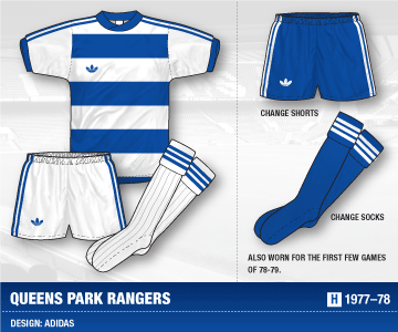
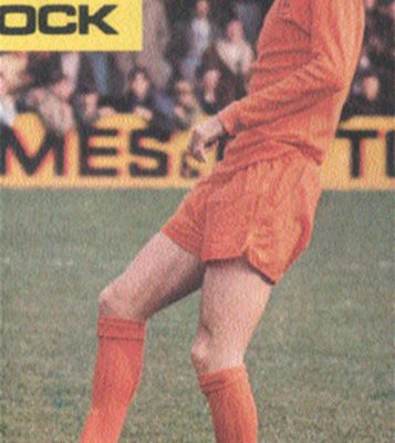
QPR have one of the most exciting kit histories going in my opinion with some quality designs that mostly stick with traditional colour schemes. When […] Read More
As you can see the site is back online after some coding bugs and hosting problems. Sorry for the disruption – new updates to follow […] Read More
I was delighted to be asked by Sunderland to work with them on adding their kit history to the relaunch of the club’s official site. […] Read More