Here you will find various updates to TRUE COLOURS including kits for the seasons covered that were released too late for the book’s publication dates and also various corrections and additions that have been discovered since the books were released. Every effort has been made to make the books as accurate as possible but if you know of any errors then please get in touch using the contact form. Thanks to my recent acquisition of hundreds of Shoot! magazines from the late 70s/early 80s and the very generous supply of information from David King’s kit research (thanks David!) I’m able to now illustrate a handful of very rare third kits that I was not aware of at the time of publishing True Colours 1 and 2.Thanks also to Dave Moor at Historical Kits for the exchange of information!
05–06 Missing kits
 Everton third kit 2005–06
Released by the club after the copy deadline for True Colours volume 1 had passed, this vivid yellow third kit became the latest addition to the ever-growing Umbro/Everton back catalogue. The shirt featured an asymmetrically trimmed cut-away neck and navy and white horizontal pinstripes to which flashes of navy were added in typical Umbro style. However, like the 00-01 and 03-04 outfit this kit was never worn on active duty. 
Portsmouth third kit 2005–06
Like the above Everton kit this white and navy Pompey outfit was unveiled too late for inclusion in True Colours volume 1. Also, like the Everton strip it only lasted one season and attracted criticism in some quarters for actually being rather superfluous to requirements. Unlike the Toffeemen’s outfit though this strip did actually make an appearance on the pitch. It was premiered, just before Christmas 2005, in the club’s 3–0 away defeat to Manchester United.
 Liverpool Euro kit 2005–06
Following Liverpool’s incredible Champions League success of 04–05 the team sported a unique home strip in the following season’s competition. The shirt (which was trimmed luxuriously in gold) loosely followed a similar design to that worn by West Ham and Bolton (other Reebok clients) and included loose diagonal shadow bands and unique gold flashes on each shoulder. The other prominent design feature was the addition of five stars above the club badge (which despite rumours did not return to the popular ‘Liver Bird’ technique) to symbolise the Red’s five European Cup/Champions League victories. 
Middlesbrough third kit 2005–06
The last of the 05–06 season shirts that did not make into True Colours was this very rare Middlesbrough third kit, worn only once in the March 06 UEFA Cup Quarter Final tie at FC Basel. The Swiss side’s red and blue kit meant that both of Boro’s designated outfits clashed and this classy all white number was worn to solve the problem. The collar matched that to the club’s standard all blue jersey with black panels and reversed stitching were added to each sleeve. Unusually the Errea logo was placed centrally on the shirt. Boro lost the game 2–0 but recovered to win 4–1 in the return home leg and proceed onto the final. Sadly the club couldn’t overcome the mighty Seville and were soundly beaten 4–0.
Wales kits
Thanks to Shakey at the excellent www.footballmatchshirts.co.uk site I am able to correct a couple of errors that appeared in the Wales section of True Colours Volume 2 and include a rare third kit from the late 80s. 
Wales away kit 1984–1987, correction
There seems to be a commonly held belief that the second Wales adidas away kit of the 80s simply reversed the colour scheme of the home and comprised of white shirts and red shorts. It appears this is inaccurate and in fact Mike England’s men continued with a yellow and green away strip – although now fashioned into a fairly plain design. The origin of the mythical white away kit of these period seems to stem from, of all places, Subbuteo, who at the time produced a miniature version of the Wales team decked out in incorrect white strips! 
Wales away kit 1987–1990, correction
The colour scheme of the rather splendid Hummel away kit was actually yellow and black, and not yellow and green. 
Wales third kit 1987–1990
As well as the standard red kit and yellow and black away, Hummel also produced an all white third kit for the Welsh side during their tenure as kit supplier. The kit was worn only once in September 1988, away against Holland in Wales’ first Italia 90 World Cup qualifier – the Dutch side’s orange shirts obviously just a little too similar to both the Welsh red and yellow. The match ended in a 1–0 victory for Holland. While we are on the subject of Wales kits, it might be a good opportunity to include the country’s new kits: 
Wales third kit 2007–2008
Wales have never been shy in adopting third strips, and this design was worn for the first time in a May 2007 friendly against New Zealand in Wrexham – forcing the ‘all whites’ to change to their blue away kit. The match ended in a 2–2 draw. The strip features a brave design of red and green alternate sleeves which are then flipped for the shorts. The shirt also includes a more restrained neck than the hefty V-necks worn on the Welsh home and away kits of the time.
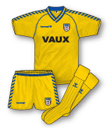
 Wales home kit 2007–2008
There appears to be some confusion in the Wales kit camp at the moment – the side took to the field in this new home kit for a friendly against the Republic of Ireland (a 2–2 draw) and their final European Championship qualifier against Germany in November 2007 (a 0–0 draw). The shirt is not as radical as the previous design, its main design feature being a watermarked dragon print. Kappa have announced that the jersey will be officially launched on St David’s Day (March 2008) with replicas also available then. A new away kit will follow in April. However, the Football Association of Wales have also announced their new kit deal with JJB Sports who will be launching their Welsh strips in August 2008! Meaning that Wales will sport their final set of Kappa strips for just 9 months. Its an unusual move and perhaps the country might have been better sticking with the existing Kappa outfits (which were only introduced in 2006) rather than opting for these short term new kits.
Middlesbrough kits
Friend of the site and self-confessed Boro anorak Shaun Wilson has let me know of a couple of Middlesbrough kits that were missing from True Colours. He also pointed me in the direction of a wonderful collection of Boro shirts: www.flickr.com/photos/boro_shirts. 
Middlesbrough third kit 1986–1987
As well as the red home and royal blue away kits of this period, Boro also donned this Hummel sky blue/navy blue third outfit. The design followed that of the home and away. The sponsorship situation at this time was a little cloudy; this jersey did not feature the standard Dickens logo of that season and was mostly worn unsponsored although the logo of ICI’s polyethylene plastic film product, Visqueen, did appear on the shirt by the end of the campaign. ICI of course came on board as the club’s main shirt sponsor a few years later in 1992. 
Middlesbrough third kit 1988–1990
Following the pattern of the previous season, a white Boro third shirt also appeared in 1988. The design essentially just reversed the colours of the home jersey complete with the logos of Heritage Hampers and kit manufacturers, Skill. The shirt was also worn with the white home shorts. 
Middlesbrough alternative home kit 1989–1990
Although I made reference to this outfit in TRUE COLOURS I though this might be an apt opportunity to illustrate it. The club’s achievement in getting to the Zenith Data Systems (ZDS) Final in 1990 marked the side’s first ever trip to Wembley. To mark the occasion a special one-off adaptation of their standard home shirt of the era was worn. The design, which was worn in just this game, was basically the same as the regular home jersey with the exception of a large, solid white chest panel that housed the Skill and Heritage Hampers logos and the club badge. Commemorative embroidery adorned the badge which also featured on the white shorts. The shorts ditched the triangular side bar trims and added a chequerboard shadow pattern. The unique strip did not bring the club luck however as they lost the game 1–0 to Chelsea.
Miscellaneous Middlesbrough kits
Rather than their standard V-neck adidas blue away jersey of the late 70s/early 80s, Middlesbrough also sported a wing collared version of the shirt, minus club badge/sponsor’s logo). Any kit fan won’t need reminding that in the early days of shirt sponsorship, sponsored shirts were banned from TV coverage. This occasionally would catch teams out if they arrived at a game that was due to be televised without an unsponsored set of kits. This situation happened twice to Boro; a 1981 visit to Manchester City meant the club were forced to borrow Manchester United shirts (can you imagine that happening today!), and in a 1983 trip to QPR plain adidas orange jerseys with black trim, minus club badge and of course sponsor, were worn by the club to ensure that the TV cameras could keep rolling. Finally, the club’s 1994–95 jade/dark green away kit was also retained as third kit for the 1995–96 season, complete with the logo of Boro’s new shirt sponsor Cellnet. It was one of the few times an Errea Boro kit lasted for more than one campaign although it is unclear whether the strip was actually called into action.
Wolverhampton Wanderers kits
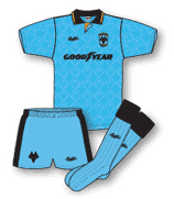 Wolves third kit 1991–1992
Clubs who wear yellow or gold shirts (Wolves, Watford, Norwich etc) seldom have to worry too much about away kits due to the relative lack of colour clashes in a season. The commercial advantages of change strips are obvious though in terms of replica sales. Nowadays, away shirts are often worn even when a clash does not occur in order to promote the kit to fans. With some exceptions though, it is rare for a team wearing yellow/gold to release a third kit as there is effectively no real requirement for the shirt other than to market another replica design. In the early 90s third kits were becoming popular for the first time and this era saw Wolves wear their only (as far as I can tell) official third outfit. The sky blue Bukta kit followed the design of the home and away, with a swish trim of black and old gold. 
Wolves away kit 2006–2007, correction
One of the problems when putting together a book like TRUE COLOURS is dealing with the tight deadlines. All artwork had to be with the printers in the summer meaning a race against time to get all the new kits included. A side effect of this is that often the only reference material available was pre-release publicity shots and as many kit fans will know early prototype versions of kits can alter considerably from the final outfit. This was the case with this Wolves away kit. The definitive strip worn during the 2006–07 campaign as illustrated here, had different sleeve detailing to the illustration included in TRUE COLOURS VOL 2.
Chelsea kits
 Chelsea third kit 1977–1981
Despite the relatively few teams wearing both blue and yellow (Shrewsbury Town?) in this period Chelsea issued a white third shirt in the late 70s to augment their blue home and yellow away outfits. The shirt was attractively simple with a basic V-neck and interestingly non-contrasting cuffs. Umbro diamond trim appeared on the shorts that were a straight reversal of the home pair. Its not clear whether this rather smart strip was ever worn in action but it did appear in one of the club’s official team photos of the early 80s in an era when ‘training/leisure’ tops were scarce. 
Chelsea third kit 1990–1991
Never shy of donning a third kit, Chelsea sported this simple all red shirt against Coventry City in the 90–91 season due to Coventry’s sky blue and white striped jersey clashing with both Chelsea’s kits at the time. Unlike many other clubs you always got the feeling that the majority of Chelsea’s third kits were necessary, functional items.
Sunderland kits
 Sunderland fourth kit 1980–1981
Fourth kits are real rarities and are guaranteed to get kit fanatics such as myself very excited! This swish all-red Sunderland shirt (with no contrasting collar/cuffs) made an appearance in the 80–81 season away at West Brom where the Black Cats lost 2–1. A quick glance at TRUE COLOURS 1 indicates that as well as the team’s red and white striped home shirt, their blue away and white third jerseys must have been judged not to provide sufficient colour differentiation against the Baggies. 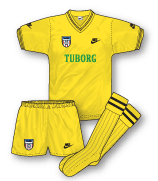
Sunderland third kit 1985–1986
The very pale yellow third kit worn in the 83–84, 84–85 seasons was not retained for the final year of the Nike deal at Roker Park and instead this brighter all yellow third outfit was introduced. The black trimmed jersey still featured the Nike logo and club badge the ‘wrong way round’ although interestingly the Nike logo also featured on each sleeve.
 Sunderland third kit 1989–1991
The merest of tweaks was applied to the Sunderland Hummel third kit of the late 80s. Instead of featuring the wrapover crew neck as worn in the 88–89 incarnation a wrapover V-neck was introduced. Other than that tiny change the kit remained the same.
Fulham kits
 Fulham third kit 1990–1991
With the Fulham’s penchant for red away shirts to accompany their white home jerseys there is always a fair chance that a third kit is lurking around somewhere in the shadows, just waiting for the opportunity to make an appearance against a red and white striped side. This yellow and blue outfit followed to all intents and purposes the design of the home, minus the piping and additional sock stripes. It made a couple of appearances in 90–91, most notably in a good 2–1 win away at Brentford.
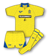
Leicester City kits
 Leicester City third kit 1979–1983
This white version of the Foxes’ Umbro shirt of the late 70s/early 80s was probably only worn once or twice but was called into action for the club’s 3–1 defeat at West Ham – a blip in an otherwise superb 79–80 season that saw the club crowned champions of Division 2 and promoted to the top flight. Hammers fans will remember that the club were then sporting the classic Admiral claret and sky blue ‘yoked’ shirt that must have clashed too much with Leicester’s blue home and red away strips.
Leicester City home, away and third kits 1989–1990 

The Scoreline Leicester kits actually went through a tiny cosmetic change in the 89–90 season. 88–89 saw the kits sporting the Foxes badge in the centre of the shirt with a Scoreline logo on each sleeve (as illustrated in True Colours but by the following year the club crest (now with the addition of ‘Leicester City F.C.’ around its edge) and the Scoreline logo were both given a more traditional placement on either side of the chest. This very minor alteration occured throughout all of the club’s three kits. 
Leicester City away kit 1990–1992, correction
The shadow pattern on the club’s Bukta away kit, introduced in 1990, actually featured a different design to that of the home kit. The pattern consisted of gradiated and abstracted diagonal blocks. Some versions of the shirt also featured a navy blue Bukta logo.
Birmingham City kits
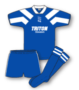 Birmingham City alternative home kit 1992–1993
The 92–93 season saw Birmingham City in a period of upheaval. The controversial reign of the Kumar brothers (and their even more controversial kits courtesy of Influence, the sportswear company also owned by the Kumars) ended in the Spring of 1993 with the arrival of new owner David Sullivan and the appoinment of Karren Brady as MD. The unpopular ‘paintbox’ home kit, supplied by Influence and worn for the majority of 1992, was quickly ditched and replaced for the last two months of the season only by this dynamic little number. This ‘stop gap’ kit featured large white shoulder panels and no manufacturers logos and was worn in the crucial 1–0 win over Charlton in the last game of the season that ensured the Blues avoided the drop to Division 2. The club badge and Triton Showers logo appeared centrally. No replicas were produced. 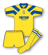
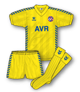
Birmingham City alternative away kit 1992–1993
Birmingham’s 92–93 white away kit was also abandoned during the takeover and was replaced by this simple yellow and blue version of the temporary home outfit. Again, the outfit featured no manufacturers’ logo. This kit was mistakenly identified in TRUE COLOURS Volume 1 as a third kit for 92–93.
Wigan Athletic kits
 Wigan Athletic third kit 1998–1999
Adidas’ arrival at Wigan in 1998 brought along some splendid outfits but one that slipped through the net in TRUE COLOURS Vol 1 was this seldom worn all-green third kit that featured in the 98–99 season. The style mirrored that of the club’s regular strips of that season with the exception of basic adidas shorts and socks that were favoured ahead of the slightly more elaborate designs that formed part of the home and away kits – perhaps the outfit was produced in a rush to meet a problematic fixture? The shirt was worn in a 1–0 defeat to Manchester City although interestingly when the two clubs met again the 2nd leg of the play-off semi-final Wigan opted for their standard white away shirt paired with the blue home shorts.
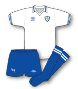
Sheffield United kits
 Sheffield United third kit 1979–1981
The Blades’ first Hobott home and away kits (as documented in True Colours) in all honesty did not provide a satisfactory solution to colour clashes so it was not a surprise when I discovered that the club also donned an all-yellow version of the strip during this period. It made an appearance away at Brentford in the 79–81 season, a match that United won 2–1. Incidentally, what happened to Hobott? They really were the masters of lower league kits in the 80s. If anyone knows drop me a line.
Crystal Palace kits
 Crystal Palace away kit 1985–1987, correction
Contrary to popular belief this dynamic mid-80s Hummel Palace kit was actually trimmed with blue and not red as I (and Eagles expert Andy Burton) had illustrated it. The proof came during the club’s shirt parade at Selhurst Park a couple of years ago when loads of old shirts were modelled on the pitch.
Coventry City kits
 Coventry City alternative home kit 1981–1983
Highfield Road must have been a very interesting place to be a kit man in the early 80s. Not only was there the issue of Coventry’s provocative Talbot shirts and their tamer alternate non-sponsored versions (for televised matches) there was also a second alternate home kit. This shirt was worn to combat the problem that occured when the plain white backs of the first alternate shirts caused a clash with teams playing in white (such as Ipswich Town and their away kit of the time). The second alternate shirt was similar in design to the non-sponsored jerseys but was predominantly navy blue. Interestingly, the backs were sky blue.
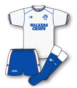
Newcastle United kits
 Newcastle United third kit 1987–1988
Until relatively recently Newcastle have always been remarkably frugal when it came to different kits. They were quite happy with just their famous home black and white stripes and an away kit. However, in the late 80s their silver away kit caused an issue at an away game at Luton Town. Most likely under the discretion of the referee it was deemed that both United’s kits clashed with Luton’s white jersey. Instead this mid-blue makeshift number appeared. It was a standard shadow pinstriped Umbro affair of the time and was worn minus club badge but including the logo of shirt sponsors Greenalls – the pressures of commercialism taking precedent over club heritage even then!
Ipswich Town kits
 Ipswich Town away kit 2006–2008, correction
This kit was actually comprised of a white shirt and navy blue shorts and socks – not black. White change shorts and socks were also worn.
 Ipswich Town kit third kit 2006–2008
A kit that missed inclusion in TRUE COLOURS VOL 2 due its emergence after the publication deadline was this Ipswich all black third kit. The design followed that of the white away and featured an identical neck design paired with white piping. The shirt was called into action in 06–07 for the 3–1 defeat at QPR and the 1–1 draw at Leeds that virtually condemned the Elland Road side to relegation.
 Ipswich Town kit away kit 1986–1989
The very swish red version of adidas’ last set of kits for Ipswich actually featured a blue stripe inbetween the white stripes on the sleeves and shorts – similar to the style favoured by the French national side.
Republic of Ireland kits
 Republic of Ireland away kit 1997–1998, correction
Ireland’s away kit for the 97–98 period was actually a remarkable combination of orange, green and black – not navy.
Derby County kits
 Derby County home kit 1978–1981, correction
This classy Le Coq Sportif home kit was actually white and navy and not white and black as depicted in TRUE COLOURS 2. It was a very dark shade of navy however! This was one of the first Le Coq Sportif shirts to appear in the English game and was a taste of what was to come in the 80s.
 Derby County away kit 1999–2000, correction
Puma’s 99–00 away kit for the Rams was navy (with a very subtle hint of purple) and not the solid purple shade included in TRUE COLOURS 2. 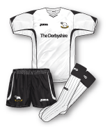
Derby County special kit 2006–2007
This kit didn’t make it to Derby’s section in TRUE COLOURS 2. It was worn for one match only right at the end of the 06–07 season in the Championship play-off final against West Brom. It was the last game of the Joma deal and the company obviously thought they’d go out with a bang in this all-or-nothing match by introducing a special, unique kit. It clearly did the trick though as the Rams won 1–0 with a goal by Pearson enough to clinch promotion to the Premiership.
More updates to follow shortly.
Very very slight tweak on the Watford away shirt from 2001-03. The Toshiba logo was embossed in red instead of white. Also, will you be doing a history on Celtic & Rangers? I can send you a PNG rendering of my own if you like. No Rangers though I do have a good memory on what they wore from 1980.
Keep up the great work!!
Thanks for the note Gareth – much appreciated. I do have a complete set of Celtic & Rangers and hope to get them online at some point soon. Thanks again!!
Hi John, loved the books, hope you can update in print some day! Couple of Chelsea notes, 77-8 yellow away with blue trim only ever worn with yellow shorts, 78-80 yellow with green trim only worn with green shorts. Home 91-3 kit changed back to our beloved white socks (with red and blue trim tops) for the 92-3 season, and ever since, hurrah! Home 2001-02 was worn v Hapoel Tel Aviv without logo so as not to offend the away team (just offend our fee paying sponsrs instead, well done, AND we lost). Regards. Nik
Exellent books and website! Would just like to point out one thing, the blue Northern Ireland away kit launched in 2006 was worn with navy shorts and socks, rather than blue as depicted in volume two. The navy socks were also worn with the home kit on at least one occasion.
Thank you Andrew for your kind words and the tip about the Northern Ireland kit. I have got a revised version of the illustration all lined up and must get round to adding it. The reason for the error was that the kit had been launched just as the deadline for the book’s artwork was due and for some reason I couldn’t get a pic of the shorts. Thanks again.
Hi John
Simply amazing site and ive got both editions of the book! I am a collector of over 250 shirts and use your book as a reference. I am a Spurs fan and have most shirts from 91 onwards. I have also managed to acquire every england home shirt since Italia 90! Got some amazing shirts from Europe and internationals.
Please do take a look at my fansite if you have time and keep up the amazing work as it is what i refer and base my collection on!!
All the best
RICH 🙂
Hello Rich – thanks for your comment and kind words. Much appreciated. I’ve had a look through your site and you have an amazing collection. If anyone else is interested Rich’s site is:
http://www.richpfootyshirts.webs.com
Thanks again, John
After reading your book ive seen a a few errors with my team Norwich
Norwich’s 1992-94 shirt (egg and cress kit) had Mitre badges on it From January 1994 to the end of the season. These replaced the Ribero ones
The 1999-01 home kit was Manufactured by Alexandra plc not patrick as your book states – patrick supplied training wear only from 2000-01
The 1999-01 away kit (white) was actually launched as an away kit in 2000-01 and was again made by Alexandra plc
The Blue pony 3rd kit from 1998-99 was worn as the away kit in 1999-2000
The Chelsea third kit 1990–1991
was also worn in their League Cup Semi Final defeat at Hillsborough
The good old days, when third kits were exotic things that were only made known to the wider public when they randomly popped up on Sportsnight!
Fulham had a couple of yellow away shirts from 87-90 both worn against brentford for sure..
87-89 was plain yellow with broad shadow stripes .. badge in the centre and no sign of a manufacturer badge
89-90 was same design as home/away.. yellow with black collar/cuffs.. no black side panels though..
Isn’t that yellow Fulham kit from the late-80s, Tony, the one John found a picture of in an old programme a few months ago?
I think he did a write up somewhere on the site…
Or am I getting mixed up?
To slightly amend your reference to Ipswich town’s 06/08 white away shirt. 2 different white socks were worn with this shirt. firstly at Southend in 06/07 the 03/04 third socks were worn and there after the 00/02 socks were worn in the event of a clash. The white shorts worn with this shirt were the 03/05 home shorts. I presume no other reverse style of shorts and socks were designed as in season 07/08 Ipswich went to mitre for the home kit but the punch kits were still retained instead of mitre producing it. I’ve been busy Jon but i will still email you more of Ipswich’s mix and match kits when i can.
Also the 03/05 white home shorts and white 00/02 away socks were used with the 06/08 black third shirt.
Picked up volume 1 recently. Excellent. What edition of each respective volume are we on at present?
Yes John any plans for any new volumes ? or are there no publishers willing to back you ?
was watching premier league classics and was surprised to see manchester united playing in their reversable gold third kit during a 3-1 loss to arsenal at highbury, despite you saying it was only worn for a 0-1 loss, (i had the urge to look it up for rememberance purposes when i saw it and noticed the error lol)
im wondering if this is a error of appearances or scoreline, im going with the latter since you mention arsenals score in the away position, and why would united change at home to gold,
arsenal did of course beat united at away that season (01-02) and played in gold themselves for that game (the shirt with the sega logo)…won 0-1 and won the premiership that day from under uniteds noses, (it was also the year of their unbeaten season)
so im assuming that you just have the wrong game from that season lol
http://www.stokecityprogrammes.co.uk/view_prog.php?progID=108968
Found this blue Charlton shirt.
The Middlesbrough sky blue/navy shirt was worn from 1984/85 .Sponsored by Hansa .
http://football-programmes.net/view_prog.php?progID=85367
Found this WBA shirt that’s not in your book John. Did they not have the red away shirt in 87/88 ?
http://football-programmes.net/view_prog.php?progID=36117
Also Bolton had a red third shirt for 86/88 to cover their sky away shirt clashing with Bristol Rovers.
i am searching for a 1992 Birmingham football club home shirt , has anyone any idea where the best place would be to look ? i know its a long shot !
hi can anyone provide me with a picture of a gillingham fc away kit in the 79/80 or 80/81 season . This was a red and white 1/4 shirt , it was only worn once due to the colours running and it was an adidas kit worn v Colchester (away) thank you .
Sounds interesting Derek! I’d say your best bet might be to see if it was possible to find the programme from Colchester’s next home game after that as it might have a pic?
Gillingham away in 80/81 was a plain red adidas v neck shirt so that shirt Derek was probably 79/80.
Man City Away 1989-1990 is missing. Was a mixture between the Grandad striped shirt (1988-1989) and the the maroon away (1990-1992).
Daniel I have found 2 sites that show the maroon & white striped Grandad away shirt shirt as 1988-90 and the all maroon shirt from 1990-92. What shirt are you referring to? Can you describe it?
This was one mentioned (but not shown) in TC1 – early in the season City were told that the striped kit would be problematic against teams who had a lot of white.
They wore yellow at Arsenal, losing 4-0, and chairman Peter Swales apparently burned it. They then turned out in an all-maroon version of the grandad shirt.
Indeed here is the all maroon Man City 3rd/4th kit worn with the away shorts and socks at QPR im the 89/90 seasom. I would guess they wore this kit at Sheffield Wednesday too, but can’t find any pictures/videos to confirm this.
http://youtu.be/szHQMsrrijs
Presumably so, Jon – discussed here http://forums.bluemoon-mcfc.co.uk/threads/city-in-yellow.183142/
Hello everyone, found these two examples of wearing the kit on you tube: https://www.youtube.com/watch?v=KBLei3cCTFs v Milwall and QPR: https://www.youtube.com/watch?v=szHQMsrrijs
that Millwall video was probably the last time an indirect free kick was giving for obstruction in the box !!
Here’s a picture of the shirt in question:
https://www.flickr.com/photos/26456071@N03/2960069498/
Personally, I think it looks even better than the 90-92 shirt that replaced it – the granddad collar makes it.
Glad to see Man City going back to a similar badge, never took to the once in current use, mostly due to the stars
It was a bit, erm, fascistic for my liking…The round one just seems more ‘traditional’. The same as QPR – this shield nonsense has always looked cheap and wrong to me. It should always be interlinked letters – the mid 90’s version was the best for me.
Hi, referring to the Newcastle third kit vs Luton Town in the article, do you have a close up view of the GreenAle’s Beer font and logo as i do happen to have the blue Umbro template and wish to repro the logo and stick on the shirt. Kindly advice. Thanks
Can ANYONE tell me about the Cameroon kit they wore in the friensly v England in 1991? It looks like Adidas shorts but Umbro shirt! Even watched it on You Tube and sure not Adidas shirt. Anyone..
Yeah, seems to be same as Wales shirt of that time – perhaps their real ones were mislaid and the FA came to the rescue? That happened Ireland twice in World Cup 94 qualifying:
I remember, as a six-year-old, being quite offended by the fact that Cameroon’s players were wearing squad numbers despite the fact that the World Cup was over with seven months.
Ireland beat Wales 3-0 the same night in the snow, an orange ball was used.
Sorry, here’s the link to Ireland’s hospitality: https://museumofjerseys.com/2016/03/31/nothing-like-an-irish-welcome-twice/
I remember that snowy night against Ireland at the Racecourse, we were rubbish and were deservedly beaten. Who’d have thought just a few months later we’d beat the then-world champions Germany in a thrilling Euro 92 qualifier?
Also noticed Cameroon’s goalkeeper wore an adidas shirt in that game mentioned, similar design to that worn by Goycochea for Argentina in the previous year’s World Cup
Thanks people! I thought I was going insane! I always remember it as a kid. I think the ‘missing kit’ theory is probably the correct one. I wondered what happened to the shirts? Probably worth a few £. Thanks for the Ireland articles too. Great read.
The Wolves kit was never a third kit. They had a gold home and sky blue away. The same design. Wolves didn’t enter the world of third kits until the 2000s
Thank you Colin – yes, I realised I made a mistake there
Further to the discussion above about the Cameroon kit v England from 1991, seems they had a random Adidas training kit when they played them in 1997 too! No Badge or anything! Check it out here: https://www.youtube.com/watch?v=hbqPVHk0Tow
Great spot Daniel, had totally forgotten that – that style was six years old by that stage!
Indeed – the shirt itself resembles the Liverpool away shirt from the 91/92 season.
Got a feeling that they must have had the same kit trouble as their World Cup 1998 kit was made by Puma…if I recall! Also, does anyone know why West Germany Away kit had a collar on before the World Cup and then (sorry to bring back memories) had no collar against England??? https://twitter.com/classicshirts/status/685219672053182464 and then https://www.vintagefootballshirts.com/products/1988-91-west-germany-away-shirt-m/15392
Also, does anyone know why West Germany Away kit had a collar on before the World Cup and then (sorry to bring back memories) had no collar against England??? https://twitter.com/classicshirts/status/685219672053182464 and then https://www.vintagefootballshirts.com/products/1988-91-west-germany-away-shirt-m/15392
I’ve only ever seen the collared shirt with long sleeves, as used in Finland in a World Cup qualifier in 1989. I’m not sure if the collared shirt was only available on the long sleeve option, and just a v-neck for the short sleeve option, or just another one of adidas’ inconsistencies with player issued kits in the late 80’s/early 90’s.
Even the replica away shirt was a lot different in that the design seemed to have more white in the pattern, and had a black DFB badge instead of a white one used on the player issue shirts. The Dutch shirt of 1988 (similar design) also had the same fate where the replica was a lot different to the player issue (especially the badge).
Also – that shirt on the Vintage Football Shirts link appears to be a replica. Compared to a player issue shirt the design has more white in it, the DFB logo is in black (rather than white) and the adidas logo is larger, missing the registered trademark logos and is probably made of ironed on “puffed up” transfer material, which adidas (and many other shirt manufacturers) tended to use on replica shirts at the time.
i do believe that Denis (at least i think its Denis i could be wrong) covers some of those enormities on his blog, im sure i saw a post their detailing it or something along those lines
German GK kits i definitely saw
The Germany away with the pattern as also used by Holland was first used in 1988 with a collar; the unusually long lifespan (until 1991, maybe later) means that the collar changed in its lifespan, common with a lot of strips at the time. There may have also been variations in the pattern. Even the home, introduced for Euro ’88 and used in Italia ’90, went through slight variations in its lifespan.
I was beginning to wonder if the comments section had been disabled on here, six weeks since the last post!
Summer football break, and in a year with no world cup or euros to talk about …..go figure
Time to raise this comment stream from its slumber……
Celtic played Hibs at the weekend and of course Hibs wore their away kit to avoid a clash. Now, bearing in mind that both of Celtic’s away kits are green, what will the wear when they visit Easter Road? I’m sure that Denis, Simon, Andrew etc must have thought similar so I’m keen to hear what they have to say……
Time to wake this comment section from it’s slumber……
Celtic v Hibs at the weekend – Hibs quite rightly changed to black away strip. Looking for comments from Denis, Simon, Andrew etc to see what they think that Celtic will wear at Easter Road seeing that both of their away kits are green…
I think the third kit, its lightest of the three and offers the most contrast (if its not a sunny day, which it won’t bee)
not that its a guarantee the mens game will follow suit but the Ladies teams’ met at Easter Road the other night, Celtic wore their light green third kit, however, a couple of months ago the Ladies sides also met in Edinburgh with both teams in change strips, Hibs in black and Celtic in light green.
having seen a picture of the game there is just about enough contrast however its not great with Hibs being in emerald this year again, if we were bottle green it would have been better, like 2006 when Hibs had an all bottle green away kit and wore it at Celtic park with Celtic in hoops without an issue.
a crazy situation to have with them having 3 kits that have green in it!
was it not only a 4/5 years ago Celtic had to come up with a 4th kit (which was the previous seasons change kit) in a European game as all their other kits weren’t deemed suitable?
Before that game, the clubs meet in a league cup semi-final, in which I’d imagine both will change.
so with volume 3 on its way thanks to John’s Twitter account which clubs or countries do you think will be featured ?
Celtic and Rangers I think will..
It will be updates of the existing Clubs won’t it? I’d love to see Luton, Oxford & Wimbledon from the 80’s
Well since vol 1 was then premiership and vol 2 was championship, vol 3 should be league 1
With an update section for the clubs/nations already included instead of a national section, that would be the ideal scenario for me personally