On a recent visit to Sven’s excellent www.footballshirtculture.com site I was very interested to see what appears to be the 08-10 Liverpool home shirt. Its certainly a good looking adidas design and in my opinion one of the best the club have worn for many years, but one aspect of it made my heart sink a little.
Firstly, I must lay my cards on the table. If you’ve read a little more about me elsewhere on the site you will see that I am a Liverpool fan of old. I guess I stopped following them fanatically in my teens when I felt a bit of a fraud supporting a team I seldom saw play and that were not my local side. So although I no longer shed a tear when they lose, theirs is always the first result I look out for on a Saturday at 4.45 (older fans pre-Sky will know what I mean here!)
OK, that’s that out of the way. My work studying football shirt history over the years has led me to several conclusions: clubs have always changed their kit on a regular basis, some third strips are unnecessary (!), if you’re wearing a good looking kit it can have an influence on the pitch and that a change of sponsor/manufacturer/design CAN improve a club’s fortunes.
One of the other revelations I have also uncovered concerns Liverpool’s apparent inability to win the league title – an achievement that has escaped them for almost 20 years! Sure there have been several notable cup wins along the way, but not the elusive honour that confirms a club are simply the best in the land. The reason for this ‘failure’ in my view is not down to an aged team that has not been updated/refreshed (as was often the argument post-Dalglish) and its not down to any rotation systems. No, in my opinion the failure is, in part at least, down to the Liverpool crest that appears on the hallowed red (and sometimes white, yellow, green or black) shirt.
 I’m sure you’re all familiar with the current rather elaborate shirt crest which has gone through several minor cosmetic changes since it was initially introduced in the 92-93 season. Liverpool last won the title in 89-90 when the club shirt (which at the time was the infamous paint splattered affair, but don’t let that dilute my argument!) featured a simple Liver Bird surrounded by a relatively simple and traditional crest that had replaced the classic icon of the Liver Bird standing alone above a base of ‘L.F.C.’ in 1987. Strong, direct, dynamic and to the point, with the club’s symbol or identity instantly recognisable and on view clearly and simply.
This identity is now hidden and diluted within a couple of shields, the Shankly gates (emblazoned with the ‘You’ll Never Walk Alone’ legend and second minature version of the Liver Bird badge), and the Hillsborough eternal flames all wrapped up with a hefty dose of scrolls. Of course I fully appreciate the significance of the flames and that is something, I believe, must not be ignored. But I do think the current badge is too wrapped up and lost in the past and the mythology of the club. It is not the crest of a forward-thinking and dynamic club. The strength of Liverpool FC has been its football and its identity – familiar and recognisable and perfectly epitomised by the peak teams of the 70s and 80s that were led and accompanied by the strong Liver Bird logo on their chests – it symbolised the team and the way they played football, the club and the city. It also instilled fear into the opposition.
Design trends come in circles and now many clubs are switching to streamlined and powerful badge designs to adorn their shirts. These badges enhance the brand identity of the clubs in question by being clearly recognisable – even when viewed at a small size in a newspaper, magazine or at the match itself. They also lend themselves easily to being rendered in virtually any colour combination. I think its time for the cumbersome and intricate badge to be phased out.
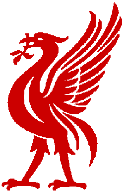 A large faction of Reds fans have been campaigning for a return of the iconic Liver Bird badge and occasionally pre-season fake shirts appear with it in place, but sadly it has yet to make a return. It does still re-appear in a part-time capacity though when the club are playing in a major cup final. Eagle eyed supporters will remember that it appeared in yellow (alongside the regular club badge and Reebok logo), slap bang in the middle of the shirts worn in the glorious Champions League final against AC Milan in 2005.
Cup wins aside, is it a coincidence that the club has not won what is rapidly becoming its ‘Holy Grail’ – the league title – with the elaborate crest spearheading the club on their jerseys? Don’t get me wrong, nothing would make me happier than for the club to clinch the title next season in this splendid new adidas jersey complete with the current badge but I believe a change is needed.
Obviously a badge/crest can’t win matches on its own but as a graphic designer and football shirt historian I believe it can inspire and influence and perhaps thats what the club needs right now.
Yeah,
I grew up like you following football in the 70s’ & 80s’,
therefore have tended to prefer the modern kits not the
crew,v-neck designs Liverpool had in the 70s’, enjoying instead the pinstripe affair, the 1st adaidas( still with the
iconic badge) and the adidas kit prior to the Carlsberg contract ( and new badge to celebrate their centenary).
I agree the old badge on the new 208-2010 kit would look so much neater, the current badge just looks clumsy and awkward. By the way anyone know what the new away & third kits will be like this season.
Cheers Nicholas for your comments, I’m glad there are other people who feel the same as me about the Liverpool badge. I’m not suggesting for one minute that the side would win the title with a simple Liver Bird on their chest but I do think it may, just may help. Everyone knows the fear generated by the ‘This is Anfield’ sign down the players tunnel! As for the away & third kits, I believe the away is grey (a no-no in my book) and the third green.
As a Liverpool supporter for more than 35 years, I completely agree with you. One of my personal hates – and I know this is shared by many reds – is the club crest introduced under Parry’s regime. The current monstrosity is messy and over fussy – why the need for the Shankly gates, two flames, Est 1892 on our badge? Bizarrely it also features green – not an LFC colour. I do think there is a place for one flame somewhere on the badge, but placed discreetly.
Thanks Mike – I really appreciate your comments. I think your suggestion with the Liver Bird and one flame is absolutely spot on. By simply focussing attention on the Liver Bird and flame is actually (in my mind) a more apt and respectful memorial to the tragedy of Hillsborough rather than dressing it up and submerging it with the gates etc.
I grew up following the club during the late 70s and through-out the 80s. For me the red ‘Hitachi’ shirt and white away kit are Liverpool Football Club. The only time we should ever deviate from this is when playing away at Southampton, Sheffield United or Athletico Bilbao and then we should wear yellow.
That’s Liverpool, that’s what we are… not green or grey or black.
Equally we are the Liver Bird, that is our club badge and it is as much a part of the identity developed by Shanks and matured by Paisley as any other aspect of the club.
I’m pleased to see a certain acknowledgement of this on the new home kit in that the golden Liver Bird crest has made a return, albeit on the back of the shirt between the shoulder blades. Certainly a step in the right direction but not quite enough to appease this old timer. We should drop the current ‘club crest’ altogether and replace it with the golden Liver Bird, stood over the LFC initials and next to one eternal flame. I saw pictures of what turned out to be a ‘fake’ shirt prior to the last home kit launch that had exactly this. I can’t help but wonder if these pictures were in fact not of a ‘fake’ as such but maybe a design ultimately rejected by the club/Parry.
Many lower league clubs allow their fans to vote on a select range of shirt designs to pick the one most favoured by those that actually by these things. For the life of me I cannot understand why every club in the land doesn’t do this. They want their fans to buy their shirts for obvious reasons so why not court the opinion of those that will ultimately be pulling out their wallets to buy these things.
Had two variations of the new home kit for next season been put to the vote on http://www.liverpoolfc.tv – one with the standard ‘club crest’ and one with the kind of ‘badge’ I’m suggesting… I’m pretty sure which design would have gained the majority fans vote. Unfortunately, Rick Parry and/or whoever else currently makes these decisions on behalf of us, the fans, doesn’t appear to think in line with the majority.
I always thought it was madness to attempt to incorporate the Shankly gates in the crest – if you want to complicate things even more, isn’t there an argument for including the Paisley gateway somewhere as well?
During the 70s and 80s there was an aura about Liverpool. Part of this was the simple Liverbird crest above the LFC initials on the shirt in either white or gold.
It put the fear into other teams.
Sadly, the club has lost some of this mystique over the past 15 years or so, but the restoration of the traditional badge, next to one eternal flame, would be a real message we were serious about being successful again.
But I’m not holding my breath bearing in mind the current shower in the boardroom.
The current crest should be dropped for a return of the old Liverbird which currently stands as a smaller version inside the current crest, this should be returned with L.F.C. underneath just like the old days when the club was the best in Europe. The two Hillsbrough eternal flames should be placed at the bottom of each sleeve just below the Premier League/Champions League badges.
Spurs have gone back to a retro style crest this season which looks very neat. Just a simple cockerel with the words “Tottenham Hotspur” underneath. I reckon Liverpool should do something similar. Have the traditional Liverbird with “Liverpool Football Club” below. Put a small flame between the chest and foot of the bird. Have it in just red and white (or possibly gold)
I think the two flames were for Hillsborough and Heysel. But yes, agree that a new(old) crest should be brought back. Spurs have done it well in my view. C’mon Liverpool, its time….
Nice one Jimmy – do you know what, I’m almost embarrassed that I didn’t realise that, of course, the other flame must be for Heysel. Seems so long ago now – I remember the game very well. I don’t seem to remember the club actively promoting the fact that the flames were memorials for Hillsborough and Heysel – do you know if they did?
Hey have a look at the current France national shirt,the cockeral is now very sleek looking and niceley embroided,is it now not time for Liverpool to do the same,and get rid of the boring mess they have on their shirts now.
Just a nice sleek and simple Liverbird with 2 flames either side and perhaps 5 stars around the neck a la Germany or even a european cup embroided on to it somewhere like AC Milan in the early 90’s?
Hello Phil – thanks for the comments. You’re dead right about the French shirt – the styling of the cockeral works really well and I think it just goes to highlight how incredibly strong the Liver Bird would look back on the Reds’ shirt. I’d LOVE to see that badge back.
John, love the books, just found the website, and I’m in trouble, it’s already 1:10 in the morning, I’ll be up all night checking it out! This is what the internet was invented for, thanks Al Gore.
I’m a Liverpool fan of 35ish years, totally agree with your points on the badge; we also need to change back to the red goalnets, remember how great they looked in front of the Kop?
Great stuff, I’ll be back
Thank you Rob – good to hear from you and glad you’re enjoying the site. I know changing the badge is not the only thing that needs to be looked at but I know many Liverpool fans agree with me that it would a really positive step in getting the glory days back to Anfield. Hope to see you back here soon. Cheers John
dear friends i agree 1000% to liverpool change the crest back to the pre 1992 . i have allready create a club in the facebook the name is : WE WANT LIVERPOOL FC USE AGAIN THE PRE 1992 TEAM BADGE. i hope and i wish to join my cause to help Liverpool return back to the glory days
Thanks Panos – good call. Just seen the 09-10 kit (supposedly) pics that are knocking about online. Still no Liver Bird on there!
Intersting read! Never really thought about the crest like that but looking now it does seem overly fussy! Take the green away from it and a nice classy red badge would look much better, the new kit has the same badge so I doubt anything will be changed for a few years yet, unfortunately.
Thanks Anfield Tour. I wrote it as a long term Liverpool supporter and with the best intentions. I have had a bit of stick for the article but I really believe in it. Funnily enough I was only thinking about the new kit today and wishing it had a simple Liver Bird badge back. I really think it would be a positive step in bringing the glory days back to Anfield…
You might be also interested in this article I wrote for Mud Sweat Badges about a memorable incident in my life regarding Liverpool kits: http://mudsweatbadges.co.uk/
Great article John and some superb points raised in the comments.
It’s been bugging me for years.
I noticed the new Liverpool kit has finally used the simple Liver bird badge but it’s stuck on the socks not the shirt.(!)
It’s even got a ® next to it so it’s now a registered trademark.
http://www.prodirectsoccer.com/prodinfo.asp?DPID=PDS-010-001-470&BRAND=0&SS=1&GROUP=PREMREP
An easy solution to all this would be for Liverpool to do a Rangers FC.
Rangers have an ‘ornate’ club badge used for club branding and use a simplified badge on their shirts.
http://www.rangers.co.uk/page/Crest/0,,5,00.html
http://www.rangers.co.uk/page/Shirt/0,,5,00.html
Liverpool’s case would be similar.
Rather than wreck all the ‘brand awareness’ they’ve built up over the past ten years by getting rid of the ornate crest, they could continue using the ornate ‘bells and whistles’ version on club branding exactly like now but change the green to RED.
And on the shirt use the registered trademark simple Liver bird badge.
They could even have the ornate crest, with red not green, on the shorts if need be.
All bases covered, Liver bird back on the shirt, green removed from the badge, most fans happy.
Do a Rangers FC!
What an amazing article.
Simplicity Is Bliss!!!!
Well done John.
Totally agree..we need are beloved bird back on it’s own…the 90s crest is a bloody disgrace it’s not Liverpool it’s crap …parry moores etc etc ruined our club an thought of there own financial gain…let’s get the old Liverpool back long live the king…
Thank you Tony – I don’t know if you’ve seen the new Scotland shirt, its brought back the crest from the 80s so you never know, the Liver Bird may be back soon in all its glory. Fingers crossed…
You’ll be happy to hear John that people who have seen the new Liverpool/ Warrior kits are reporting that the club have reverted back to the simple LFC liver bird on the shirts. Eternal flame moved to the back neck, collar. AT LAST!
REALLY?! Thats FANTASTIC news! Thats really made my day Dave. Thanks for letting me know. Can’t wait to see them. Do you know whos seen the shirts?
It’s the usual kit ‘in the knows’ on RAWK -lfc forum- who’ve seen the kit samples early.
Simple crest going to be used on the training gear too.
Home kit all red, minimal white. Liver bird logo. Flame on back.
Finally!
I totally agree. the LFC should change the color of the shirt and the logo as if in the 70’s and 80’s. Please Please do it for LFC.
The new kit is retro design! Looks alot like the succesful kits of the 80’s! Hopefully I can witness a league success for the first time now, instead of the stories from my Dad!