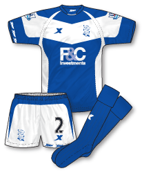
 Birmingham prepared for 2010-11 with the announcement of a new kit deal with Chinese sportswear manufacturers Xtep. The club previewed four designs and asked supporters to vote on the one they preferred. Faced with some simple, clean designs fans, bizarrely, voted for this strip. Although it carries on some degree of tradition by featuring a large expanse of white on the kit I can’t help but think that the designs is just too full-on. One rejected design was virtually identical to this but with the broad white V removed and in my view this would have been a better choice. One element I do like is the inclusion of small Xtep logos on the cuff of the right sleeve and the left leg of the shorts. Although the original illustration of the kit showed blue and white socks, for some reason the final versions worn are just plain blue.
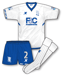
 Perhaps as a reaction to the somewhat over the top flamboyance of the home shirt the away couldn’t be much simpler. Just an elegant pointed V-neck and the merest of blue trim under the arm adorns this jersey – apart of course from club badge and sponsors logos (including the small Xtep marques on the sleeve). Plain blue shorts and white socks complete the outfit although the shirt has already been worn with the white home shorts, creating a rather unbalanced combination.
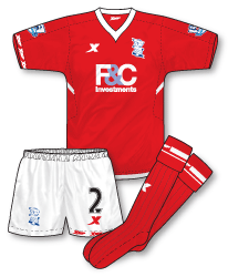
Given the amount of white on the home shirt and the plain white away, there is clearly a need for a third kit. Rumours are that it will be red but no confirmation of this has yet been announced.
 STOP PRESS – Although at the time of writing (August 2010) no official announcement about the third kit has been made evidence on the Premier League website shows how it will look. Its essentially a red version of the away kit.

Agree with you on the cuff logos thing. I think its a nice touch, original and good looking…
As a kit manufacturer new to the Premier League I would have thought Xtep would have wanted to stamp their identity onto a kit. Instead this just seems a bit of a mishmash of styles.
Not doing it for me i’m afraid.
I’m a Birmingham fan, and I can’t be doing with these kits.
Believe it or not, many Birmingham fans on message boards have been claiming that Aston Villa infiltrated the vote on the official club website and voted for this kit because it was the worst one!
Typical that we lose Umbro just at a time when they are producing some of the best kits in the country.
In a recent pre-season friendly with MK Dons, we wore change shorts with the home kit, and maybe it’s just me, but I think it looks better.
http://www.gettyimages.co.uk/detail/103218003/Getty-Images-Sport
The away kit isn’t too bad, I suppose, at least it’s a simpler design, but the collar just looks awful in person.
Yeah, the rumours of a red third kit are going around, and it is needed for the match at Ewood Park. I suppose when we play at the Hawthornes, we could get away with wearing the white away kit.
I may be totally wrong, but I think the reason why the club haven’t announced anything is because fans haven’t had their home or away kits delivered yet – and maybe releasing information on a third kit would rub people up the wrong way. I’m just guessing.
Although, there are rumours that the red third kit will not be released, and will just be a one-off strip for the Blackburn game later in the season.
I’m very dissappointed with Xtep. Call me a snob but I just wish we had Nike, Umbro or Adidas. But, alas, we are stuck with these guys for the next five years!
Not a bad first effort from Xtep, perhaps an evolution in thinking from last seasons shirt, but still not a patch on the Umbro designs.
Be thankful that you haven’t got the awful LiNing the other Chinese manufacturer that has arrived in europe this season. the Celta, Malaga and Espanyol shirts have been ruined by them.
Interesting views…Eric, you make some fascinating points (especially about delivery of replicas and the third shirt mystery) and I’m glad its not just me thats questioning how this kit was chosen. And Mark, your description of it as ‘a mishmash of styles’ is absolutely spot on.
Birmingham has got a third kit of red, white, red, based on the away template. You can see it in the Premier League’s Official Handbook 2010-11 which can be downloaded from the Premier League website.
Great tip Martinos! Thank you, the handbook can be downloaded here:
http://www.premierleague.com/staticFiles/4f/53/0,,12306~152399,00.pdf
Maybe you should get in touch with the handbook and provide the artwork from now on John.. What a mishmash of styles and none are good..
Thanks for that, Martinos, interesting stuff.
Yeah John, as tony said, you should do the illustrations for them. Yours are so much better it isn’t even funny. And this is an official Premier League document!
By the way, has anybody seen the descriptions for Chelsea’s goalkeeper kits? The home is described as “slime with black trim” and even better is the third, which is descirbed as “warning with black trim”.
WARNING!?
My initial thought on seeing this kit was ‘busy’. Was the original draft submitted in crayon on orange squash stained paper? It’s like the designer got so excited at being given the job that he was determined to include all of his favourite kit features in one, lest he never get the opportunity again…So he laboured all day, even missing playtime, concentrating very hard not to colour outside the lines, tongue sticking out the corner of his mouth until at last he could sit back and relax with a dairylea (other cheese triangles are available). I can see his boss smiling weakly, patting him on the head (possibly telling him to go wash his hands) and then handing the away kit to someone a bit more grown up…
Everywhere you look there’s detail!
The away kit is very nice though…very calm and stylish.
One more thing to add, which I forgot in my previous post.
At the time of the kit revealing, the Birmingham Managing Director said in a local newspaper that the away kit was going to be the exact reversal of the home kit.
They must have changed their minds.
Birmingham’s home shirt is rather overdesigned in my opinion, though the white V does relate to some point in the club’s history, when they wore blue shirts with a white V in the 1920’s.
I did see the kits they put up for the vote and they were all rather uninspiring to be honest. I’m sure if Xtep had put another option for the “Penguin” shirt then that would have been a clear winner. The away shirt isn’t too bad, though the collar looks like it was half-inched from a Puma design from last season.
I’m thinking the red third kit will be used at West Brom.
Oh and yeah I read that Premier League handbook and I agree with EricGeneric about some of the kit colour descriptions. That “warning” colour for Chelsea’s third choice goalie kit was the in-your-face orange strip that Petr Čech first wore in the 08/09 season, and it has been retained for a third (!) season – he even wore it on the opening day against West Brom. And that third kit being described as “macaw” – I personally would call it “vomit green”. I also had to laugh at Bolton’s and Everton’s kit colour descriptions, for god sake keep it simple!
Thank you Tony – I appreciate your kind words!! Eric – love the Chelsea descriptions, where were they published? Jon – you’re right, overdesigned is the word. Maybe they were trying too hard? I wonder what the situation is with replicas, last I heard they were struggling to get them out.
They were published in the Premier League handbook, John.
If you scroll down to the information about each team, they have pictures of the kits, and underneath each kit there is a little description.
I’m a little surprised they don’t have pictures of the goalkeeper kits as well. I would have thought that would have been handy for the kit men.
In Australia we have a lot of really badly designed AFL and Rugby League kits and I have to say the first thing I thought when I saw that Home Shirt was that it was a bad Australian Rugby-League Kit.
The away and third kit (Not much help to a supporter) are a lot better, but really the club should expect more from its provider – this is the world’s most watched sporting league.
Hello Johnny, funnily enough I recently finished a small commission illustrating Australian rugby league kits so I know exactly what you mean!! Your last point is spot on…