 What caught my eye kit-wise this week was the varying fortunes of two European sides sporting outfits in unfamiliar colours on our green and pleasant pitches.
The first saw action at Old Trafford in the Champions League on Tuesday against Manchester United and belonged to the mighty Real Madrid. A simply beautiful kit honed out of one of the most unfashionable colours in football, green, but in a rich dark ‘Racing Green’ shade. So classy, its a really strong example of elegant kit design with adidas’ three stripes given more of a supporting role than usual thanks to being knocked back to a subtle silver. It also accompanied a controversial but valuable Real win.
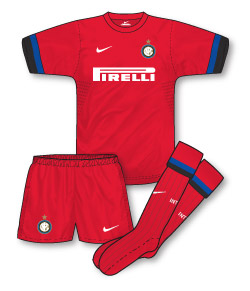 A couple of days later Inter Milan turned up at White Hart Lane for their Europa League fixture with Spurs carrying their all-red kit in their luggage despite their being no clash with Spurs’ white strip. Another good looking Nike kit, with simple but effective incorporation of Inter’s blue and black on the cuffs, it is one, however, that has become very unpopular with Inter supporters as of course it rather foolishly features one of the main colours of their bitter rivals AC Milan. Inter were well and truly beaten by AVB’s boys.
Interestingly, Real were reluctant to wear their green kit on Tuesday, which they have come to see as an unlucky outfit, and wanted to sport their famous and traditional all-white. This however would have meant Manchester United would have had to sport black shorts and socks due to the colour clash. Quite rightly, as the home side United refused to do this and UEFA forced Real to wear their special European change kit.
It was a very different story in London on Thursday however with, it appears, Inter’s kit choice governed by a simple desire to give exposure to their red strip in the hope of shifting a few extra replicas. Their comprehensive defeat to Spurs ensured this plan backfired somewhat.
Hmmm…is there a lesson to be learnt here when it comes to deciding which kit to wear away from home….!?
I don’t know why, John, but Inter wearing red really jars with me. It’s just wrong some how, even though the kit itself looks pretty good!
I found the shade of Real’s kit quite intriguing too. Not sure if I like it, but it was an unusual choice of colour that’s rarely seen, and I suppose Adidas should be applauded for their originality and creativity in that respect.
I couldn’t believe the amount of English-based journalists n Tuesday commenting on Madrid being in their away, or the fact that Sky Sports News felt compelled to put it near the top of their running order.
Real wore change kits at Old Trafford in 2000 and 2003, and, short of wearing dark shorts and socks with the white shirt for possibly the first time ever, what else would they do?
I agree Chris about the Inter kit – daft choosing red – has no Inter character about it at all.
Denis, I think the real story was that Real wanted to play in white and were a bit peeved that they had to change because Utd wouldn’t change shorts/socks but as I said above, they shouldn’t have to if they’re the home side.
I agree fully John, Real were very childish to expect to have the choice when they were the visiting team
I guess I’m the only one who thinks the Inter away kit is actually orange then…
I remember back in 91 when Arsenal played Benfica in the European Cup we wore the home kit in Lisbon , they wore their white away kit and at Highbury Benfica wore their red home kit and we had our yellow/navy bruised banana kit on.
Think the rules on colour clashes were a little different then,
I remember back in the ’09-10 season, Chelsea were away at Porto in the CL group stage and won 1-0. What was interesting from a sartorial standpoint was that both sides were in their change kits(Chelsea – white, Porto – orange). I think that while English elite sides now(regrettably) launch three new kits a season, the “third kit” is considered to be the only away kit that they wear in European matches(hence continental sides call theirs the “European kit”).
Interestingly, AC Milan consider white to be a lucky colour for them in European finals: they’ve won 6 out of 8 finals played in white while only 1 out of 3 has been won in the traditional red&black…
Did anyone see Lyon in their black kit when they played Tottenham in France a few weeks ago whilst Spurs wore their usual home kit.
The only defence of Real is that United’s official Home colours are red/white/black which you wouldn’t class as a clash with all-white. But they should know United like to wear white socks in Europe (is that actually the ‘official’ kit submitted to Uefa for the CL?) and I’m not sure if shorts clashes are allowed anyway. Bet the green kit sales are up now so it worked out pretty well.
Yes, it is the official kit submitted for Europe, the same way that teams like Marseille can make their third kit their European home and force teams who wouldn’t clash with all-white to change when there is an issue with the Euro kit.
I’ve noticed Inter have worn the previous away kit – white with a blue and black sash – whenever there has been a colour clash in Serie A this season. They did wear red at Udinese recently, so it appears the red kit has been “demoted” to third choice so to speak.
I do remember reading comments all over lots of football sites of Inter fans getting rather vocal about the red kit. Ironically I do recall Milan had a blue third kit in the 90’s which was equally frowned upon by their own fans. Tells its own story, whatever you do, don’t pick a change kit colour more associated with your bitter rivals.
Seen many cases of teams doing just that – might be good for another article!
Given that Real consider their third kit unlucky I can’t see why they didn’t just wear their away kit. As it is Navy Blue with Pale Green highlights this wouldn’t have clashed.
apparently red is the colour of the city of milan and the Inter owner Mr Moratti wanted to claim it for Inter. strange reason. i read this in either 4-4-2 or world soccer magazine earlier this season.
Yeah, I heard that too, Scott.
I think it was James Richardson on Football Weekly. I’m still saying it looks orange!
definately red. i should be getting a long sleeved shirt shortly. i have a few inter shirt and although red is milan’s colour i like the kit.
Interesting one isn’t it?
Re. Teams wearing colours associated with rivals – as a Bayern fan this is a familiar one – TSV 1860 Munchen have more traditionally played in sky blue, and blue (of various shades) has been used in our home shirts (even being the primary home colour in 97-99), as well as the gorgeous navy away shirt of 08-10 (which curiously was not too popular with a lot of FCB fans, maybe because of the blue connection). The reason for this is that Bayern consider themselves to be the team of all Bavaria (Bayern meaning Bavaria in German) and the blue diamonds from the club crest are from the Bavarian coat of arms. The red comes from one of the primary colours of the team who they merged with in 1909 (having previously played in white and black). I have always assumed that TSV’s colours come from a similar source, as blue is a prominant colour in the city crest as well. Interestingly, when Bayern wore the midnight blue kit in 97-99, they had to wear a one off all red kit to maintain traditional colours in the derby with TSV (in case anyone is wondering, it was the template with white side bars on the chest and the three stripes in red over the top – as used by Rangers in their home kit of the same period).
mind you we only have to look at both manchester clubs. both clubs fans like the away kit to be the colour of their rivals(city red/black stripes, united blue).
Inter have kept the white shirt with a Blue and Black Sash (which is considered the Iconic change kit for Inter, along with white with a blue and black chest band) as the Third kit. If the president of Inter wanted an Inter shirt with red on it that would be accepted, why not remake the Saint Ambrose kit they used a few years back?
http://www.erojkit.com/search/label/Internazionale
Inter have used gold/yellow for kits in the past, I would have liked to have seen the red replaced by yellow for this seasons kit.
@Scott grimwood – United have never had a sky blue change kit, though they did have one in the early 90s that looked sky blue from a distance, but was comprised of a white shirt with blue “crowns” on it. The blue used on the Chevron on the 2009 shirt was light compared to the shade they normally used though.
In a lot of the footballing world (Spain, Latin America, Italy) Sky blue (“Celeste”) and medium blue are considered separate colours.
@Martyn Ping – In Spanish and Russian, Sky blue (Celeste) and Blue are considered separate colours, in the same sense as purple is separate from blue, or pink is separate from red. So a Native Spanish or Russian Speaker would say that Bayern dont wear the colours of their rivals.
The best example of clubs wearing the colours of their rivals I would say is the example of Quito, where LDU (First choice all white), Deportivo (Red and Blue stripes, from the flag of Quito) and El Nacional (Red, with Navy blue and Celeste as secondary colours) have change kits that regularly use one of their rivals main colours.
Spiderbait although Inter’s red kit look’s nice i too would have prefered a gold/yellow change kit if they were going for something different. With Man Utd and wearing blue i was refering to them wearing blue kit’s in general not a particular shade.
My team Ipswich also had a yellow away kit from the late 1960’s until 1977 until they switched to adidas and a white and black away kit. The yellow shirt’s were paired with either blue or black short’s though. I have seen black and white photo’s of Ipswich even wearing the yellow socks with the blue shirt’s.
Scott, the season Ipswich won the F.A. Cup when they adopted white & black as their change colours, they found they had to bring in a 3rd strip of orange shirts which were worn with the black shorts.
They played Bristol Rovers in the F.A. Cup & Q.P.R. in the League so couldn’t wear either blue or white shirts. So which genius decided on white as the away strip? They knew they’d have to play Q.P.R. in the League so how could they think white was an acceptable colour for their away strip?
The orange shirts didn’t even have the Suffolk Punch badge on them just the Adidas logo.
didn’t want to mention the orange kit as it might start confusing the issue. the white kit originally had black sock’s but over time the white pair were used more than black. the orange kit indeed didn’t have a badge, something that wasn’t rectified until the following season when the V necked kit’s were used. i am alway’s on the look out for more pictures or stories of Ipswich kit oddities.
My team, Newcastle used to play in all red, the same shade as Sunderland, but that came to an end after Hereford beat us in the FA Cup, and to my knowledge, was never worn since.
Rob – Both Liverpool and Man Utd had Red home shirts and White away shirts throughout the 70’s & 80’s despite Southampton, Sunderland, Stoke and Sheffield Utd all being around the top flight, perhaps QPR’s kit being hooped as opposed to striped made the colours bolder?
Spiderbait (19) – The blue used in the Bavarian coat of arms is much lighter than the navy that Bayern have used, but they did use a much lighter shade for a time, which was quite close to the sky blue as used by 1860. And 1860 used navy as a third or even second colour throughout the 90’s/00’s…this seasons home is mid blue, which HAS been used by Bayern…I thought this site was for discussion, not ‘oh, you’re wrong, get your facts right’…I was just offering an opinion…ask Blackburn Rovers fans about being blue and white, and they’d probably agree – the blue has been sky, mid, and royal. Blue is blue, yes?
Anyone know why Man Utd wear those white socks only in Europe? My guess is it’s to look more like Liverpool back in the 60’s 😉
It’s a visual thing. Fergie believes his players can pick each other out better.
@Martyn Ping (26) To English speakers, yes blue is blue, but to speakers of Spanish, Sky blue and Medium blue are separate colours. For example, Argentina and Uruguay play in Celeste(Sky blue), not blue, and Malaga, for example, play in a different colour combination today than they did in 2007-2008, for example.
http://www.oldfootballshirts.com/en/teams/m/malaga/old-malaga-football-shirts-t715.html
the point I was making is that in some European countries, sky blue (Celeste) and mid blue are separate colours, and in languages, there is a firm distinction between some colours that does not exist in English.
France are always known as ‘Les Bleus’ in rugby and football, where the shirts have gone all the way from mid blue to navy, and back again. Italy are the ‘Azurri’ even though most of the 80’s and 90’s it was a much darker blue. Bayern are ‘Die Roten’ but the shade of red started out much darker (almost claret) and has changed a lot over the years. And correct me if I’m wrong, but hasn’t the red in Barca’s home kit gone through several changes? Yet I’m sure most Barca fans still describe their colours as red…Not to repeat myself, but if we’re being pedantic about how the blue (when used) on Bayern kits is not 1860’s traditional sky, the current 1860 HOME shirt is mottled navy (like a denim effect) with sky blue trim…navy as used on several Bayern kits…
Barcelona fans describe their colours as “Azulgrana” (Deep red and blue), thats the terminology for most teams in Spainish speaking countries no matter the shade of the red or blue. The shades of blue for Barcelona have changed hugely over the years, its navy and red for this season, but in the 1970s, it was mid blue and red, and for a while in the 1990s, it was claret and blue. Barcelona played in white shorts for most of their early years, but Im pretty sure that would never happen today, though Im a big fan of teams playing in white shorts with halved/striped shirts of a different colour(I prefer Inter to be playing in white shorts, and Milan never looked right to me playing in black shorts instead of white with their Red and black shirts)
The lingual and cultural distinction between sky blue and other shades of blue is a bit hard for English speakers to get their head round (it was for me at first).
On 1860, this seasons shirt looks weird, and the sponsor is pretty mind boggling. Aston Martin? Its like Ferrari sponsoring Birmingham City. Any special reason for this? Im a big fan of the special shirt they released in October though.
I can only recall Bayern wearing sky blue for their outfield players once, in the European cup final against Porto, which was pretty strange as there was no need to change. Oliver Kahn wore sky blue shirts all the time, and Peter Schmeichel wore sky blue in goal for Man United.
@25 Andrew Rockhall -QPR did wear kits with white sleeves for most of the 1980s, while the other teams you mentioned had striped sleeves. Perhaps that was also a factor?
*Blaugrana, not Azulgrana for Barca.
Re. 1860 sponsor – I have wondered about that myself! it’s also interesting that Audi sponsor (and own) Ingolstadt, their local team, also in the second division, but I can think of no viable reason, other than the fact that Aston are not as yet established in Germany and all the top flight contracts were occupied…1860 are considered ‘sleeping giants’ so thats probably the reason.
Re. Sky blue shorts for Bayern in the ’87 EC Final – these were the shorts from the special third shirt worn only at Kaiserslautern (in Brazil – esque colours to counter a superstition that they never won there) – they did wear them as away shorts intermittently through the 80’s, and it looked awful, but that is the only instance of an actual sky blue (or similar – hard to tell with horrible 1980’s shiny polyester) being worn. Mid blue is more common, but as stated, Bayern had to play 1860 in a special all red shirt when our home kit was midnight blue. I don’t think there is a specific German word for ‘sky blue’, meaning that 1860 fans consider their colours just blue (although their nickname is ‘Die Lowen’ – the lions).
But OK, fair point – Schalke 04 are known as the ‘Konigsblauen’ – literally ‘kings blue’, but always translated as royal blue – their colours have never differed since being selected in the early years of their existence.
I’ll just say in closing that it depends on the country – in Germany (apart from Schalke), blues are blues, and reds are reds, meaning that Bayern HAVE worn similar colours to their rivals, and the same in Italy (Rossaneri – Milan; Nerazurri – Inter; Rossablu – Cagliari / Genoa; Giallo Rossi – Roma)-only Milan, I would say, have never varied the shade of red used, whereas the ‘rossi’ in Roma’s nickname belies the fact that it is nearer to maroon or claret on a lot of occasions.
The general rule seems to be down to the suppliers these days – darker or lighter shades do crop up (remember Man City’s ‘lazer blue’?) even if the fans would prefer the shade to remain consistent – Bayern themselves have played in a dark, nearly maroon shade, and a vivid, bright red, which has been the case from when they added the red to the strip in 1909…AHA! Just remembered as I was writing – Bayern did bring sky blue into the strip, paired with claret, in the 20’s, in a striped design, so they HAVE worn their rivals colours! (phew!)
Just checked – sky blue used on the home shirts 1909 – 1912; used on socks in the 1920’s – check out stickerfreak.de and follow the links to have a look.