As someone whose studied football shirt design indepth for the best of 15 years I’ve always done my very best to focus on the positive. Not always easy with some strips that have cropped up in recent years but I do get tired of the ‘Worst Football Shirts Ever’ features that are ten a penny online and in the media. When I wrote True Colours and started this body of work it was always about a celebration of football kit design from very much a positive point of view.
I was delighted to find others out there in the football world felt the same about this constant obsession with the ‘worst’ kits and together with a few like-minded souls (namely Chris & Rich from the esteemed Football Attic blog along with Jay from the equally highly regarded Design Football) and a few guest writers have decided to present a more favorable look at some of the strips that have been worn over the years.
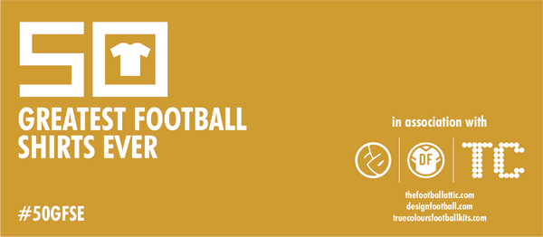
Months in the planning, we’re proud to present at last The 50 Greatest Football Shirts Ever!
Over the next few weeks we’ll be posting about our favourite shirts with an illustration of each one and a little bit about why it floats our boat. Its our selection of what we, personally, consider to be the creme de la creme of football shirt design. Shirts that excite us, tell a story, have deeper meaning, cultural significance or just plain look good!
As a subjective selection there’s going to be some controversies. There may be kits that you feel we’ve missed and should be included and ones that you’re scratching your head in disbelief at their inclusion. But hopefully you’ll enjoy our reasoning and explanations behind their selection…whether you agree with us or not!
I’m so pleased and proud to be involved with this project – it starts tomorrow (Sunday 21 June) with a new kit every day (or so) – and I hope it will provide a real celebration of excellent kit design past and present.
For more details head over to The Football Attic.
Ohh let me throw a few in…Italy 1982,Liverpools hitachi kit(had trouble with that one being a United fan!) England in 1986,juventus in kappa early 80’s.Wales admiral 78,Spurs in 81,Arsenal in the 70’s(home and yellow away). And Man United away in late 70’s
Man Utd (H, A, 3) – 89/90
Holland (H) – 88
Arsenal (GK) – 89/90
Peru (H) – 78
Here’s hoping! Great project, anyways.
Can’t wait to see who’s at no.1! Oh wait, I already know! Mu ha ha ha haaaaa! 😉
Ipswich 1980/81 home.
Was that the Ipswich shirt with white pinstripes? Fantastic shirt. Most of mine are 80’s biased,the France 84 is another one.
Bayern home 00/02; away 09/11; home 07/09 – Germany WC 02 home; Germany WC 06 home; Arsenal ‘Invincibles’ home; Arsenal ‘Invincibles’ yellow away; Chelsea 04/05 home; Newcastle 95/97 home; Leeds 97/99 home; Forest 94/96 home; Liverpool 08/10 home; Werder Bremen 03/05 home…
Ipswich 1980/81 home was the plain blue shirt that they won the Uefa cup in. The pin stripe shirt was worn in 1981/82.
I have a general query regarding this subject.
Have you allowed yourselves able to select 2 versions of the same design? i.e. Denmark 86 home and Coventry 87-89 home?
You’ll have to wait and see Andy 😉
Generally I think that the definition of a classic kit to me is one that transcends its use. For example, a kit that may be a template, but when in a certain clubs colours, with a certain sponsor etc, it becomes classic. I hate overly large sponsors logos, especially if they’re shoe horned into a design that doesn’t suit. For example, the ‘blue star’ Newcastle Breweries logo, and the Newcy Brown logo both fit perfectly with the Magpies stripes, as did the NTL logo, but neither Northern Rock or Wonga (or the short lived Virgin Money) did / have. Arsenal looked better with JVC or O2 than they ever did with Emirates, and my own club, Bayern, look better with the one letter ‘T’ than the full T-Mobile logo (though I did like the T.Home and the Liga Total! sponsors). I must admit though, I do get all nostalgic for the old Opel Bayern shirts, even though they’ve had T-Mobile for nearly as long now. See what I mean? I think John has made the point before – all of these factors have to come together to make a classic strip. That’s why the navy Bayern away of 08/10 is my favourite – un intrusive sponsor logo, restrained trim, classy shadow pattern, and to top it off, ‘FC Bayern’ in calligraphic script in red on the back of the collar. Pure class.
To me our NUFC home 95/97 was one of the best ever, the brown ale fitted perfectly and of course with that fabulous team it worked hand in hand. Twenty years on we have wonga .. enough said!
France 1980 with blocked in collar is absoulete gem, having said that any of the early 1980s Adidas pinstripe designs are master pieces, Ipswich, Forest, Nantes and Hamburg.
One of my favourites is the simple Erima Germany home from 1978, my beloved Dad bringing it back for me from a holiday in Cologne that Summer. So formidable that shirt was!
Does anyone know why Erima briefly supplied Germany at the end of the 70’s? Historically, adidas is reported as being a constant supplier since ’54, yet I have seen pictures of the above kit. Its always confused me.
here is a few of my more memorable combinations, not saying the teams perfomed particularly well at the times they wore these shirts but the sponsor stood out more to me at that time for one reason or another weather it be shirt or on pitch exploits
Sheffield Wednesday = Sanderson, Finlux or ASDA
Arsenal = JVC
Manchester United = Sharp
Everton = Hafina, NEC or Danka
Newcastle United = Newcastle Brown Ale
Rangers = McKewans Lager
Bayern Munich = Opel
West Ham = BAC Windows or Dr Martens
Aston Villa = Muller, AST Computers or LDV Vans
Birmingham = Auto Windscreens or Phones 4 U
Southampton = Sanderson or Draper Tools
Ajax = ABN AMNO
Parma = Parmalat
Liverpool = Crown Paints or Carlsberg
Inter Milan = Pirrelli
Chelsea = Commodore/Amiga
Borrussia Dortmund = Continentale
Manchester City = Brother
Wimbledon = Carlsberg or Elonex
Nottingham Forest = Labatts
Middlesbrough = Cellnet/BT Cellnet
Napoli = Mars
Sampdoria = ERG
Juventus = Sony
Boca Juniors = Quilmes or Pepsi
Barcelona = nothing
Tony Spike, have you listened to the latest episode of the TwoHundredPercent podcast? If not you need, to, it’s your kind of thing!
Martyn
according to the Erima website, they supplied West Germany for both the 1974 and 1978 World Cups. Note also that Umbro supplied West Germany in 1966
http://www.erima.eu/en/company
I’m guessing West Germany wore Umbro “aertex” jerseys in Mexico 1970 as well, judging by the design of the shirt numbers.
Which begs the question who made their kits in 1972?
I believe the Euro 72 Shirts were also Erima, who were a subsidiary of adidas.
Andy
I found this, which claims to be a 1972 match worn Umbro shirt. I would suspect that if Erima shirts were worn in the 1972 Euro Nations Cup win, Erima would be celebrating it on their website. Also according to Wiki, Adidas didnt take over Erima till 1976.
http://paragonauctionsite.com/lot-4339.aspx
Interesting, thanks. However I believe that the Erima ‘era’ was very short, and occurred after the ’78 World Cup (ie EC ’80 Qualifiers). I’ll do some investigating. I do believe though that adidas were the supplier in ’74 – the font used on the numbers was the ‘3D’ style used right up until the early 90’s, which was linked with adidas. Never heard up to now of Umbro being involved with Germany / West Germany.
I have to start by saying how much I have enjoyed this feature, and the Podcasts that run alongside it, but I was staggered by the non inclusion of either of the umbro, Liverpool home or away kits used from 76-82.
Re my earlier comments from July – I did some investigating and Erima supplied West Germany from ’77 up until the end of the Euro ’80 qualifiers. The coaching staff and anthem jackets were supplied by adidas in ’72, ’74, and ’76. I think this is an interesting footnote in kit history waiting to be explored.
@Andrew – that was one of the ones I thought would be a lock for inclusion. Thought that we might see at least one Brazil shirt too but the judges were keen to point out that they felt ‘iconic’ shirts weren’t necessarily the best-designed.
I’d have definitely included something from Samporia too if I had been in charge.
Interesting choice for number one. Personally my favourite Germany home is the 06/08 or 02/04. I was also a bit surprised to see no Bayern kits in there – although I may be biased, surely some of the FCB kits used in the last forty years fall under the criteria? Yes, I accept that most of the kits from the mid / late ’70’s were a bit ‘samey’, but from ’91 onwards adidas have tried to reinvent the strip whenever a new one is unveiled – rightly or wrongly most of them have been unique.
@Andrew,
no i haven’t seen it yet, ..or listened to it yet or whatever the context is
I was very surprised that there wasn’t an Ajax shirt on the list, as their design is unique and one of the most recognisable tops in world football.
I think they said it fell more into the iconic category than great, same with Real Madrid
Tottenham Hotspur Home 1991-1993 = Game Changer. Others: Holland 1988, West Germany 1990, Real Madrid 1985, Wales (Hummell) Home 1987 & Liverpool 1981.
Do you think the recognition of the kits is sometimes liked to the success of the team?