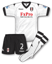
 I’m not sure but I think I must be the only person who likes Fulham’s kits this year. In fact, I don’t just like them, I love them! I always think its hard to get Fulham’s kit too wrong, the white and black, despite its workmanlike and understated demeanour, just looks great. Kappa have come in this year replacing a couple of years of Nike teamwear and have dressed Fulham in a very simple, but classic strip with V-neck and Kappa’s familiar reversed seams for comfort. Fulham share Villa’s sponsor, FX Pro, but their logo looks much better on Fulham’s white than on the Villa outfits. Intelligent splitting of the Kappa logo as well, with the seated figures on each sleeve and just the logotype on the front of the jersey.
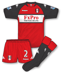
 The away takes Fulham’s familiar red, white and black and blends it in to a bold new design (with a dark grey replacing the black) including a white chest band and a neck design reminiscent of Kappa’s shirts at the turn of the millennium. The shorts follow the same design as the home black pair so there are mix and match options (there’s also a white change pair just in case as well).
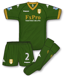
 The third kit is the real deal breaker here though and I’m sure it will rub a lot of Craven Cottage’s faithful up the wrong way. The dark green and gold strip really breaks with tradition and brings a completely new look to the Fulham team. Rumours are that the gold and green have been inspired by the famous corporate branding of Harrods owned (until very recently) of course by Fulham chairman Mohammed Al Fayed. The simple fact that Al Fayed no longer owns Harrods makes the choice of hues very strange. The design is identical to that of the home and I, personally, think it looks superb. Whether it is effective on the pitch is another matter (at the time of writing the kit has not actually been worn or, come to think of it, officially unveiled so a few of the details may not be 100% correct). Another big talking point is that it seems the Fulham badge will be rendered in gold and white rather than the traditional red, white and black. Its another brave design and for me is the only questionable element of the strip.

Funny you should post this up now John as Fulham will be giving the green and gold kit it’s debut on Saturday away to West Bromwich Albion at The Hawthorns: http://www.football-shirts.co.uk/fans/fulham-third-shirt-launch_9253
Personally I love the home and third kits but not the away. I am convinced that the white band is only in place to allow the sponsors logo to remain red. I also don’t like the use of grey in place of black. That being said they have changed it on new third strip.
Saw the Fulham kit on MOTD the other day and instantly liked it. Going for the classic look can so often result in a strip that’s too plain or just boring, but this one, despite being as simple as can be, seems to have an air of sophistication rather than dullness.
At first glance I didn’t like the away. It looks like it’d be at home in the MLS, but on second glance I’m warming to it. I like that the white panel isn’t just a straight band, but curves in…a neat little distinguishing touch.
The 3rd looks very nice indeed. I’m not a great fan of green kits, but the gold offsets the main colour very nicely and again exudes that little touch of class.
John, you say the colour choice for the 3rd kit is strange but surely given how long it takes to design a kit, Fayed still owned Harrods when they started.
Premier League seem to think the 3rd kit as shown here is official. However it doesn’t appear on the website.
http://www.premierleague.com/staticFiles/4f/53/0,,12306~152399,00.pdf
Home kit is nice, although I hate how Kappa have the badges and logos so high up on their kits. Also, the fact that the players have to change kits at half time due to them being dripping in sweat because of the wful material they are made of (I also noticed this was a problem with the almost identical Valencia kits this season) is a bit of a problem.
I agree with Andrew about the away kit. Too “ten years ago” for my liking.
That green and gold shirt would be great for a post-Glazer United (I live in hope) as it actually resembles the kit Newton Heath wore in 1894 (the only one there is any actual evidence of them wearing). Can’t see it being much use on the pitch though. Players head to toe in that shade of green can’t make them terribly visible.
the home kit is spot on,have to agree about the kappa badges being too big though.The 3rd kit reminds me of a norwich away kit.
Tim – interesting point about the material. I own several Kappa kits from the Kombat range (= the player quality range compared to the inferior replica Clone kits) and they are really not that comfortable to play in. I am wondering why Kappa does that. They are changing the fabric slightly year after year but the reality is that the cheap Clone kits might be more comfortable.
Apart from this I like the home a lot – I just wish FxPro would invest a few quid into somebody who would design their logo without using Times New Roman.
It could be worse Juro – it could be comic sans.
No, I didn’t realise that about Kappa fabric, I remember something similar happening with sweat on Puma shirts a few years back as well. The Italian shirt almost went a dark blue colour. I love Kappa shirts but have never worn one. John B, Tim – funnily enough the high placement of the badge/logo is actually one of the things I love about these kits!
Juro – as a graphic designer my toes do curl a bit at the dare I say ‘obvious’ FX Pro design and would love a chance to re-do it. From my experience I suspect its been designed in-house with a large amount of input from the MD whos been ‘playing around with a few ideas’ on his PC.
Green kit worn today against West Brom, looks quite dark
http://www.dailymail.co.uk/sport/football/article-1323209/Is-worst-kit-time-Fulhams-Harrods-Green-strip-unlikely-best-seller.html
Of course, the Daily Mail have wheeled out their usual feature, writing it off immediately just because it’s something out of the ordinary
Thanks for the tip Denis – as you would expect the Mail’s article is absolute cobblers. Sure, there are issues over visibility on the pitch but to call it the worst kit ever is just ridiculous. I don’t know why the Mail can’t seem to write a decent bit on football kits.
Personally I think its a superb kit.
A lot of the papers have been doing a ‘worst kit ever’ feature on the green Fulham kit over the weekend.
John, The Mail can’t write a decent bit on football kits for much the same reason as they can’t write a decent bit on any subject. “OUTRAGE AS ‘MUSLIM’ FOOTBALL KIT CAUSES CANCER!” “FULHAM OWNER AL-FAYED NOT EVEN BORN IN THIS COUNTRY!”
The Mail is easily the worst hate-mongering rag in circulation.
Ha ha!! Like it Tim – I do dislike the Mail purely due to their ‘football shirts are a rip off’ line they spin almost every pre-season.
Like you said John it looks like the MD has had quite a bit of input into the company logo. Unfortunately client involvement can happen more times than any self respecting designer would like, or encourage. One thing is for certain, this logo has not been designed by any top designer.
Back to the shirt, is this not just an old AS Roma template?
Willie: no, it’s the current template used by Sampdoria (http://www.footballshirtculture.com/images/sampdoria_kits_kappa_1011_2.jpg). Can’t remember too many V-neck Kappa shirts before (except Wales a couple of years back).
Actually you are right that it’s identical to last year AS Roma. Sampdoria has a different placement of the Kappa wording. It’s very confusing to keep track of the Kappa templates as the changes are usually very subtle.
Fulham wore the dark grey away socks with the home shirts and shorts tonight against Chelsea, looked fairly bad.
Also, I noticed Blackpool wore their away against Aston Villa when there was no real call to do so, especially as Villa played Stoke recently and neither changed
I agree, Denis, regarding Fulham. It seems odd that Kappa haven’t provided them with black change socks, as obviously having white socks is going to throw up lots of clashing issues.
Something that I noticed from last night’s matches, was Fabianski wearing a pink goalkeeper kit in the Wolves-Arsenal game.
http://www.gettyimages.co.uk/detail/106683982/Getty-Images-Sport
This is strange for two reasons. Firstly, I would have thought pink was too close to Arsenal’s red (and white) strip. Quite why he didn’t simply wear the home goalkeeper kit, which is grey, I don’t know, as Wolves were wearing gold, their goalkeeper was in black, and the officials were in light blue.
Secondly, this now means Arsenal have worn FOUR goalkeeper kits this season. Grey, turqiouse, black, and pink. This has to be some sort of record.
Agree re Fabianski’s outfit Adam, pink was an odd choice.
Perhaps depressingly, though, four GK kits is not a record, for Arsenal anyway. In 04/05, Lehmann and Almunia wore grey, black, yellow and a kind of acquatic blue (which, incidentally given the comments on the pink top, was often used with the royal blue away kit).
http://www.gettyimages.co.uk/detail/51799199/Getty-Images-Sport
http://www.gettyimages.co.uk/detail/51815058/Getty-Images-Sport
http://www.gettyimages.co.uk/detail/51151954/AFP
http://www.gettyimages.co.uk/detail/51845361/Getty-Images-Sport
In 02/03, David Seaman wore four versions of the same design and, again, the choices were not always logical, the mainly black kit was used alongside the navy away while the predominantly yellow was worn with the team in the gold third.
http://www.gettyimages.co.uk/detail/1623208/Getty-Images-Sport
http://www.gettyimages.co.uk/detail/1586974/Getty-Images-Sport
http://www.gettyimages.co.uk/detail/52723389/Bongarts
http://www.gettyimages.co.uk/detail/1950763/Getty-Images-Sport
Going even further back, in 1992-93 four GK tops were also worn. The blue, green and grey are shown below and while I can’t find a picture of it, surprisingly red was also used, in a match at Ewood Park when Arsenal wore the bruised banana kit
http://www.gettyimages.co.uk/detail/1636895/Getty-Images-Sport
http://www.gettyimages.co.uk/detail/79024163/Bob-Thomas-Sports-Photography
http://www.gettyimages.co.uk/detail/78967235/Bob-Thomas-Sports-Photography
I just remembered 1998-99 too (yes, I’m aware that I have no life!)
http://www.gettyimages.co.uk/detail/1201844/Getty-Images-Sport
http://www.gettyimages.co.uk/detail/1552573/Getty-Images-Sport
http://www.gettyimages.co.uk/detail/1215318/Getty-Images-Sport
http://www.gettyimages.co.uk/detail/79029938/Popperfoto
The red GK kit from 92/93 can be just about made out here http://www.youtube.com/watch?v=2j6ZY4h0oGo
Interesting stuff, Denis.
I’m glad to know I’m not the only sad git who notices these things. 😛
I actually have a bit of a thing for goalkeeper kits, mainly because they seem to get ignored by everybody. I considered doing a blog about them, as there are so many websites about football kits, including this great one (!), but so little about goalkeeper kits.
The only time they ever seem to get talked about is on those ‘the ten worst kits football kits of all time’ lists with a picture of Jorge Campos playing for Mexico at the 94 and 98 World Cups in his crazy self-designed kit.
My site, http://www.prideinthejersey.com, includes GK kits from Gaelic football and hurling Adam, but it’s not too exciting since usually they are just reversals of the outfield strip!
Where would I be able to find the pink kit do you know?
If you mean to buy, Daniel, in the arsenal.com online store they only have the grey/silver home goalkeeper kit.
Most teams these days only have one goalkeeper kit as a replica to buy, I suppose because the goalkeeper kits are not big sellers, and it wouldn’t be worth them stocking all two/three/four of them.
I suppose it might be available on one of the many general football kit websites, althought I doubt it.
On the subject of Arsenal, I’m watching their match with Everton live on Sky Sports now, and they are wearing their away kit, complete with redcurrant shorts.
A little strange as I thought they preferred the change yellow shorts. I’m pretty sure they’ve worn those in every game the away kit has been used this season.
The redcurrant shorts were worn against Partizan Belgrade, Adam, I think the yellow shorts were used because of clashes.
Interestingly Arsenal have started providing the kit information on their website a couple of days before games http://www.arsenal.com/news/news-archive/everton-v-arsenal-kit-selection
Nice find that Denis – good to see Arsenal paying attention to their kit – one of the hallmarks of the club
Oh yeah, Denis, you’re right – I forgot about the Partizan Belgrade match.
I know there was a clash at Anfield on the opening day of the season, but they did wear yellow shorts against Shakhtar and Sunderland when there wasn’t a clash. Unless, I suppose, it was considered that redcurrant clashes with black.
I was always under the impression that Arsenal, like some other teams, didn’t bother with short clashes? As they never change shorts when wearing their home kit on their travels.
That’s a nice little touch by Arsenal, regarding announcing on their website which kit they will be wearing. As John said, Denis – nice find!
Interesting that they describe the away kit as gold, when it’s clearly yellow. Actually, it’s a much brighter yellow than I was expecting.
Not sure what the story is Adam, I know that in 07-08 white shorts had to be worn with the white kit away to Sheffield United in the Carling Cup, though the redcurrant ones were used against Sunderland in the league.
Arsenal don’t seem to mind changing shorts on away kits, but bar a period in the 70s, never do so on the home.
After wearing the grey socks from the away kit in the Chelsea game at Stamford Bridge, Kappa must have decided it looked bad and have provided Fulham with some black change socks for the home kit – as they wore them at the Emirates today.
http://www.gettyimages.co.uk/detail/107327339/Getty-Images-Sport
Looks much better!
dennis h (22) regarding the 4 92-93 arsenal gk kits i think green was meant 2b 1st choice by adidas and was in cup games? but in the 1st year of the premier league the prem refs change their shirts from black to green meaning arsenal/adidas brought out the blue and grey gk tops….. which both clash with blackburns outfield plays hence the perfect and rare time 4 the arsenal gk to wear red!! may be wrong as im a spurs fan but i have always been an adidas fan. that yellow away kit arsenal had then was even worse then spurs poor umbro one of the time but at least david seaman look class against blackburn l.o.l!
Hi Dave, while you’re right about the refs wearing green for the first time in 92/93, the blue was marketed as the first-choice GK shirt, however your logic still stands as none of the blue, green or grey could have been worn at Ewood Park!
I like the kit too.
http://www.airosportswear.com also design great kits!