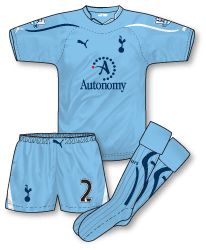
 As usual Spurs launched three new kits at the start of the season – their fifth set of Puma designs. Last season’s home strip ruffled a few feathers and this year’s has done the same. Again Puma have ignored the pure lilywhite shirt design preferred by fans and have instead included a prominent navy panel across the shoulders in a style slightly reminiscent of Admiral’s famous England outfits of the early 1980s. The Puma logo is placed high and reversed out of the navy on the right shoulder with the Spurs badge further down. A wrapover neck with a small V inset forms the colour and the main panel of the shirt is adorned with a subtle diagonal shadow stripe. The shorts mirror the shirt design and include a large white panel on the bottom of the right leg. There’s a new sponsor at White Hart Lane this season – well, tell a lie, there’s actually two. Software company Autonomy will appear on Spurs’ shirts for league games with financial firm Investec worn for cup matches. The deal to split the sponsors in this way is a first for the Premier League (I believe) and was the brainchild of Spurs’ chairman Daniel Levy. Investec’s cup shirts have been very popular and have sold out in the club shop.
The design has grown on me to be fair since its launch – I still would much rather see the club in a pure white shirt and I’m really against giving secondary colours too much prominence on jerseys. Still, its something different and will no doubt lead to a very warm reception for the much plainer shirt I’m sure Puma will introduce at the Lane for 11-12.
 Away from home Puma have opted for light blue this season. Its a different design to the home shirt and instead is one of this year’s standard Puma templates as premiered in the World Cup and also worn in the Premier League by Newcastle. However for this strip Puma have gone for alternate blue and white flashes on each sleeve and trim on the collar. The shorts however retain the white trim and include the ‘interesting’ Puma logo on the waistband.
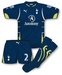 The club’s third shirt is in navy blue and again is formed from another standard Puma template that was launched in South Africa. For me this is the least successful kit of the bunch.There’s just too much going on and the combination of white and fluorescent yellow gives the jersey a cluttered approach. The shorts and socks however simply follow the design of the away pairs.
Not a fan of these either, and it’s nothing to do with me being a Gooner!
My favourite set of Spurs kits was 04-05, plain white home shirt, navy shorts, white socks, with the away a reversal while the third was all-yellow
I was delighted with this home kit (and the traditional all white variation for Europe), especially after last seasons effort with far too much yellow. As you say I think the path has been cleared for a plain shirt in Puma’s last season as technical sponsor next season before a rumoured return to Adidas in season 2012-13. COYS!
Hadn’t realised that a return to adidas was on the cards.
I like the fact that Spurs wear all-white in Europe, it’s good when teams have kit traditions like that
Don’t mind the idea of the diagonal panel on the shirt, but I dislike the way it is split up with that weird collar insert (why not just use a v-neck if they wanted to split it?) and the fact that the lines below the solid blue are different on either side. Too fussy by far, made even fussier by the fact that one of the legs of the shorts has been given the same treatment.
The away isn’t too bad, but I can’t stand that collar. The third is a mess, no other way to describe that. Just plonk every unattractive trim design all onto one shirt in various colours? Brilliant work again Puma!
I find it interesting that Spurs (and I believe Liverpool) decided to go with their own font for names and numbers this season in the FA Cup and do away with the premier league patch. I think teams should still have a standardised font in this competition as it is probably only a matter of time before some team or other come up with something completely unreadable. In regard to patches perhaps it’s time for all teams (maybe from the 3rd round on) to have a dedicated FA Cup patch on their sleeves. I think it might help the competition with creating it’s own identity…just a thought!
I for one love the Spurs home kit, as it just looks so smart, either in its usual combination or with white shorts.
The aways on the other hand a absolutely awful; the away is a boring template kit while the third is a dog’s dinner of a kit – what a mess!
I know they’ve got a ‘kit policy’ – but would it trouble Spurs to keep their kits for more than a season?
Alan: Interesting idea regarding FA Cup badges. I’m a big fan of teams having their own name and number fonts for certain competitions too.
Nice light blue away kit, the others look a bit cheap n’ nasty.
I for one preferred last years home kit.
#3 – preferred the 05-06 kit myself even though the logo didnt appear.
Home kit is an improvement on the recent home kits.like the work done on the shoulders.the only criticism i would have is that there is too much branding on the sleeves.overall though decent enough.
I cant see the difference between the newcastle and tottenham kits other than the colour.templates are similar to me.ironic in a way that the sponsor is autonomy.
oh and the less said about the thrid kit the better.
John it’s purely a self indulgant request, but can you reproduce the all white European strip?
Andrew, I’ll see what I can do. Ironic isn’t it though that the superb result mid-week was achieved in non-Euro navy shorts!
I think Spurs decided on that design for the home shirt so that it would match Aaron Lennon’s eyebrows!
I think the home kit design is alright, save for the strange collar, but it just doesn’t look like a Spurs shirt to me. Still, its a lot better than last season’s mess (yellow on white just looks odd to me). The away kit is nice, but the third kit is just too busy and never been a fan of that strange collar that Puma have introduced for that particular template.
I agree John, I hope we’ll be in traditional all white for the second leg on March 9th and make Milan wear black shorts, though they’ll probably wear the all balck thrid kit for no particular reason!
I wasn’t sure about the home kit at 1st but it grew on me. I love the 2nd kit but like everyone else i think the 3rd kit is shocking! One of the worst Tottenham kits in years! COYS