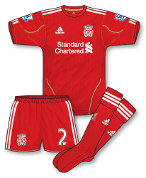
 To wrap up my reviews/summaries of all Premier League 2010-11 kits are Liverpool’s three strips for the season. I posted a detailed initial review of the home on its unveiling back in July. Nine turbulent months later for Liverpool my opinion is still pretty much the same. Looking at the other new adidas kits that have appeared in the past few months its good to see that they gave Liverpool a unique outfit. I have warmed to the design slightly but am not really a fan of the shadow pattern used throughout which seems to dull down the vibrancy of the shirt. The gold trim is a nice touch and something I would like to see used (with care!) on future Liverpool home kits.
 Always good to see the Reds away from home in white and black and the 2010-11 adidas nearly, but not quite ticks all the boxes. I think my main issue with it is the effect of the black red and gold pinstripes. Pedantic maybe, but using three colours here seems to create thicker stripes that look too heavy for the shirt somehow. Its a nice idea but I wonder if there was a better way to incorporate the three colours into the pinstripe design? Still, the rest of the kit gets my thumbs up especially the socks with their black and red turnover.
 The third Liverpool kit for the season sees a return to black (yet again), this time trimmed with a bright, flurescent yellow. The shirt fabric incorporates the same shadow pattern as the home but for me the whole strip is a tad dull and doesn’t really excite me. Its seen a fair bit of use this season though and the yellow colour has formed the main theme of a lot of the club’s European training wear. Best part of the shirt for me is the fact that the Liverpool crest has switched to yellow with only the flames retaining the red colour (a trick also included on the recently unveiled 11-12 away kit)…but don’t get me started on the Liverpool crest…
Fitting that the black kit was worn for the funeral of Arsenal’s title hopes yesterday! Not a fan of it other than that, bit of a chav magnet IMO, I’ve seen people wear it with the matching tracksuit too!
Don’t mind the away but preferred last season’s white kit – one thing I don’t like is that when Liverpool have sock clashes with their white/black kits is that they wear black socks, I’d prefer if they used the home ones like they used to in the 70s.
I’m surprised to find myself liking the black and yellow third kit, for some reason. It looks a lot better with the yellow numbering and lettering, used in the Europa League, as opposed to the white standard Premier League numbering.
Actually, I’m a little surprised the Premier League don’t have yellow as a choice for their numbering. Anyway…
One thing I don’t like about the kit is the diamond shadow pattern, as you also said John. That goes, obviously, for the home kit, also.
I find the white away kit just a bit of a mess really. As Denis said, last season’s white kit was much better.
Excellent illustrations and article, as always, John.
One more thing, is the home kit 10-12?
The third kit is far too ‘Kilkennyesque’ for my liking.
#4 – I don’t see how it resembles kilkennys kit myself.off to PITJ with that talk.
The away kit if anything reminds me of the fila polo Bjorn Borg wore during his glory years in Wimbledon
The home kit isn’t being changed next season. The away kit is being replaced with a black one: http://www.liverpoolfc.tv/shop/awaykit?ncid=Retail_AwayKitReveal_OTHER_30032011
Thanks, Andrew.
I see Liverpool are getting a new third kit, also. I thought the white away kit from this season might simply be retained as the third kit for next season.
My prediction would be yellow with red. We haven’t seen one of those since, I think, 06/07.
New deal with Warrior sports in the pipeline i believe.
Warrior who?
Warriors……..come out to plaaaay!! Sorry couldnt resist!! Another new kit supplier to the premier league.
I was disappointed by this season’s crop of Liverpool kits. There’s a fine line between detail and fussiness and I think adidas landed the wrong side of the line this time around. The diamond pattern on the home kit gives it a slightly unpleasant orange hue – it might work better if the pattern extended to the sleeves. The gold detailing works well though. The white away kit is way too fussy with the triple pinstripe. Of the three, the black is easily the best thought through and is the most effective black kit LFC has had in my view.
Excellent analysis Ned – youve hit the nail on the head re the orange hue/diamond pattern. The triple pinstrips is too much. The only point I would disagree with is on the black kit, although the black is simpler I have to say it does nothing for me.
John – thanks for the kind words! I should explain my point about the black kit a bit further. While black wouldn’t be my first choice either, it seems to me that adidas have put a bit of thought into it. The diamond pattern is consistent with the home kit and the use of fluorescent yellow trim alleviates some of the visibility problems that come with black kits. Combined with the training gear for Europe, I think this makes for quite a cohesive 3rd kit.
Personally I would prefer a yellow/amber away kit. White & black LFC away kits don’t work as well as they should as because so many teams wear a combination of red, white & black.