Before putting together a page with the full kits for 2011-12 I thought I’d look at each team’s strips for the season in a bit more detail. First up, Arsenal.

Biggest change on the Arsenal kits this year is the introduction of a new badge commemorating the club’s 125th anniversary. Frankly the new crest is HUGE and completely dominates the shirt. The design sees 15 laurel leaves on the left hand side of the badge and 15 oak leaves on the right. The reasons for these may not be immediately obvious (!) According to the club’s official site the laurel leaves “reflect the design detail on the six pence pieces paid by 15 founding fathers to establish the club. Laurel leaves represent strength” and the oak leaves “represent the origins of the club – the 15 founders met in the Royal Oak pub”. I was surprised to be honest that the meanings behind these symbols are so weakly contrived and don’t actually adequately reflect, in my view, the impressive stature of the club and its true beginnings. I would venture that there are more iconic symbols that could have been used.
The rest of the home kit sticks solidly to good old Arsenal principles of red shirts and white sleeves, trimmed with just a sliver of red on each sleeve. Nothing wrong there other than the fact that an almost identical kit was launched just a year ago (the main difference being the crew neck colour). If the football world is going to persist with single season kits I feel manufacturers for the sake of simple value for money do need to design kits that offer a more substantially different design to the previous.
Another Arsenal kit principle seems to be one of creating confusion. Last year it was which goalkeeper top is the official first choice and the promotion of a third strip that it seemed they had no intention of wearing. This year its the socks. In virtually every game (I think) this season the regular home kit has been worn with white socks. Yet publicity photos of the new kit show the players sporting red pairs. And indeed, on the official site, only red home socks are sold. So whats going on?! Clearly there has been a last minute change in the official home kit but for some reason true replicas are not being offered. Very strange…
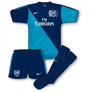
The away kit adopts the navy blue/teal colour scheme that has been favoured several times since Nike took over in the early 90s. In fact their first change kit for the club comprised of these colours. Basic cut/trim is identical to the home, the key design feature is the diagonal division of the shirt into the two colours with alternating sleeves. Not a bad look but one that is taking a bit of getting used to for me. As its the 125th anniversary I would rather have seen a more historical angle to the away kit than this. Navy socks are first choice but teal pairs will also be worn. As with the home kit, the slivers of trim on each sleeve (not sure if these appear on the long sleeved versions – can anyone confirm?) look great until the Premier League patch is applied over them. Wonder what happened to the rulings that sleeves need to be kept bare in order for tournament patches to be added?
In conclusion, a solid home kit spoilt only by the big crest and the fact that its actually not that much different to last years, and a brave away that may prove to be a bit of a grower!
the home strip would look much better with red socks,such as at spurs last week.
Where I think they missed a trick is by not having a Red collar last season, so they could change it back to a traditional White one this year. The sock situation is odd. Red looks more traditional but several teams seem to go with the White sock option, especially for games under floodlights.
I’d have loved if the kit was more like this http://arsenaldirect.arsenal.com/nike-fan/nike-afc-125-authentic-polo-/invt/423995r/ with hooped socks as it would have harked back to the classic 30s-50s design, something that Arsenal have not done, surprising as the 30s were so successful.
The polo shirt is very smart Denis, and like you said it would make a cracking home top! I’ve always loved the classic Arsenal home top design and for that reason I liked last seasons top better.
As for this seasons away, I think it’s OK but I would have preferred to see them revisit the classic 70s yellow and blue kit.
The home socks are red this season, just click the world’s longest web address for confirmation:
http://arsenaldirect.arsenal.com/browse/homekit?ex=co_wizr-locayta&collate=ivtype&collate=price&collate=pcatid&collate=colour&collate=department&collate=gender&collate=bagstyle&collate=brand&collate=author&collate=format&collate=edition&collate=occasion&collate=cardformat&collate=event&collate=size&collate=metal&collate=language&collate=necktype&collate=sleevelength&collate=duration&collate=acctype&collate=cardformat&collate=footballsize&collate=glovestyle&collate=glovessize&collate=headwsize&collate=headwstyle&collate=imagesize&collate=imagetype&collate=jackettype&collate=jewelltype&collate=clothesstyle&collate=mediaformat&collate=subscriptype&collate=stationarytype&collate=toystype&refine_sort_alph=ivtype&refine_sort_alph=price&refine_sort_alph=cat&refine_sort_alph=brand&refine_sort_alph=pdxtfield1&refine_sort_alph=pdxtfield2&sortpdxtmanualsort=ascending&sortorder=pdxtmanualsort&fieldrtype=type&termtextrtype=invt&typertype=exact&fieldpcatid=pcatid&typepcatid=exact&termorder=rtype%3Apcatid&template=wz_locayta2column&pagenum=1&perpage=9&threshold=1&spellcorrect=1&datasource=afcen&setpagenum=1&termtextivtype=socks&typeivtype=exact&fieldivtype=ivtype&bklist=icat,4,shop,replicakit,homekit
John mentioned above that the ones on sale are red Al, but from what we’ve seen in Arsenal home matches the first-choice socks are white
My personal litmus test will be when Chelsea visit Arsenal at the end of the month. The Gunners have usually worn white socks for this fixture making the Chelsea change to their blue variety
Sorry meant to say in April, Arsenal visit us first
The white socks are identical to last year’s ones, so they decided to launch the alternate red socks this year even though the white ones are still first choice.
Similar but no the same Martinos – the white ones have ‘1886’ on the back, the same as the reds http://www.gettyimages.co.uk/detail/126286848/Arsenal-FC.
Incidentally, for the Champions League game with Olympiakos this was not the case, presumably because of UEFA’s strict rules about kit markings?
Arsenal wore white socks today in a youth friendly at the Emirates, so I guess that seals it!
I don’t know why a) Arsenal’s first choice socks are white despite being advertised/sold as red, and b) why red socks are not more frequently chosen as first choice colour, given that they’ve been worn more frequently than any other.
Arsenal look good in white socks, but even better in red.
Is it just me who thinks that the away strip would benefit from a slightly lighter blue, closer to sky-blue, and a small injection of red?