A good year for kits in the Championship, in my opinion. Lots of good designs.
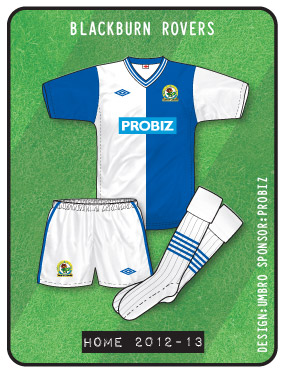
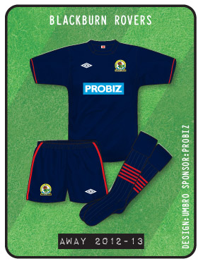
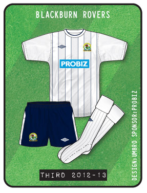
Strange that Blackburn didn’t seem to bother using the standard shorts with the third kit, and instead decided to use the away shorts, whenever I saw them anyway.
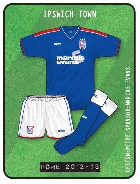
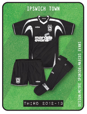
On Ipswich’s black third kit , this season they used the black short’s from the white away kit instead of the usual pair that it had when it was the main away kit the previous two season’s.
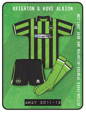
Only one thing: Didn’t Brighton have a black and yellow strip on in the playoffs last week against Palace? or was that a preview of next seasons away shirt?
So it is! Apologies, John / Eric. Looked yellow on the TV, but it was only shown for about thirty seconds!
Seriously, as a Bundesliga (and FC Bayern) fan, the kits for next season (especially from adidas) are quite stunning…I’m already looking forward to TC comments in the coming months!
Actually, just saw a very interesting picture gallery on kicker.de – under the heading ‘Torshutzenkoenig – Seeler – Kiessling’ (under the league results summary) – pictures of every top scorer from 1963/4 (first season of the Bundesliga) to today. From a kit perspective it’s very interesting – things that were tried in Germany but not England such as Borussia Monchengladbach having their club badge beneath the sponsor…Also for some gorgeous kits over the years that deserve to be seen / remembered. See what you think.
This now is all I needed to look at John after the disappointment of 9 days ago! I was just starting to get over it.
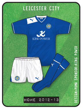
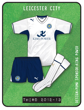
Like the Leicester home shirt even if I preferred the Burrda Home kit design of 2011-12.Though many leicester fans were said to be raging over the poor quality of the Burrda kit last season.The King Power sponsor supposedly peeled off very easily after a couple of washes.
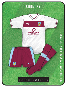
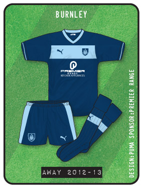
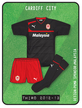
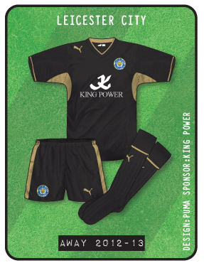
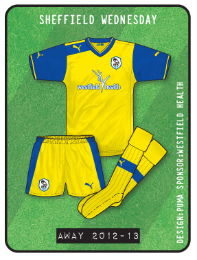
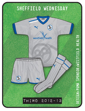
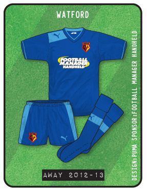
The 2nd and 3rd kit are a bit dull. Might have looked better with a fill of colour around the puma logo like they did on the home shirt
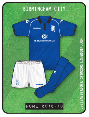
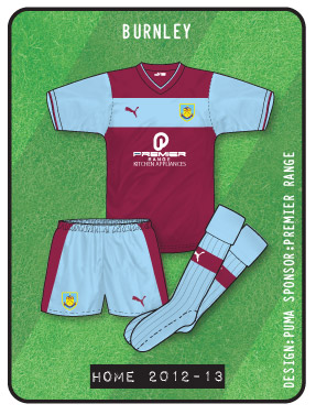
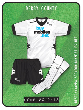
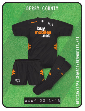
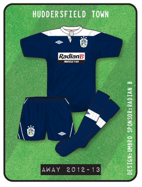
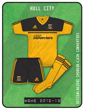
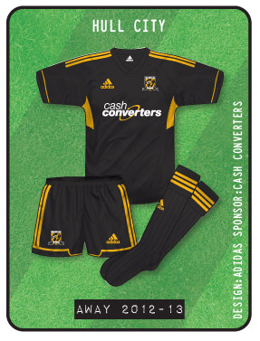
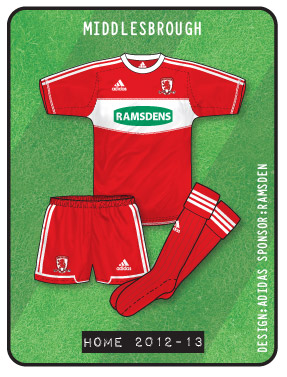
Anyways some good stuff shirtwise in the championship this year.Really impressesd with the home shirts.Like all the home except for Burnley and Derby County (too high a sponsor in Derbys case).
Even with those 2 its not a disaster as Derbys might look better with lower positioned sponsor and Burnleys would maybe have looked better with just maroon all over the front.
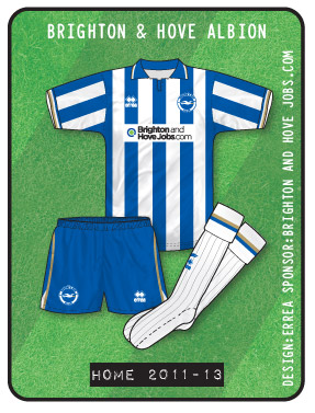
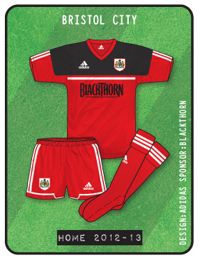
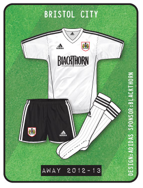
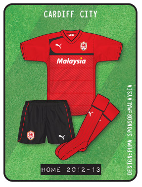
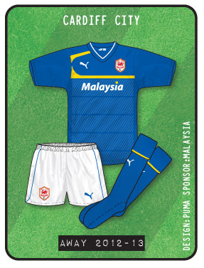
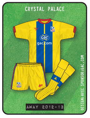
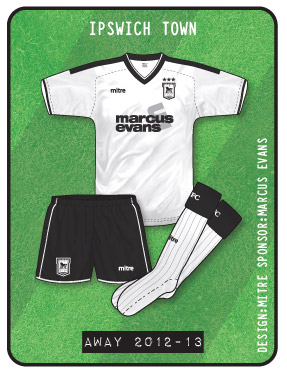
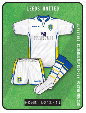
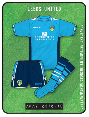
Brighton,Bristol city and leeds have the best looking home shirts of the above with Hull,Ipswich and Yes….Cardiff! the pick of the away.
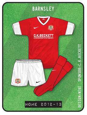
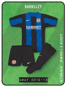
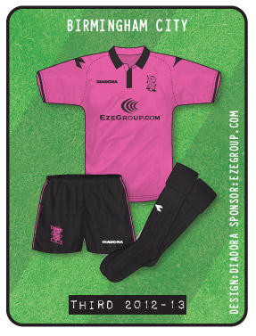
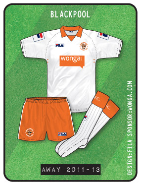
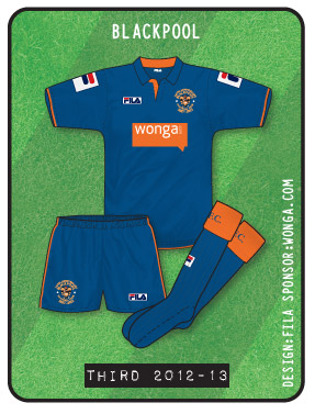
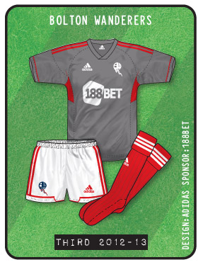
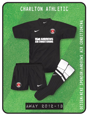
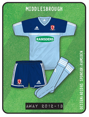
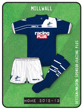
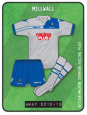
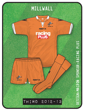
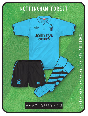
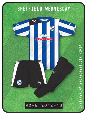
Some bad ones too of course. Middlesborough and Millwall away and the third kits of sheffield wednesday, Blackburn and Birmingham (dear oh dear!)
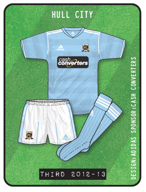
The Hull 3rd kit on there is actually the away one from last season. The sponsor this year isn’t on a black background. It was surprising how much it was used this season!
just seen Ipswich’s kit’s for 2013/14. the home has gone back to white sleeves with the away being red and black in the same design. 2012/13’s white away being retained as a third kit.
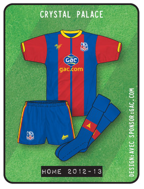
Palace are the pick of the bunch for me. I think the Yellow trim on the home works really well. And nice to see ‘Avec’ back. I thought they had dissapeared.
Denis,
If I had to take a (tenuous) guess, I’d say that the first line refers to the place, the second the stadium itself. Bit strange, but that would be my guess. Other than that, maybe a good old fashioned kit man typo…
My guess would be similar, but if that is the case I really think that the top line should be London rather than Wembley. Not worth getting worked up over, admittedly
Actually, “Final Wembley 2013” is the corporate branding for the game (take a look at ads etc) so it’s actually the name of the event followed by the location and the date.

Great stuff John!
A good year for kits in the Championship, in my opinion. Lots of good designs.
Strange that Blackburn didn’t seem to bother using the standard shorts with the third kit, and instead decided to use the away shorts, whenever I saw them anyway.
http://www.gettyimages.co.uk/detail/news-photo/david-dunn-of-blackburn-competes-for-the-ball-with-james-news-photo/167277763
On Ipswich’s black third kit , this season they used the black short’s from the white away kit instead of the usual pair that it had when it was the main away kit the previous two season’s.
Only one thing: Didn’t Brighton have a black and yellow strip on in the playoffs last week against Palace? or was that a preview of next seasons away shirt?
They wore their normal lime green and black away kit, Martyn.
A kit which has actually lasted for two seasons, which is nice to see these days. Even though it is an awful kit!
http://www.gettyimages.co.uk/detail/news-photo/aaron-wilbraham-of-crystal-palace-is-tackled-by-matthew-news-photo/168519852
So it is! Apologies, John / Eric. Looked yellow on the TV, but it was only shown for about thirty seconds!
Seriously, as a Bundesliga (and FC Bayern) fan, the kits for next season (especially from adidas) are quite stunning…I’m already looking forward to TC comments in the coming months!
Actually, just saw a very interesting picture gallery on kicker.de – under the heading ‘Torshutzenkoenig – Seeler – Kiessling’ (under the league results summary) – pictures of every top scorer from 1963/4 (first season of the Bundesliga) to today. From a kit perspective it’s very interesting – things that were tried in Germany but not England such as Borussia Monchengladbach having their club badge beneath the sponsor…Also for some gorgeous kits over the years that deserve to be seen / remembered. See what you think.
This now is all I needed to look at John after the disappointment of 9 days ago! I was just starting to get over it.
Like the Leicester home shirt even if I preferred the Burrda Home kit design of 2011-12.Though many leicester fans were said to be raging over the poor quality of the Burrda kit last season.The King Power sponsor supposedly peeled off very easily after a couple of washes.
The 2nd and 3rd kit are a bit dull. Might have looked better with a fill of colour around the puma logo like they did on the home shirt
Anyways some good stuff shirtwise in the championship this year.Really impressesd with the home shirts.Like all the home except for Burnley and Derby County (too high a sponsor in Derbys case).
Even with those 2 its not a disaster as Derbys might look better with lower positioned sponsor and Burnleys would maybe have looked better with just maroon all over the front.
Brighton,Bristol city and leeds have the best looking home shirts of the above with Hull,Ipswich and Yes….Cardiff! the pick of the away.
Some bad ones too of course. Middlesborough and Millwall away and the third kits of sheffield wednesday, Blackburn and Birmingham (dear oh dear!)
Here’s the Kicker slideshow that Martyn mentioned (OK to post?): http://www.kicker.de/news/fussball/bundesliga/startseite/552482/2/slideshow_von-seeler-bis-kiessling_alle-torschuetzenkoenige-seit-1963.html
The Hull 3rd kit on there is actually the away one from last season. The sponsor this year isn’t on a black background. It was surprising how much it was used this season!
just seen Ipswich’s kit’s for 2013/14. the home has gone back to white sleeves with the away being red and black in the same design. 2012/13’s white away being retained as a third kit.
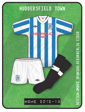
Nice, aren’t they? If a bit of history and heritage doesn’t inspire Town for a promotion push then nothing will.
Martyn, weren’t the inscriptions on the Bayern shirts a bit silly? ‘Final Wembley 2013, 25th May Wembley Stadium’
Palace are the pick of the bunch for me. I think the Yellow trim on the home works really well. And nice to see ‘Avec’ back. I thought they had dissapeared.
John, any chance of posting last season’s championship kits if you’ve done them. They never appeared. Many thanks.
Denis,
If I had to take a (tenuous) guess, I’d say that the first line refers to the place, the second the stadium itself. Bit strange, but that would be my guess. Other than that, maybe a good old fashioned kit man typo…
My guess would be similar, but if that is the case I really think that the top line should be London rather than Wembley. Not worth getting worked up over, admittedly
The kit man could have put Brent on the first line, but Ricky Gervais would probably have tried to claim it as praise.
Or he’s copyrighted the Brent name.
Actually, “Final Wembley 2013” is the corporate branding for the game (take a look at ads etc) so it’s actually the name of the event followed by the location and the date.