Sorry for the over-riding white theme in this latest batch of 09-10 kits…
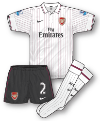 Arsenal Third Kit 09-10
First up is the new Arsenal third kit. Unlike recent seasons surprisingly last season’s popular yellow away was not retained as third choice for 09-10 and instead a white version of the navy away kit has been unveiled. It mirrors the design exactly with redcurrant pinstrips replacing the pale blue ones of the standard away. As with the away kit the pinstripes on the sleeves continue on the shoulders and form a horizontally pinstriped panel on the back of the shirt where the player’s name will sit. Instead of pairing the shirt with redurrant shorts Nike have plumped for “anthracite grey”. I’m not sure how well the grey shorts go with the jersey to be honest and I would have preferred a redcurrant or white pair.Looking at the shirt in a sports shop the other day I was struck by the slightly scratchy fabric. Not as comfortable I would imagine as some other recent kits.
 Manchester United Home Kit 09-10
A controversial design from Nike. The new Red Devils kit, that unlike the previous strip will only be worn for one season, has ruffled a few feathers with a large black chevron across the chest. The red also seems slightly pinkier than usual. Its another conceptual affair from Nike and commemorates 100 years at Old Trafford. The 1909-10 Utd team sported a kit with a chevron although it was red on a white shirt – perhaps switching to white this season would have been a move too far! I can understand why it might take a bit of getting used to but the heavy use of red and black just screams Man Utd to me and I think its a very threatening and intimidating outfit. This will be the last Utd shirt to feature AIG as sponsor although many believed the logo wouldn’t last as long as 09-10 due to the US company’s financial problems.
 Tottenham Hotspur Home Kit 09-10
Another controversial kit is this unpopular Puma design for Spurs. The standard 09-10 Puma template is not the problem with fans though – its the fact that the prominent second colour is yellow! Its part of a campaign from Puma entitled “Glory comes in three colours” with navy the away colour and yellow third. However, Spurs supporters are up in arms over the the yellow flashes on the home jersey and an online petition to have the kit ditched has reached over 3,000 signatures with fans threatening a massive boycott of replica versions. I think they may have a point. Yellow is a Spurs colour though and has featured on several home kits over the years but never in as prominently as on this one. Its a brave design move and in the days of one-season kits an attempt to try something new. Sadly, it looks like its not going to be a success.

Blackburn Rovers Away Kit 09-10
Umbro have taken a radical approach with Rovers’ new away, opting for a predominantly white jersey with healthy dashes of red and blue. There’s a real variety of designs coming from Umbro this season that surely must please the anti-template brigade. Personally, although I like the design I do have an issue with away kits that don’t form a viable alternative to the home and this outfit falls right into that category. With Blackburn’s home shirt being, famously ,half-white, is this really a suitable change strip?
You really got to wonder if anyone in the meeting at the Umbro offices twigged that it was a white kit and they play in half white. Just what must have been going through their heads?
Also Arsenal in white again? I remember first time round it was controversial even though it served a commemorative service this however doesn’t yet I’ve not heard a peep from Arsenal fans, how odd.
Last thing, I have posted before but never got an answer, did you get the texture you use for your shirts from the FIFA community because it looks like one I used to use years ago to make kits for that, it served me well and salute it if it is for continuing the good fight!
Hello Curswine – although its not uncommon for a team playing in say red and white stripes to have a white away kit they can kind of get away with it. The Blackburn situation has got me scratching my head I must admit. A few years back Kappa did a similar thing with them and issued a navy away kit.
Sorry, didn’t see your earlier comment about the texture, I got it a few years a go now from a games site, can’t remember which one though. A few tweaks here and there and a combination with another I think and its perfect for adding fabric folds! I’m impressed you recognise it!
The more cynical amongst us may suggest having an away shirt that isn’t a total departure from the home shirt colours makes a quasi-convincing argument for producing a ‘limited edition’ third shirt.
I can fully understand Spurs fans being unhappy about the amount of yellow in the new shirts, having it as a trim colour is fine but when it becomes a full on third colour it looks out of place.
I didn’t like it when Hull City’s shirt had white arms early in the decade, white as an accent colour is fine for numbers, sponsors name and a small amount of contrast trim, but more than that is too much and dilutes our amber and black identity.
I really don’t like the Spurs shirt…it does indeed have too much yellow, though it’s more the fussiness of the V part of the shirt that puts me off. It just seems to jar with the rest of the kit and the yellowness of it seems to amplify the effect.
contrastingly, I love the Man U kit, though feel the round neck is a bit dull. that said, I guess a V neck would have clashed with the black chevron.
The Blackburn kit feels decidedly lower league to me…akin to Leeds’ shirt last season. Just looks cheap and doesn’t feel like an Umbro affair at all, more a much lesser known manufacturer.
The Arsenal away is very nice, but out of the two gunners kits that were released last season, the home should have been replaced this season. On the new Red Devils shirt, it looks pretty generic and I dont think it looks all that intimidating to be honest, the angle of the chevron is too wide to make it look that in your face. Perhaps if the V was white and extended onto the shoulders the kit would work better.
Yellow and white dont work together really, and the attempt by Puma to design a Spurs shirt with the spikes template and yellow is just wrong. It could have looked great if they had used justnavy, but the yellow is just too much.
Well using it constantly for a couple of years and it is bound to become accustomed to you, I think the sleeves are also from the FIFA texture but I’m not 100% sure.
http://img270.imageshack.us/img270/2742/homepp2pt.png The shirt texture has been touched up on this but the sleeves look the same 🙂
i suppose Nike have got one thing right with the United kit,red shirts,white shorts,black socks apart from that i think its an awful design,black V? the shirt should have a white collar at least,isnt this kit for 2 years and only the sponsor changes for next season.
Compared to some other nike kits and the latest umbro efforts it falls shy by a distance.
I think its the lack of white collar etc that gives it a threatening look. There’s been several occasions in the past 20 years when Utd dropped the white. Not sure about the timeframe of the kit now – according to the Utd site its just for one season but of course that might be just down to the AIG situation.
I’ve always prefered a white collar on Uniteds shirts,the 96 umbro and the following seasons dirty grey collars arnt United to me,but i’ve grown up on admiral and adidas.
As for my comment on umbro shirts, i’ve just seen the new west ham home……i ‘ve changed my mind,its awful.
Yes! I’m not sure about that new Hammers shirt. I think its trying to emulate the class of their mid-80s adidas one but it doesn’t hit the spot for me.
definateley a shortage of blue on the shirt and its made worse by claret socks,to me west ham wear white socks(i do have an issue about clubs wearing the right socks!! my biggest bug bear is United in white socks,i’ve mentioned on here many times before! vision expert ha!
Being a West Ham fan I was looking forward to the kit release today but having just seen it (leaked) I am, once again, underwhelmed. By no means awful but pretty dull all the same. If they wanted to somehow emulate the 1986 shirt Umbro have a good template in the Ireland away they could have used.
Rumours are that fans will be heavily involved from now on so hopefully that will make a difference and seeing as this is our last year with Umbro hopefully we can get back to a home kit change every TWO years.
be nice to see west ham in adidas again,the first one they produced was beautiful,81-82ish?
That West Ham kit’s a bit of a shocker – nowhere near enough blue on it. In fact, I don’t think Umbro have produced a decent West Ham home shirt kit yet, they’ve all been too fussy for my taste.
With Canterbury going into administration, I wonder who will produce Portsmouth’s kit this season.
The Tottenham kit is truly awful. You’re dead right about the line between something being trim and it becoming a third colour. I can only recall the mid-90s umbro as a previous example of Spurs having yellow trim on a home shirt.
I think it’s a particularly naff template anyway, but if they had just had the yellow ‘v’ they might have bot away with it. The yellow side panels are way, way too much.