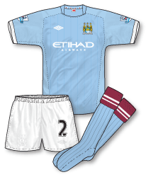
 Last year’s superlative and almost unbelievably classy Manchester City set of kits was always going to be a tough act to follow but Umbro have given it a good go. The 2010-11 home kit follows a design similar to this year’s England away kit with its varying fabric panelling. Subtle woven pinstripes are added to the shirt and, like the England kit, a non-contrasting neck is paired with white cuffs. The devil is in the detail with Umbro though and the kit features a nice Man City scarf strip inside the back of the neck. The shorts interestingly (or perhaps not!) feature the tonal Umbro logo and Man City badge – meaning to the layman that you can barely see them. This adds to the minimalist effect of the strip but personally I’m not a fan of it. What I am a fan of though is the return to maroon sock turnovers, last seen on a City home kit back in 1972. This looks so good and so distinctive its amazing its taken kit designers almost 40 years to bring these back to the club’s home kit.
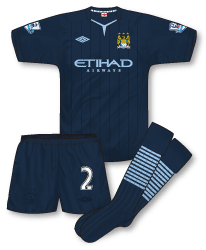
 The away kit (launched in New York City of all places) is a slightly more sombre affair comprising an all navy outfit. The cut and basic template mirrors that of the home kit but with a different neck design that includes a light blue inner panel. The Umbro and Etihad logos are also light blue – a nice touch. It might have been interesting to see how the shirt looked with light blue cuffs as well.The inner-collar City scarf is again included, bringing continuity between this and the home design. The shorts again feature tonal badges, giving emphasis to the squad number. The socks incorporate a series of 11 thin light blue hoops – presumably symbolising the 11 players.
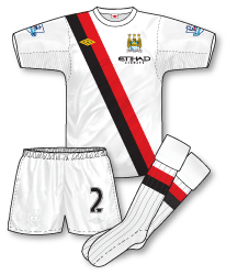
 Last year’s hugely popular third kit – the 70s style white with red and black diagonal stripes – is retained, but with a twist. Instead of being paired with the black shorts and socks it was worn with in 09-10, this time round it will be worn with the home kits all-white shorts and a newly designed pair of white socks that feature single red and black hoops to correspond with the jersey motif. Although the shirt is undoubtedly a classic and the new socks and pretty smart, I’d like to have seen this still worn with its earlier black shorts. Still, you can’t grumble, any shirt (especially one as good as this) being retained for two seasons is something to celebrate!

I actually like the away shirt and shorts, I think it looks fairly fresh rather than sombre, hate the socks though!
Third is lovely, though would be more suited to Man U if they still had Umbro, like John I’d prefer black shorts
Please create Tottenham
Normally i share the same veiws as you John but i really like the home shirt but the only problem is how more traditional can umbro be?
Wanted to see the classic red/black umbro away shirt but il guess i will have to wait longer!
Finally whats the point of having logo’s on the shorts if you cant see them? Why would you want to hide your identity?
another good set by umbro,the away socks are a bit dodgy though!
I like the fact they finally reintroduced one of City’s classic (and fairly unique) colours back to the kit, but why change last season’s? It’s not as though they need the cash from replica sales and you have to wonder how many replica buying City fans (there can’t be that many of them outside of Manchester and I don’t see many being worn here anyway) will just say “Sod it, I’m not spending anither £40 for a shirt with a slightly different collar and some white sleeve trim”?
I like (well, so much as a United supporter can do) the away – socks included. The third is a classic and the only puzzle is why City wore those colours in the first place back in the 70s. I heard that they wore red and black stripes in the 1969 cup final because they wanted to emulate European Cup winners AC Milan – but Milan hadn’t actually won the cup yet that year – they had only days earlier beaten United in the semi-final. I never heard an explanation as to why they wore their local rivals colours with the original sashed shirts in 30-odd years ago though.
Hmm…I have to stick my neck out and say I love the socks. Something about hooped socks seems very traditionally ‘football’. Hello Alexander – I too was worried as to how Umbro were going to follow last year’s shirt in terms of tradition, I think with the modern neck design and the maroon topped socks they have struck a good balance between the past and the future. Tim – yes it is odd how City have adopted Utd’s colours as their favoured away strip. I believe the AC Milan influence is true, Malcolm Allison (who was assistant boss/coach at the club then and selected the strip) was way ahead with his kit design theories.