Click here to buy the new Arsenal shirt
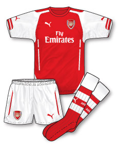 When a club changes its kit supplier after a long time with a single previous company it can often also bring a change in fortune – as if the arrival of this partner encourages everyone to raise their game and impress them. The most notable example of this was the arrival of Umbro at Old Trafford in 1992 after Manchester United had spent 12 years being kitted out by adidas with out a sniff of the League title. First season with Umbro and the championship (the inaugural Premier League campaign of course) was theirs.
So over at The Emirates, after an incredible 20 years, Arsenal’s long-term technical suppliers Nike have been replaced by Puma after months of speculation as to who would take over the deal to supply the famous red shirts/white sleeves combo.
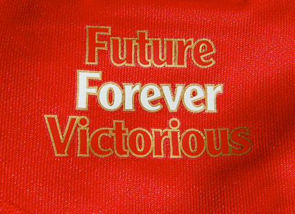 Clearly a new kit supplier is out to make an impact and Puma have launched their new Arsenal ‘trilogy of kits’ with great (and no doubt expensive) aplomb thanks in part to a live video projection over the Thames narrated by Arsene Wenger. The focus was on ‘the future’ (which forms part of the club’s ‘Future, Forever, Victorious’ mantra, that, when you think about it doesn’t really mean anything) although most Arsenal fans are more concerned about the present and when Wenger is going to deliver a PL title than the indefinable future!
So, is the home kit any good? Simply, yes. For me it ticks the main design requirement of a kit (other than of course enabling people to tell two teams apart on the pitch) in that it manages to be both traditional and contemporary simultaneously.
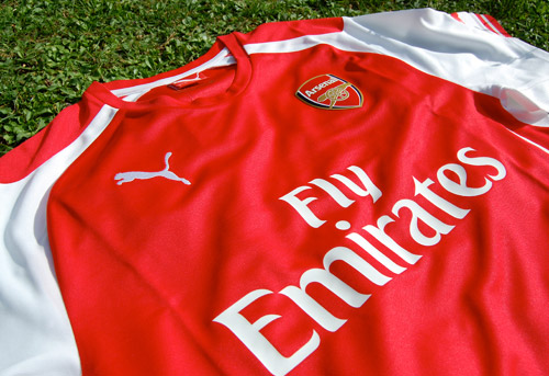
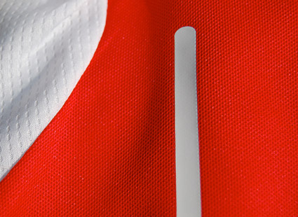 First thing that’s noticable is how bright the colour is – no muted shades here, this is bold, in-your-face red – and it looks magnificent. Its also incredibly lightweight. Puma have not shied away from tackling head on the famous white sleeves and have given them an almost raglan sleeve cut with thin white panels that extend to the minimalist crew neck. These panels give the sleeves extra emphasis and create a distinctive design that moves away from Nike’s previous rather ‘safe’ and ultra-traditional white sleeves. Breathable fabric panels feature under each sleeve and continue for a little way down each side onto thin white panels that stretch down the back of the shirt towards the hem. These panels spread out to form a white curve that arcs round to the front. The mysterious sequence of broken white bars on either side of the front of the shirt (as seen on many of Puma’s World Cup kits) are also present. Quite what these do or signify is beyond me!
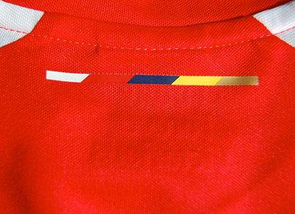
The Puma logo appears on both sleeves above a little red trim and on the reverse of the jersey just below the neck, there is a thin sequence of colours that seem to introduce Puma’s colour palette for the club this season.
The shorts are relatively sober white but the socks reintroduce a superb red and white hooped design which co-ordinates perfectly with the kit. I am sucker for hooped socks and they always seem to suit an Arsenal strip.
Puma have pitched this just right in my view – and I love the care and attention to detail they seem to have put in to this kit. Its going to be odd not seeing Nike’s tick on the Arsenal strip though and it remains to be seen whether this change in supplier will build on last season’s FA Cup success and also bring the change in fortune that Gooners are hoping for.

Agreed John. As I’ve mentioned elsewhere, I too love the new Gunners kit. I think that Nike had gotten rather stale, without any of their last few Arsenal kits being particularly exciting, whereas this debut Puma offering is a good mix of traditional and modern. I like the other two kits, too – the away a new interpretation of the trusty old yellow and blue, and the third…I know it’s going to divide opinion, but personally I like it – I think its a brave and bold design choice, but is definitely ‘Marmite’!
The ‘future, forever, victorious’ line is a Puma concoction John, not an Arsenal motto
It’s far better than I expected from Puma. Only negative point is the white gap on the sides that detract from the traditional red body and white sleeves. It would also have been lovely to see white and navy blue hooped socks as worn in the late 60s.
Isn’t it the translation of the Latin motto used on the last badge before this one? ‘Victoria,Concordia,Crescit’ or something like that?
No, that means ‘Victory through harmony’.
Spot on Denis
‘Forward’ was actually the original Dial Square motto which was used on the 125 campaign a few years ago.
http://www.facebooktimelinecovers.org/wp-content/uploads/arsenal-forward-logo.jpg
Yeah, the other one is just an advertising tag, the ‘Future’ represents the third kit ( :/ ), the ‘Forever’ the home and the ‘Victorious’ the away.
I don’t care much for the Woolwich Wanderers but the least their kit should have is a white collar.
Since the white sleeves were introduced in 1933 they have been only 9 seasons without a white collar.
Denis(5),
Apologies, Latin isn’t my strongpoint! – anything about German football, I’m the man, but Latin…(apart, that is, from the Bundesliga clubs names that are derived from the language)
Andy(8),
I have to disagree – while the Gunners are usually clad in a white collar, the way Puma have designed the sleeve trim would’ve IMO made the collar area too busy if it was white.
Also, quick honourable mention to Arsenal’s greatest rivals – Spurs’ three new kits, I think, are lovely – Under Armours best efforts since moving into football, and (shock, horror) a viable away/third kit!
@ Andy.
I make it eleven seasons without the white collar if you include the present season and twelve if you include the redcurrant jersey in 05/06.
14-15
13-14
12-13
11-12
09-10
08-09
04-05
01-02
00-01
83-84
82-83
You highlight my poor maths, but still, since 1933 they have had a white collar 86% of the time.
Pretty much so Andy. I also count that for five seasons since 1933, we havent had the white sleeves
1965-66
1966-67
2005-06
2008-09
2009-10
Although, our kit from 08 to 10 had white on the sleeves, they werent white in the conventional Arsenal sense of being totally white
Not too fond of the red shoulder pad in the middle of our sleeves this time around somehow and i just don’t think that the design lends itself too well to a skin tight fit
David – do you count 94-96 with the ‘half sleeve’ effect? And would you agree that no Gunners kit made by Nike since the one after the ‘Invincibles’ kit (the suit of armour one with yellow trim, which not everyone liked but I thought was quite fresh and new) has really been that nice? I think the introduction of Puma has freshened up the kit and brought in some new ideas. Add to that the joke of an anniversary strip…a great history like Arsenal’s, and all they could come up with was a plain white badge with a wreath round it (justified as always with meaningless PR gumph)? If it was me, I would have re-introduced the classic 30’s monogram logo (love those old style club badges), included a shadow pattern of Highbury, shrunk the Emirates logo and put it underneath the swoosh, the works. Here’s hoping that Puma keep their form up in the coming years.
I had forgotten all about the first Nike home Martyn your dead right and not just on that but on pretty much everything.
Indeed would have love to have seen the monogram logo reintroduced for one season. Nike totally lost the plot generally post their 2005 templates in my opinion, however i didn’t think the 2008 /09 Arsenal set with the 89 tribute was that bad although they then to become typical templates
While the 2010 version was plain it was a shame to see it go after a mere one year.
If our last Nike effort was worth a two year span then surely the 70s style kit also deserved similar.
It didn’t get one because of the anniversary, a pity as it was a far better candidate than the 11-12 one.
I did like the 06-08 strip, nice and classy. It’s a pity though that the 30s kit has never been revisited, given how important a time it was in the club’s history.
Thought I’d posted all this an hour ago but clearly not.
I might be in a minority here and my views on the new Arsenal home strip might reflect my views on Puma as a manufacturer, but I much preferred Nike’s efforts.
This kit features, as is so often the case with Puma, too much excess detailing; for instance, those lines down the side. In any case, they would work better if they continued from the sleeve to the bottom of the shirt.
Those lines combined with the red sleeve inserts lend the shirt a business that is only exacerbated by the unnecessary Puma sleeve logos, a habit thankfully ignored by most other manufacturers, though sadly now adopted by Umbro.
What else? That red – why not a proper red? Instead it’s a kind of vermillion. It doesn’t work.
The fit. It’s truly tragic, and much too slimline on even the players. That surely can’t be comfortable to play in, and it looks even worse.
As it goes, I don’t think the strip is that bad, only that it pales in comparison to Nike’s final edition (a classic, in my book). Still, I guess there will be another new one next season, eh folks!
According to Simon Shakeshaft, who is writing the new book on Arsenal kits, Puma want alternative shorts for all three kits. I suppose we’ll see if they got their wish at Goodison this evening.
Nope! Navy shorts it was…Bet Mr Blatter was spitting feathers when he saw that!
I’m glad Arsenal are using traditional home and away colours again. The white shorts with the home kit are truly iconic. Hopefully the blue shorts with home kit for that Euro match last season was a one off.
Nick- whilst I quite like the Puma home and away kits, I agree about Nike doing great with Arsenal kits before. The 97 home and 03/4 away were perfect!
Believe that arsenal are wearing hone shirt with away shorts and socks in under 21 at villa. Can anyone confirm and post a picture?
It’s live on Sky. God alone knows why they’re wearing they combo…
*that
I wouldn’t mind the navy outfit were it not for the lime green trim. Otherwise, I’ve always been a fan of that combo of navy and lighter blue.
I was wondering about Arsenal’s name and number font for cup competitions – can anyone tell me if this is a bespoke or template font?
Any idea what shirt Pat Rice is wearing in this programme from the friendly against France in 1989 (see the reserves/youth page)? It looks to be in the same style as the 88/89 kits, but with a white body and red collar.
http://www.thearsenalhistory.com/progs/198889/19890214FR.pdf