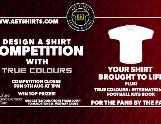
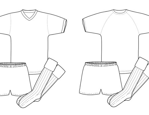
Here’s the shirt template you’ll need to enter the competition. Just download the image below. Use crayons, felt tip pens, digital – whatever you like! […] Read More
![]()
THE FOOTBALL KIT HISTORY SITE
Here’s the shirt template you’ll need to enter the competition. Just download the image below. Use crayons, felt tip pens, digital – whatever you like! […] Read More
In these strange days of quarantine, one good thing I guess is that we all have a little extra time on our hands. But if […] Read More
At last….I’ve got a new website! My last site was launched…goodness, about 12 years ago, and to my shame the design hadn’t been updated since. […] Read More
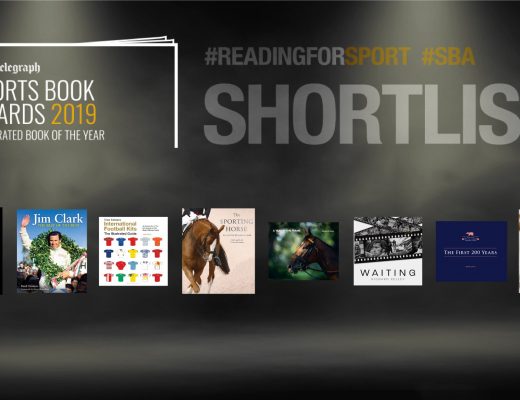
I am thrilled beyond belief to announce that True Colours: International Football Kits has been shortlisted for The Telegraph Sports Book Awards 2019 in the […] Read More
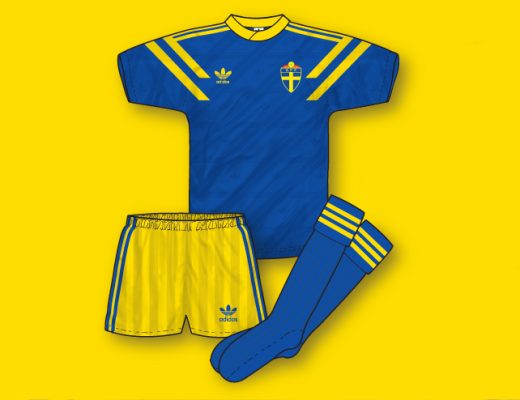
In preparation for the publication of my new book ‘True Colours: International Football Kits” in May 2018, I’ll be posting on social media a selected […] Read More
Better late than never! Here’s a round up of February’s Kit of the Day posts. If there’s any kit you’d like me to feature then […] Read More
I’m so pleased so many of you have been enjoying the True Colours ‘Kit of the Day’ feature on both Twitter and Facebook. For any […] Read More
Just a quick note to wish all visitors to my site a very merry Christmas and best wishes for 2013. I really appreciate all your […] Read More
I thought I owed you all an apology for the relative lack of updates on the site lately. As some of you will be aware […] Read More
For anyone interested in football from the 60s, 70s and 80s then Backpass magazine really is essential reading! Reminiscent of the classic late 70s era […] Read More