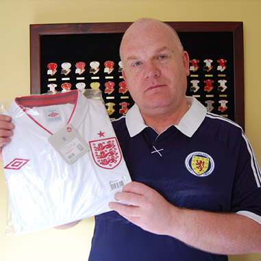
Well after some deep soul searching I finally plucked up courage to don the Shirt of Hurt for Sport Relief! When I realised I’d hit […] Read More
![]()
THE FOOTBALL KIT HISTORY SITE
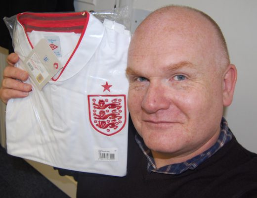
Well after some deep soul searching I finally plucked up courage to don the Shirt of Hurt for Sport Relief! When I realised I’d hit […] Read More
As many of you will know, when it comes to international football my loyalties lie with Scotland. Always have, always will. Inevitable really as it […] Read More
I’m being interviewed again on BBC Radio Merseyside tomorrow (Thursday) morning at about 9.15am. The feature is all about the Liverpool and Everton kits that […] Read More
I was interviewed by BBC Radio Merseyside on Thursday regarding in the somewhat controversial new Liverpool third kit. Want to hear what I think of […] Read More
I was delighted to find out this morning that the True Colours site has been nominated for the Best Football Fashion Blog award hosted by […] Read More
I thought I might draw your attention to a little piece I wrote for Umbro in conjunction with their new Diamond Icons range of leisurewear. […] Read More
Firstly, happy new year to all visitors and friends of the site! Wishing you all a healthy and happy 2011! To celebrate the new year […] Read More
I just wanted to take this opportunity to wish you all a Merry Christmas and a happy, healthy and prosperous New Year. Thank you for […] Read More
For a glimpse into the kit history of your team as featured in TRUE COLOURS click on the team links below where you will be […] Read More
The new Everton away kit is being launched tomorrow and BBC Radio Merseyside have asked me for a live interview to talk about the design. […] Read More